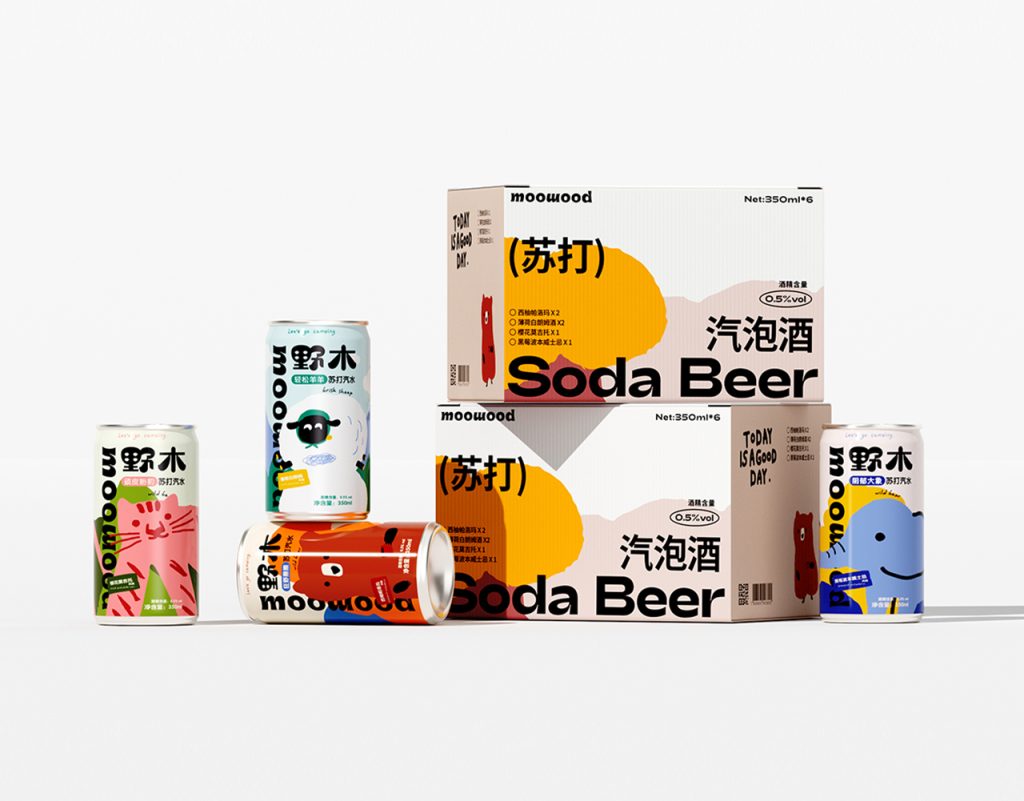

野木—苏打汽水
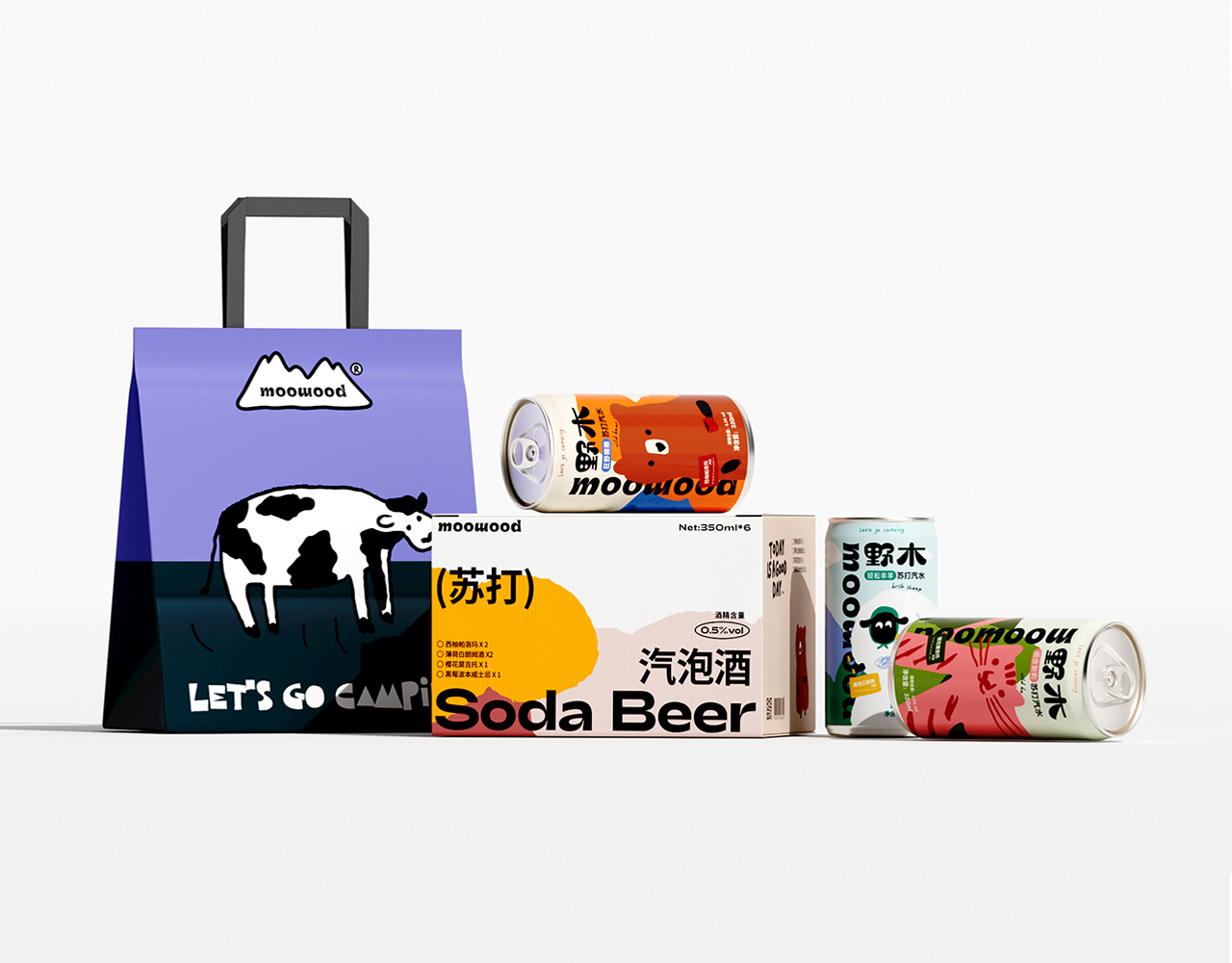
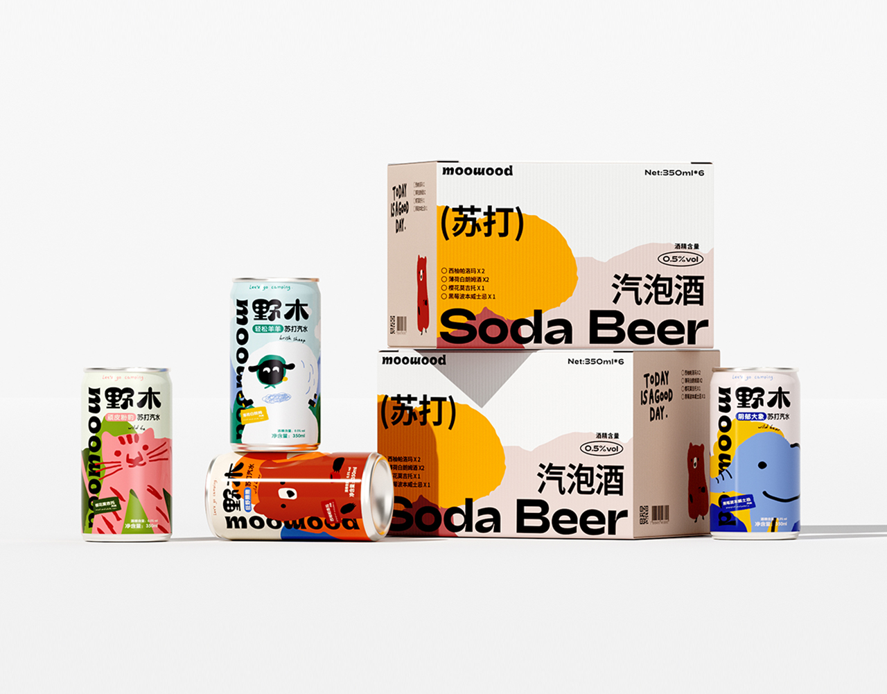
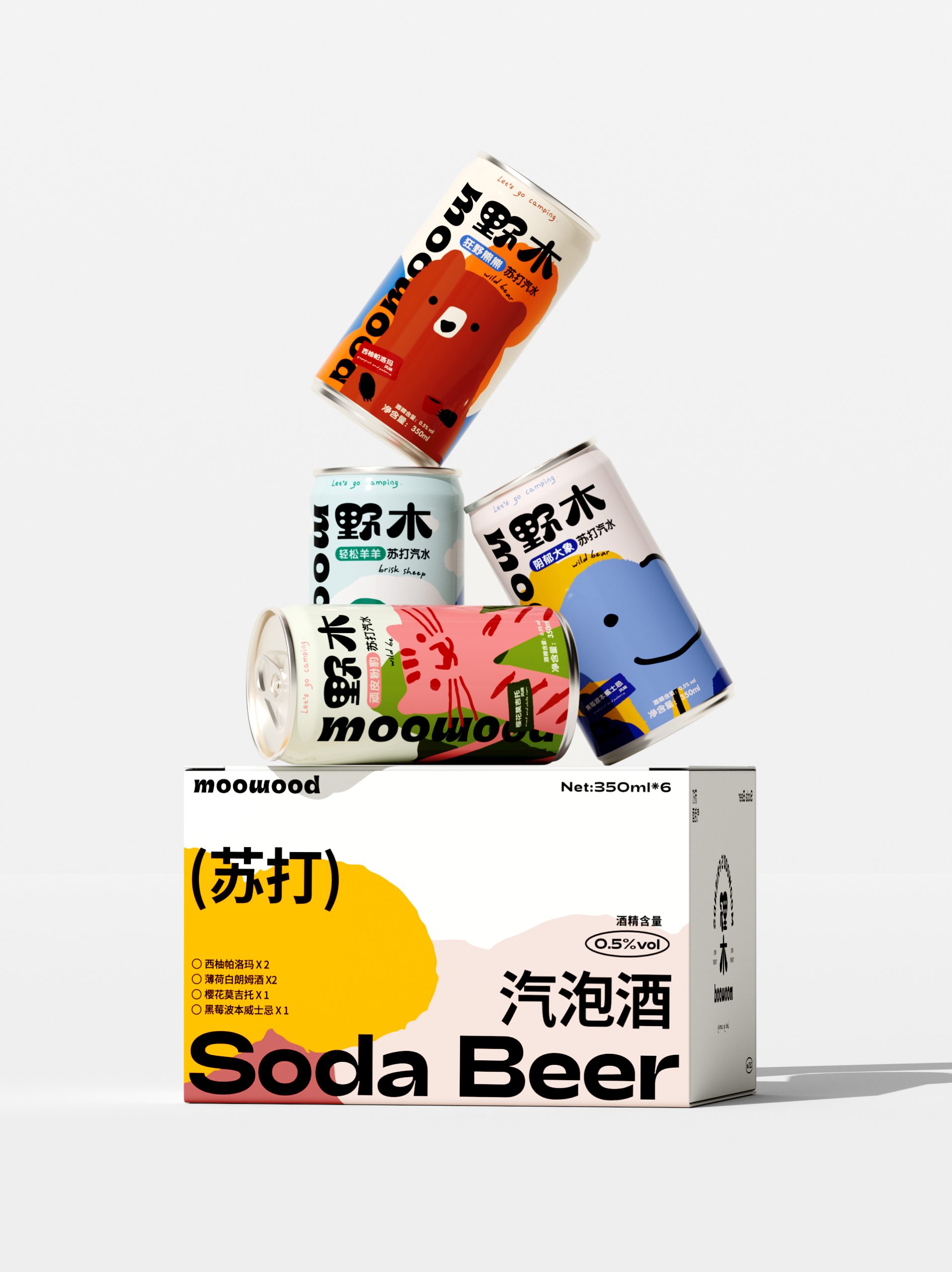
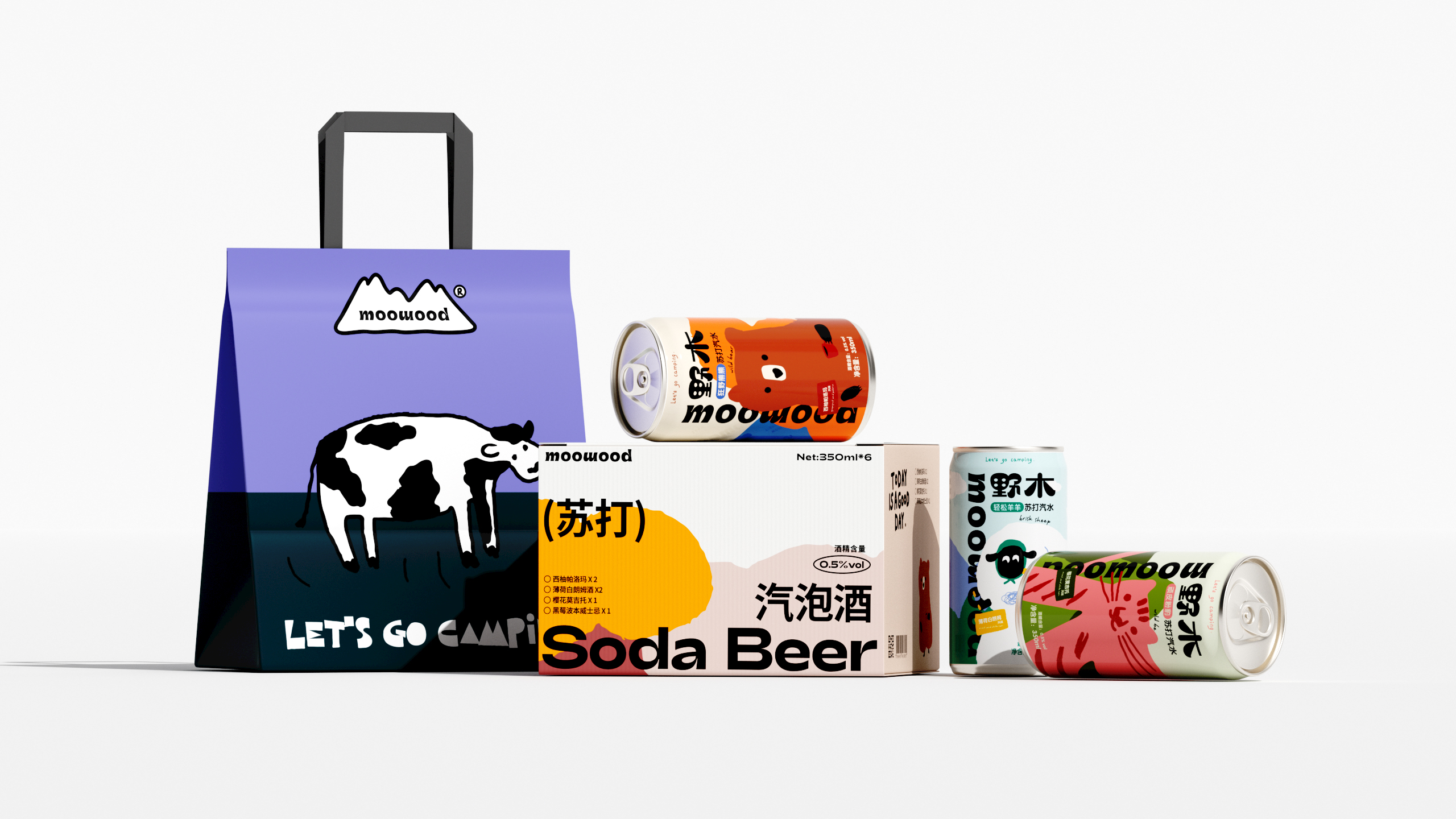
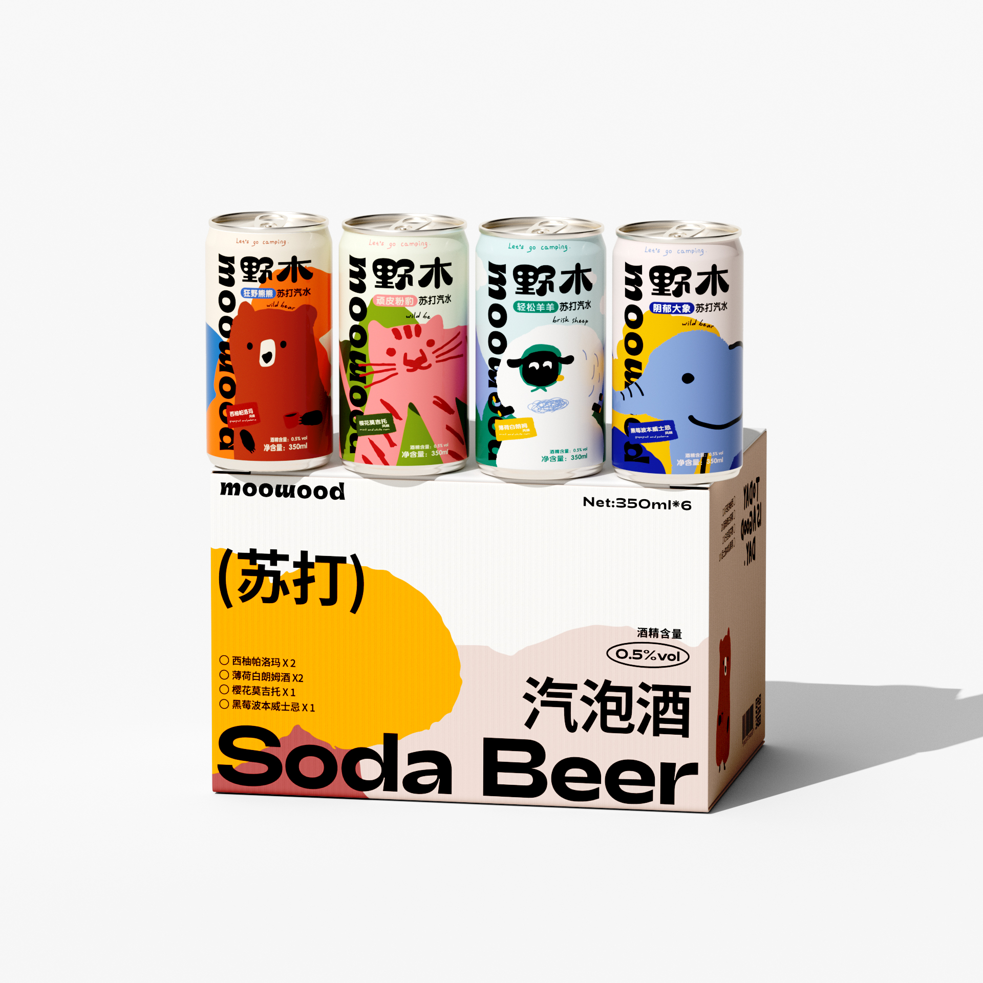
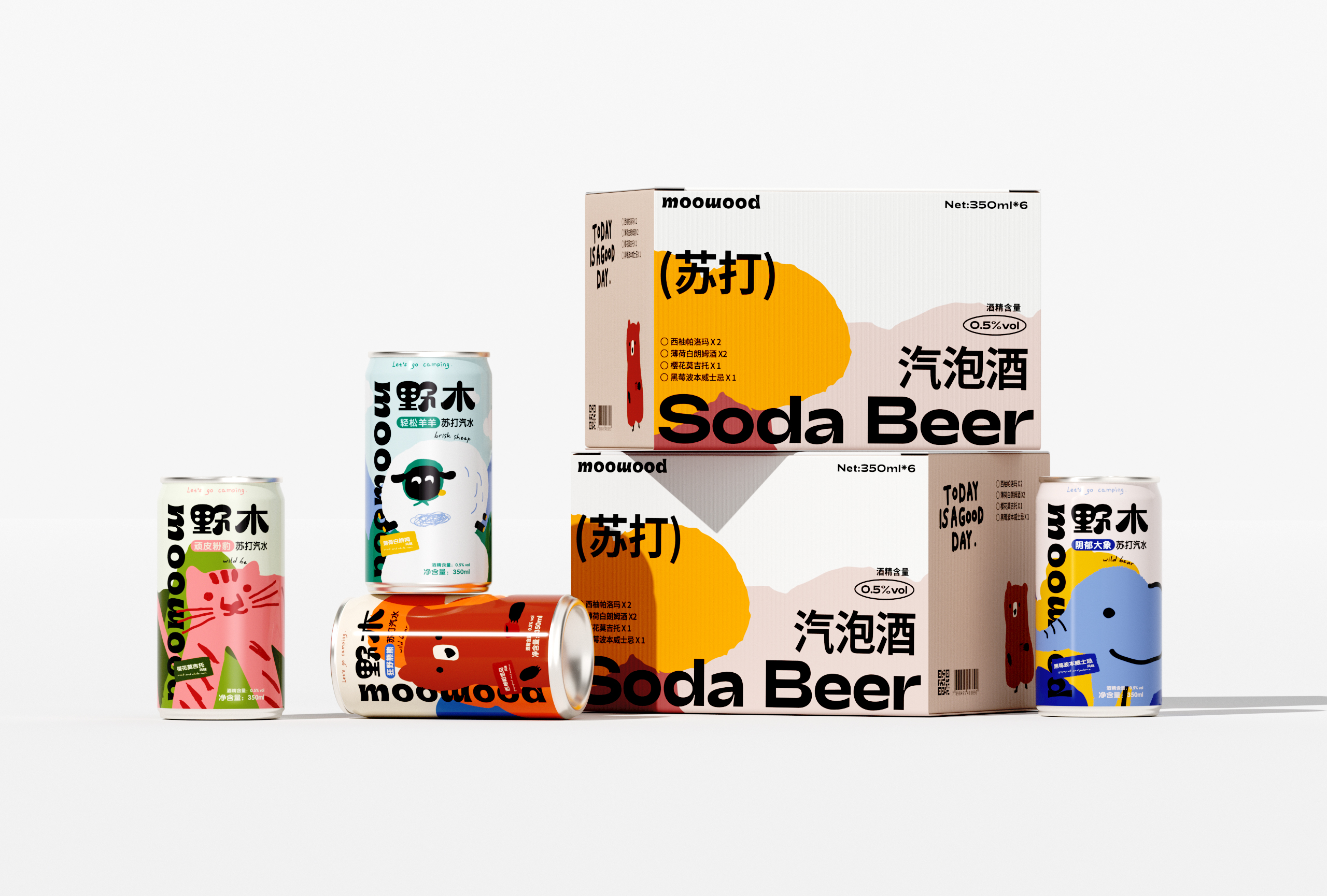
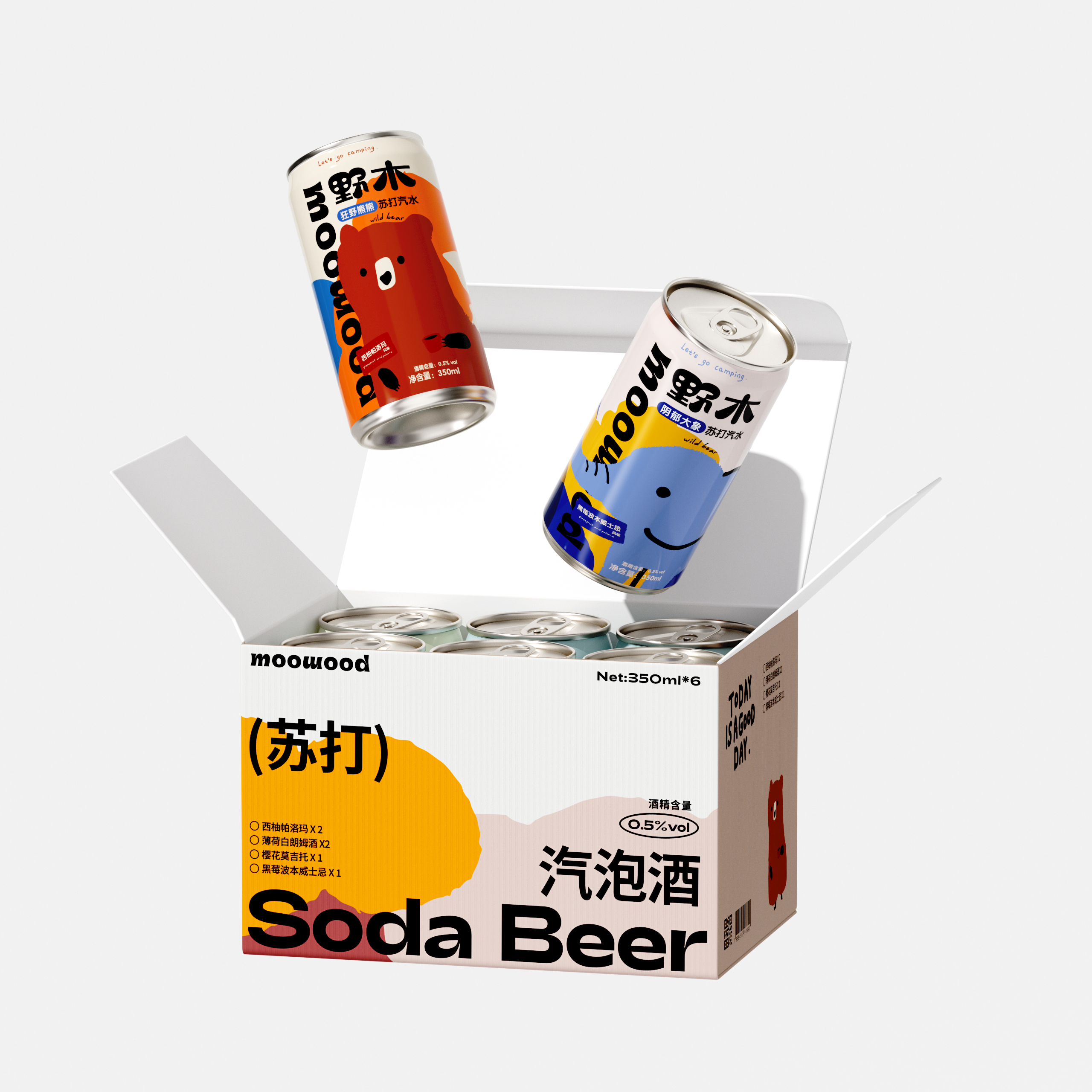
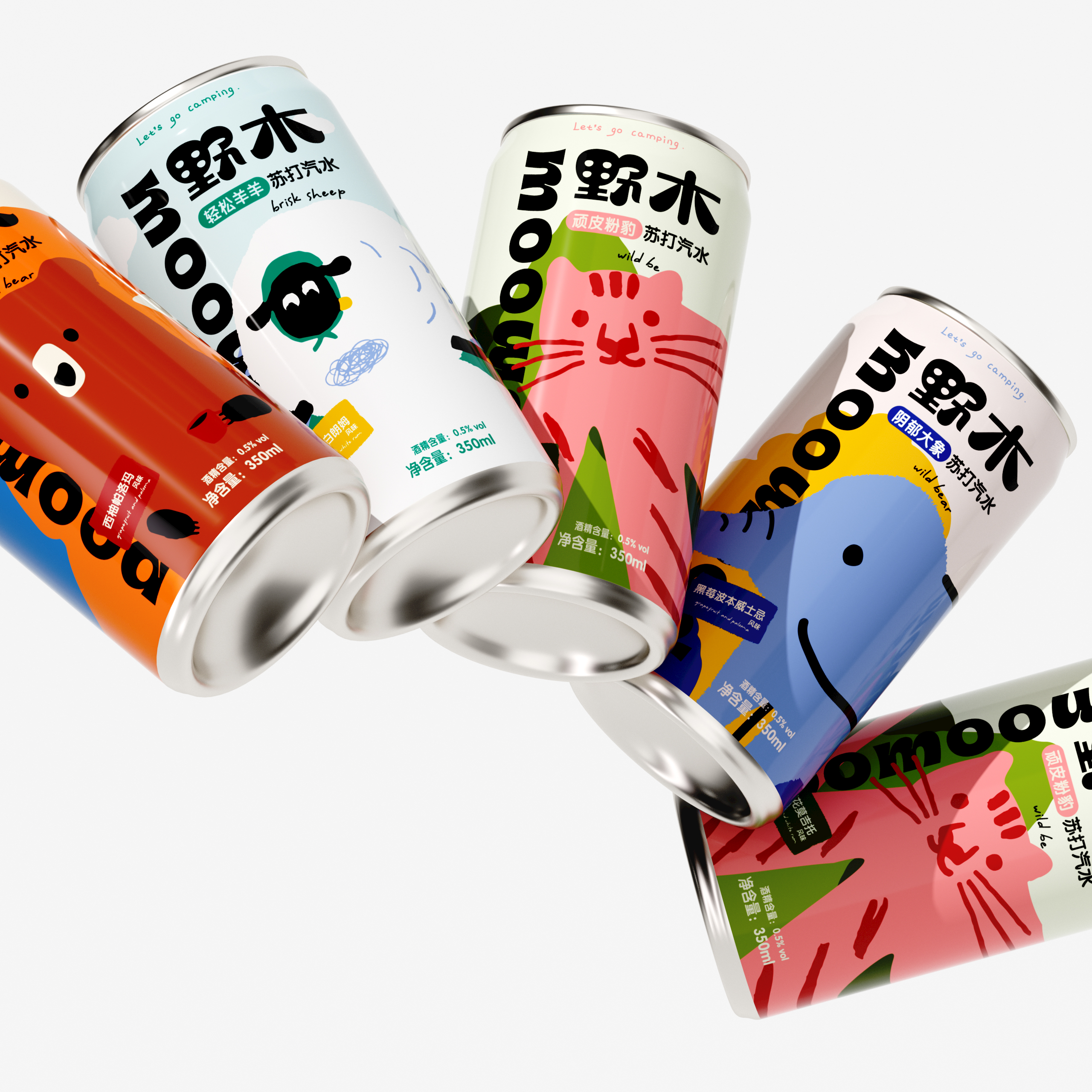
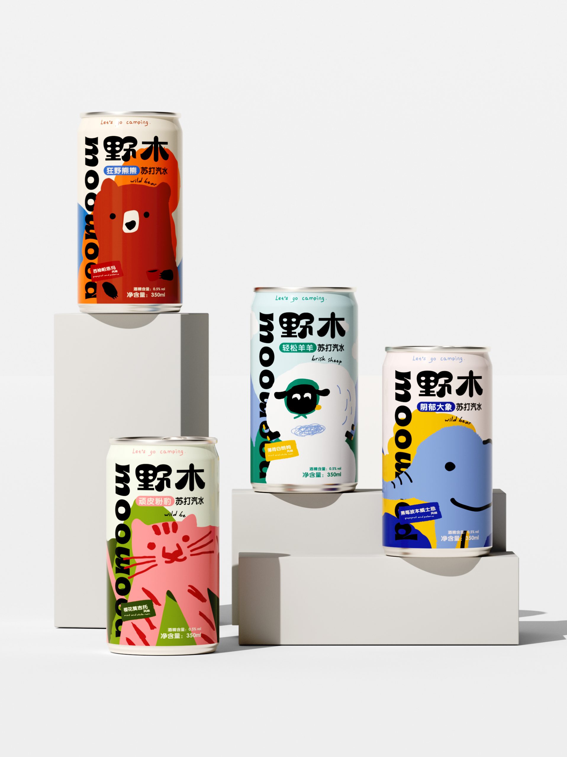
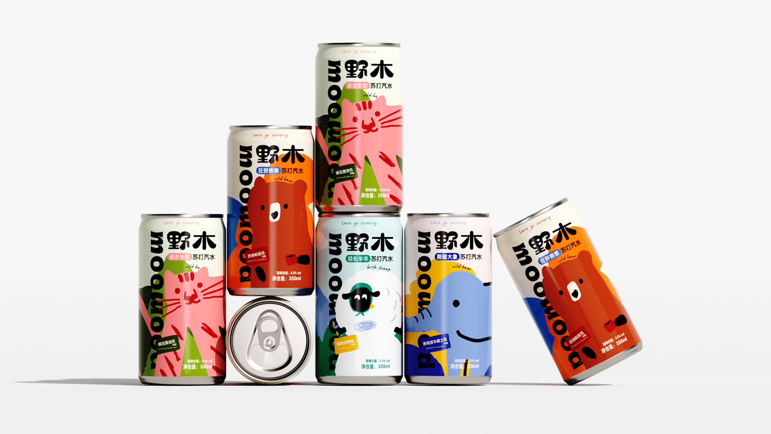
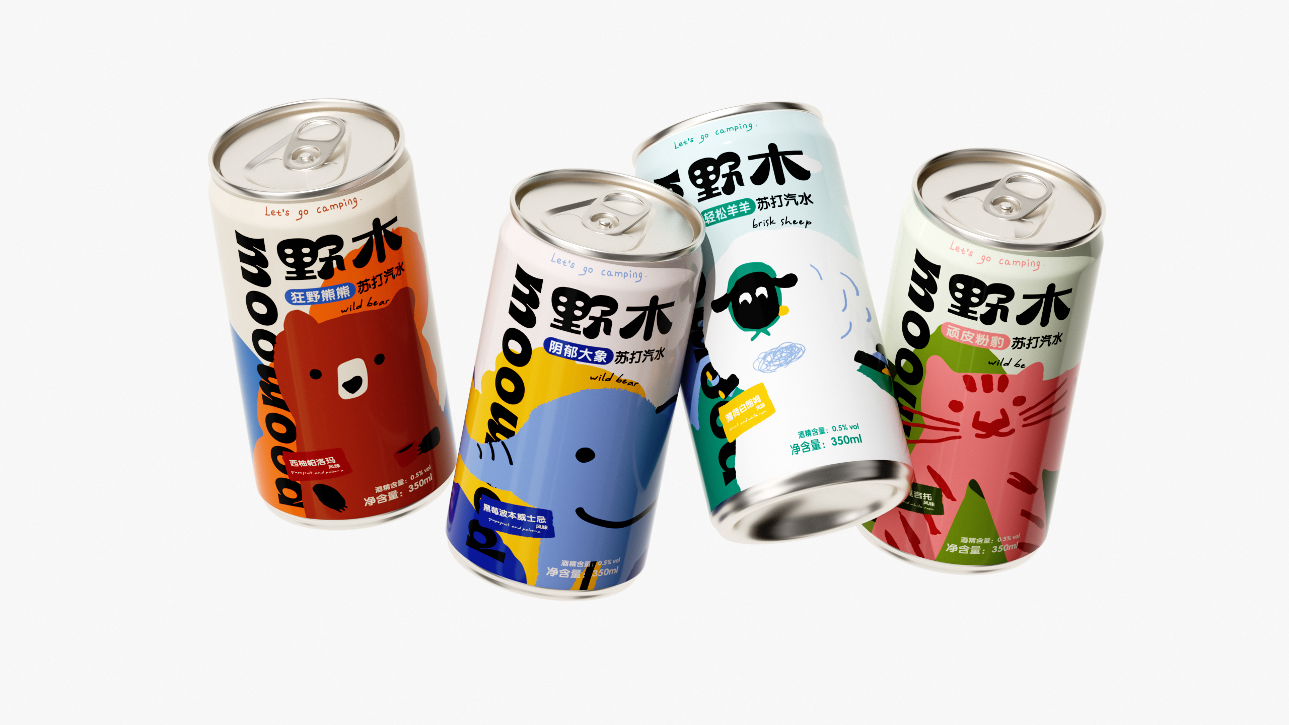
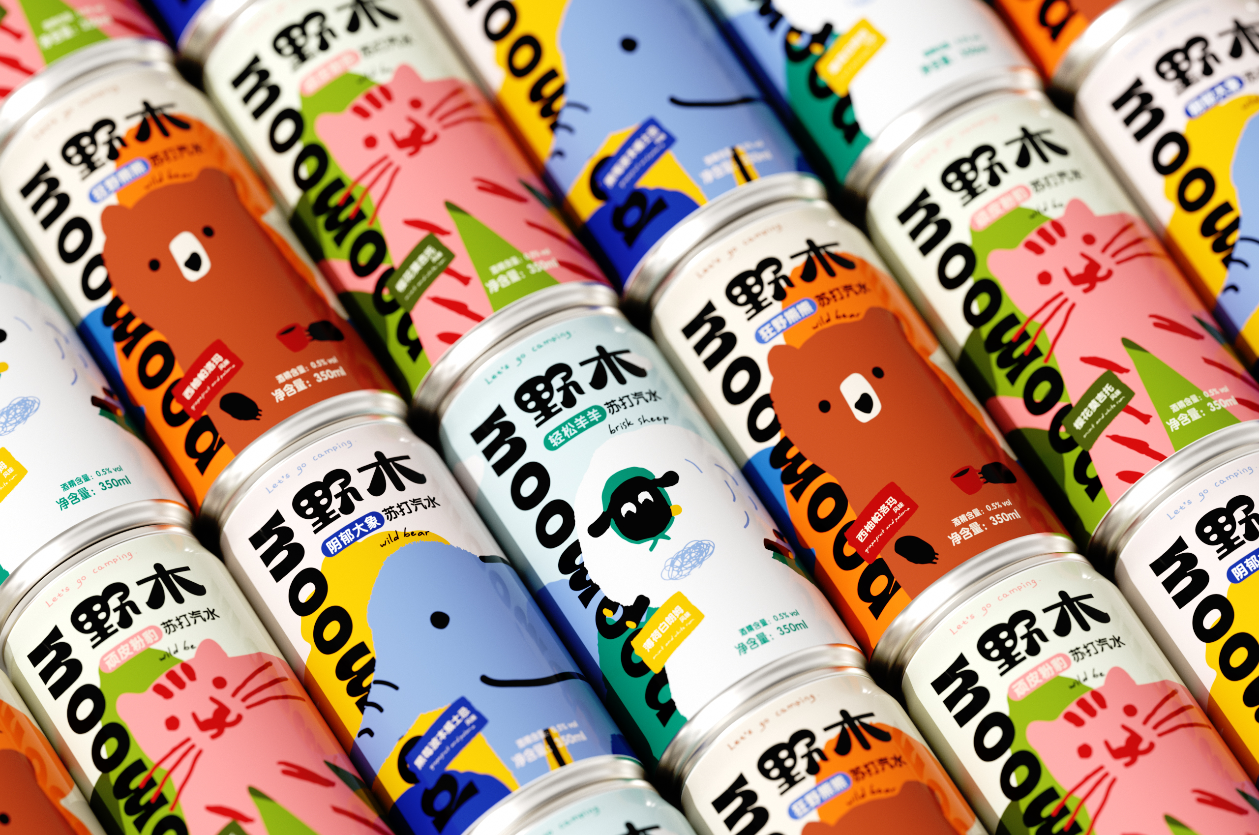
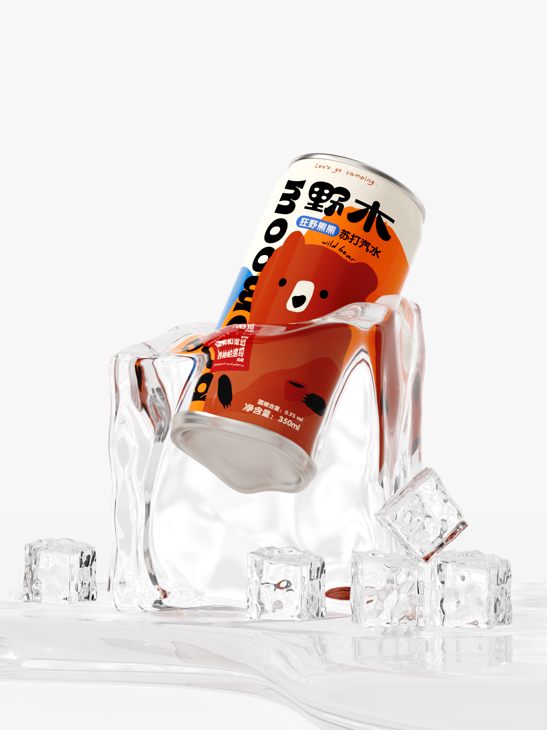
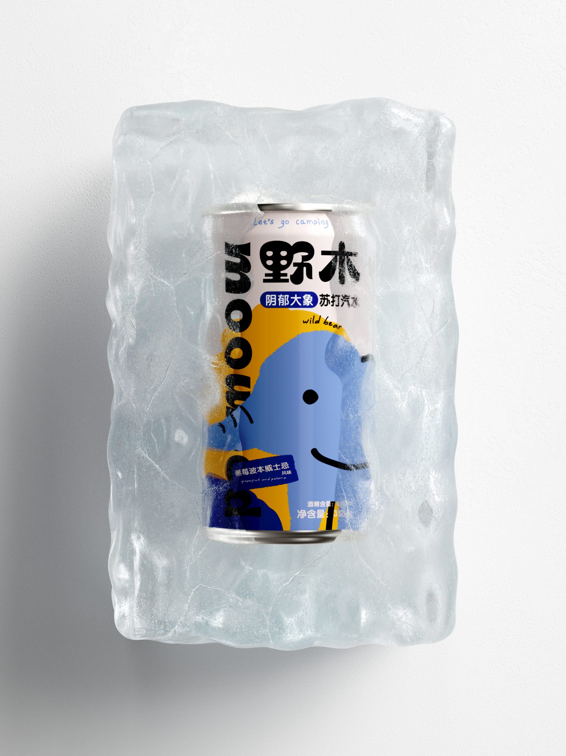
This packaging feels like it decided to ignore the “beer should look serious” rule and just went full personality mode. From a designer’s point of view, what stands out is how it blends contradiction into something oddly cohesive. “Soda Beer” already sounds like an identity crisis, and the design leans into that tension instead of hiding it. The soft, almost childlike animal illustrations clash beautifully with the bold, oversized typography, creating a playful confusion that actually becomes the brand’s strength.
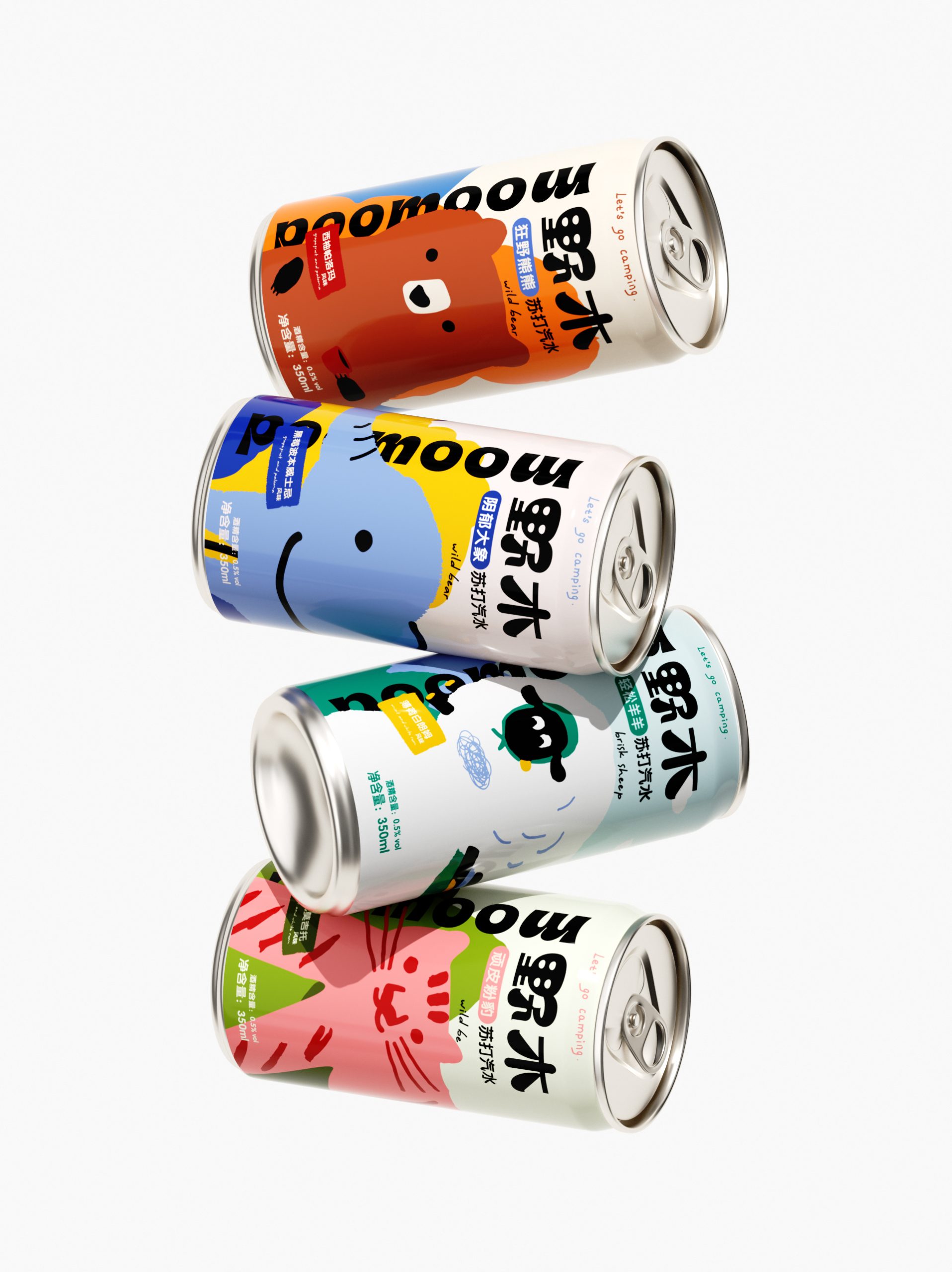
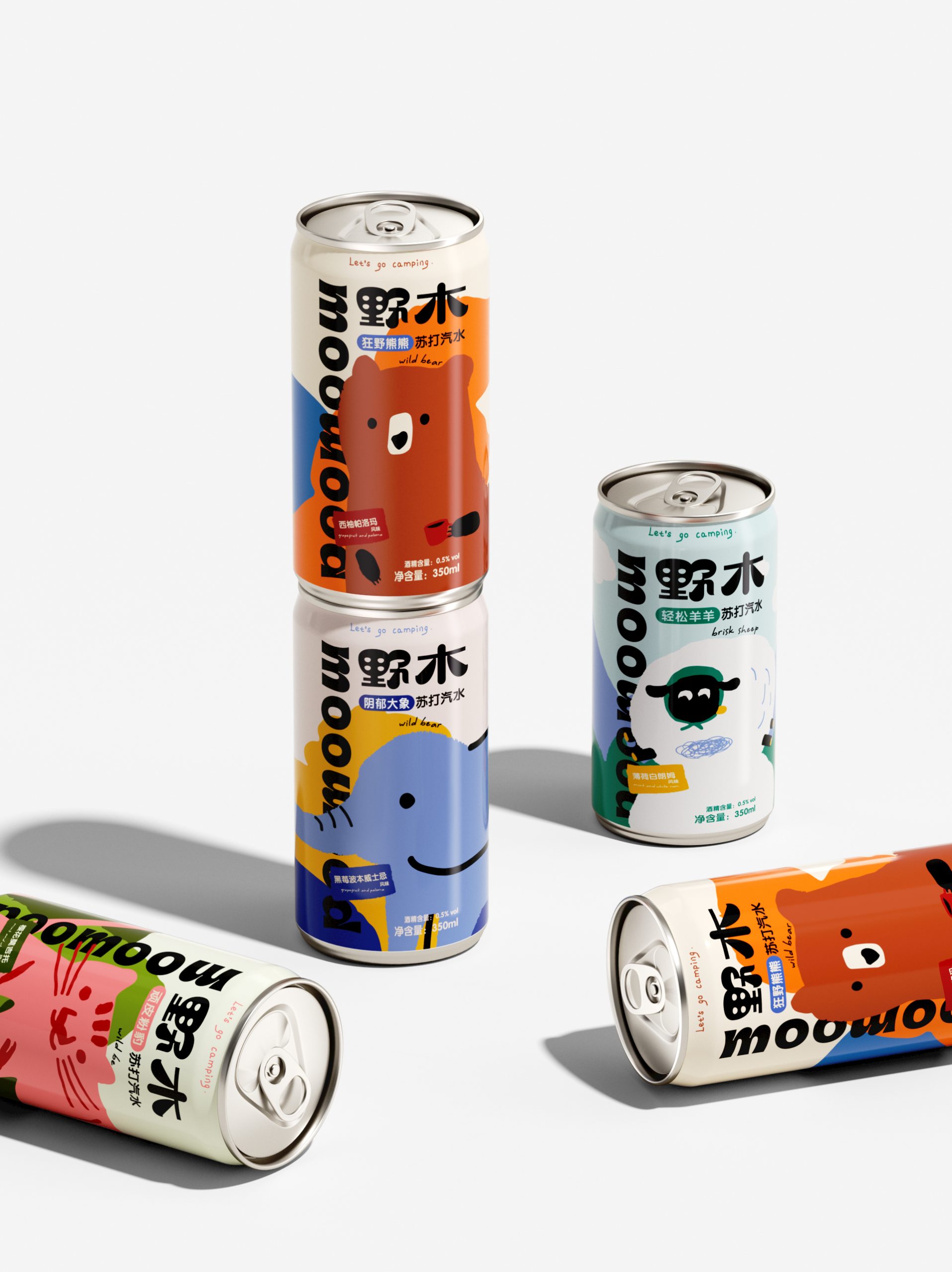
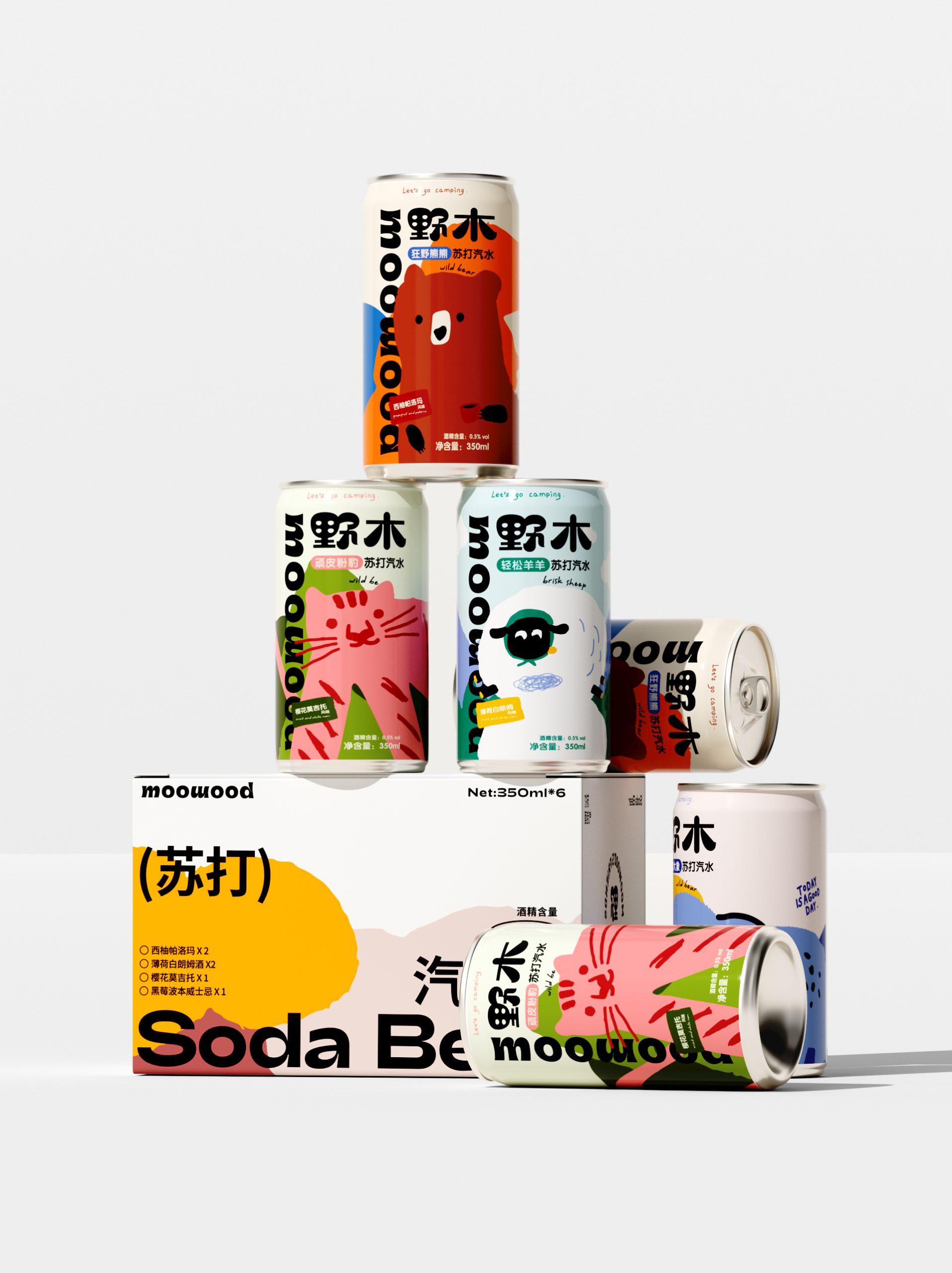
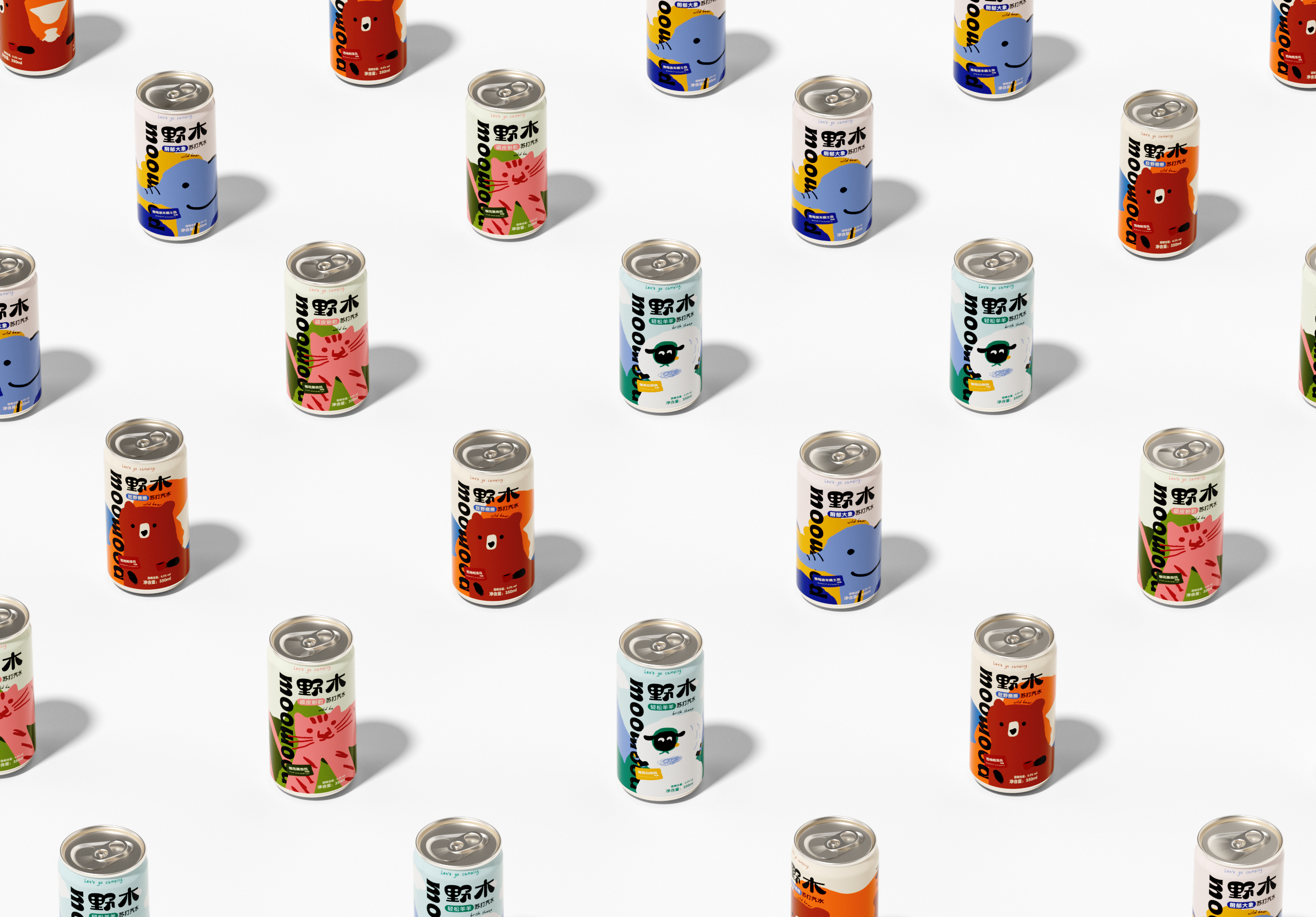
The cans feel like individual characters rather than product variants. Each one has its own mood, almost like a little cast. That makes the lineup more collectible than consumable, which is a clever move. People are not just picking a flavor, they are subconsciously picking a personality. It turns a simple drink into a social object.
The use of flat colors and thick outlines keeps everything approachable, but the layout itself is surprisingly disciplined. The typography is loud, heavy, and grounded, acting like an anchor to balance the chaos of the illustrations. Without that, this could easily drift into looking childish. Instead, it lands somewhere between cute and confident.
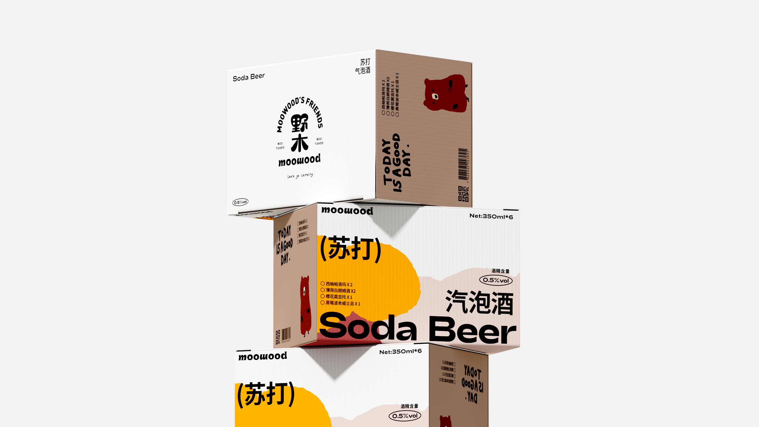
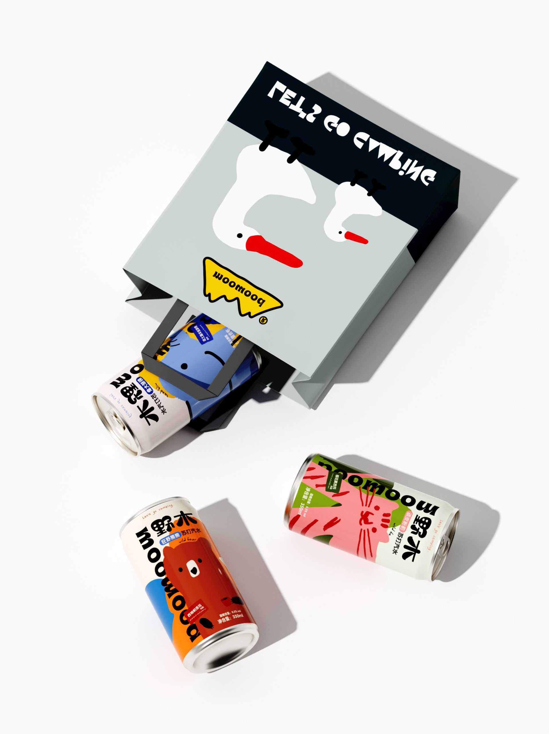
The box design is where it gets really smart. It strips things back, almost looking like a different brand at first glance. But that restraint makes the cans pop even more when displayed together. It is like the packaging understands retail behavior. The box attracts from afar with bold type and color blocking, while the cans reward you up close with character and detail.
 krrrrrllii
 babyage
 Deep
Deep monther al omari
 Atiq Alam
 TUERCA Studio
 neo creative studio
 Pinot Agency
 Pixels Studio
 Anastasia Cherepanova | xtramez
 awaiskhadim
 Studio Be Design
 Belova Oksana
 We Craft Studio
 ArtDesignByDIna
 Ananya Taran
 Nadezhda Gorelikova
 orhanirmaktasarim
 WillBe
 Hi estudio
 43oz
43oz Rosario Lo Iacono
 alchimistestudioParis