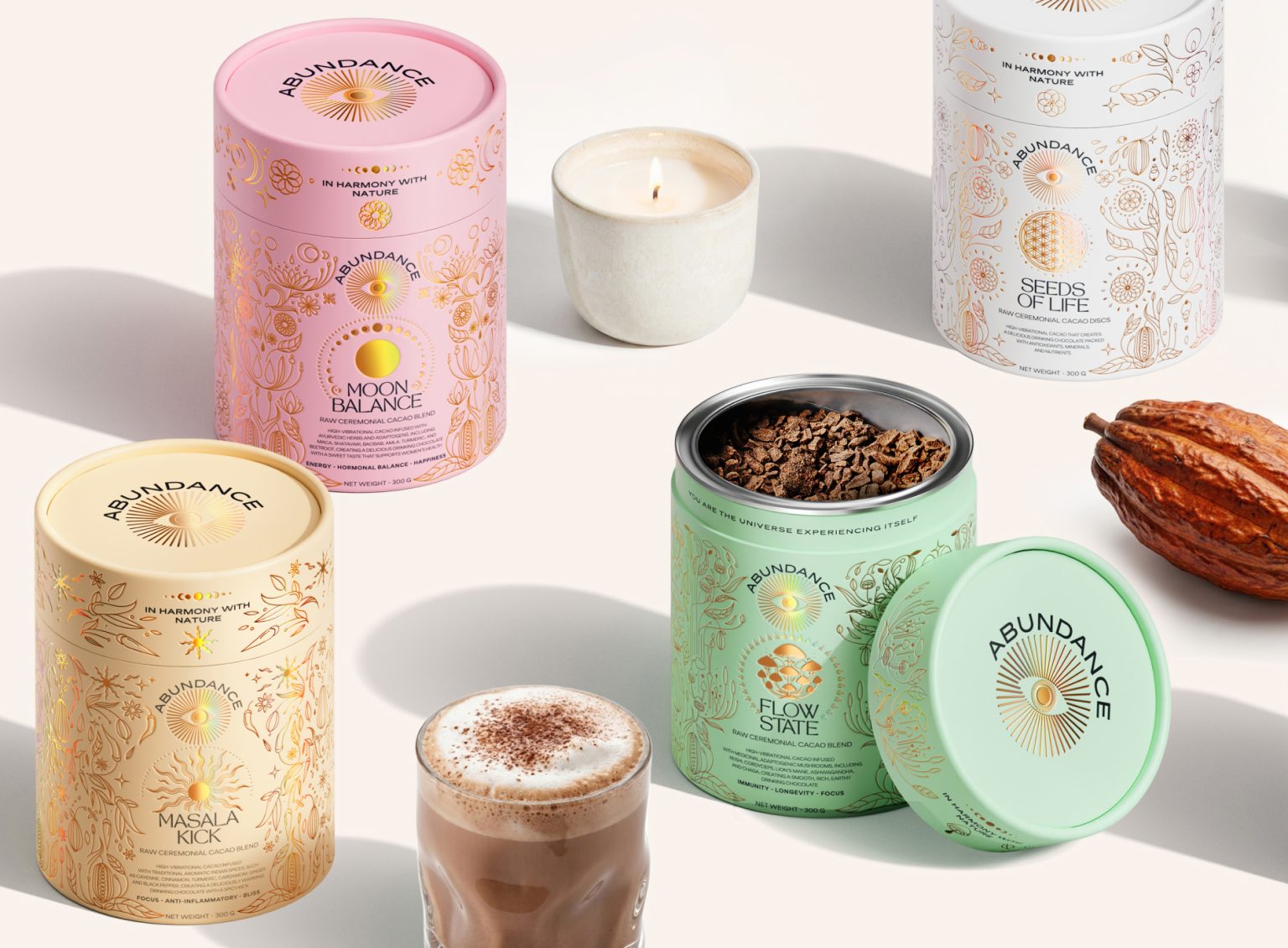

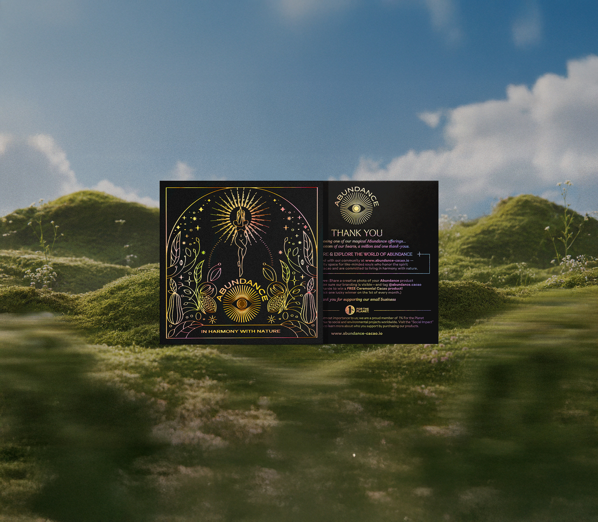
Abundance is a ceremonial cacao brand that merges modern wellness with ethically sourced ingredients, rooted in ancient rituals and designed to reconnect people with nature.
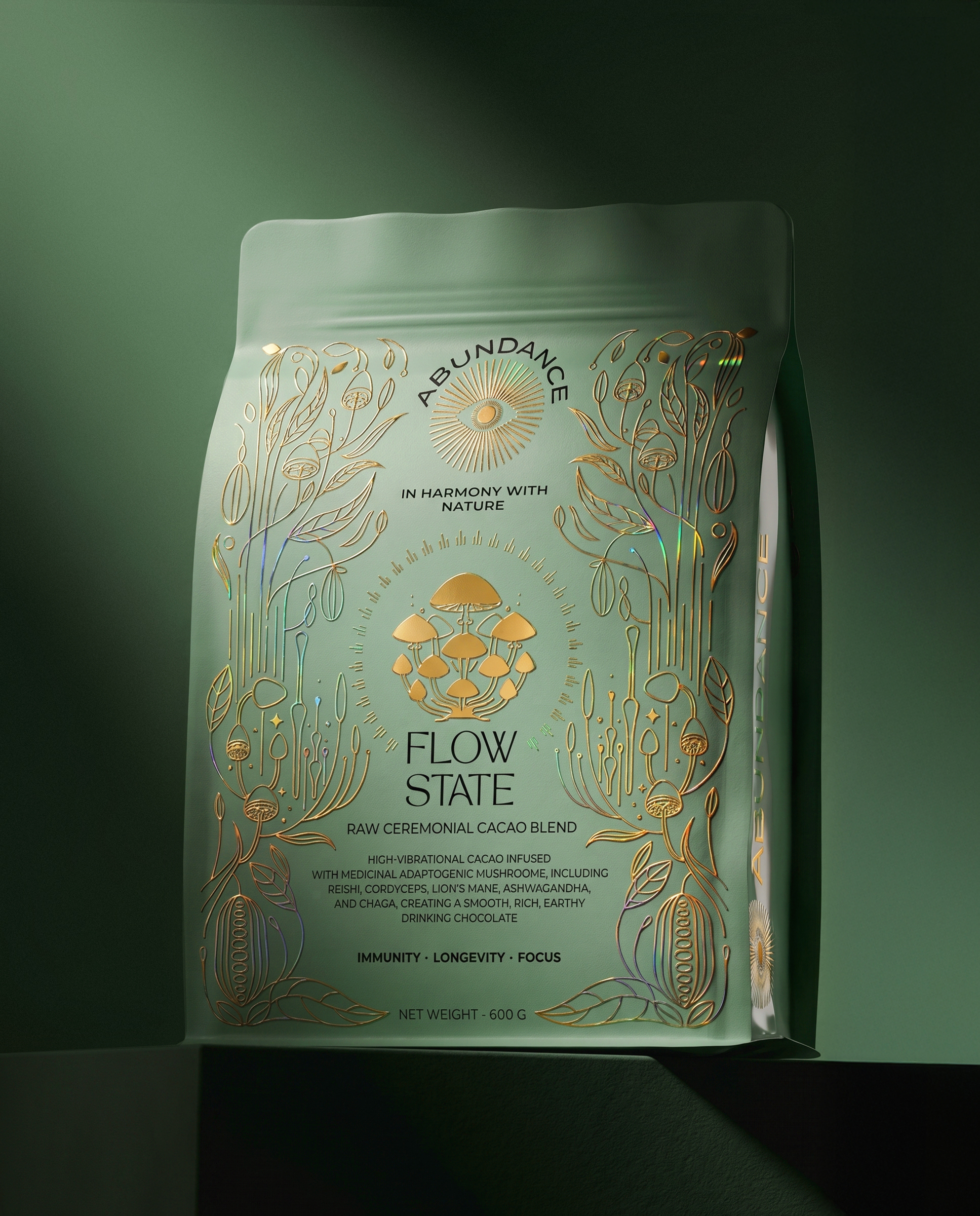
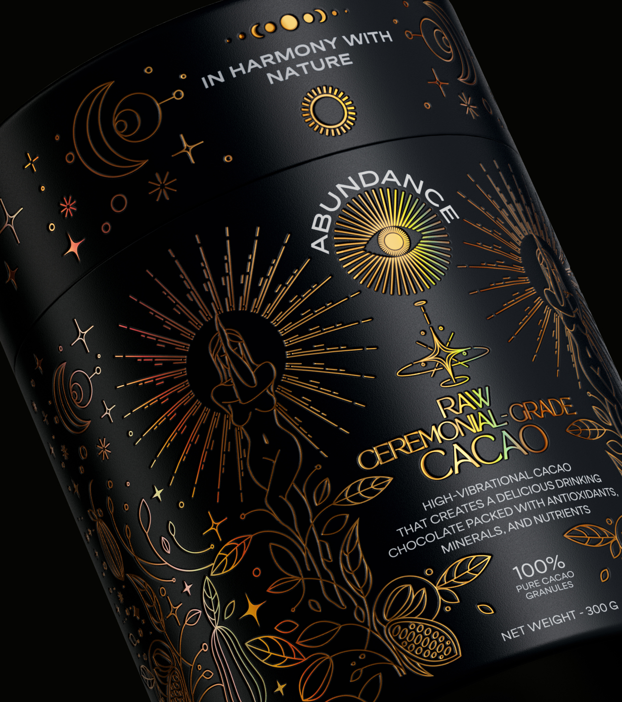
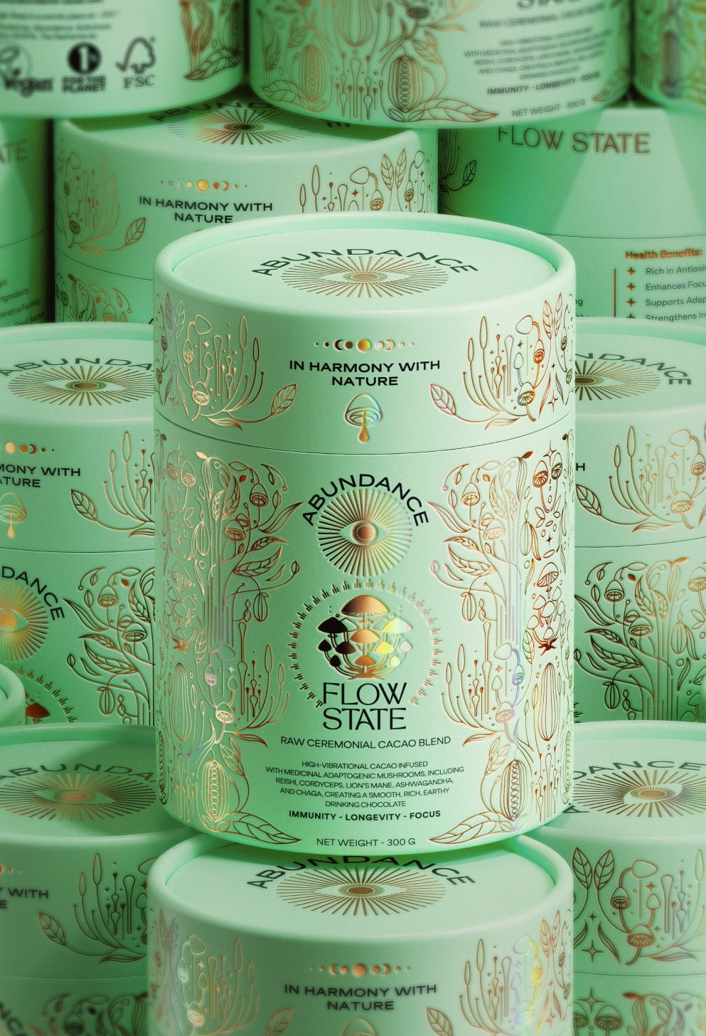
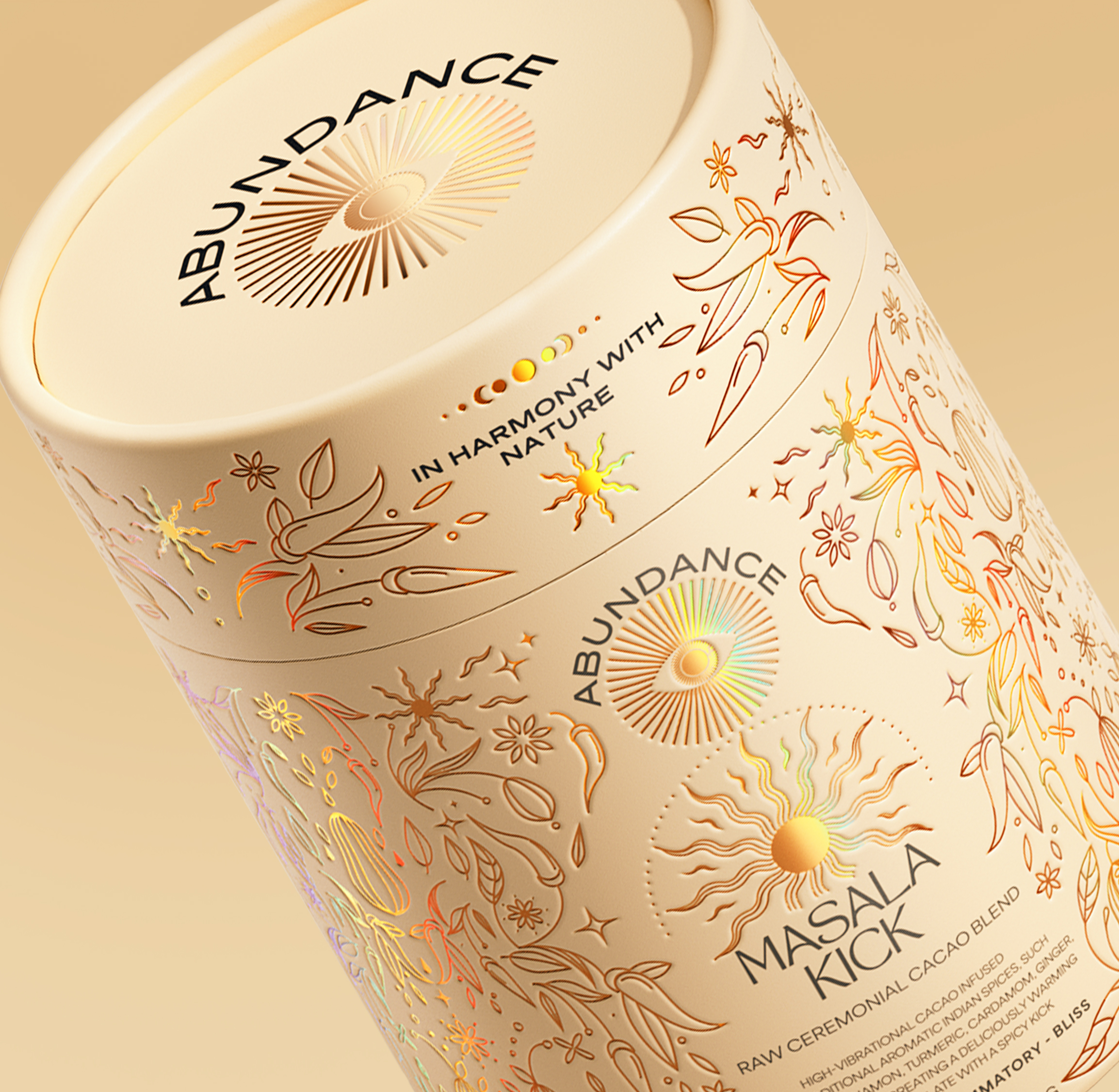
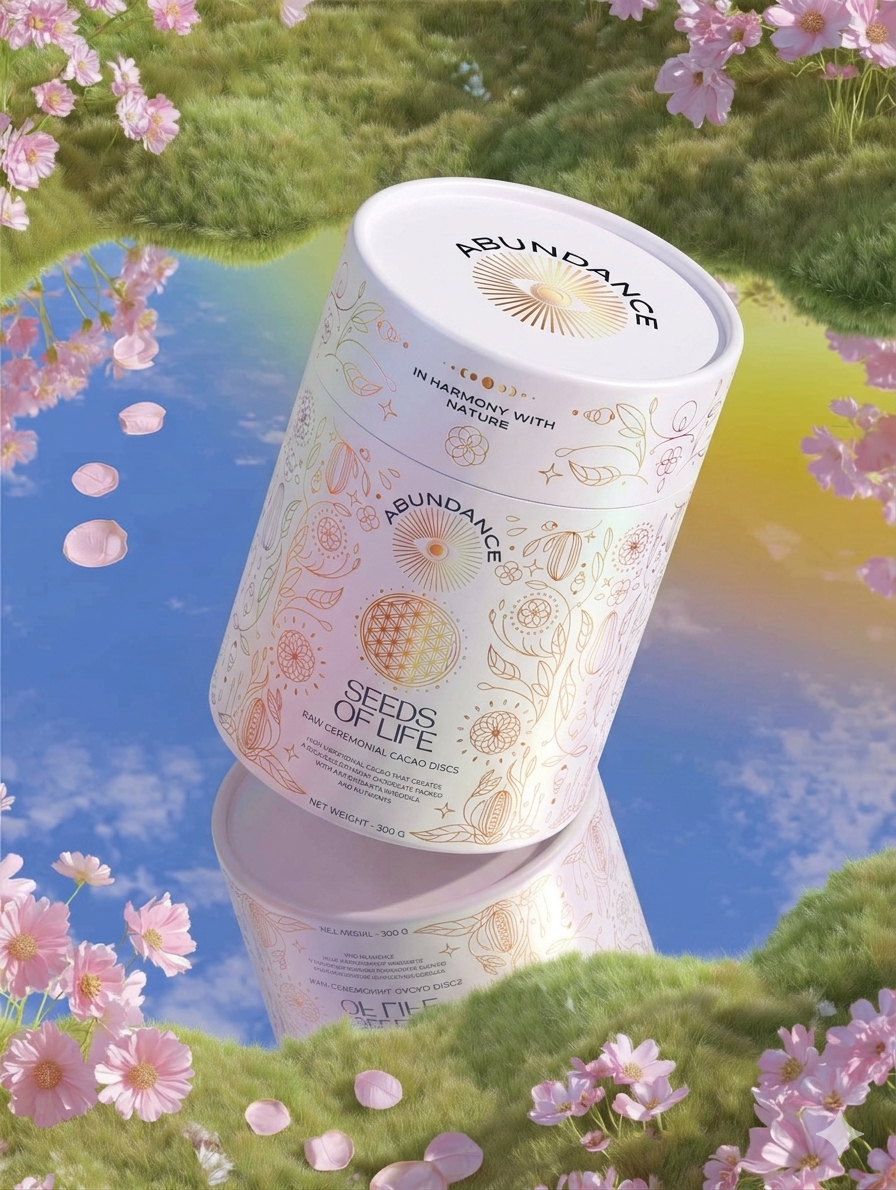
This project explores the design of a packaging system for ceremonial cacao — a product rooted in ancient ritual and reinterpreted for a modern wellness audience.
One of the main challenges was finding the right balance between spirituality and functionality. The category is often split between clinical, minimal design and overly decorative, mystical aesthetics. The goal was to create something that feels intentional and elevated, while still communicating clarity and purpose.
Curator’s Insight:
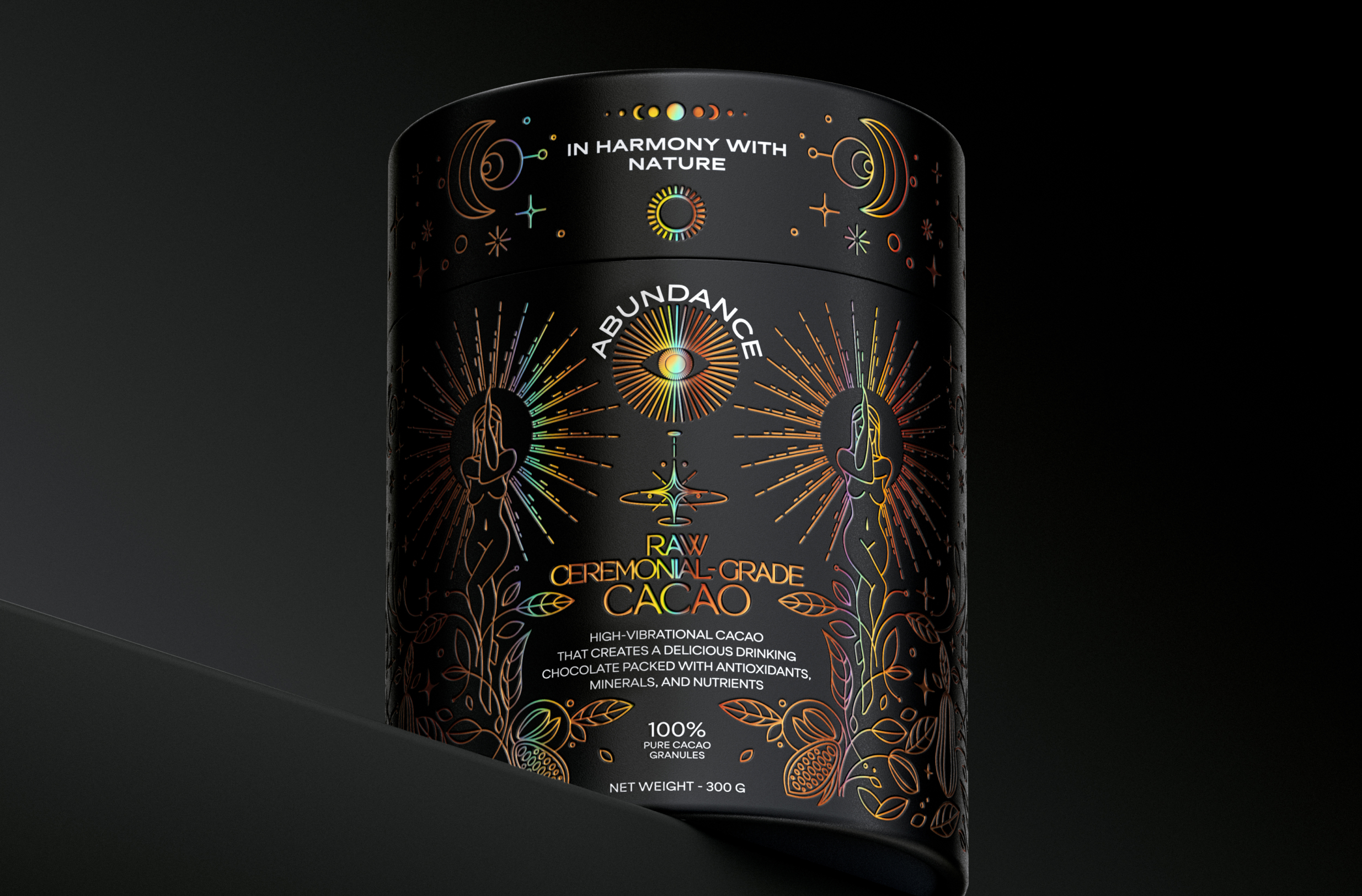
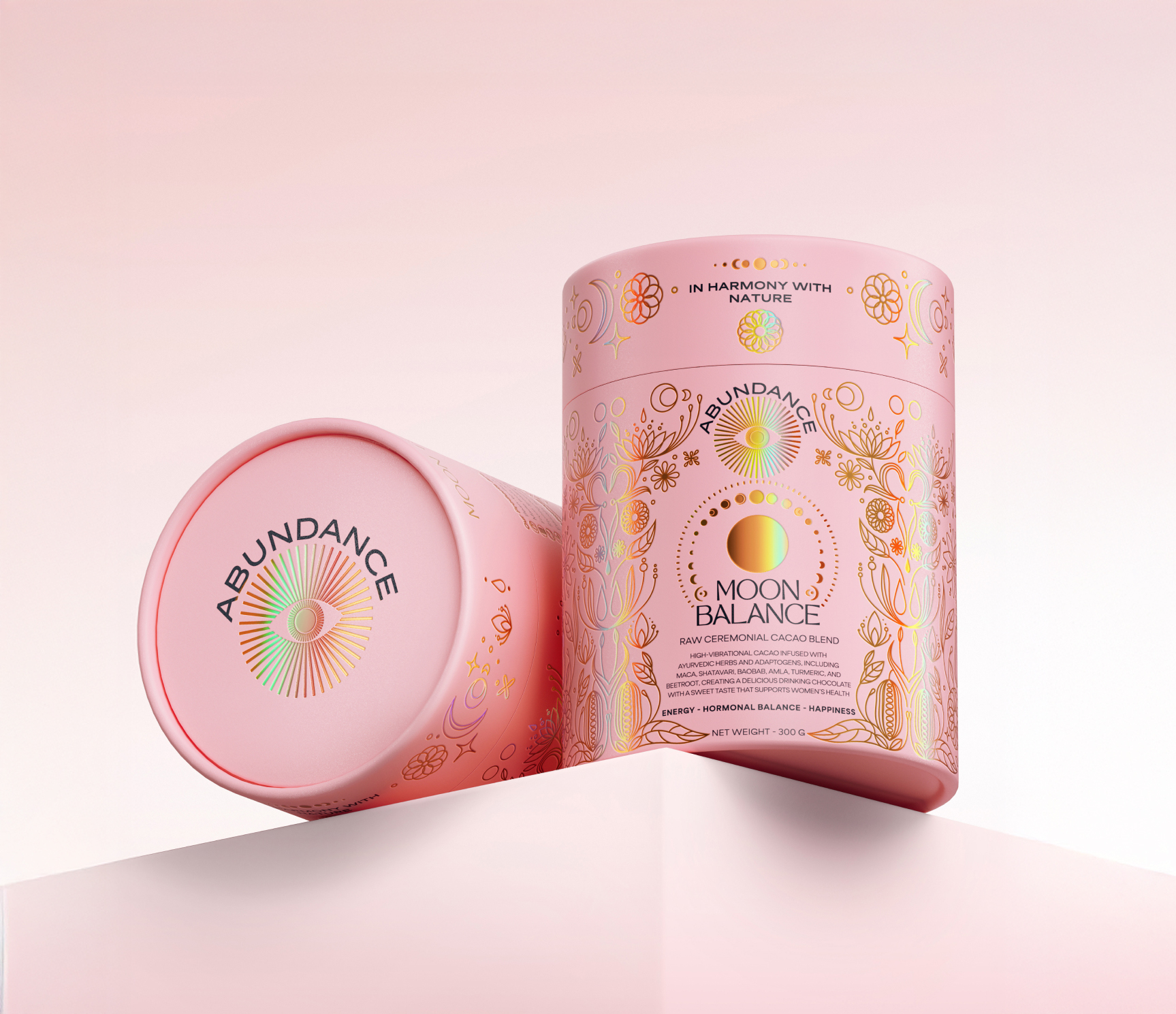
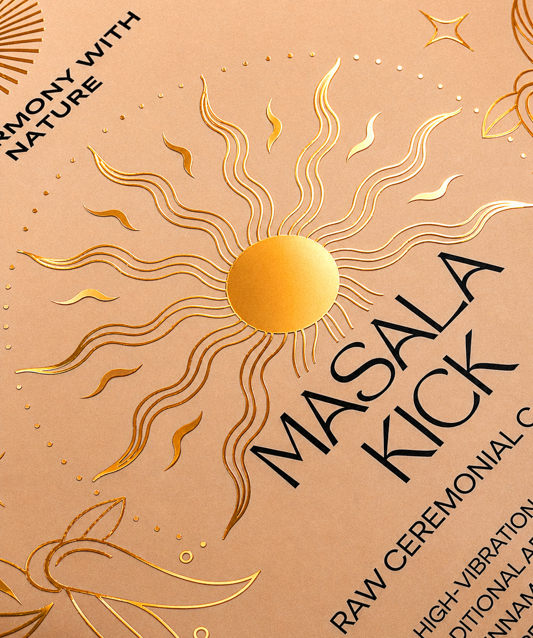
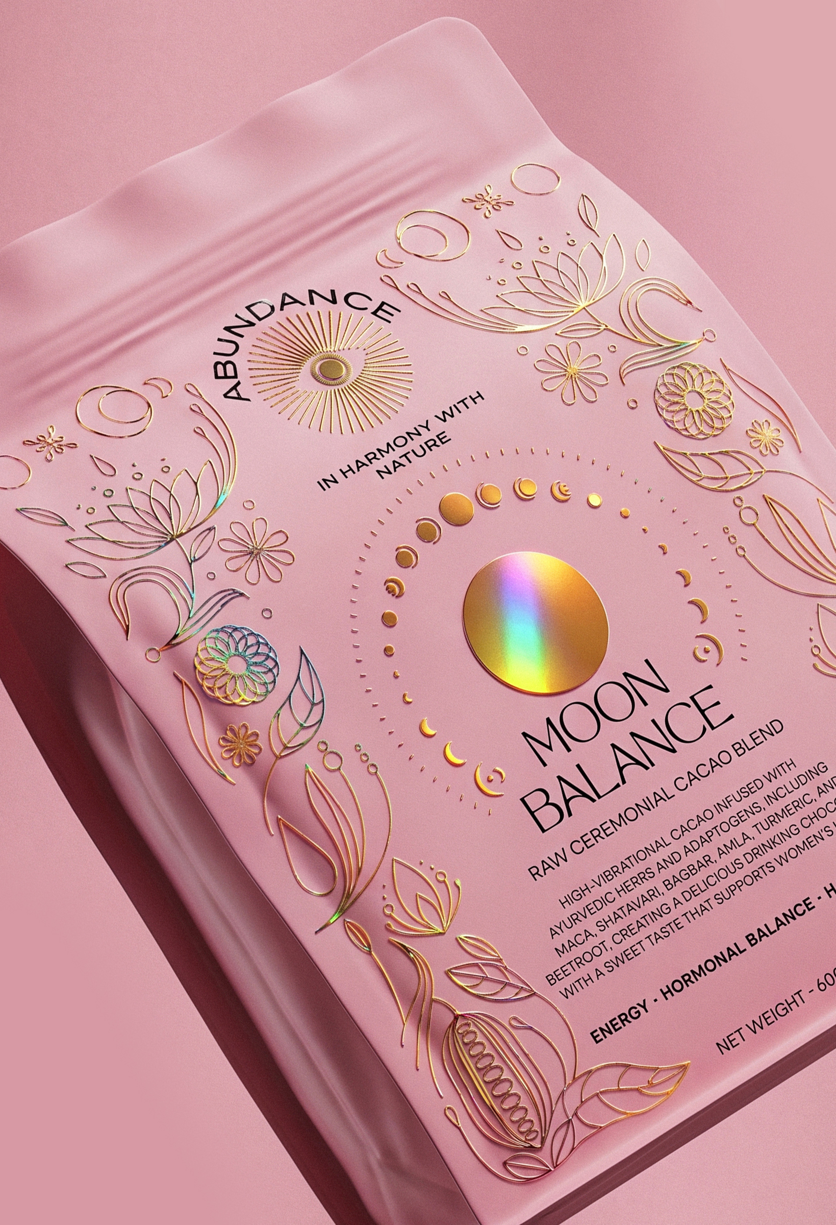
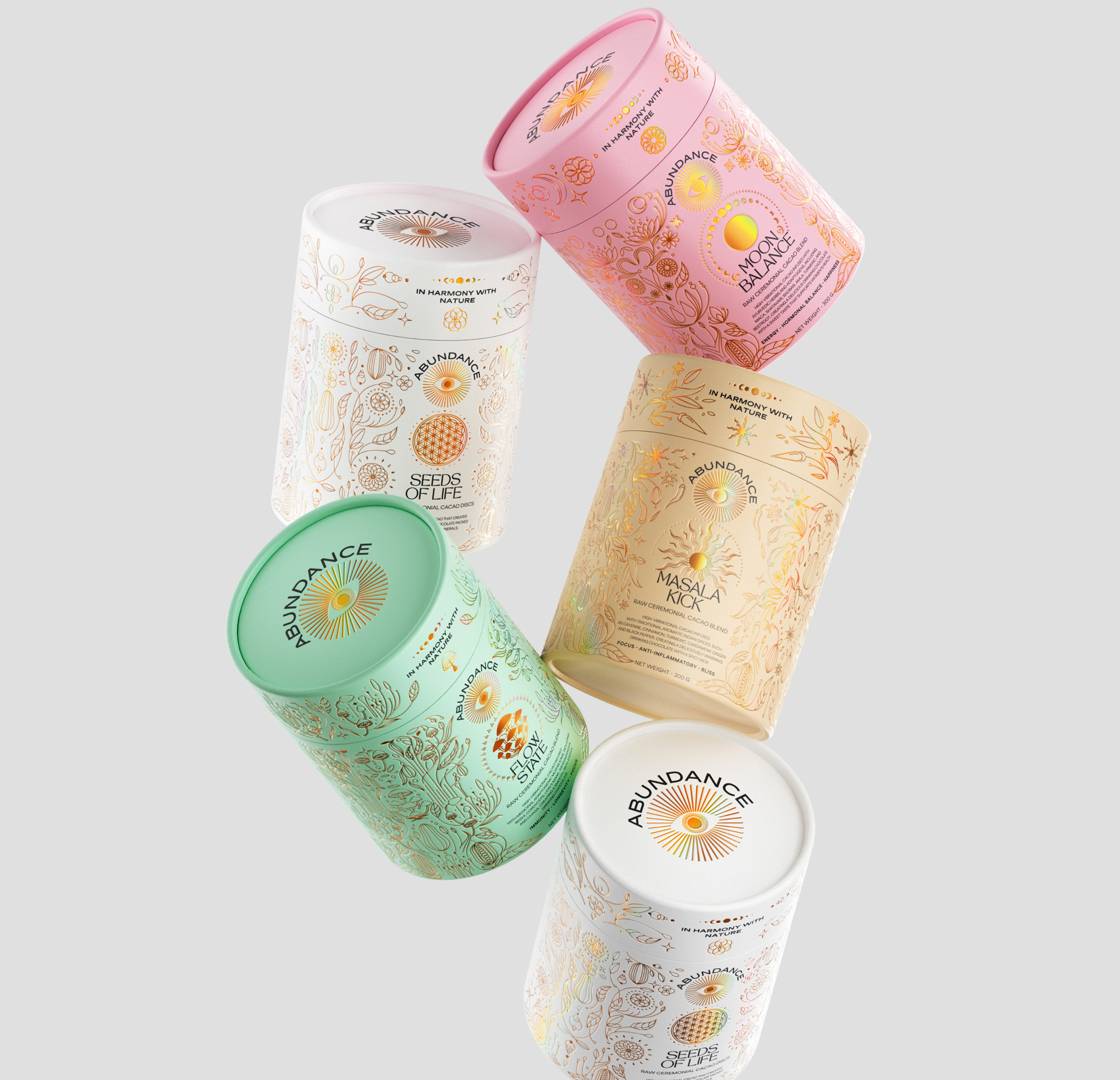
What makes this system work is the discipline applied to the foil. Gold leaf motifs could easily tip into clutter on a pink ground, but the linework here stays fine and open, letting the base colour breathe. The eye is drawn first to the holographic focal element at the centre of each face, then outward into the botanical field, which reads more like wallpaper than illustration. That layering creates a sense of depth without relying on three-dimensional form.
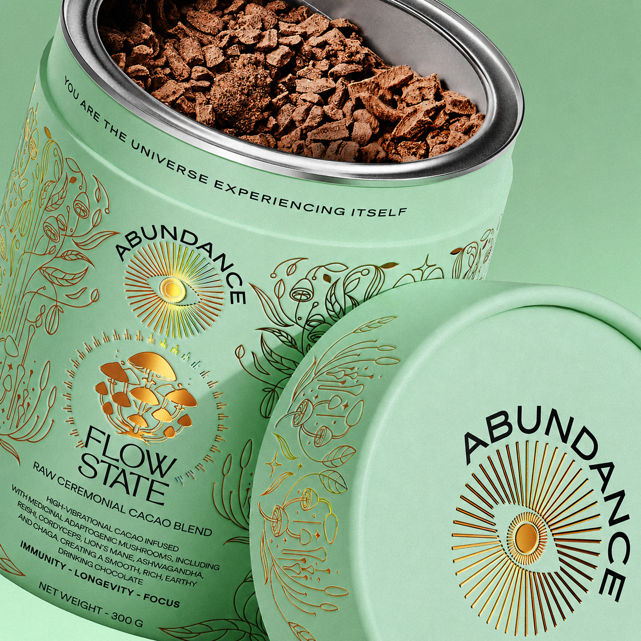
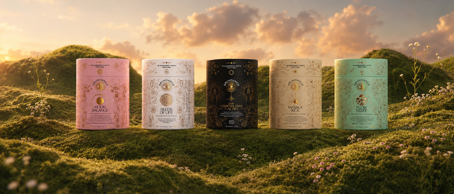
The range extension is equally considered. Moving from blush to cream to sage to white, each variant maintains the same visual grammar, so the shelf presence reads as a family rather than a series of standalone SKUs. The shared brand mark, an eye within a sunburst, functions as both logo and thematic anchor, reinforcing the wellness positioning across the line without the need for repeated copy.
 Derrick Lin
 monther al omari
 43oz
43oz lilyz design23
 Modern Theory
 Eighteen Brand Studio
 Bhumika Singh
 MohamedMashaly
 Pixels Studio
 Gulya
Gulya UPRISE
 Lizaveta Kharitonyuk
 Bonsanco Creative Studio
 DesignRepublic
 GIRAFA STUDIO
 PiotrWisniewski
 Sophiagdotcom
 CreativeWise
 SoreThumbStudio®
 Modern World Studio
 Palashcc
 Valérie Colace