

AYURAURA AMLA POWDER
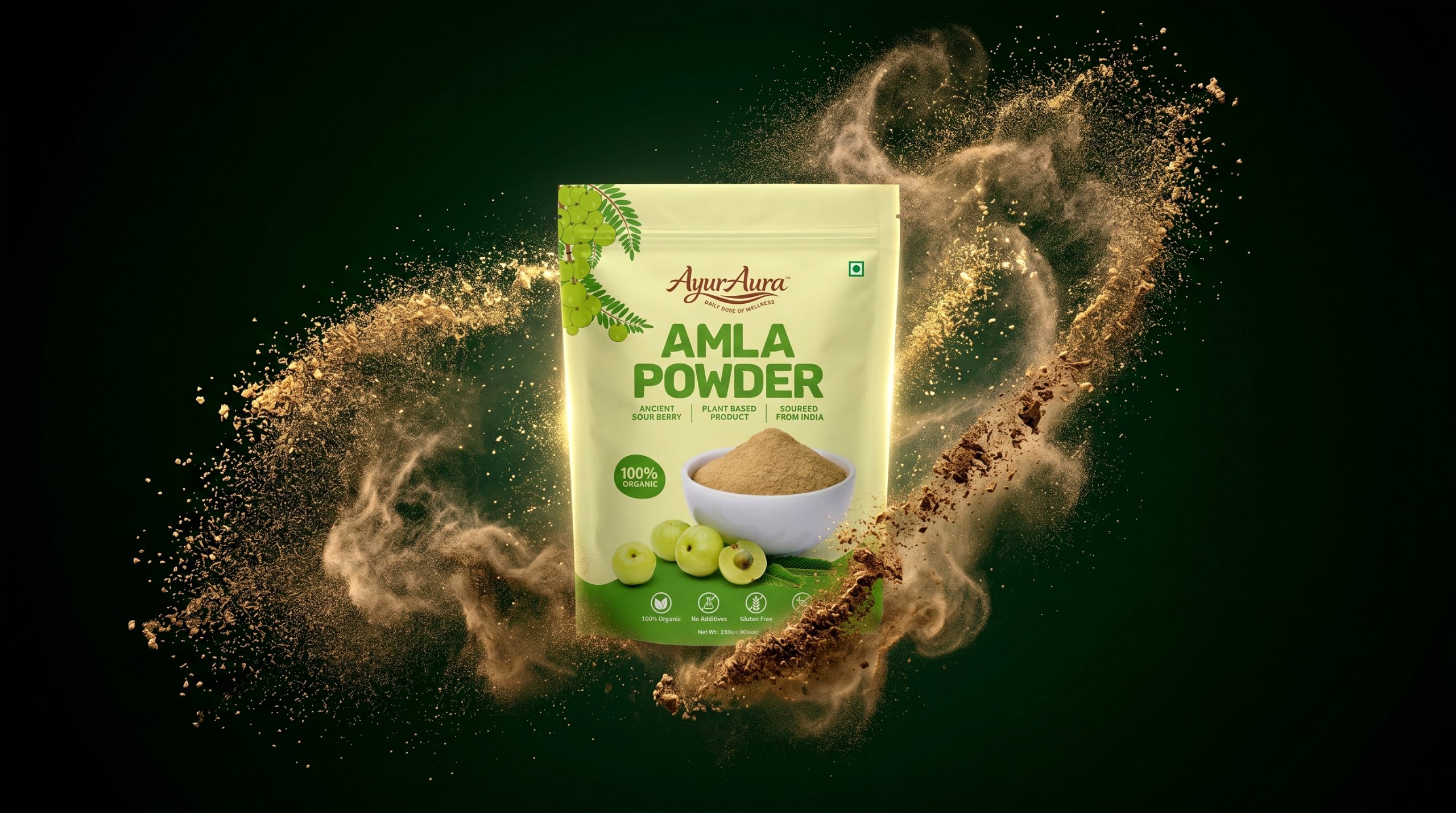
Originally approaching the project with a product rooted in Ayurvedic tradition, AyurAura needed more than a simple label — they needed a complete brand identity and packaging system that could speak to both the Indian wellness market and discerning international consumers. With growing demand for clean, plant-based superfoods, the team was tasked with building a design that could hold its own on global shelves.
The project began with a brand strategy and competitive audit phase, examining the organic health food aisle and the growing consumer demand for ingredient transparency. From this research, the design direction was centered on three core pillars: authenticity, purity, and Ayurvedic heritage — values that would drive every visual decision from color to typography.
The resulting design reframed Amla Powder not as a niche Ayurvedic commodity, but as a premium superfood ready to be discovered by a new generation of health-conscious consumers worldwide.
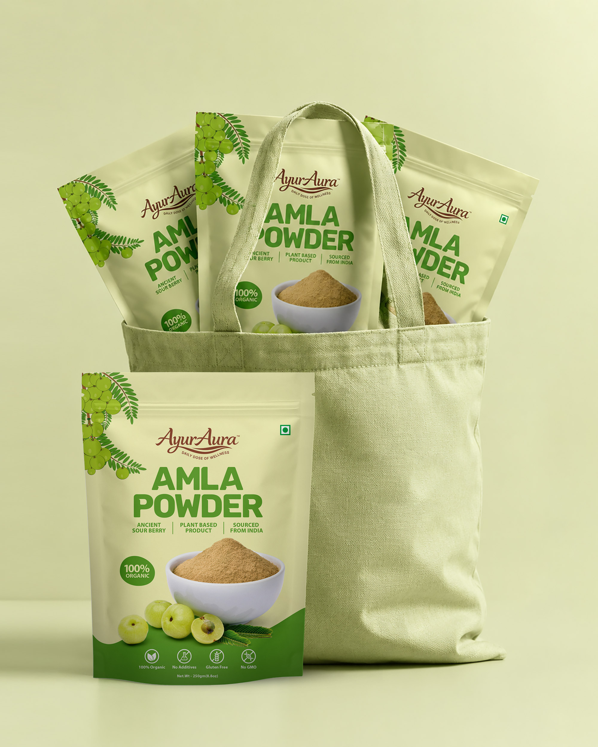
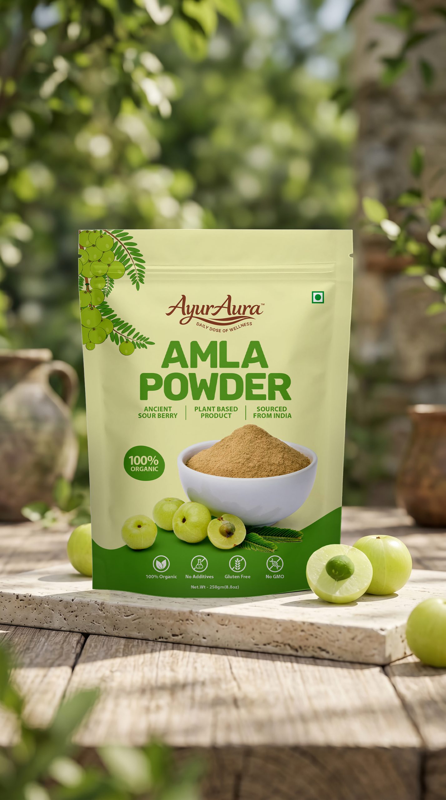
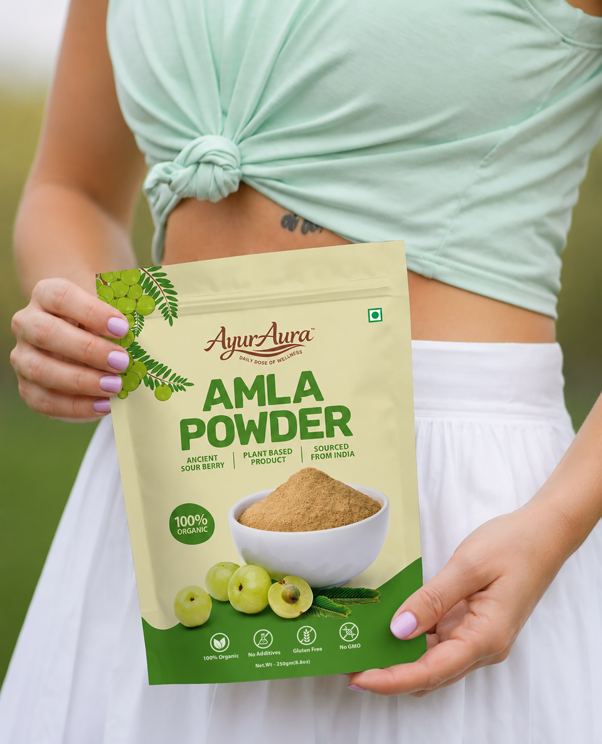
The identity system brings this strategy to life through a warm, nature-forward visual language. The amla fruit takes center stage — fresh photography of the ingredient alongside a powder bowl directly connects the consumer to the source. A grounded color palette of earthy greens and warm cream, combined with an elegant serif wordmark and bold product typography, reinforces the brand’s promise of real ingredients, real origin, and real transparency.
To balance trust with shelf impact, the design incorporates a clear icon system — 100% Organic, No Additives, Gluten Free, and Non-GMO — giving health-conscious consumers instant confidence at a glance. The back panel was designed with equal care: a structured layout houses the brand story, FSSAI compliance information, complete nutrition facts, and ingredient disclosure — nothing hidden, everything earned.
The stand-up doypack format (250g / 8.8oz) was chosen for its practical retail functionality and premium market positioning, with bilingual weight marking ensuring readiness for both domestic and export distribution.
The brand officially launched as a market-ready packaging system suitable for Indian retail, e-commerce platforms, and international export channels — a cohesive front-to-back label design that translates consistently from screen to shelf.
—
#PackagingDesign #PackagingOfTheWorld #AyurvedaPackaging #OrganicPackaging #HealthFoodPackaging #BrandIdentity #LabelDesign #PouchDesign #FMCGDesign #HerbalProduct #NaturalPackaging #MadeInIndia #IndianDesigner #HyderabadDesigner #GraphicDesign








 butterflyhunters
 monther al omari
 Asprey Creative
 About House of Ta
 Up-Brands
 KJS CRAFT
 hello ocean
 PG Branding
 CF Napa Brand Design
 booouuuche
 Hyejung Choi
 Abbydraw Designs Unique Conceptual Branding & Packaging Designing Ideas
 Hollóka Grafikai Műhely / Graphic Design Studio
 Minim Brand Design
 saerom81
 YNL
YNL bilel tkouri
 vitoramockup
 Lampra
 Sanavala
 www.branding.uz
 alchimistestudioParis
 Estudio Argo
 Modern Theory