

Pure Cluck is a modern ready-to-eat protein brand built for people who refuse to compromise on nutrition, no matter how fast life moves. Rooted in the idea that clean, high-protein food should be effortless and accessible, the brand identity was crafted to feel bold, trustworthy, and unapologetically functional.
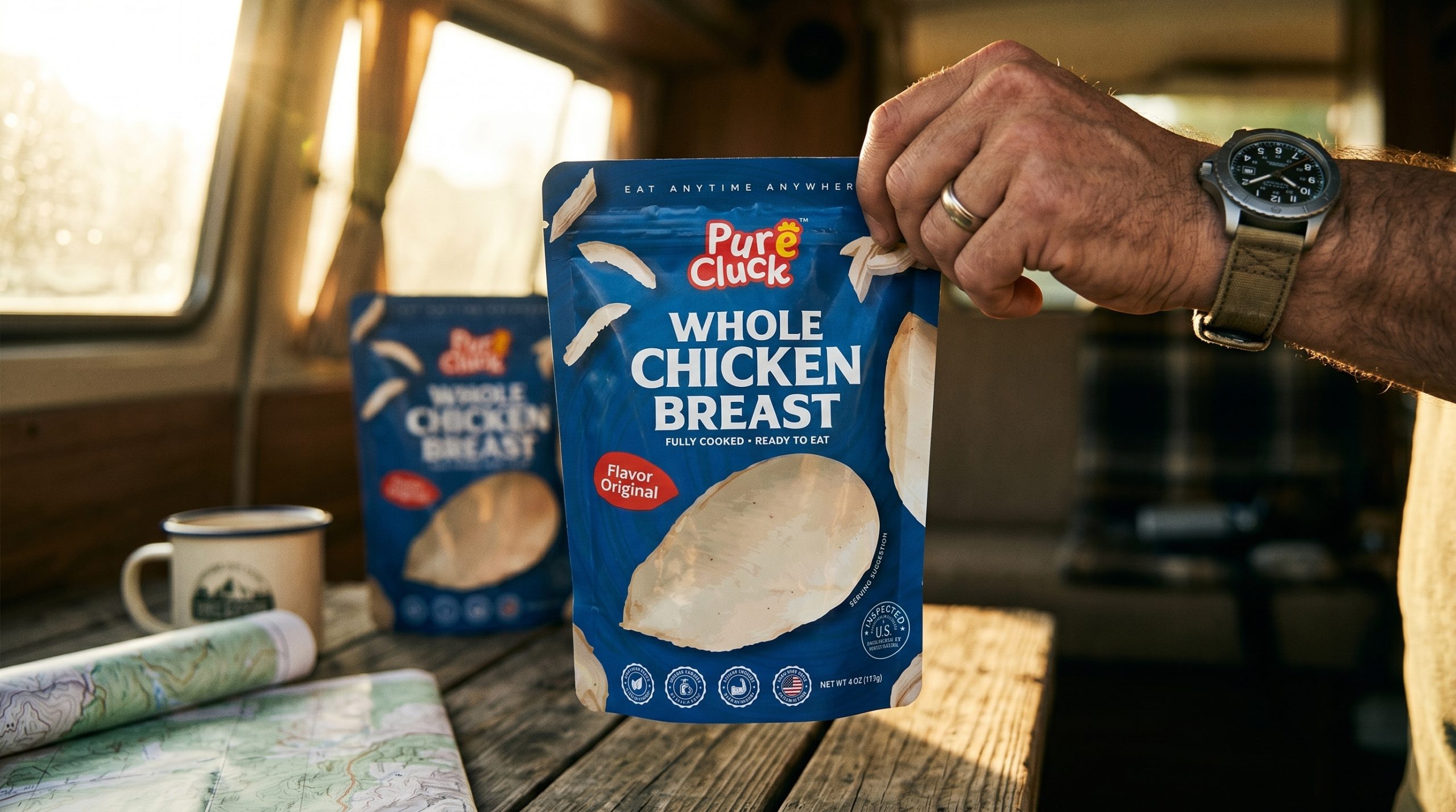
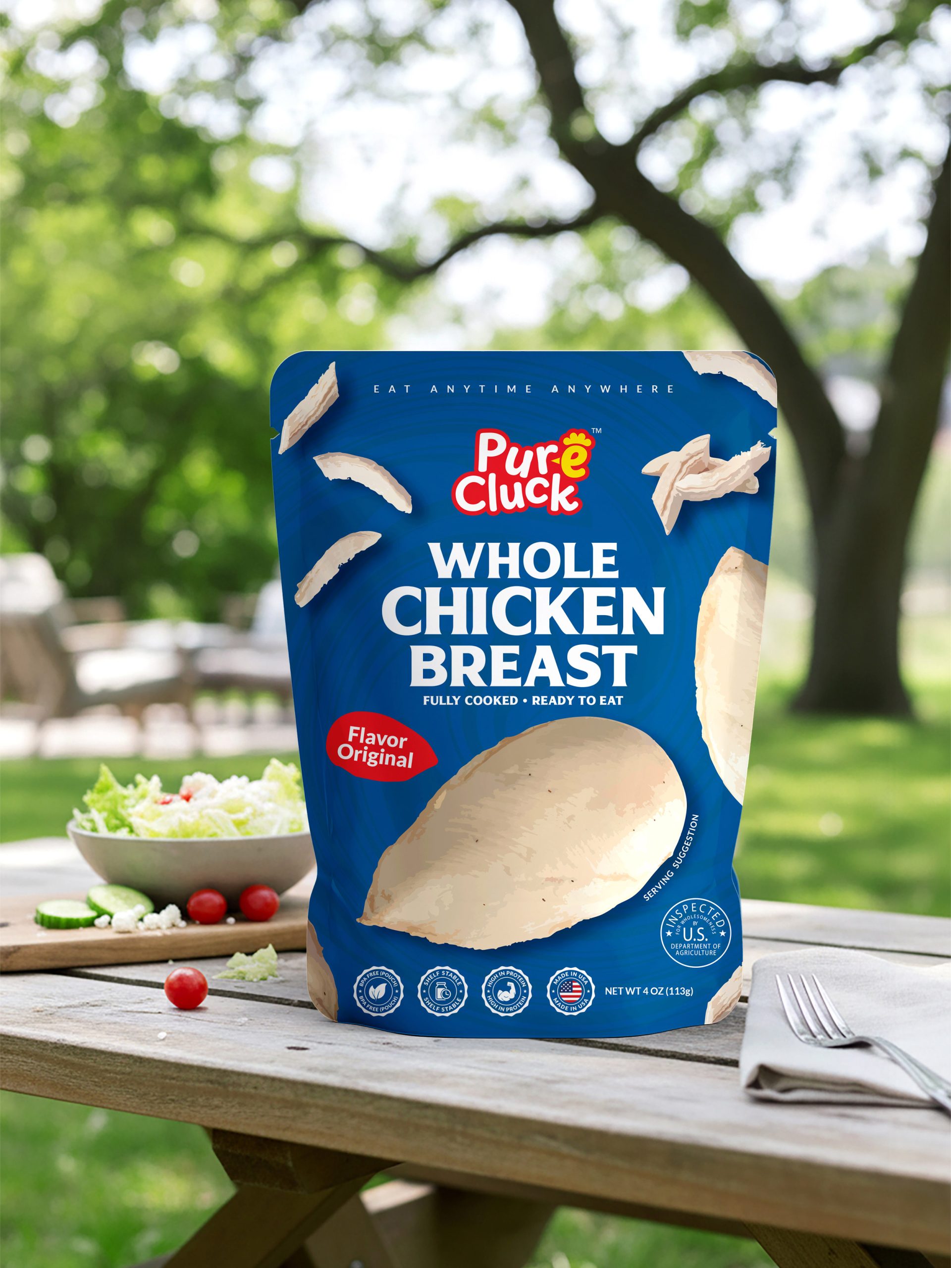
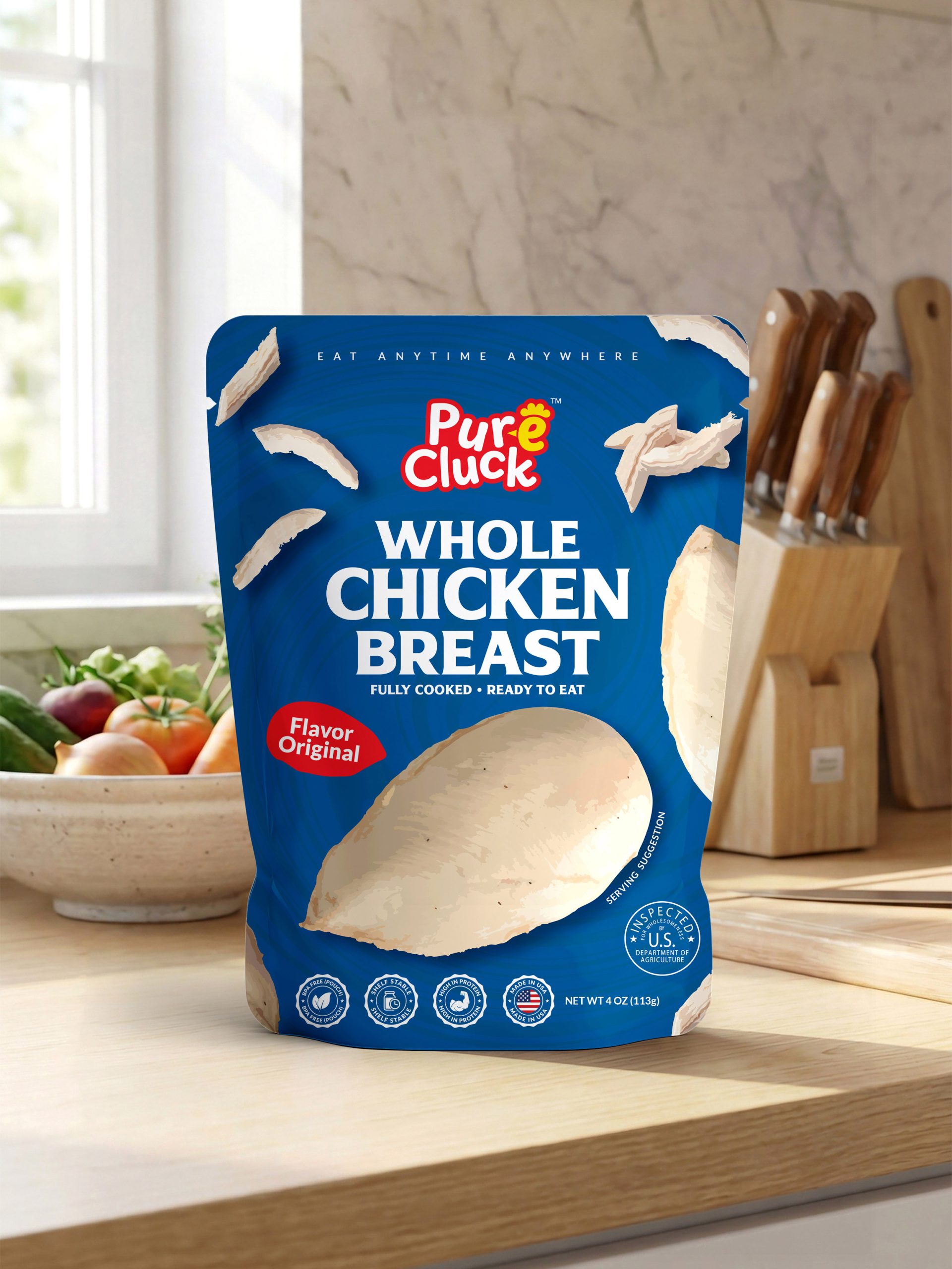
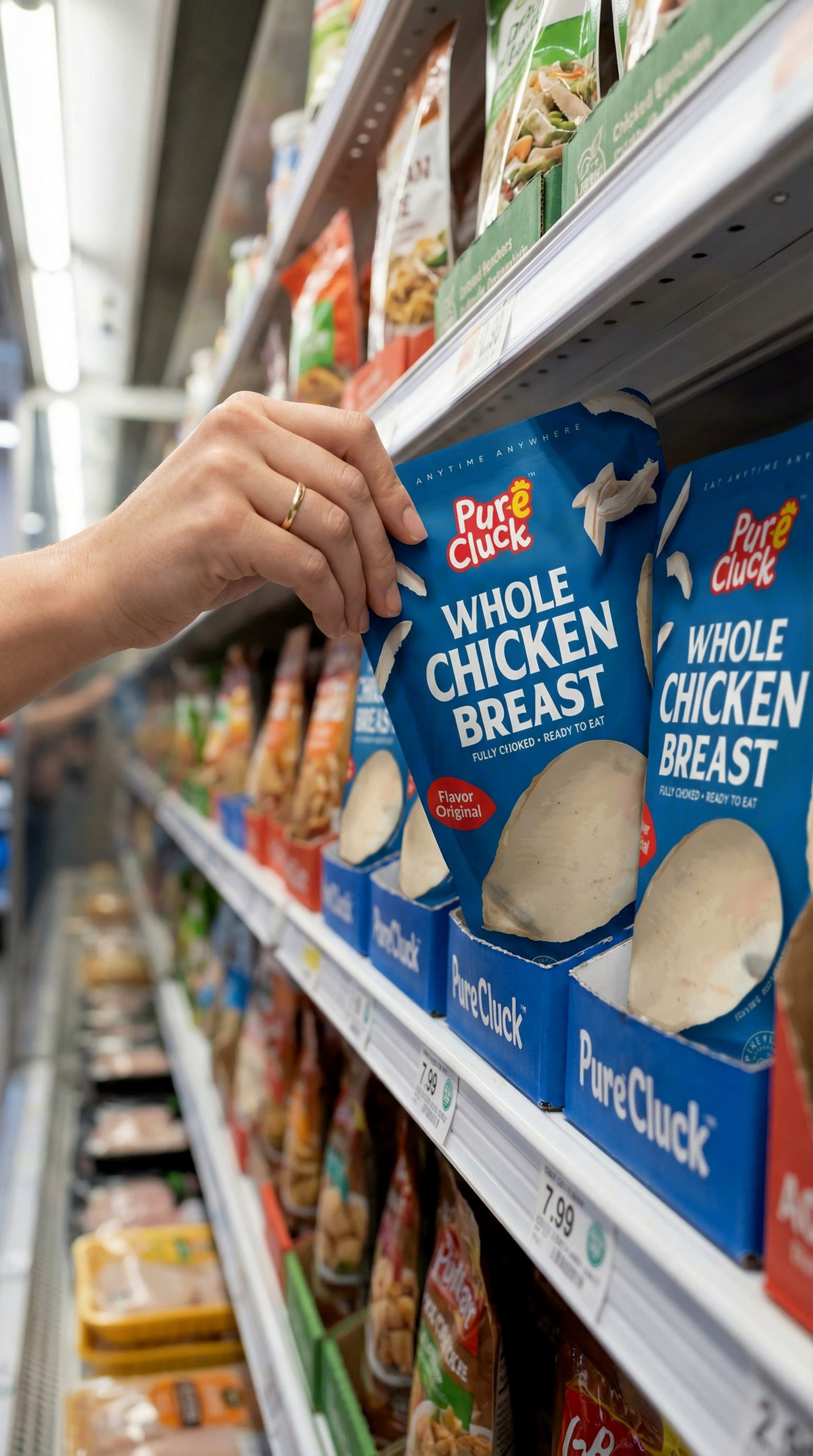
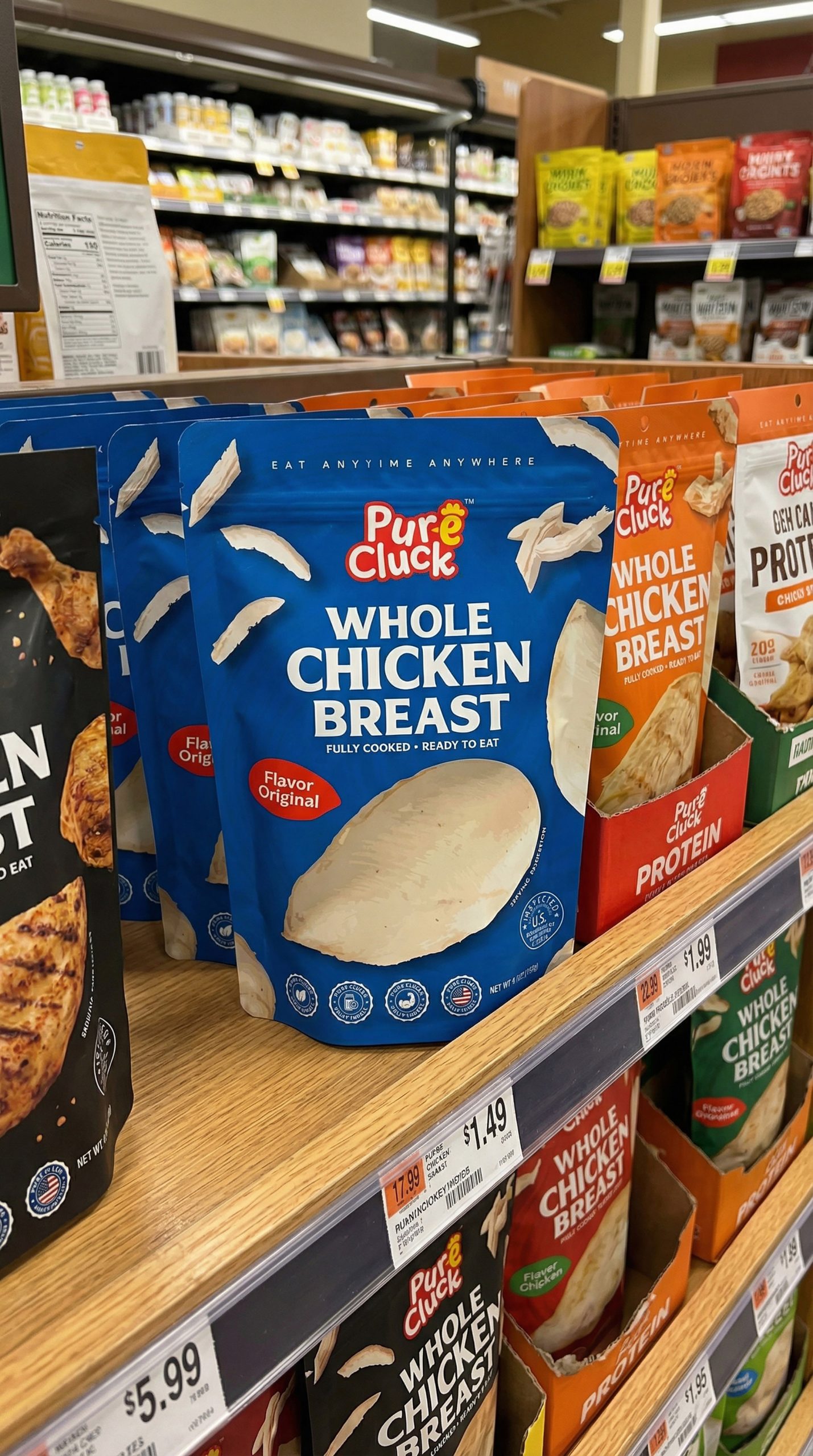
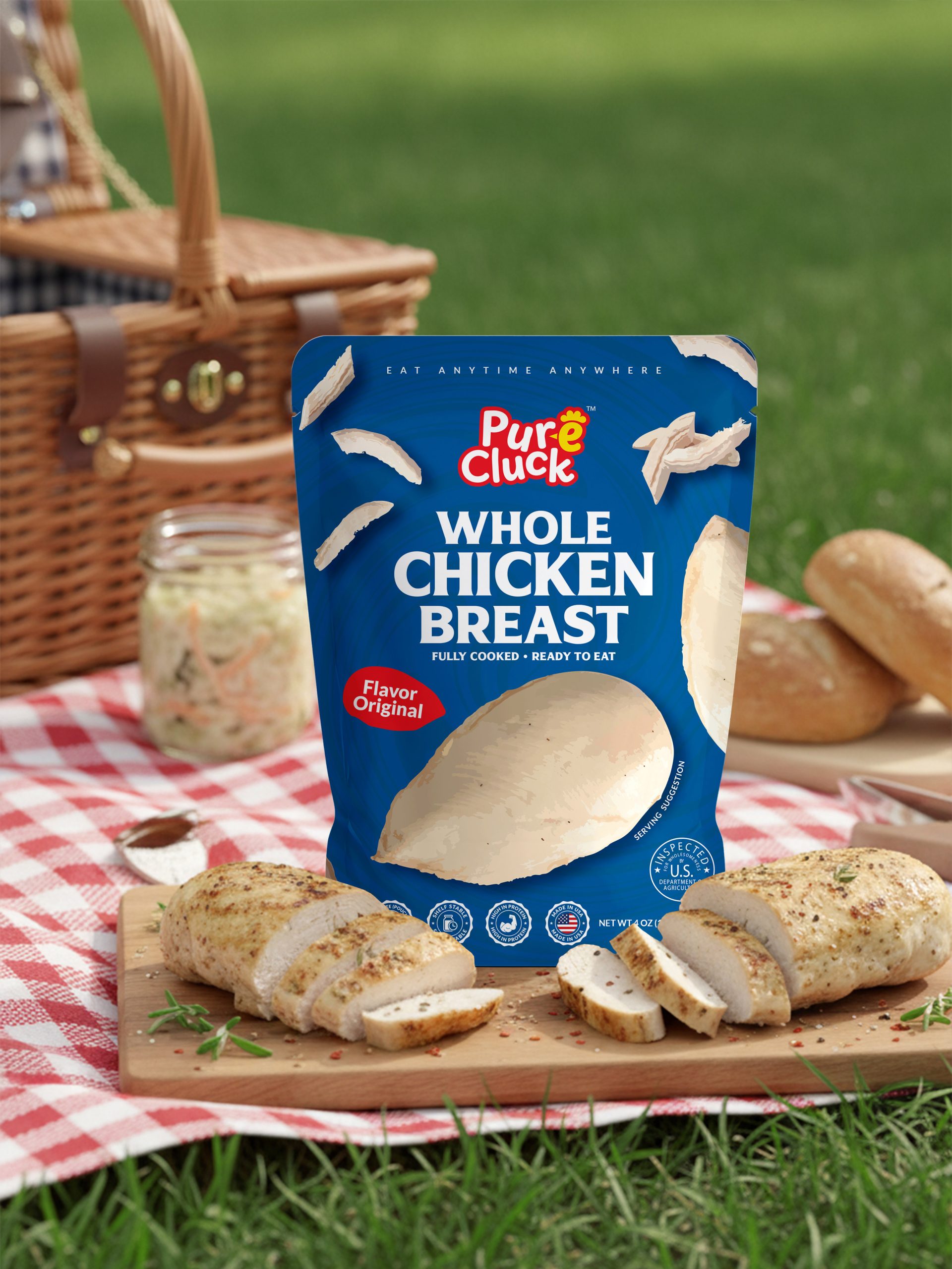
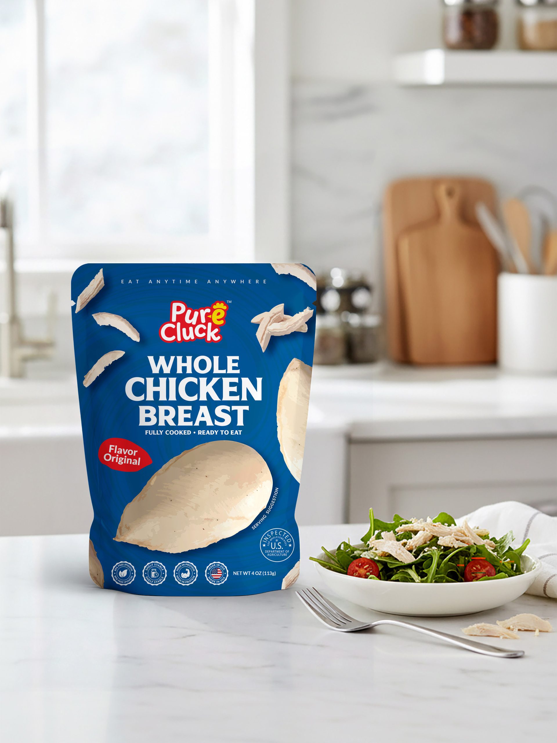
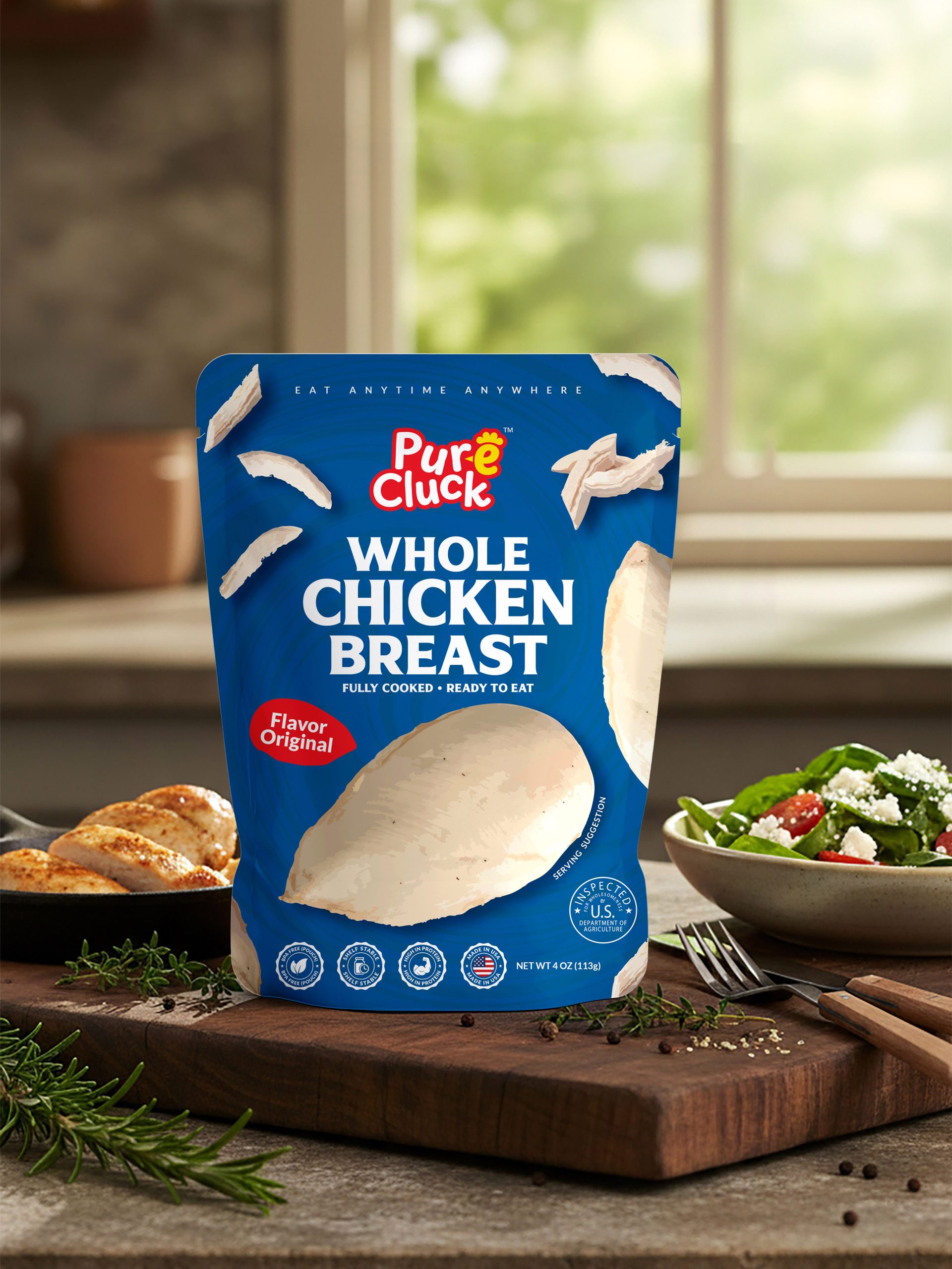
The project focused on building a complete packaging system that speaks directly to the on-the-go consumer. The stand-up retort pouch format was chosen intentionally — its silhouette communicates shelf confidence, while the tear-notch at the top reinforces the core brand promise of zero friction. Every structural and visual element was designed to work together: the pouch stands, the colors stop, the message lands in under three seconds.
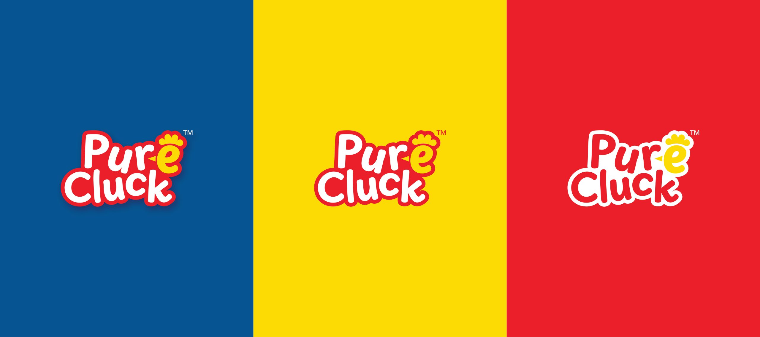
The color system is built on a deep cobalt blue as the dominant background — a deliberate choice to signal freshness, cleanliness, and premium trust in a category that often feels clinical or cheap. Red accent badges inject energy and create visual hierarchy, guiding the eye from product name to flavor variant to key claims. White condensed typography at large scale ensures shelf readability from distance, while the floating chicken photography adds appetite appeal and a sense of movement that keeps the front panel dynamic without feeling cluttered.
The back panel was treated as a second design canvas — not just a compliance wall. “TEAR. EAT. FUEL.” leads as a bold editorial headline. A red use-case module with custom iconography communicates lifestyle fit at a glance. The nutrition facts, ingredients, and storage copy were all typeset with hierarchy and breathing room, making the panel feel designed rather than dumped.
Pure Cluck is more than a protein snack — it is a statement that eating well should never slow you down.




 NEV
NEV Stefano Bracci
 Alina
Alina monther al omari
 Lizakjx
 JOAOMARCOSDESIGN
 alchimistestudioParis
 Harriet Neild
 octavio rojo
 宏洛图品牌设计HONGLT
 DESIGN CONCEPTS
 Alexander Skurihin
 Studio K95
 ARMBRAND
 Richa Rai
 houseoferas by Miti
 Agence des Coteaux
 Kushi Eaknath
 Ann Treasa
 Xiao Ning
 krrrrrllii
 babyage
 Deep
Deep