

Protein Refreshed, adding some much needed sparkle to the world of protein.
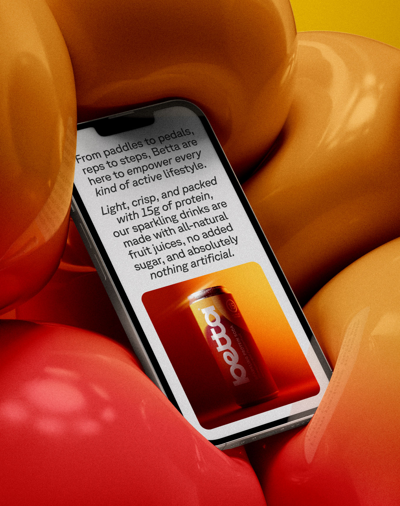
From paddles to pedals, reps to steps, Betta are here to empower every kind of active lifestyle. Light, crisp, and packed with 15g of protein, their sparkling sodas are made with all-natural fruit juice and nothing artificial, offering a refreshing alternative to flat, fake, heavy protein shakes.
The brief was clear: create a brand that could hold its own in both the premium soft drink aisle and the performance nutrition space. The challenge was building something that felt exciting and energetic, without leaning on the literal fruit cues or tired visual codes of either category.
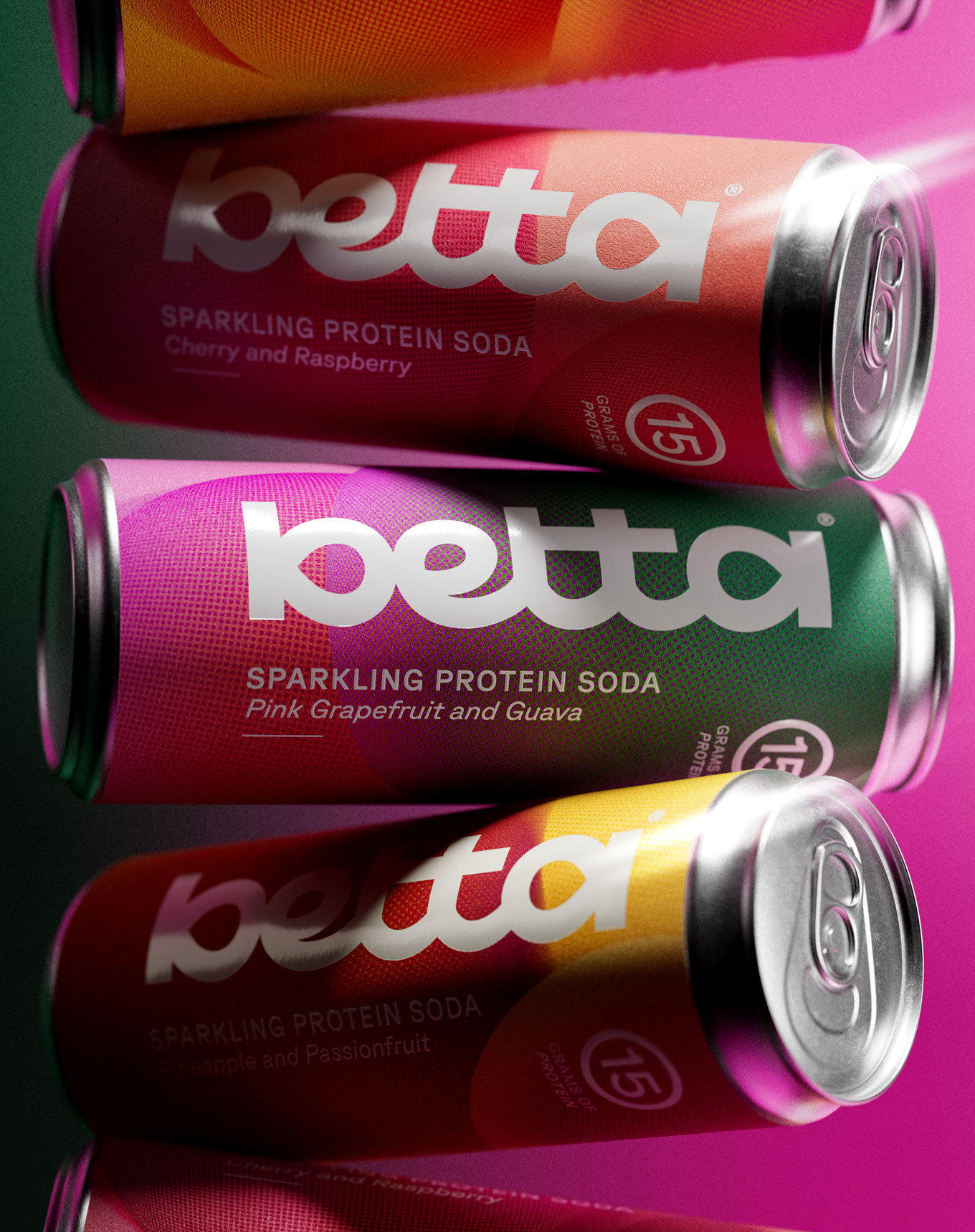
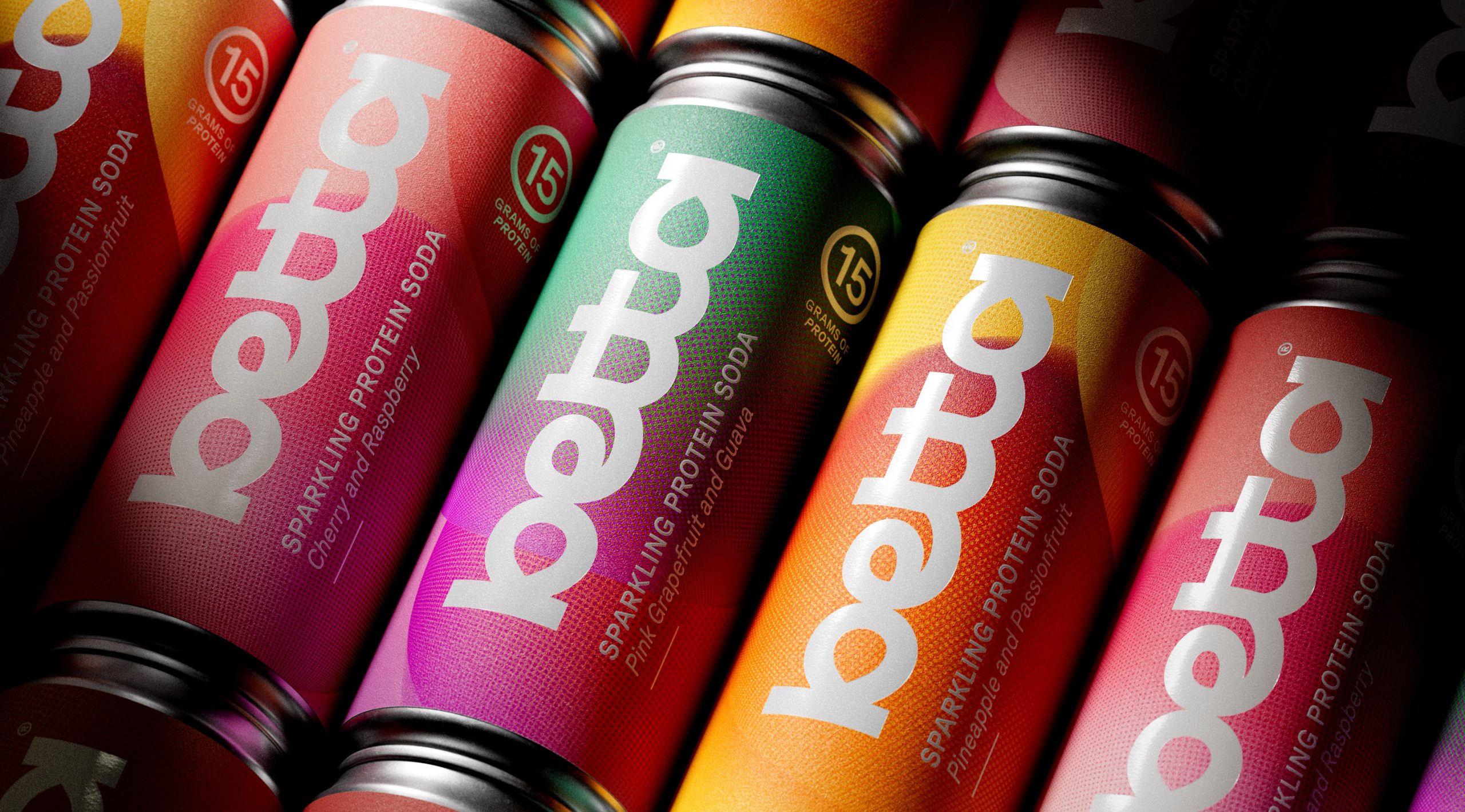
Our brand creation goes big on fizz, bringing the product’s sparkling personality to life in a never-still world of bubbles. A fluid word-mark sits at the centre of a never-still 3D world of bubbles, capturing constant motion and energy. The packaging avoids literal fruit cues typical of the soda category, instead drawing on the visual language of sports performance. Labelled cans introduce tactile contrast to the premium finish, while bold colours deliver strong flavour recognition.
This was a full brand creation project, comprising brand strategy, naming, packaging design and brand universe. From the earliest strategic decisions around tone, audience and positioning, through to the visual language, 3D world building and packaging finish, every touchpoint was considered and crafted to work together as a cohesive whole.
The result is a brand that feels as good on a gym bag as it does on a dinner table. One that doesn’t ask you to compromise on taste, design, or nutrition. Betta is proof that the protein category was overdue a shake up, and that sometimes all it takes is a little sparkle.
Curator’s Insight:
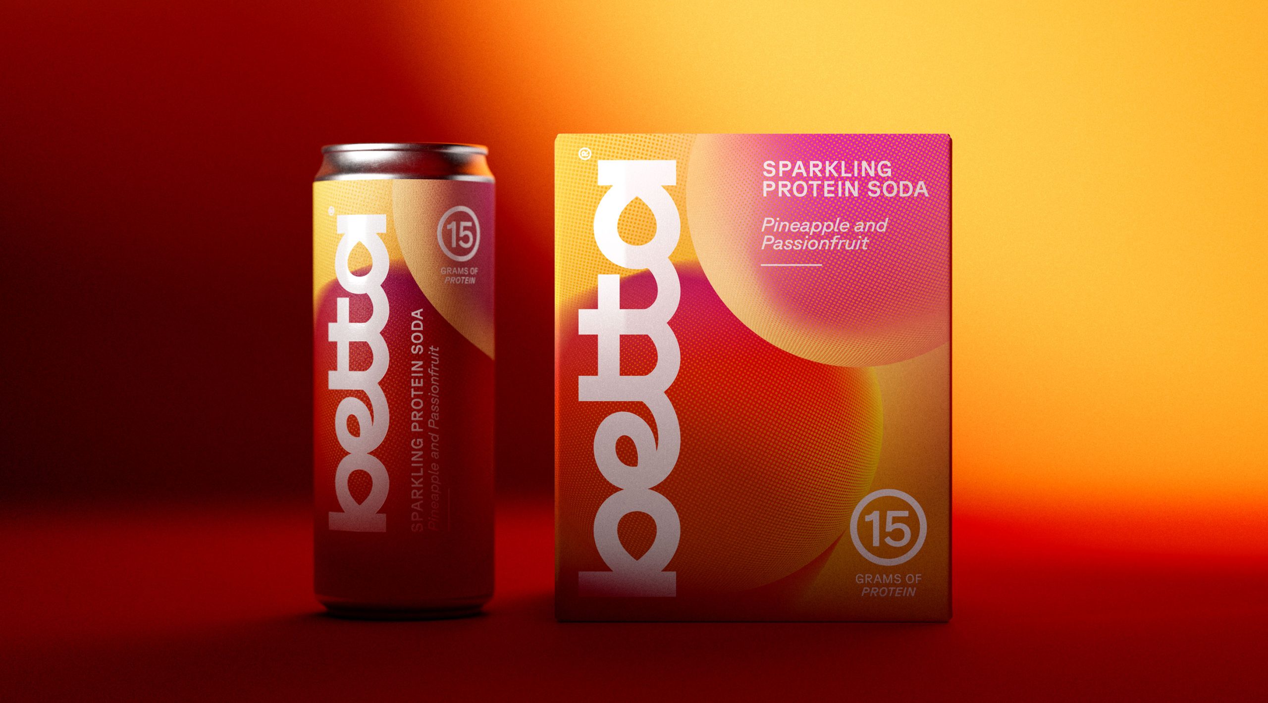
What Betta gets right that most functional beverage brands get wrong is the refusal to let nutrition claims do the visual heavy lifting. The “15g of protein” badge is present, but it is almost incidental, tucked into a circular mark that reads more like a sports emblem than a nutritional callout. That restraint is deliberate and it is doing real strategic work.
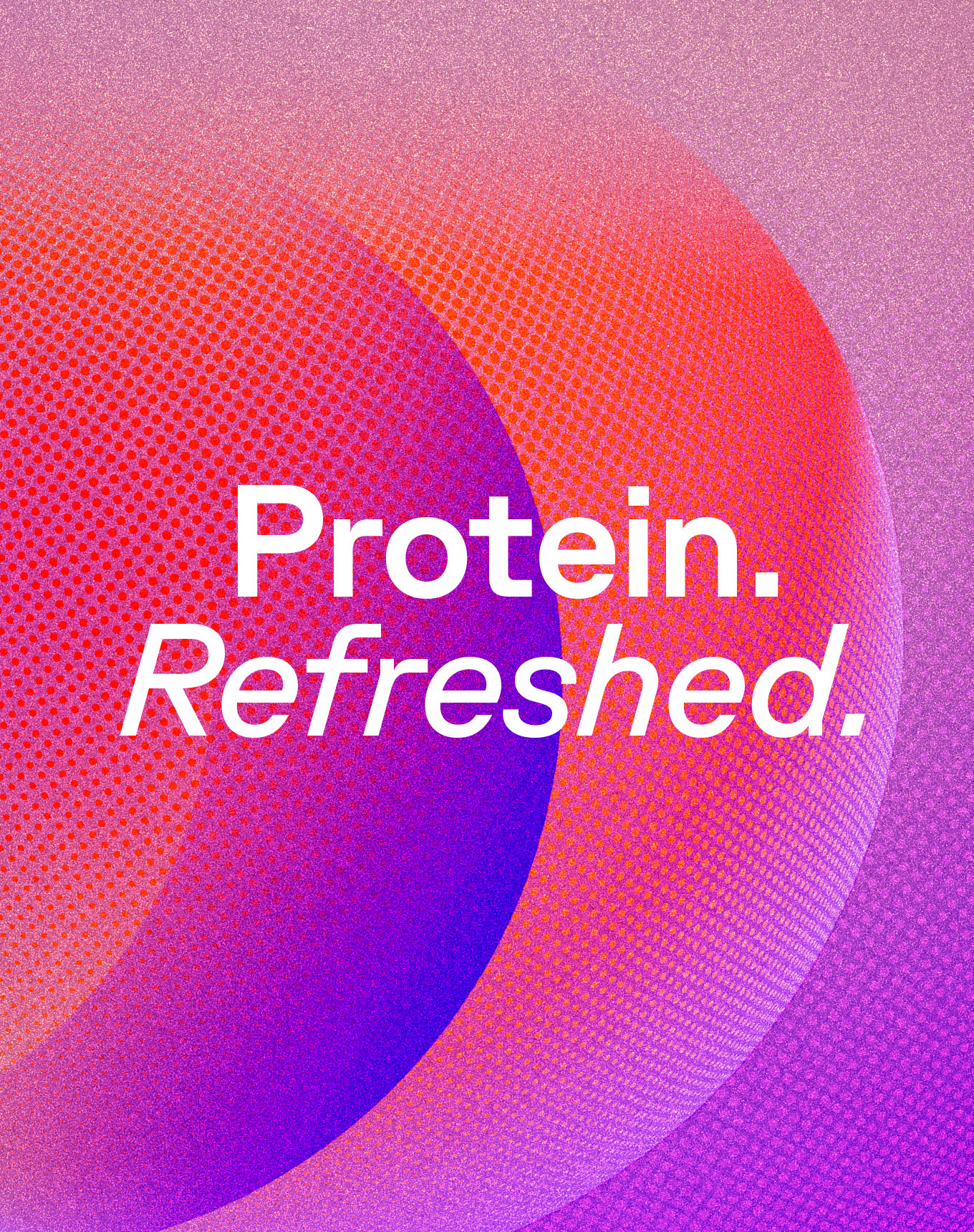
The gradient language here is not decorative. Each flavour’s colour field bleeds and shifts in a way that mimics the visual behaviour of liquid in motion, which is a quietly clever way to communicate effervescence without illustrating bubbles at all. The halftone texture layered beneath the gradients adds a tactile dimension that photographs beautifully but also signals craft and material quality at shelf, where the labelled can finish creates a contrast against the premium aluminium that most competitors avoid.
The box packaging reveals something else worth noting: the oversized wordmark rotated vertically transforms the brand name into an almost sculptural form, functioning more like an art object than a product label. It is rare to see a functional brand confident enough to let identity eclipse product information at this scale.






 Derrick Lin
 monther al omari
 43oz
43oz lilyz design23
 Modern Theory
 Eighteen Brand Studio
 Bhumika Singh
 MohamedMashaly
 Pixels Studio
 Gulya
Gulya UPRISE
 Lizaveta Kharitonyuk
 Bonsanco Creative Studio
 DesignRepublic
 GIRAFA STUDIO
 PiotrWisniewski
 Sophiagdotcom
 CreativeWise
 SoreThumbStudio®
 Modern World Studio
 Palashcc
 Valérie Colace