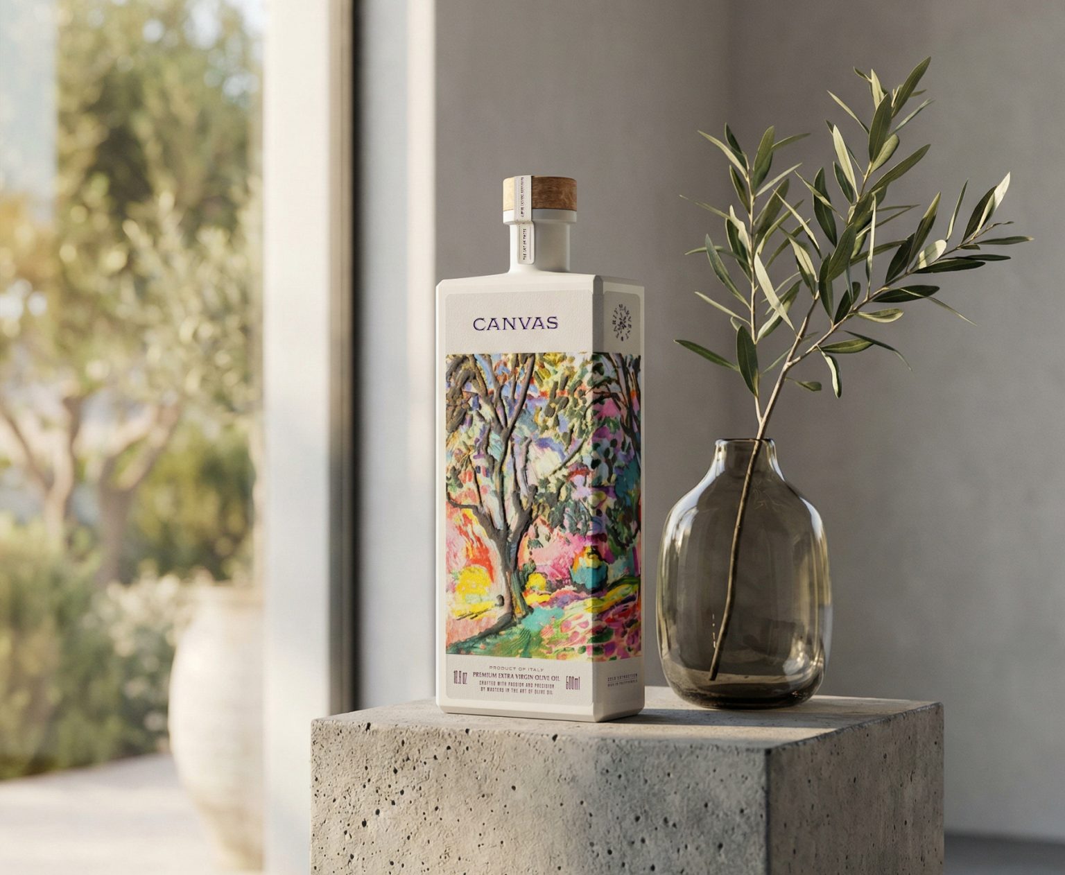

The Canvas project represents a sophisticated dialogue between rural heritage and the heightened sensibilities of fine art, reimagining the olive oil vessel as a curatorial object. In this context, the product transcends its culinary utility to become a sculptural medium, where the liquid interior is framed by a narrative of brushstrokes. The design language is built upon the premise of the tabula rasa, using the bottle’s physical form to explore how iconic imagery can be recontextualized within a modern, minimalist framework. It is an exercise in elevating the everyday into the realm of the collectible, aligning with the aesthetic rigor found in high end editorial archives.
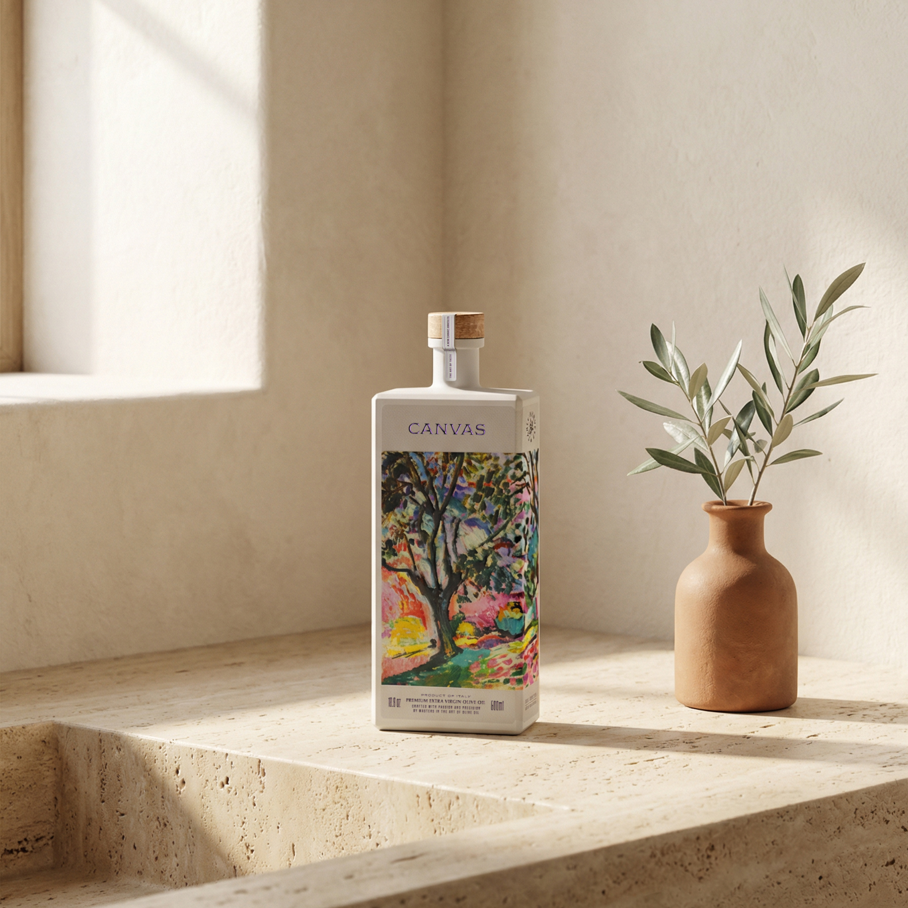
The vessel itself is a monolith of white matte glass, a deliberate choice that serves as the literal and metaphorical canvas for the brand. By employing a dense, opaque coating, the design eliminates the visual noise of the liquid’s varying hues, focusing the viewer’s attention entirely on the silhouette and the graphic intervention. This lack of specular reflection creates a soft, diffused presence in any context, ensuring that the bottle functions as an architectural element rather than a standard grocery item. The matte finish also provides a tactile precursor to the complex textures found on the label.
Curator’s Insight:
The tension in this design is between restraint and excess. The bottle form and typography are stripped to near nothing, a matte white monolith with a single word set in serifed caps. Against that, the label panel drops in a full-bleed painting with no border, no margin, no white space to soften the transition. The abruptness of that edge is intentional. The painting is not mounted on the bottle; it occupies it.
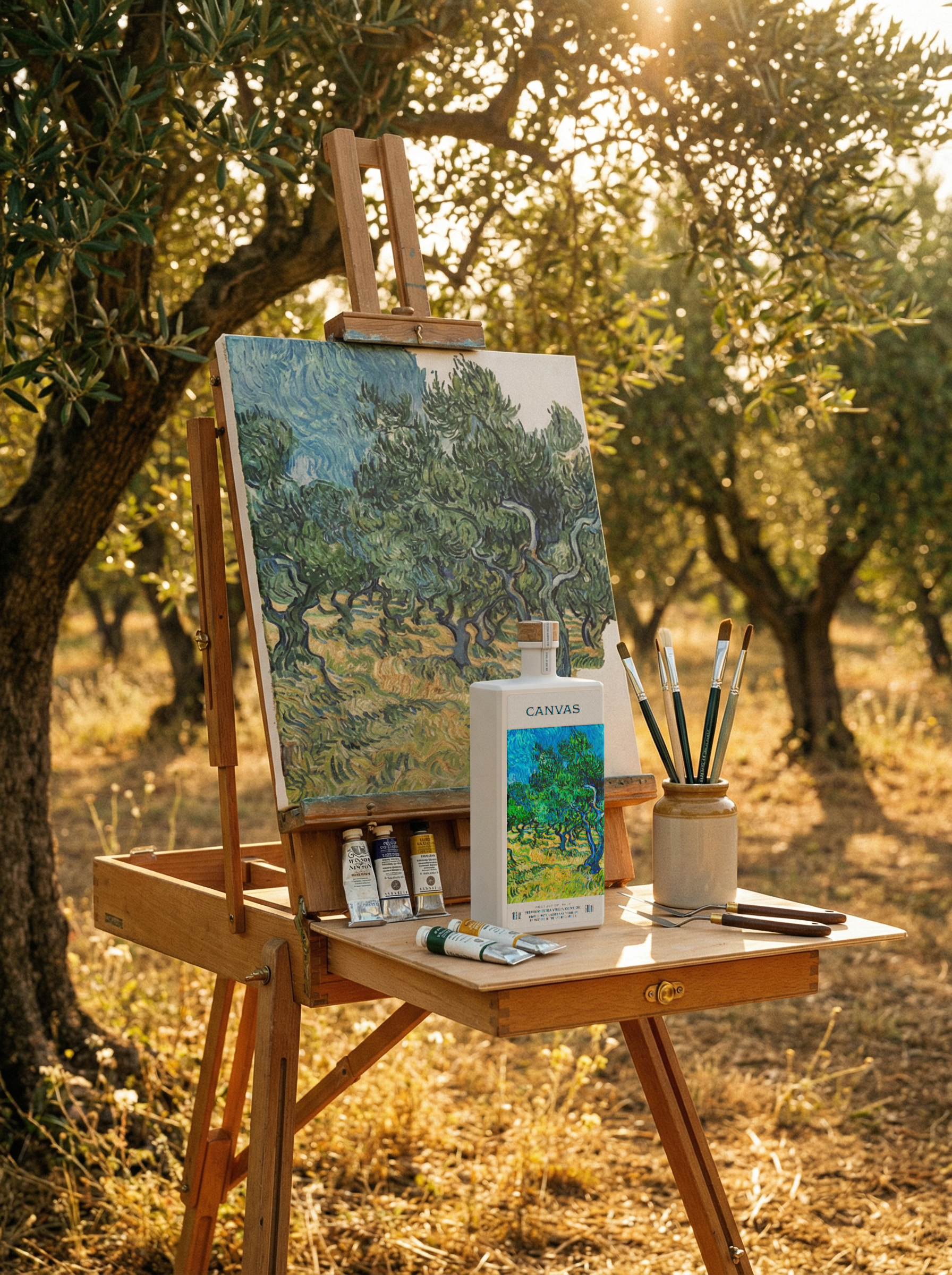
What keeps this from feeling arbitrary is the subject matter. Each artwork depicts an olive tree, which means the label does not decorate the product so much as illustrate its origin. The connection is literal before it is aesthetic. That content logic gives the range coherence that pure art-on-packaging projects often lack, where the artwork is chosen for mood rather than meaning.
The cork stopper is the one material decision that earns its place quietly. In a design this controlled, natural wood at the crown reads as the only concession to warmth, and it is enough.




 Derrick Lin
 monther al omari
 43oz
43oz lilyz design23
 Modern Theory
 Eighteen Brand Studio
 Bhumika Singh
 MohamedMashaly
 Pixels Studio
 Gulya
Gulya UPRISE
 Lizaveta Kharitonyuk
 Bonsanco Creative Studio
 DesignRepublic
 GIRAFA STUDIO
 PiotrWisniewski
 Sophiagdotcom
 CreativeWise
 SoreThumbStudio®
 Modern World Studio
 Palashcc
 Valérie Colace