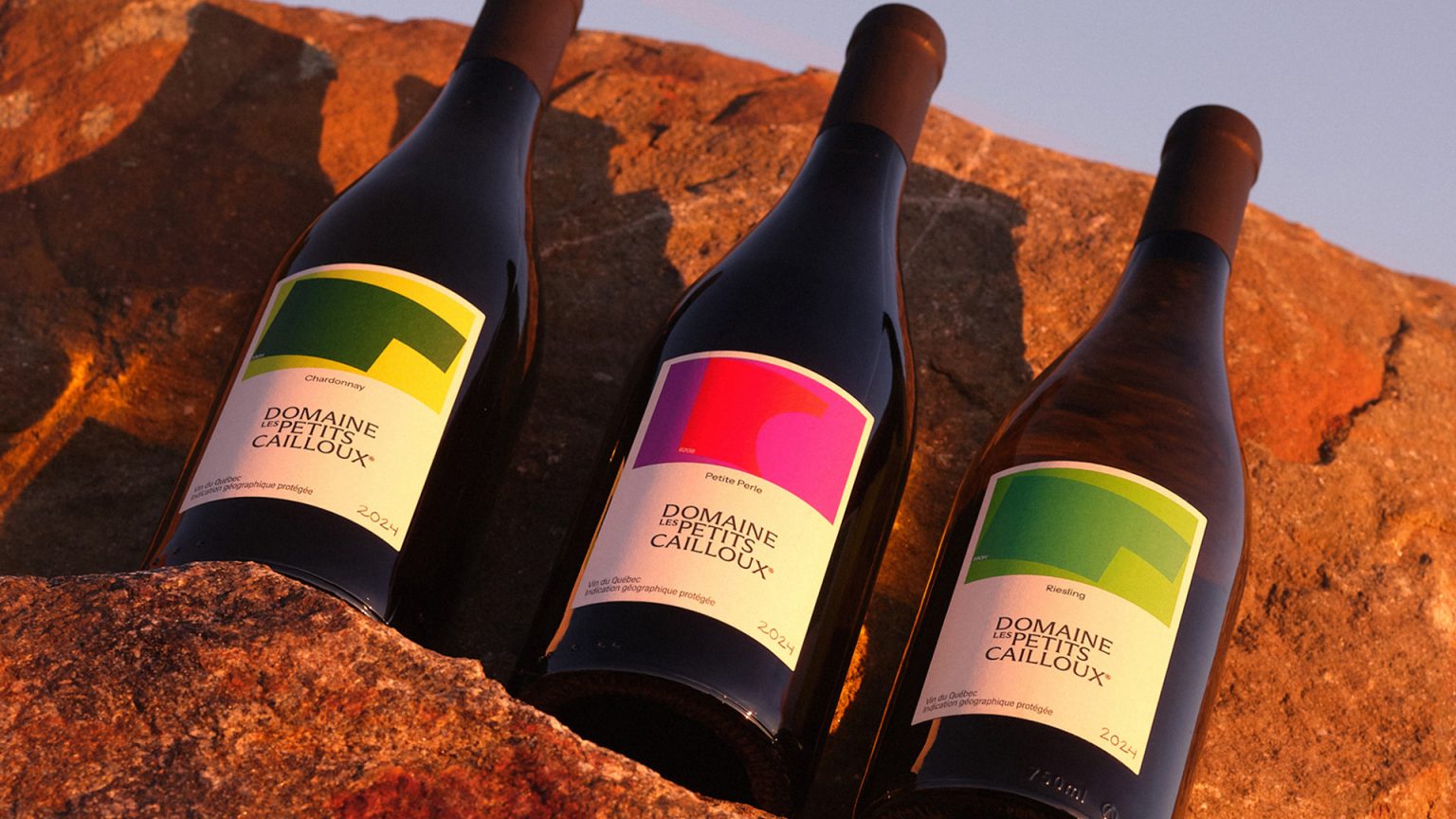

Located at the foot of Mont Yamaska in Quebec, Domaine Les Petits Cailloux struggled to stand out in a highly competitive wine market due to its generic brand image. To attract a new generation of adventurous consumers, the winery needed to move beyond traditional codes and showcase its singular geography. The rebrand transformed the company’s story, which is rooted in the owners’ dual passions for viticulture and paragliding, into a compelling visual narrative.
The new system is anchored by a symbol that reinterprets the namesake stones from the original logo, while the logotype is inspired by traditional stone carving typography. Abstract label compositions use aerial views of the vineyard plots, with a colour palette informed by specific tasting notes. To illustrate the wind sweeping across the mountain, the copy follows a fluid path, creating a cohesive identity shaped by both land and sky.


 monther al omari
 Ximena Ureta Design Studio.
 vitoramockup
 Up-Brands
 Sophiagdotcom
 Peter said
 ayeidadezigns
 Tancybox
 宏洛图品牌设计HONGLT
 Modern Theory
 Dozen Agency
 Atiq Alam
 Olio Studio
 Ruchi S. Joshi
 mmdesign
 awaiskhadim
 Octasoft
 United Creatives Studio
 Kingdom & Sparrow
 Anastasia Bakhmatskaya
 CreativeWise
 Great and Golden