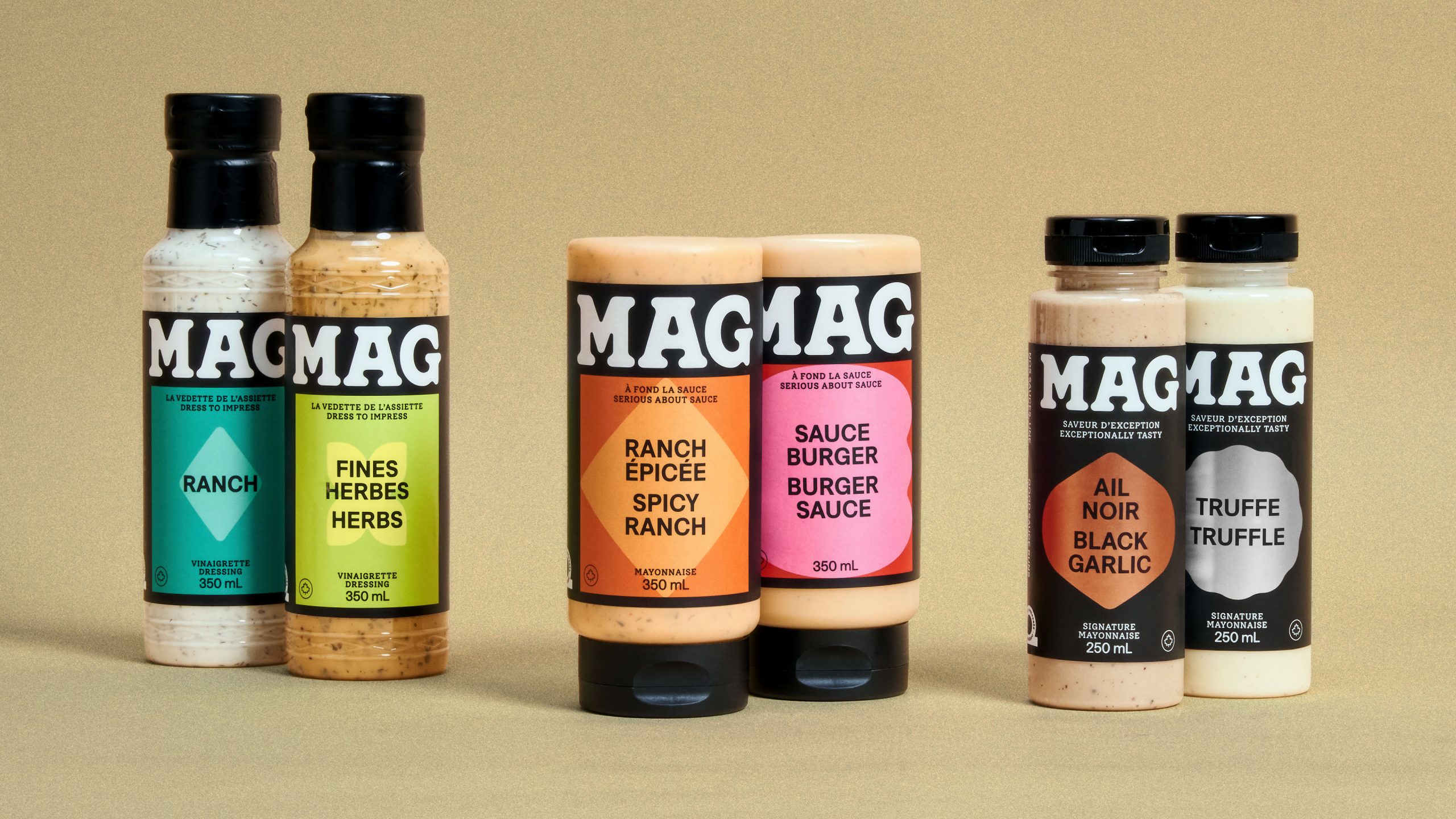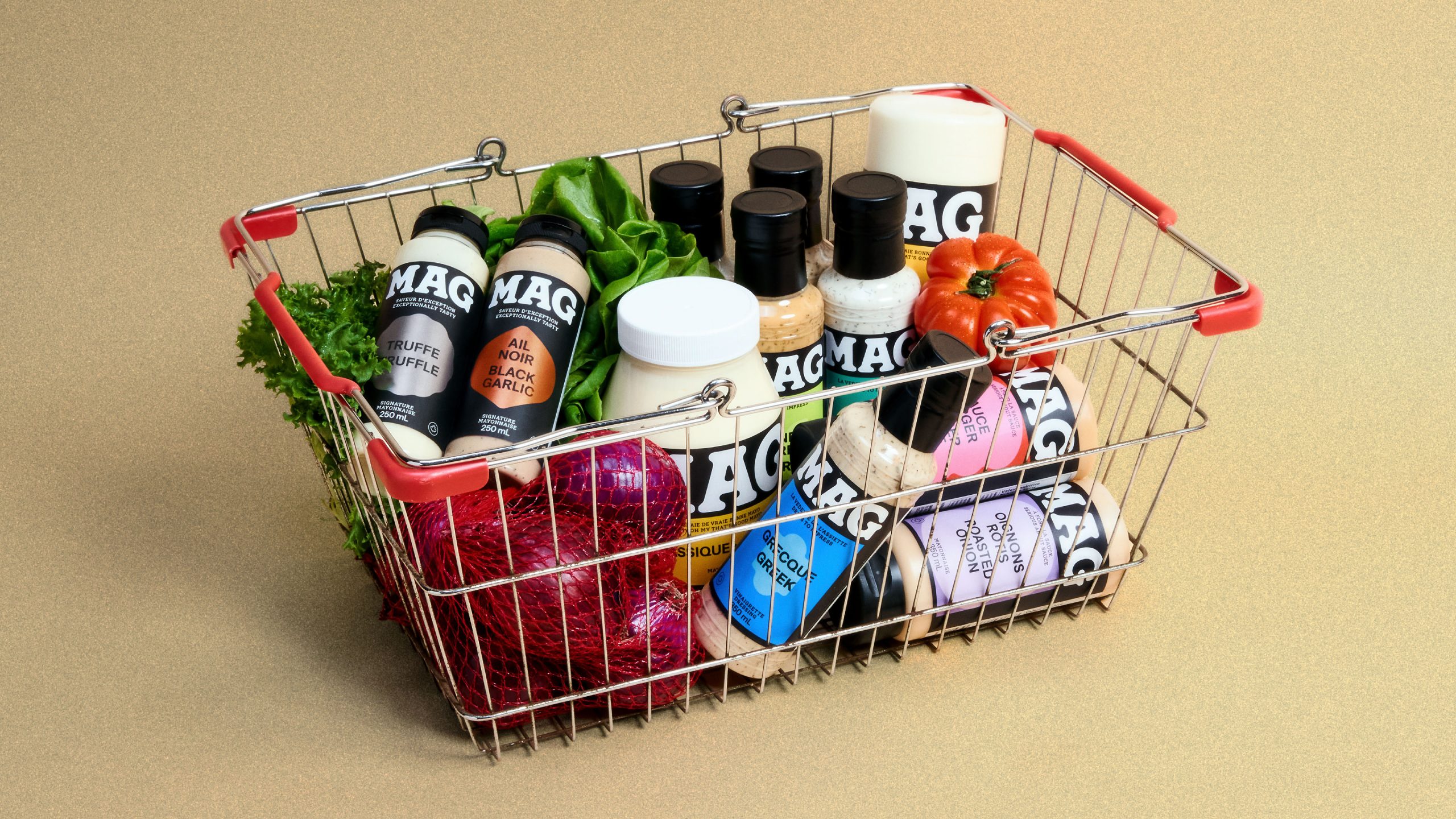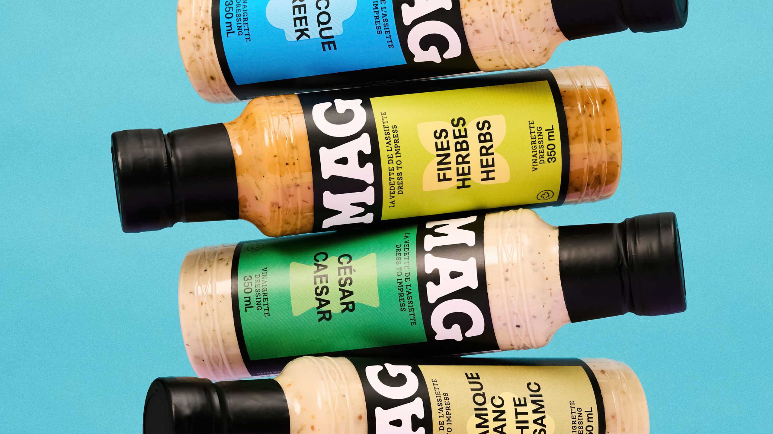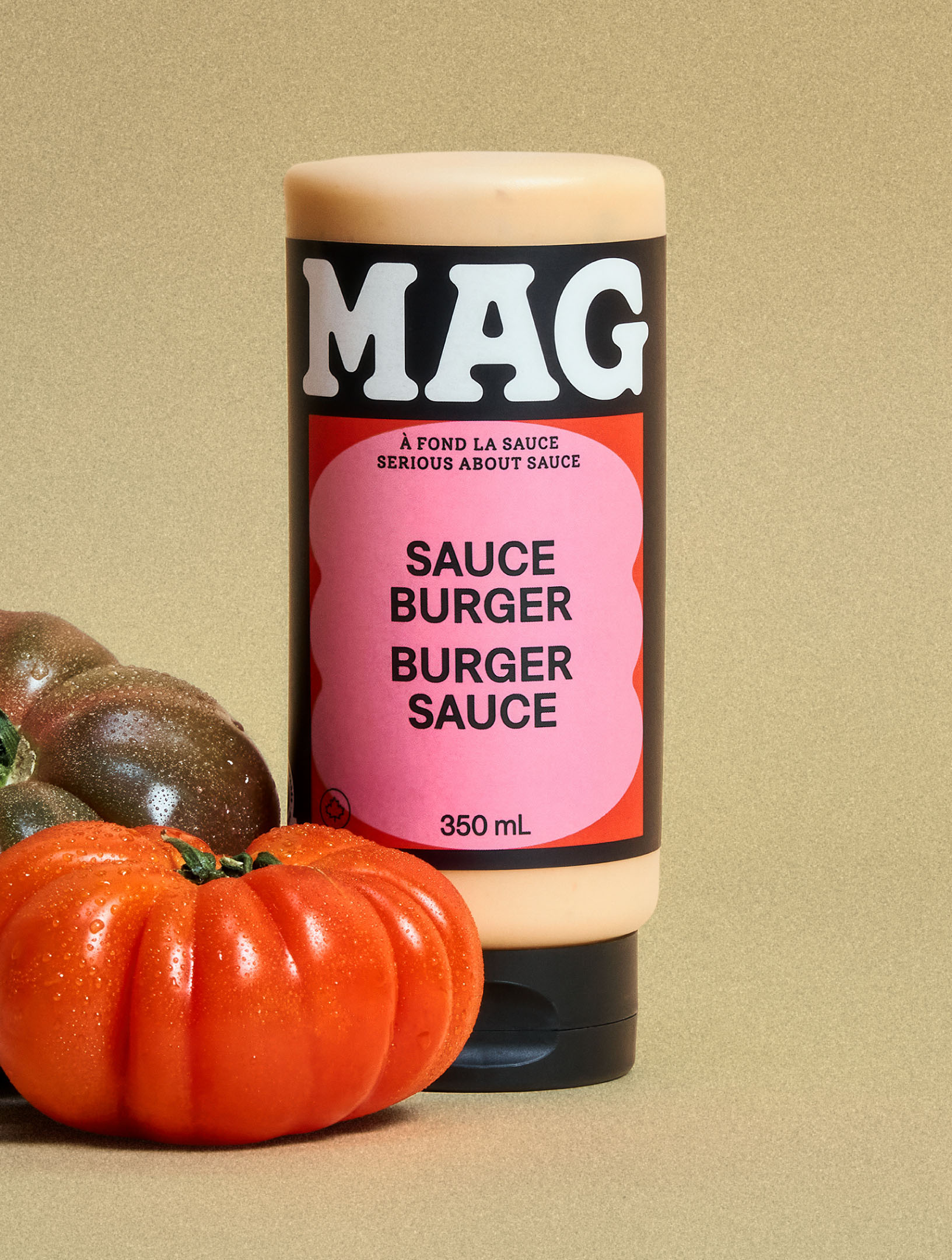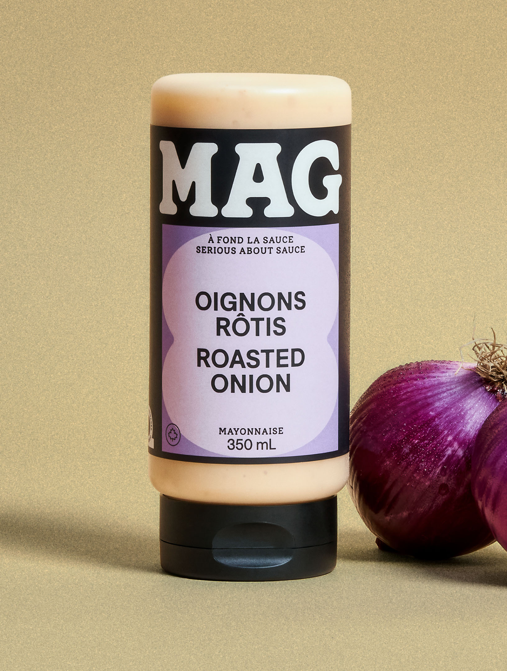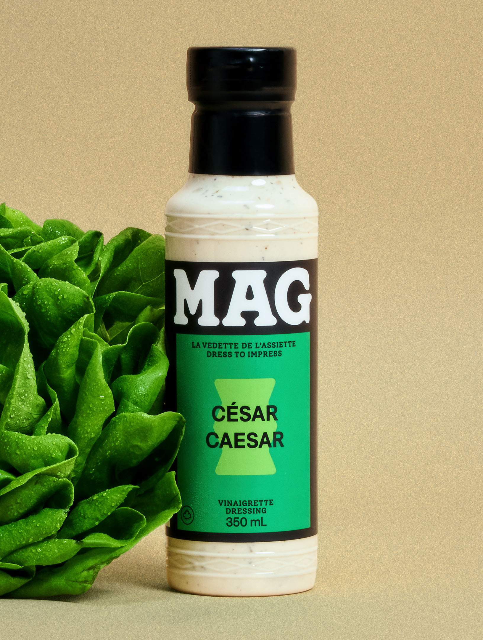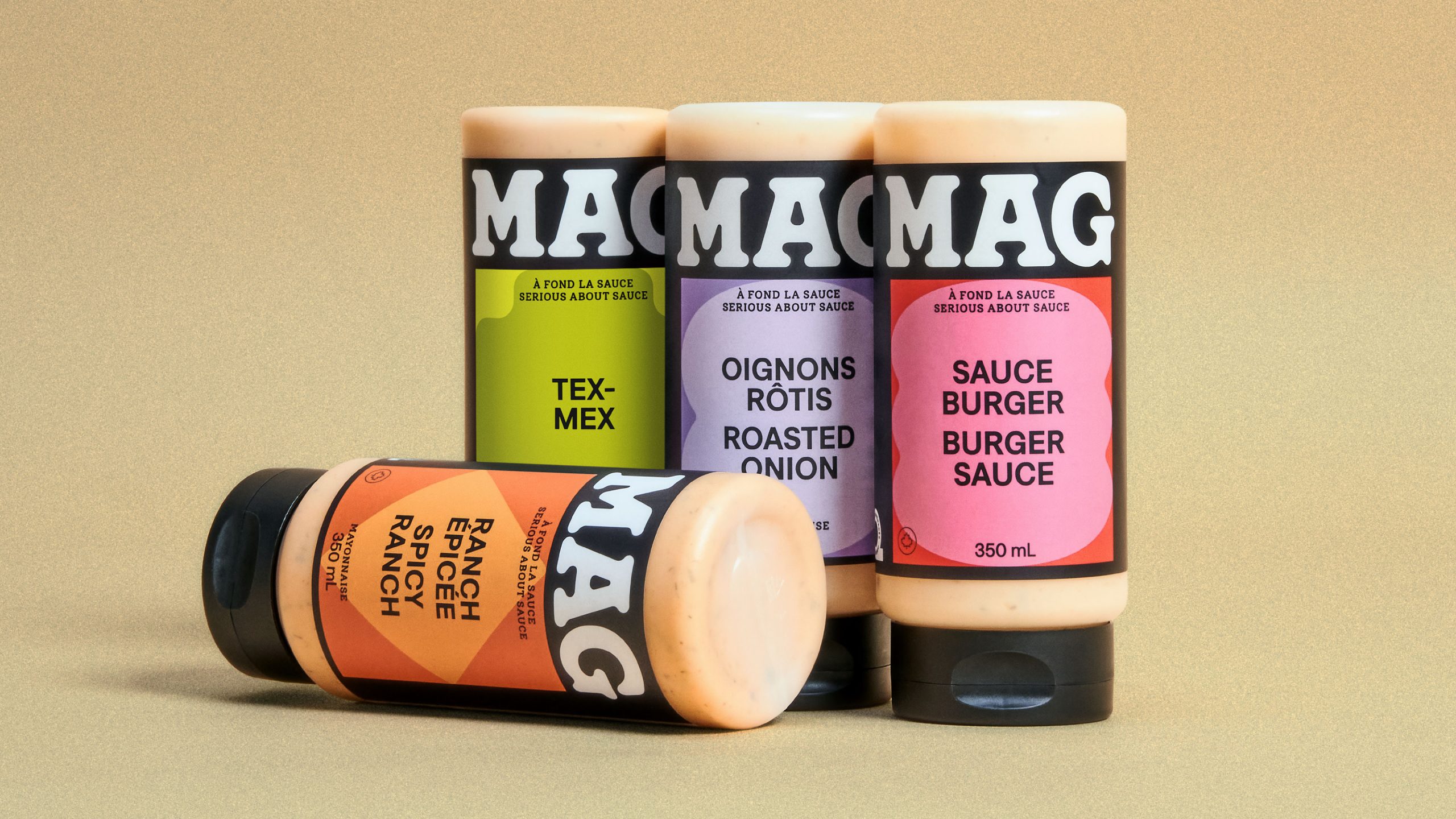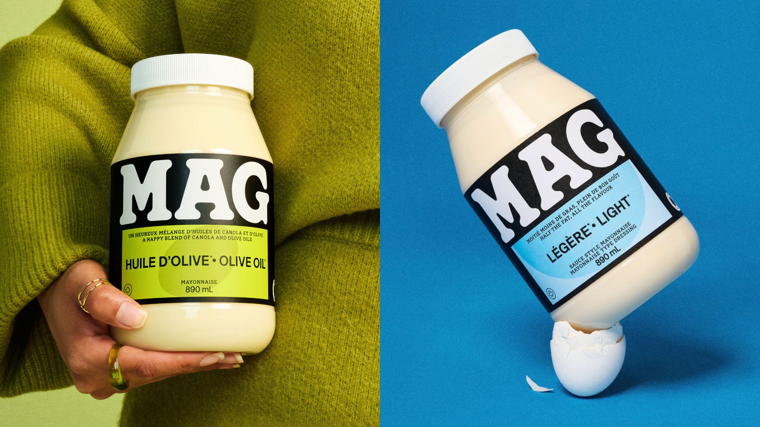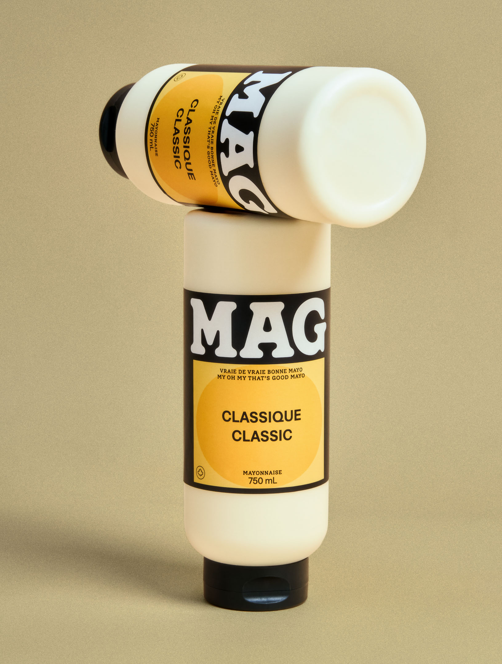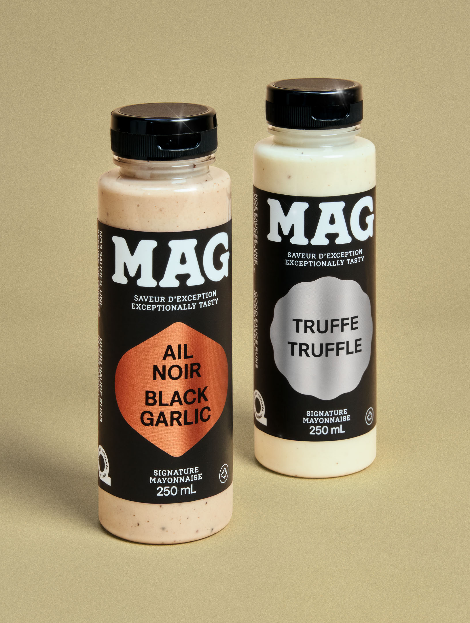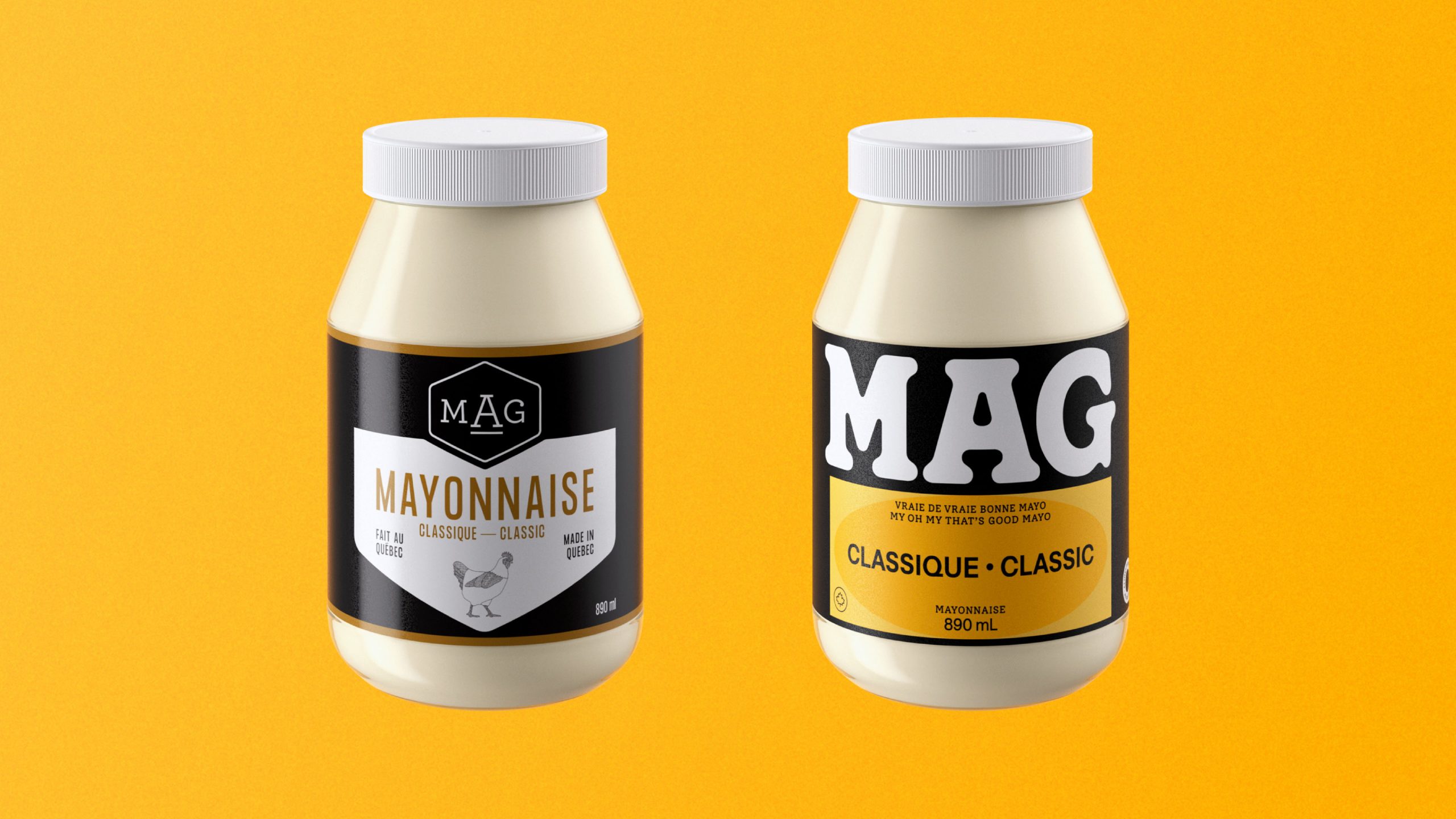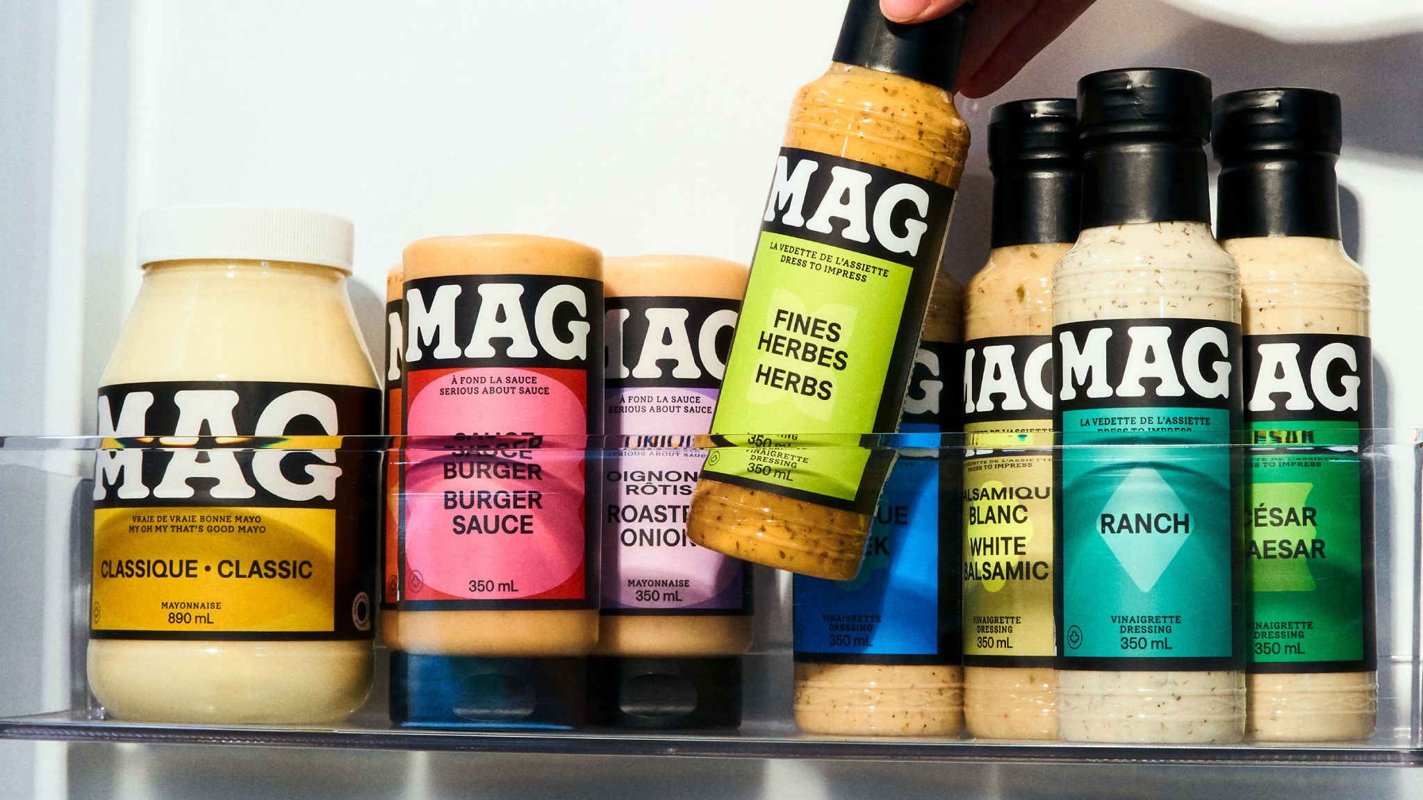
MAG is a Canadian sauce and mayo company. Convinced that the taste of its products could compete with the best in its category, MAG set out to refresh its identity by creating a brand image that is accessible, bold, and that stands out on grocery store shelves. Its graphic system adapts across product lines, packaging, and product types: each flavor is represented by a unique color and shape. This redesign not only helps the brand stand out on the shelves, but also supports its expansion into grocery stores across the rest of the country.
Curator’s Insight
MAG’s refreshed identity leans hard into shelf impact through a bold, modular design system. Strong typography anchors the brand, while vivid colour blocks and simple geometric cues differentiate flavours at a glance. The packaging feels confident and approachable, designed to pop in crowded grocery aisles without overcomplicating the message. Consistency across sauces and dressings builds instant recognition, while the flexible visual language allows the range to scale effortlessly. It’s a branding move that treats packaging not as a label, but as a billboard — loud, clear, and unapologetically modern.