

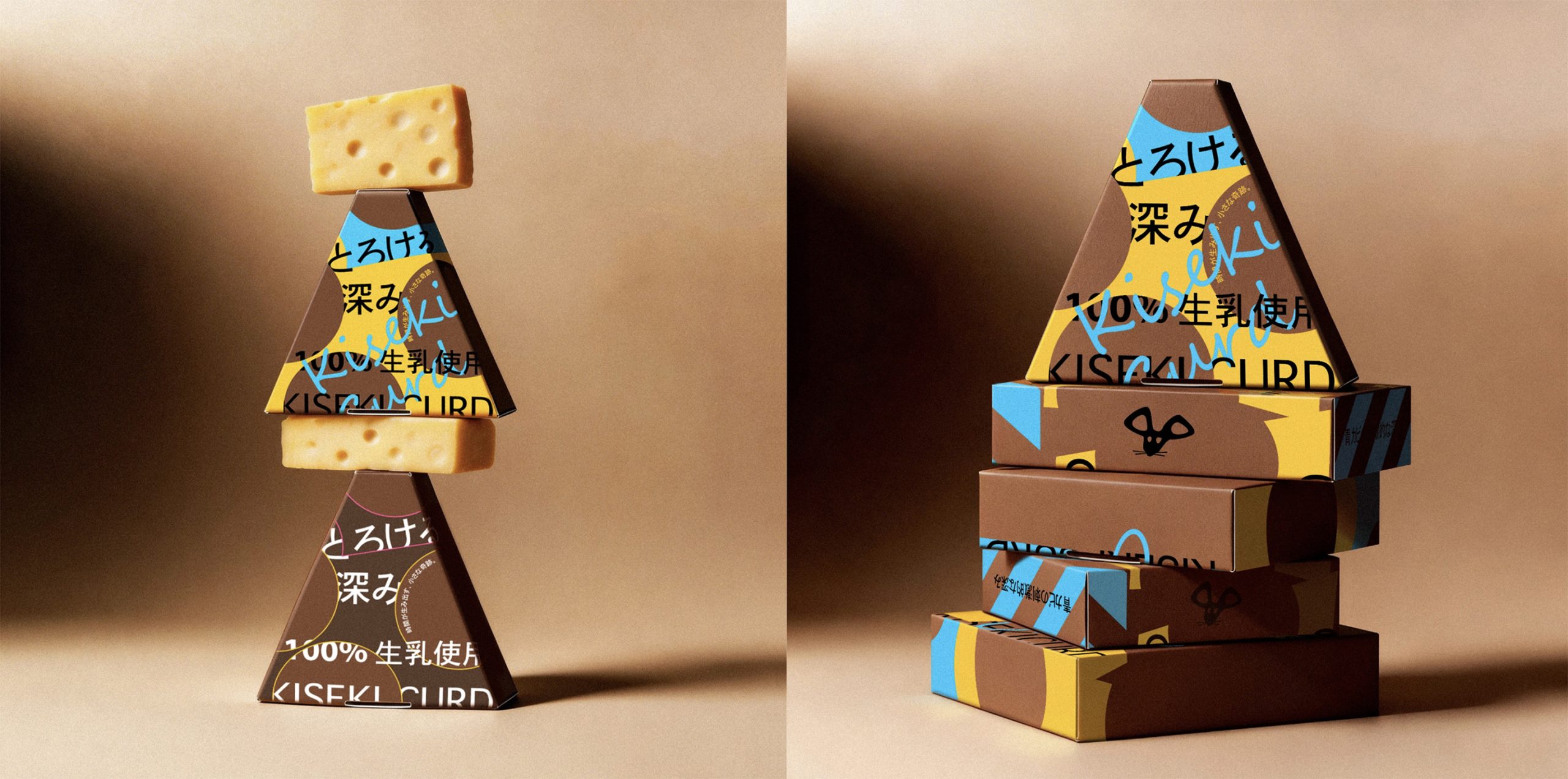
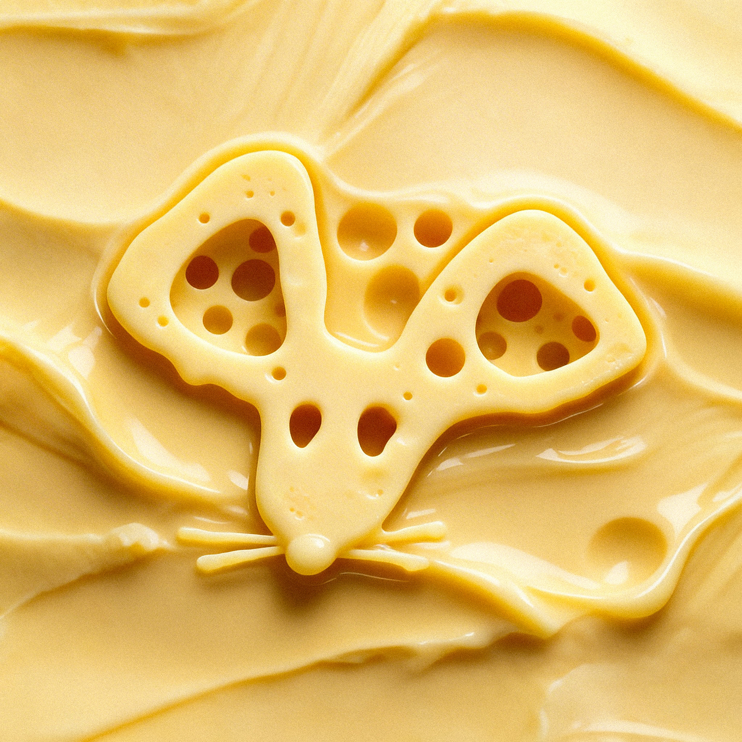
In the field of brand design, there is an unspoken rule: cheese packaging must not feature mice. The reasoning is that mice carry negative connotations of filth, destruction, and theft, which clash with the pure, artisanal, and refined image that cheese strives to convey. This judgment is not without reason—but precisely because everyone avoids it, this symbol has become the blank space with the greatest potential for recognition.
Cultural semiotics tells us that the meaning of a symbol is not fixed, but is continuously negotiated and reconstructed through use. The association between mice and cheese is already ingrained in consumers’ minds. What a brand should do is not erase this imprint, but actively step in and redefine its meaning. In other words, rather than letting consumers subconsciously complete the “cheese → mouse” association (and then feel confused by the brand’s deliberate silence), it is better for the brand to speak up and say: Yes, mice know cheese. We are the brand that mice approve of.
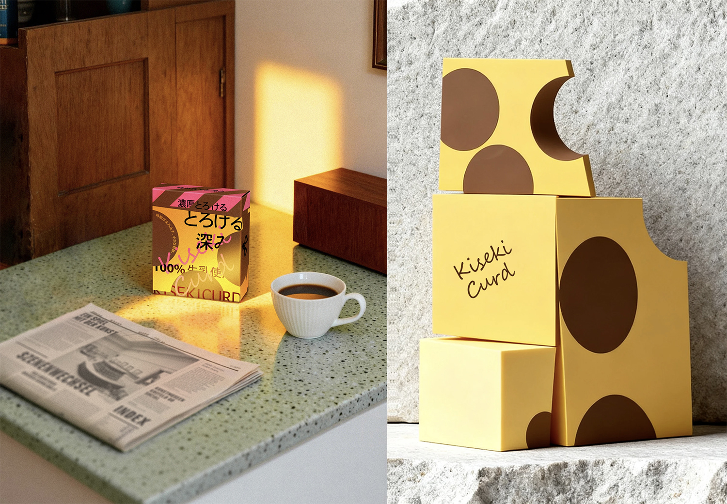
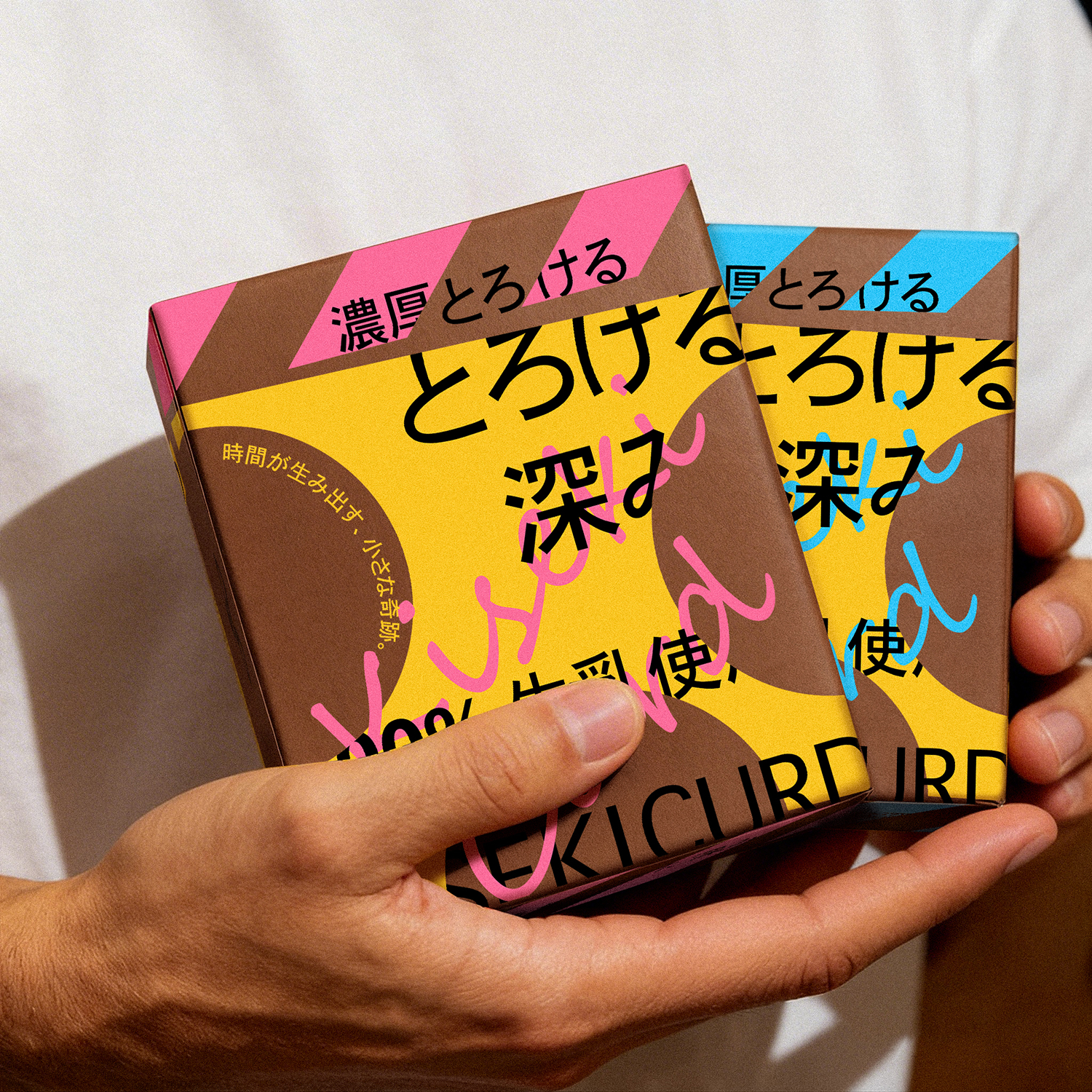
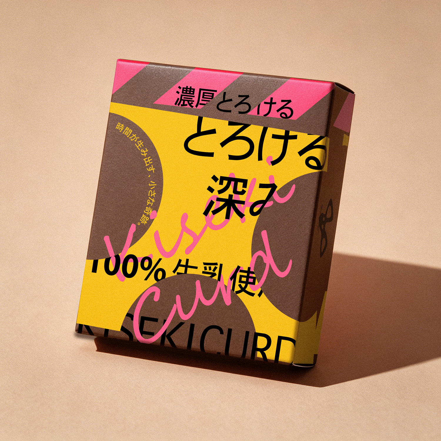
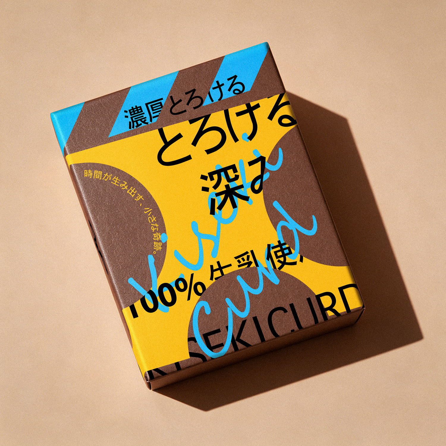
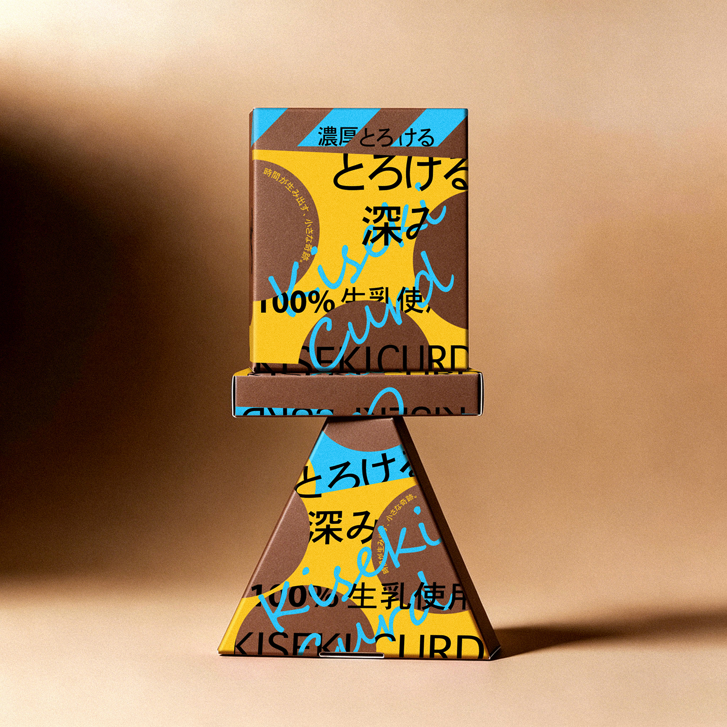
This packaging design rejects literal depictions of cheese forms. Instead, through the precise cutting of geometric shapes and the negative-space intervention of circular cutouts, it constructs an abstract visual grammar of “cheese imagery.” The cutting action simulates the moment when cheese is broken apart and shared, suggesting the solid, weighty presence of its block-like structure. The circular cutouts serve as “windows of flavor”—both as marks of time (holes formed during the aging process) and as visual focal points.
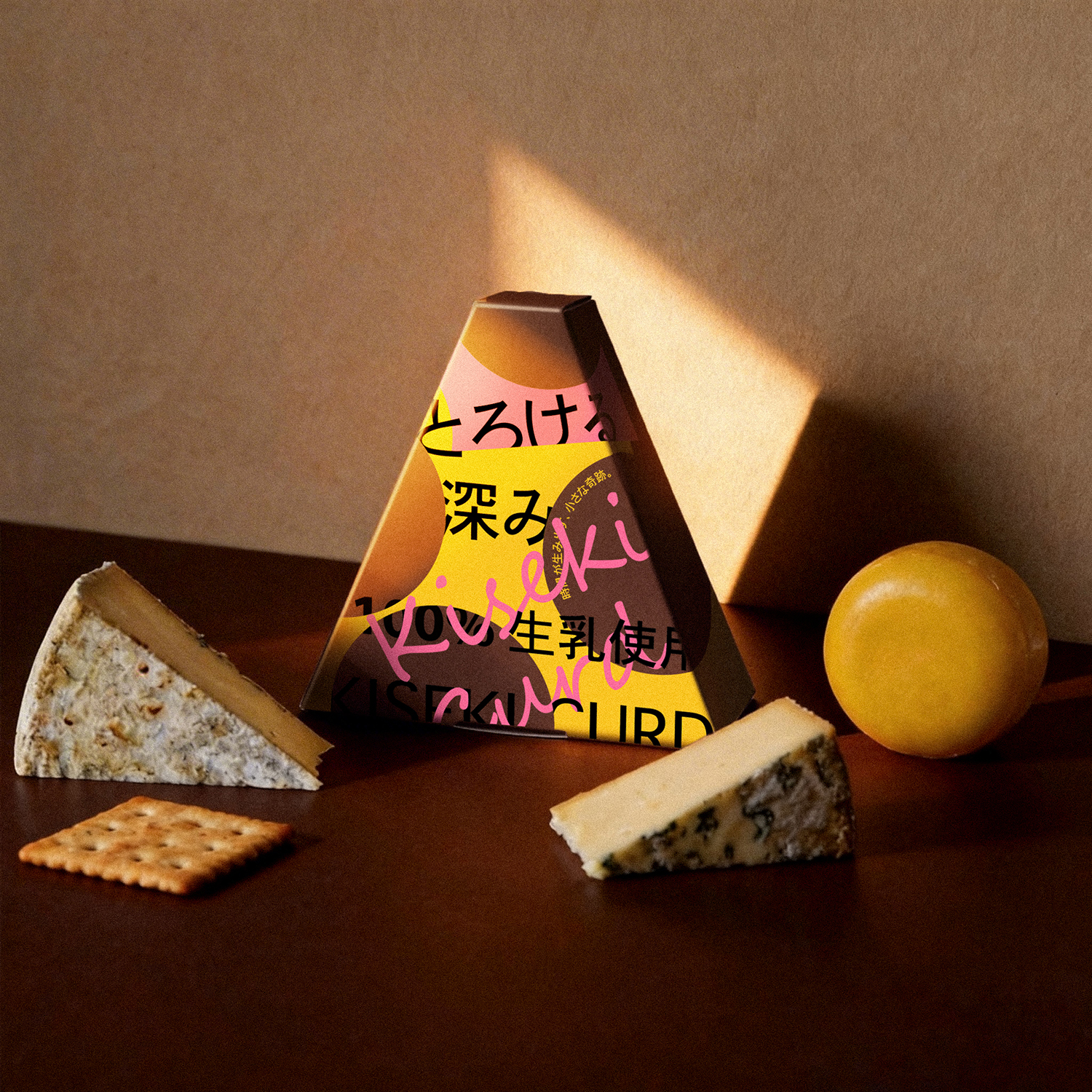
On this basis, the typographic strategy is elevated into a tool of perceptual experience. Through deliberately designed text overlaps, shifts, and mutual obstructions, a spatial relationship of “interlocking” and “layering” is created on the two-dimensional plane. This visual incompleteness and sense of motion directly triggers the viewer’s gustatory imagination, just as the layered flavors of cheese unfold progressively across the palate as it is chewed and melted in the mouth. At this moment, the visual “gaps” and “obscurations” are transformed into the “layers” and “lingering aftertaste” of flavor.
Curator’s Insight
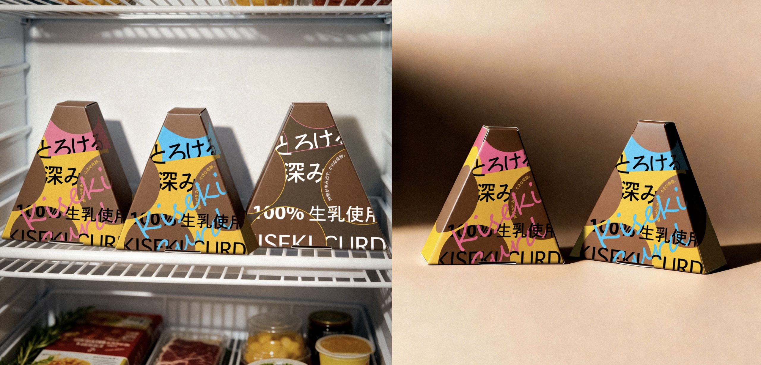
What is quietly compelling here is how the design engineers tension through incompletion. The typography does not simply decorate the surface; it actively performs the product. Characters are cropped by panel edges, obscured by one another, and caught mid-word across folds, creating a visual rhythm that never fully resolves. This is not carelessness. It is a deliberate strategy that recruits the viewer’s eye to finish what the design leaves open, mapping the cognitive act of reading onto the sensory experience of tasting something that reveals itself gradually.
The dual-form packaging system also deserves attention. The cube and the triangular wedge are not just SKU differentiators; they establish a visual ecosystem where the same graphic language behaves differently across geometries. The diagonal stripe that reads as accent on the square becomes directional momentum on the triangle, pulling the eye upward toward the apex. It is a rare case where structural form and surface graphic are genuinely in conversation rather than one simply hosting the other.








 IDEOLOGO
 Eva Chistyakova
 Open Strategy & Design
 cem kutlu
 monther al omari
 Bonsanco Creative Studio
 Confetti Design Studio
 古戈品牌
古戈品牌 Rare Ideas
 Studio Pistache
 Studio Tumpic/Prenc
 Atiq Alam
 bachir bachchar
 Akshita Agarwal
 Carreto Concepts Design Studio
 Hollóka Grafikai Műhely / Graphic Design Studio
 Arsen Avetisyan
 Derrick Lin
 Axiniya Knyazeva
 Hadi Samir
 Furt Goods