

Olea is a personal care brand focused on the inclusivity of skin and hair, closing the gap between genders, body qualities, and personal care needs. Created for women and men with all types of hair and skin, the brand develops products for comprehensive and conscious care of both the body and the planet, understanding that well-being is directly connected to the care of our habitat.
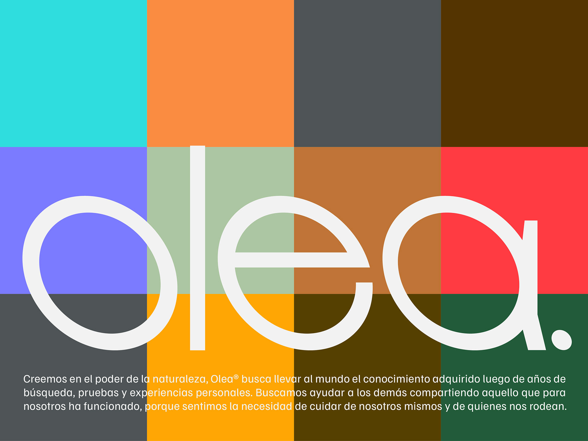
Rooted in the power of nature, Olea brings together knowledge gained through years of research, testing, and personal experience. The brand seeks to help others by sharing what has worked, driven by the need to take care of ourselves and those around us.
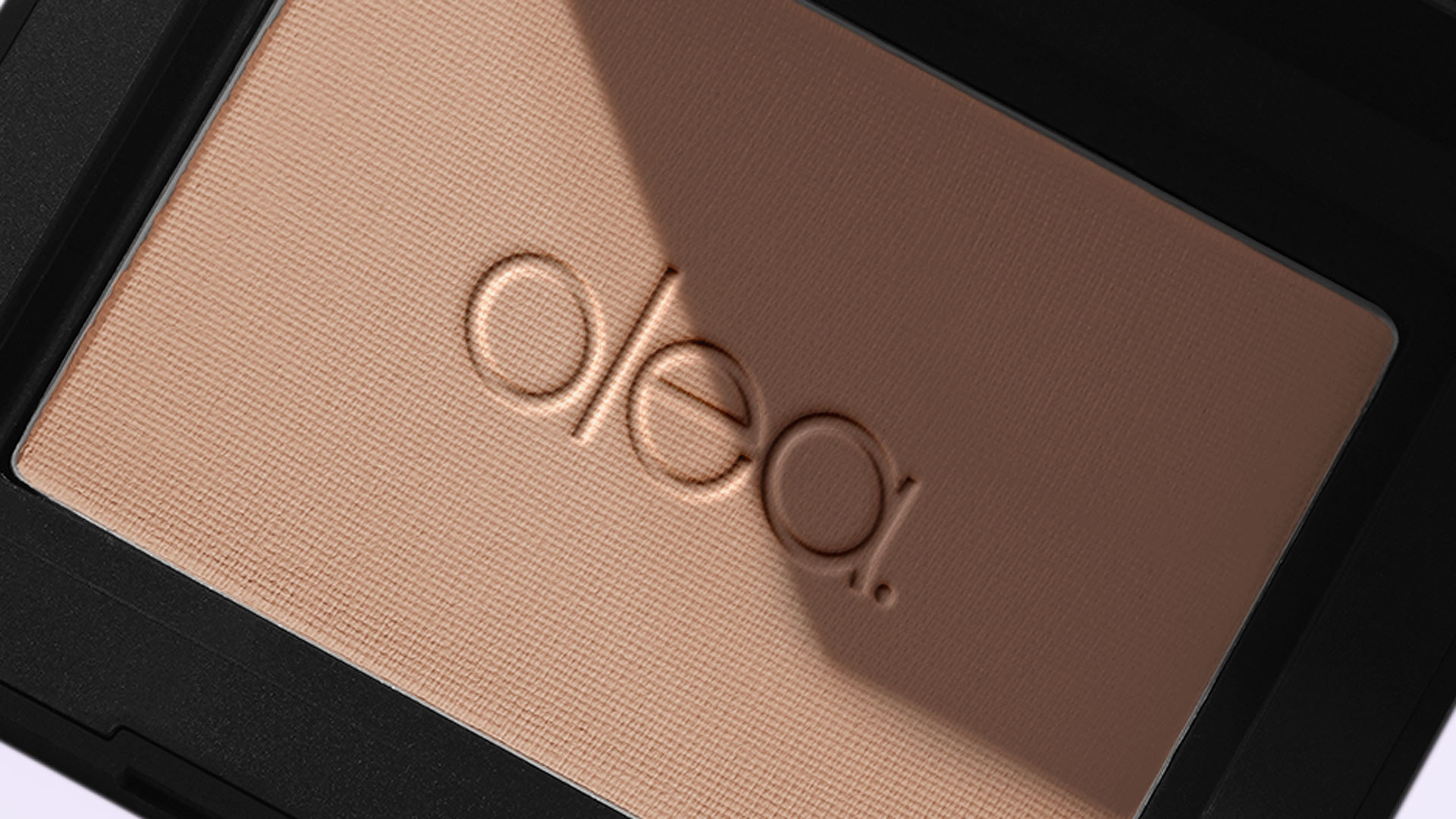
The logo for Olea was developed around the ⬯ shape, inspired by the form of the olive fruit. This organic oval became the main conceptual and graphic reference for the brand symbol, creating a simple and recognizable visual element directly connected to nature, origin, and personal care.
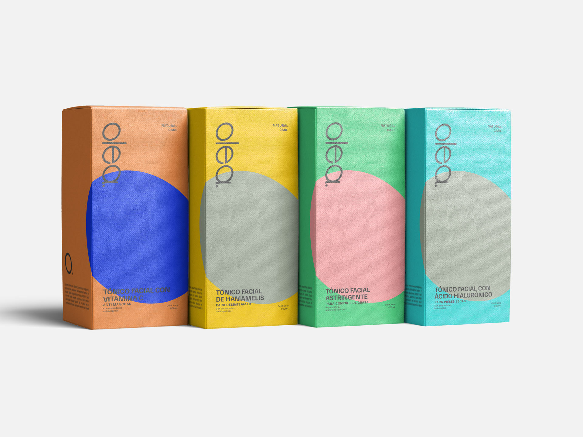
The graphic system was created to organize and categorize each product line through a defined color palette. This allows Olea to differentiate its products while maintaining a consistent visual structure across packaging, labels, containers, editorial pieces, and digital applications.
The editorial system extends the identity beyond the product. Copywriting, layout, color, image treatment, and graphic compositions were defined to create a consistent visual language across brand communication, allowing Olea to speak clearly through both physical and digital touchpoints.
The interface design for web presents Olea through product categories, brand messaging, visual storytelling, and a clean structure that supports both communication and commerce.
Curator’s Insight
What stands out here isn’t just the color system… it’s the restraint. Each variant gets a single saturated circle against cream, and that’s enough. The olive-derived oval quietly anchors every SKU without ever needing to explain itself. There’s a confidence in how little the label asks of you: the form reads immediately, the product category follows, and the amber glass does the rest. Olea feels like a brand that’s been edited down to only what matters… which, for a line built around conscious care, seems exactly right.




 Derrick Lin
 Biaa
Biaa Petitmoulin Studio
 White Bear Studio
 Eva Chistyakova
 monther al omari
 Atipus
 alchimistestudioParis
 oneandother
 bloomburo
 helocrene
 Shapers Studio
 Denver Design
 Aidearte
 andrew.huerta
 softmachine
 airobtq
 Buzz & Co.
 Ruby
Ruby themythographer
 IDNB Inc.
 viktorflr
 Zenpack