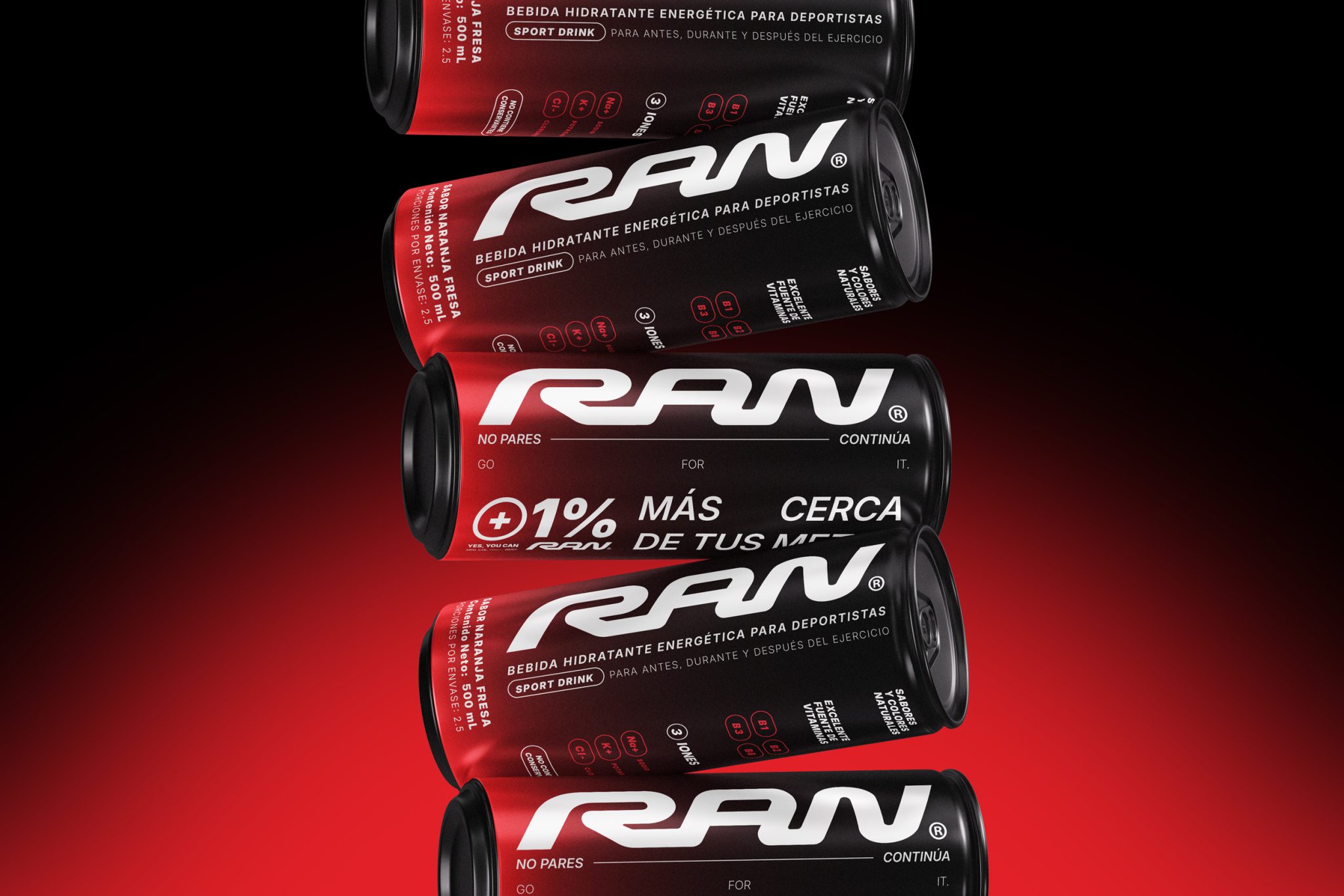

RAN was built as a hydration and energy brand around one clear idea: moving forward. Not from extreme performance or unattainable competition, but from everyday progress: moving, improving 1% each day, and understanding that any goal counts as long as there’s action behind it. From there, the brand stops being just a sports drink and becomes a voice of momentum: liquid motivation for a community in motion.
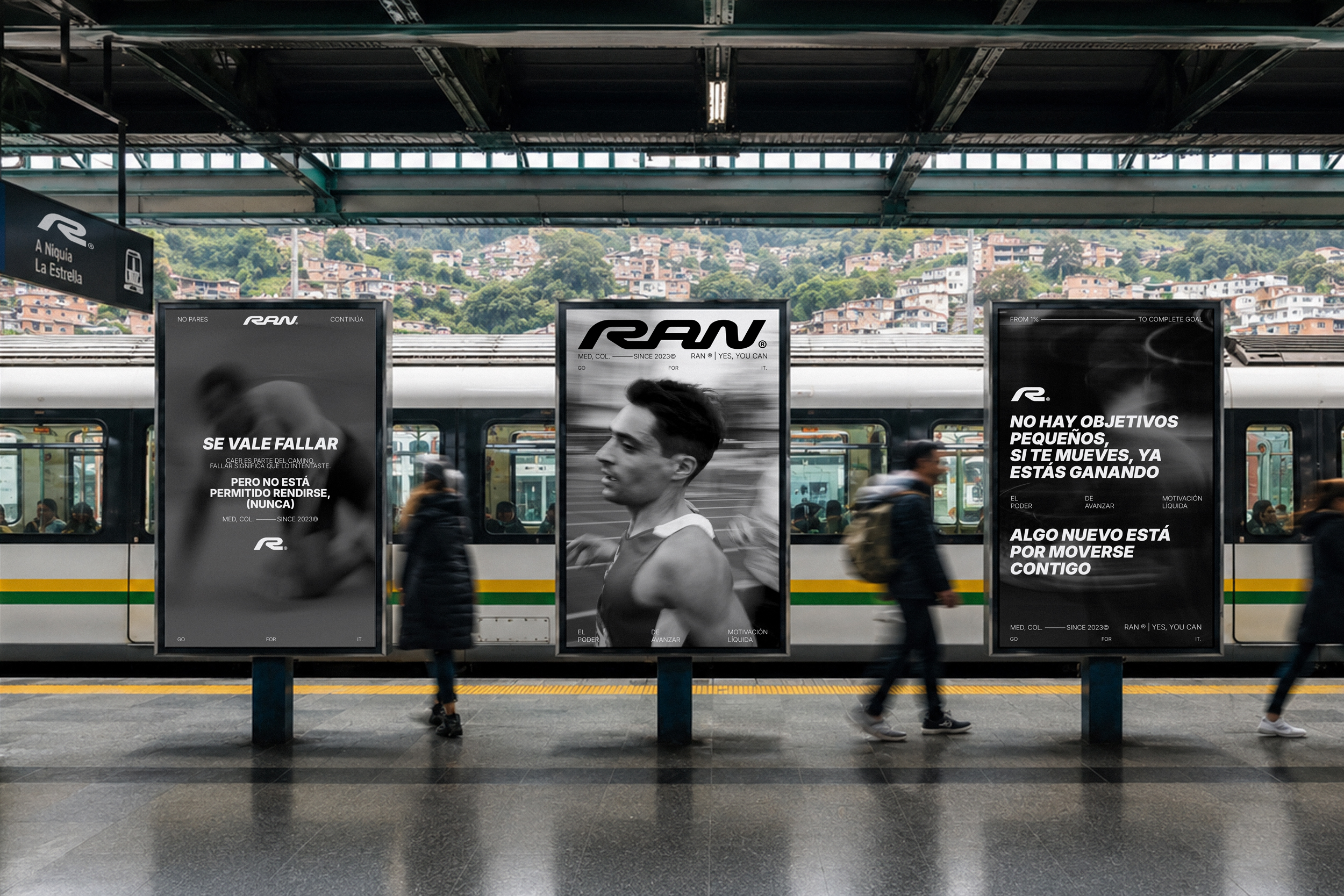
The strategic challenge was shaping a sports brand with its own character, capable of connecting with a culture broader than traditional fitness. RAN speaks to the runner, the athlete, the competitor and equally to anyone simply trying to push forward in their own process. The solution was building an identity system that blends energy, discipline, street, speed and community under direct messages like “Go for it”, “Yes, you can” and “There are no small goals. If you’re moving, you’re already winning.”
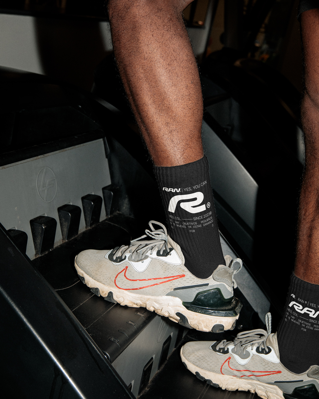
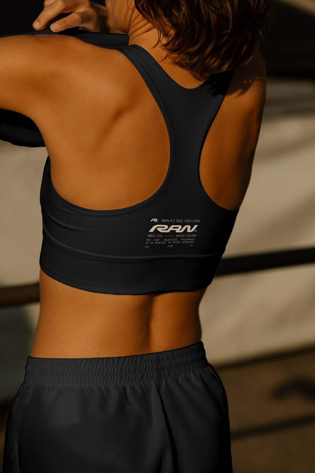
On the design side, we developed a high-impact visual identity: a custom typographic logo, compact and fluid, built with continuous forms that evoke movement, speed and direction. Its curves and cuts create a sense of trajectory, as if the word itself were in constant motion. The brand leans on a primarily black and white palette, with vibrant red and green accents that activate the system and differentiate flavors, products and communication moments.
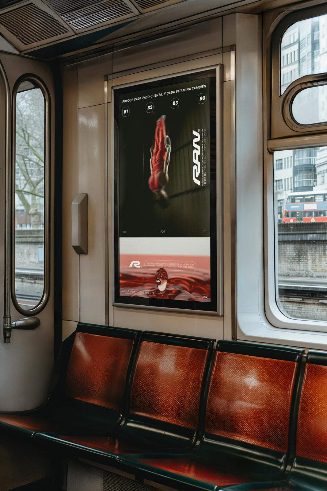
The graphic universe was resolved with an intense visual direction: motion photography, blur, bodies in action, liquids, high contrast and a sports/urban aesthetic that feels technical, aspirational and approachable all at once. Inter typography brings clarity, functionality and editorial weight, letting the system work across commercial pieces, social media, web, packaging and brand communication.
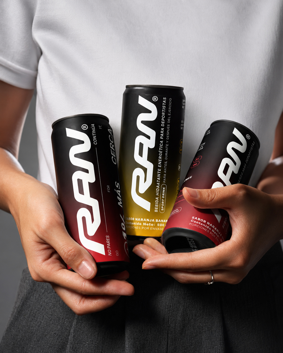
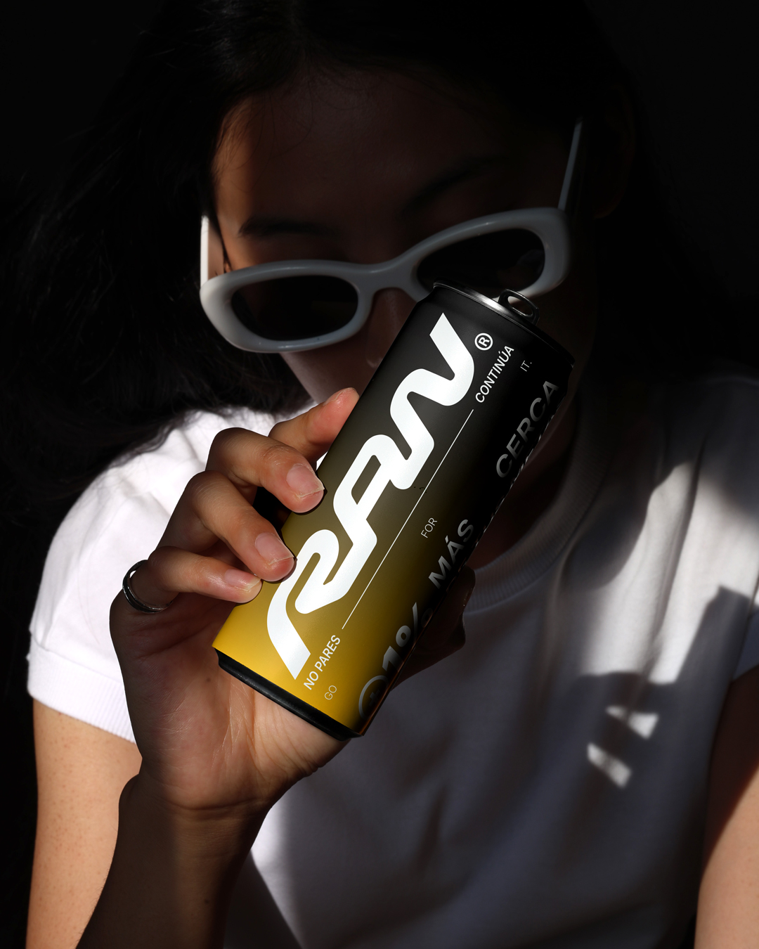
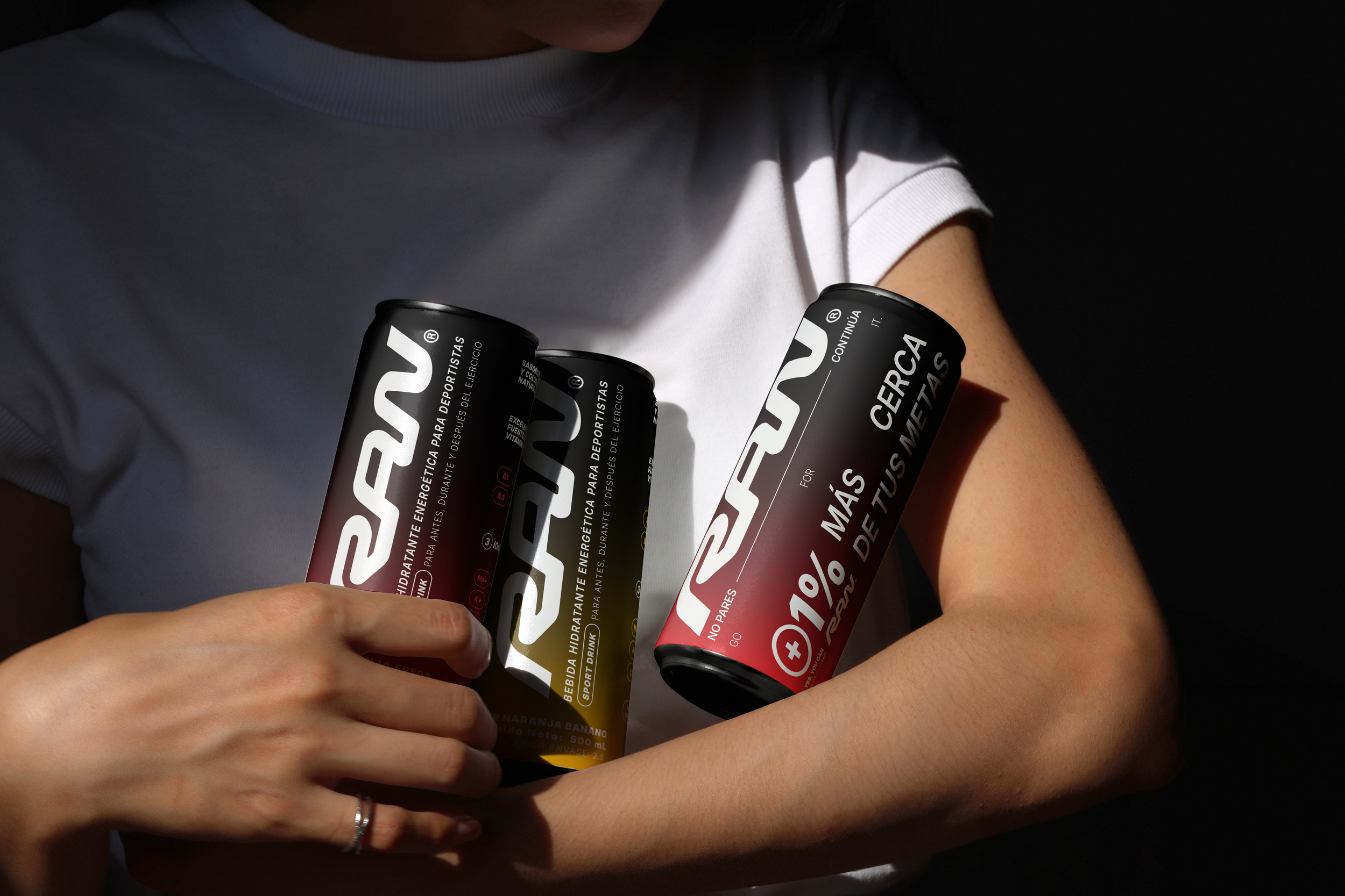
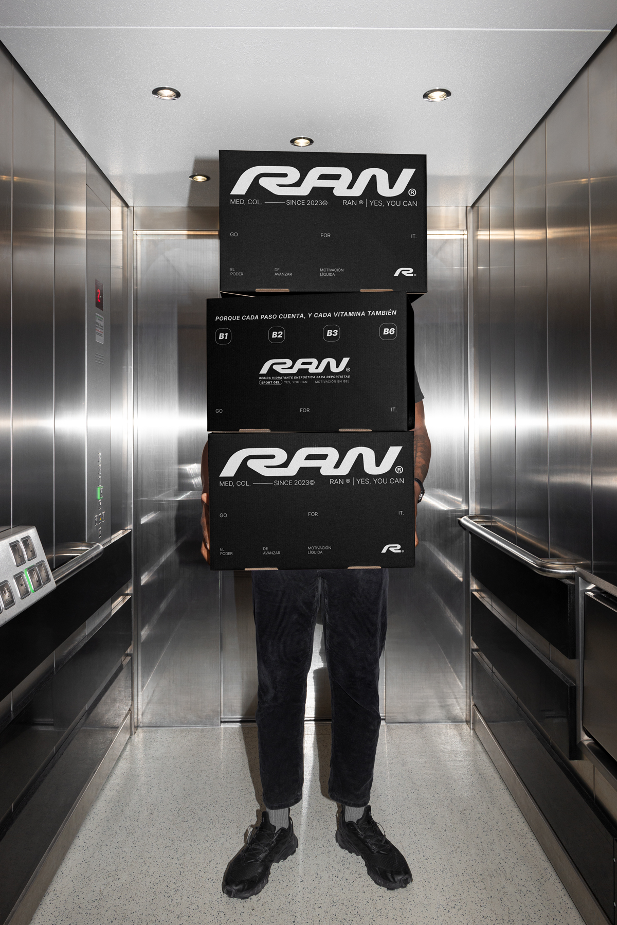
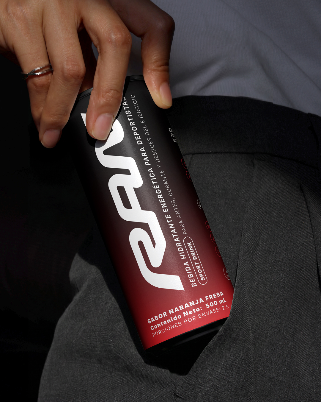
In packaging, RAN was developed as a product with strong shelf presence: black bottles, vertical logo as the hero element, blocks of technical information, flavor visual codes and details that reinforce the performance feel. Complementary formats like sachets and gift boxes were also explored, extending the brand toward a more complete experience of community, launch and belonging.
Taken together, RAN’s branding transforms a drink into a symbol of progress. A brand that doesn’t just sell hydration, it sells drive, consistency and attitude. An identity built to live in product, social media, community and contemporary sports culture.
 NEV
NEV Stefano Bracci
 Alina
Alina monther al omari
 Lizakjx
 JOAOMARCOSDESIGN
 alchimistestudioParis
 Harriet Neild
 octavio rojo
 宏洛图品牌设计HONGLT
 DESIGN CONCEPTS
 Alexander Skurihin
 Studio K95
 ARMBRAND
 Richa Rai
 houseoferas by Miti
 Agence des Coteaux
 Kushi Eaknath
 Ann Treasa
 Xiao Ning
 krrrrrllii
 babyage
 Deep
Deep