
Solspill: A Lifestyle-Driven Hydration Brand
Solspill is a premium hydration brand created to transform the way people experience everyday moments. More than a functional drink, it was designed as a lifestyle companion that connects energy, flavor, and experience into a single, cohesive brand.
Challenge:
The hydration market is saturated with products that either lean too heavily on performance or fall into generic, tropical-driven aesthetics. Most brands communicate function, but fail to create emotional connection or cultural relevance. The challenge was to build a brand that could stand out in this crowded space by moving beyond utility and creating a strong lifestyle positioning through naming, verbal identity, visual identity, and packaging.
Solution:
Solspill was born from a personal insight. During a period of travel, the founder identified a gap in the market. There was no drink that truly captured the energy of real-life experiences. Existing options felt either too clinical or disconnected from the moments people actually value.
From this starting point, the brand was built around a clear idea. Hydration should not feel like an obligation, but like an experience that enhances and elevates everyday life.
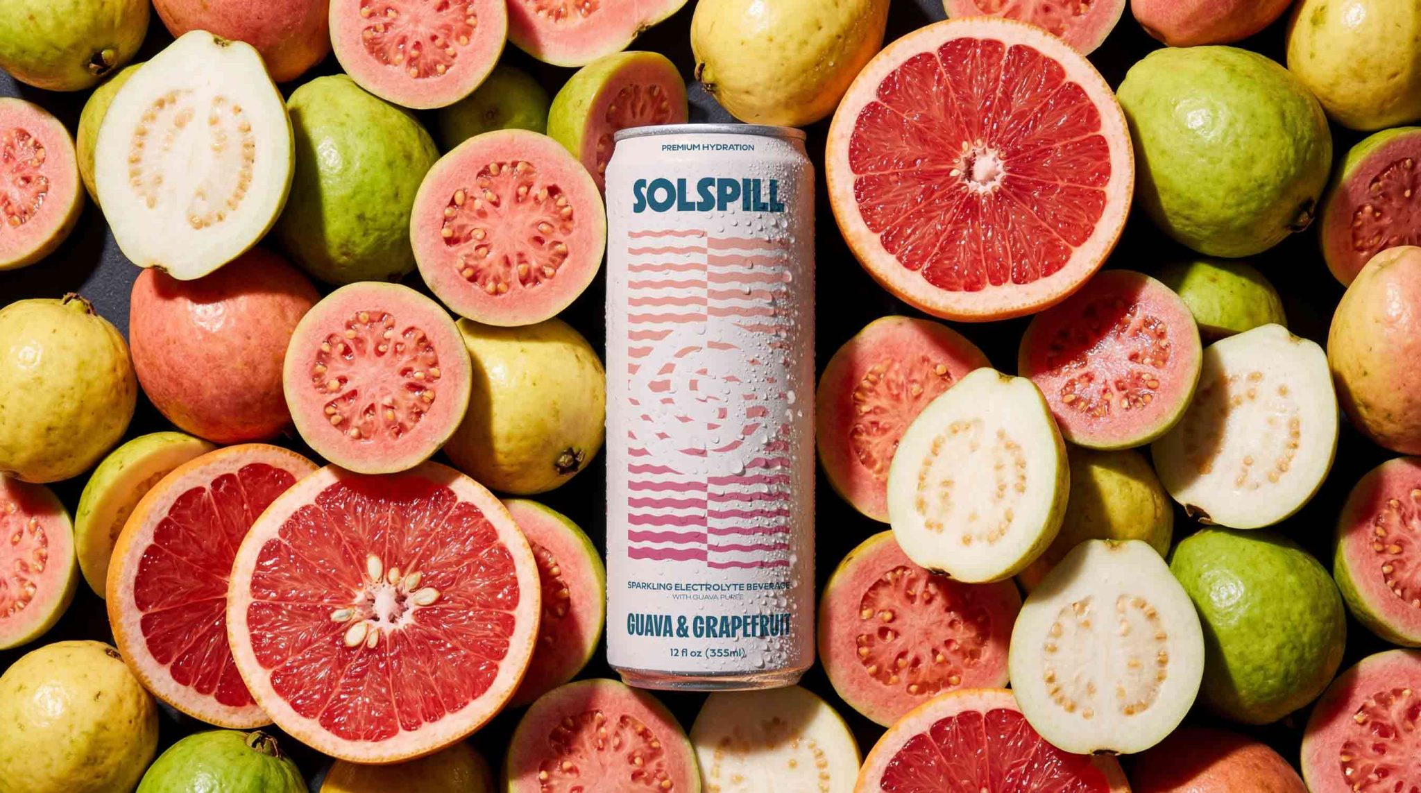
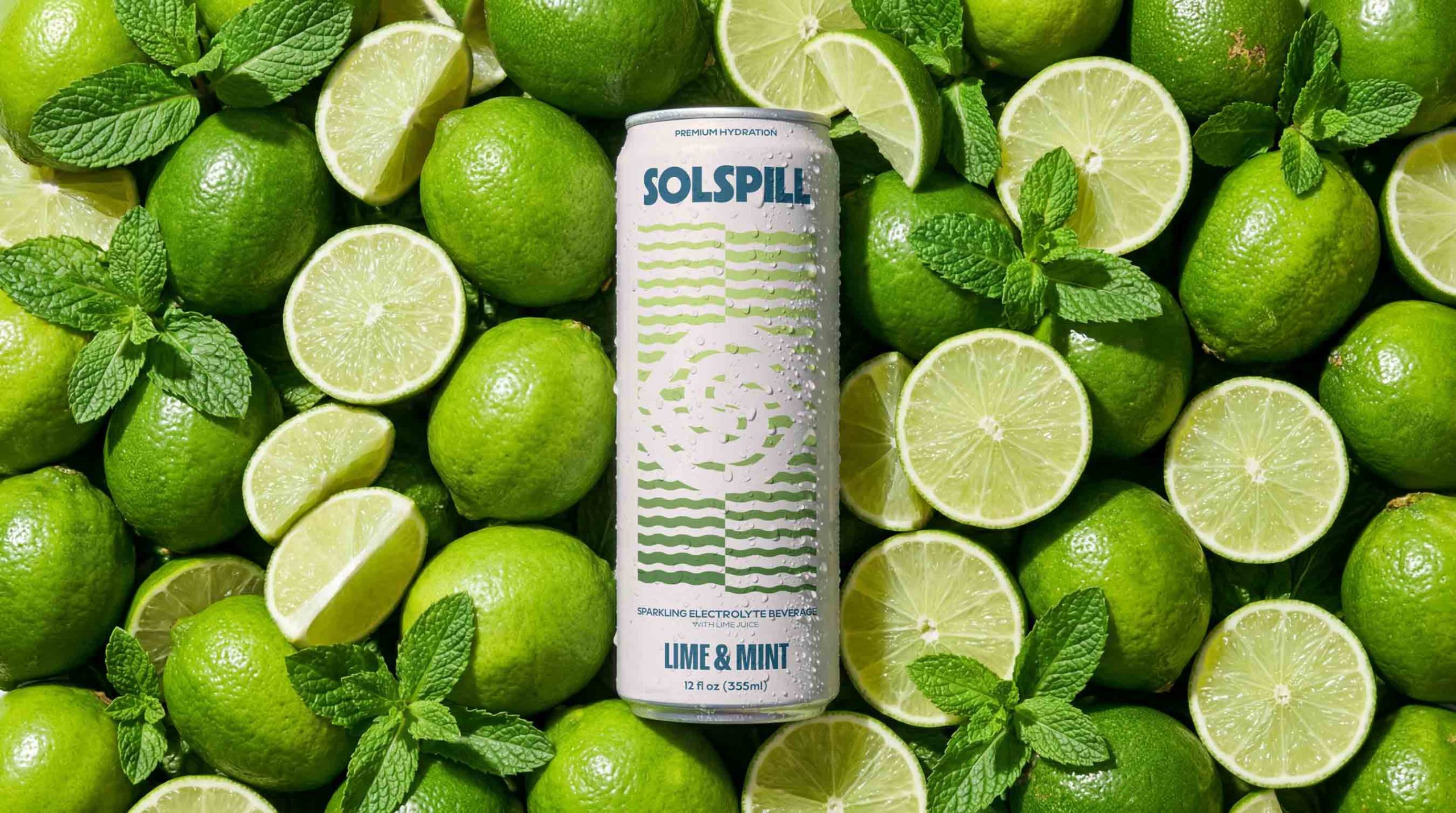
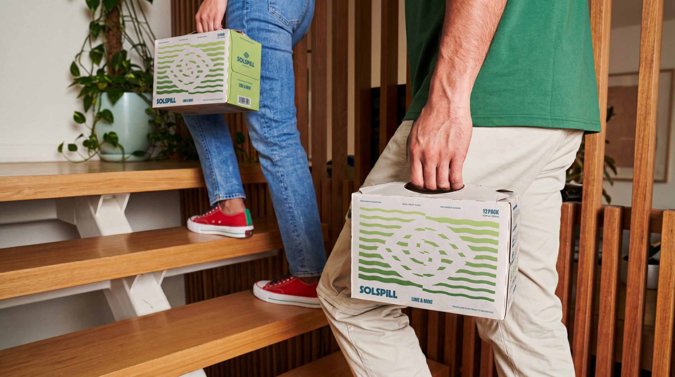
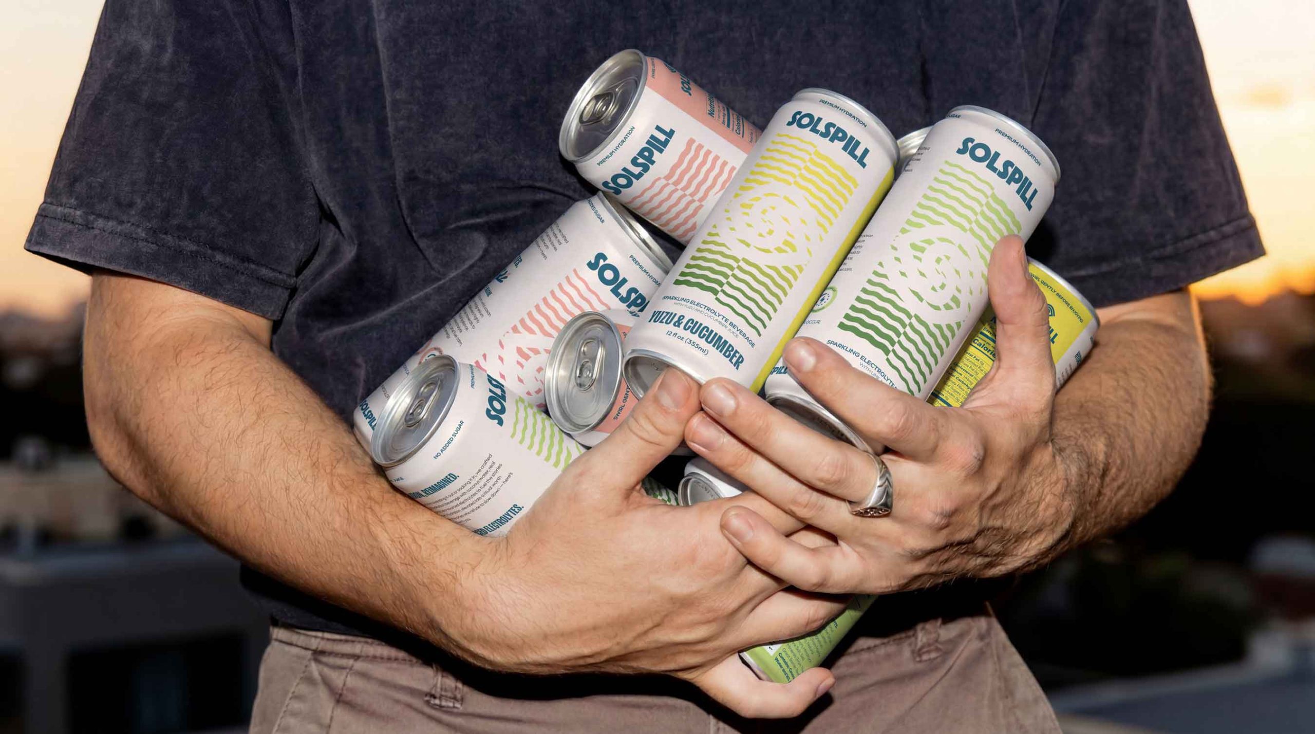
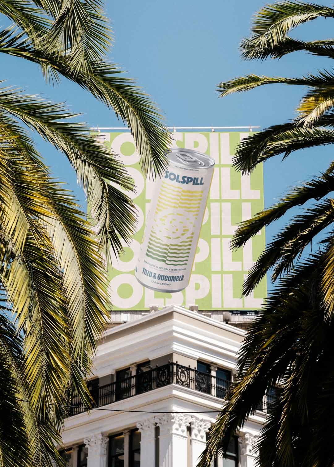
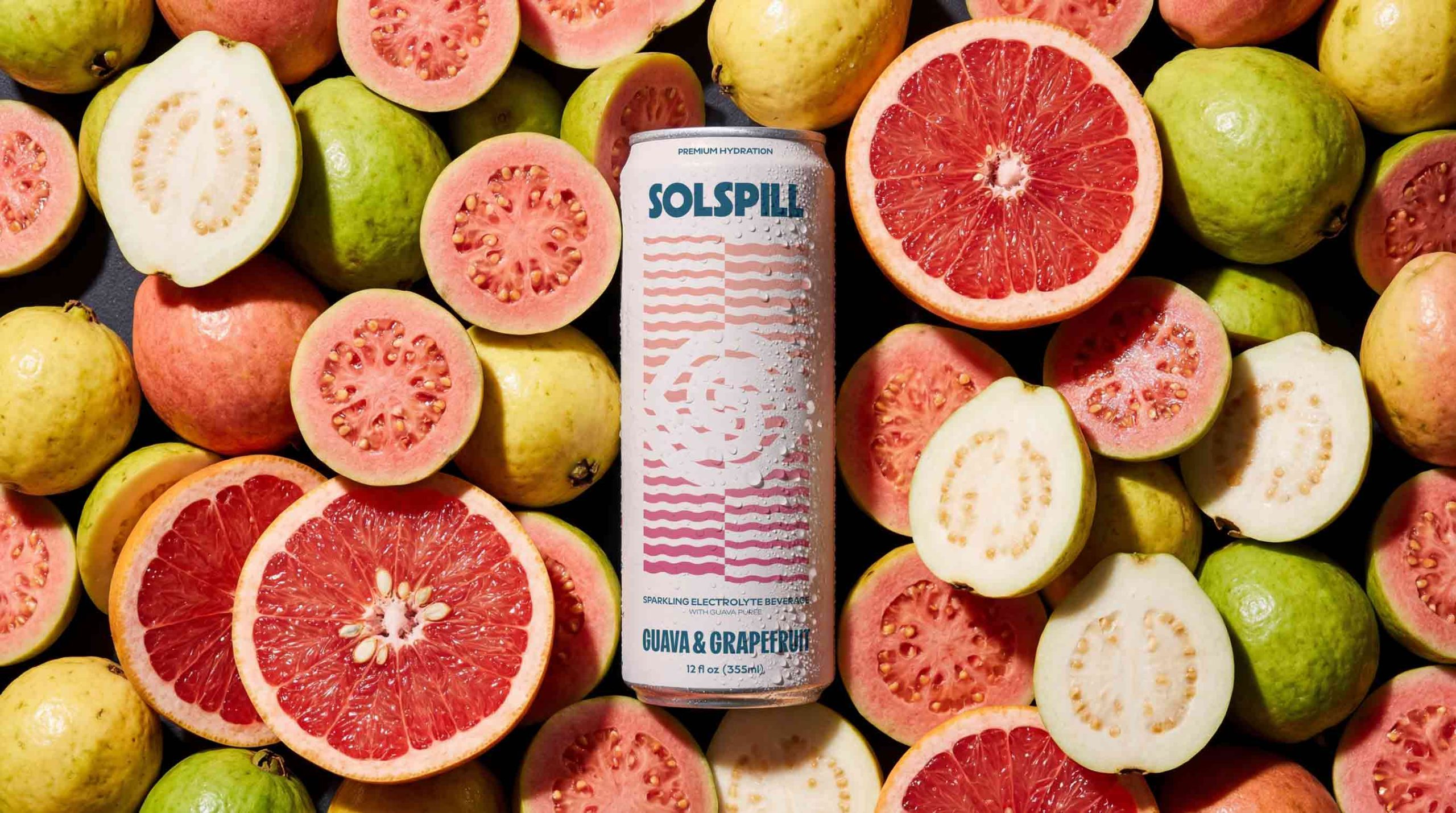
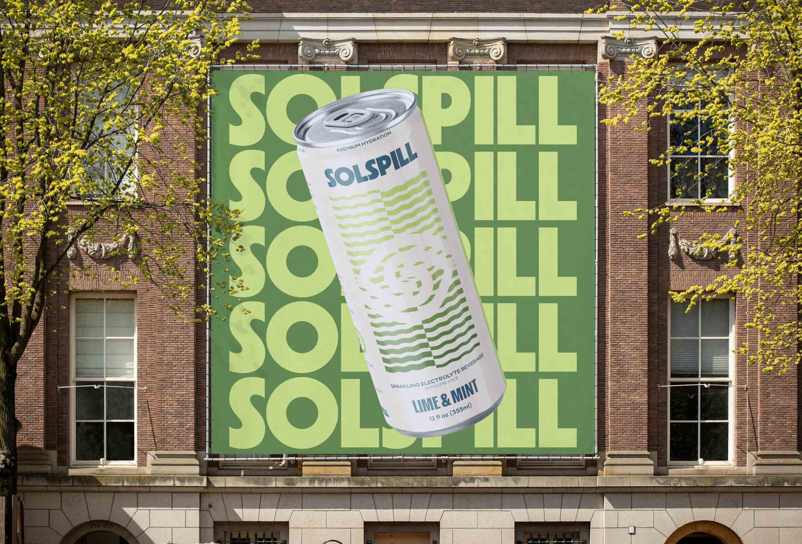
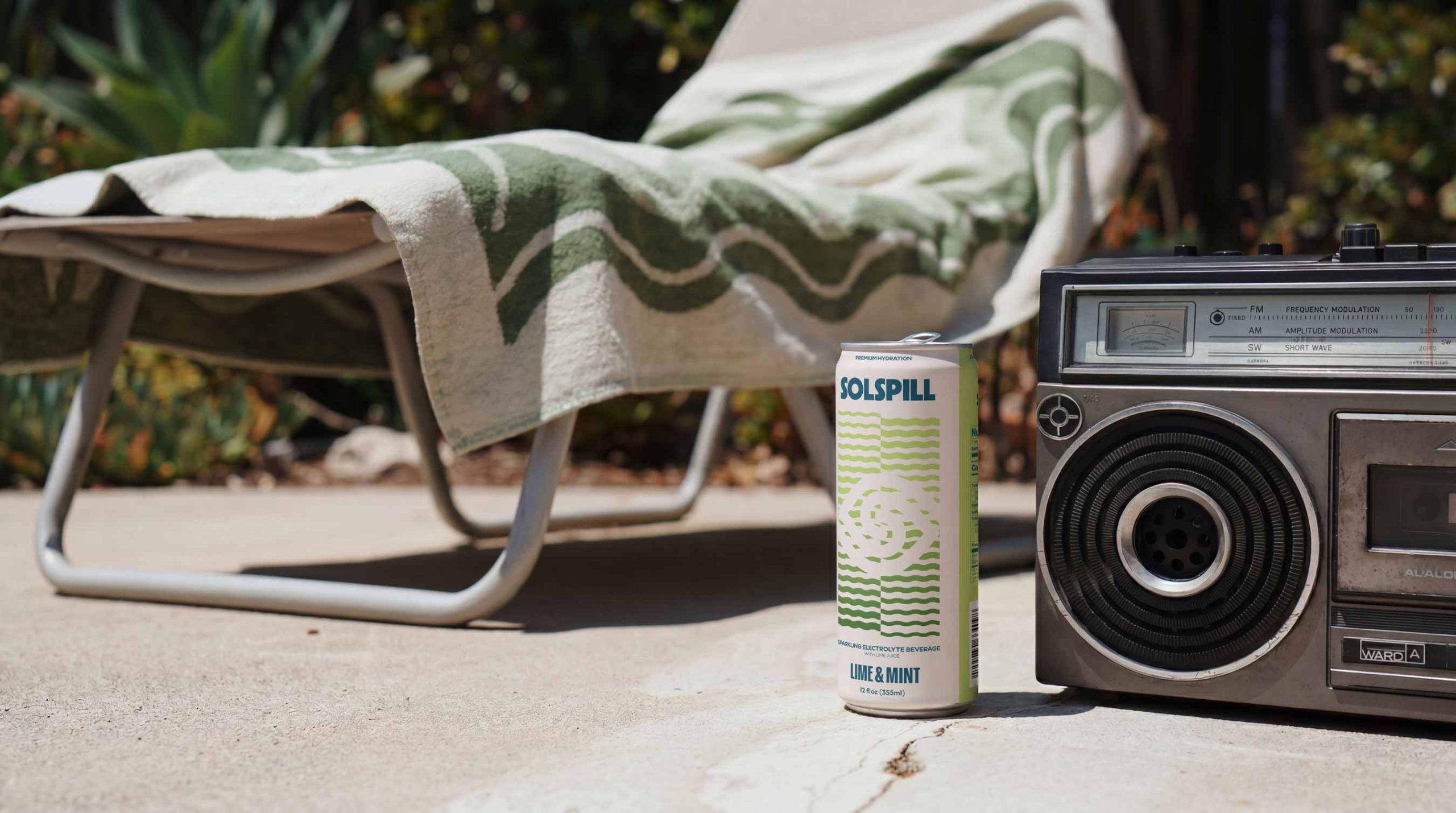
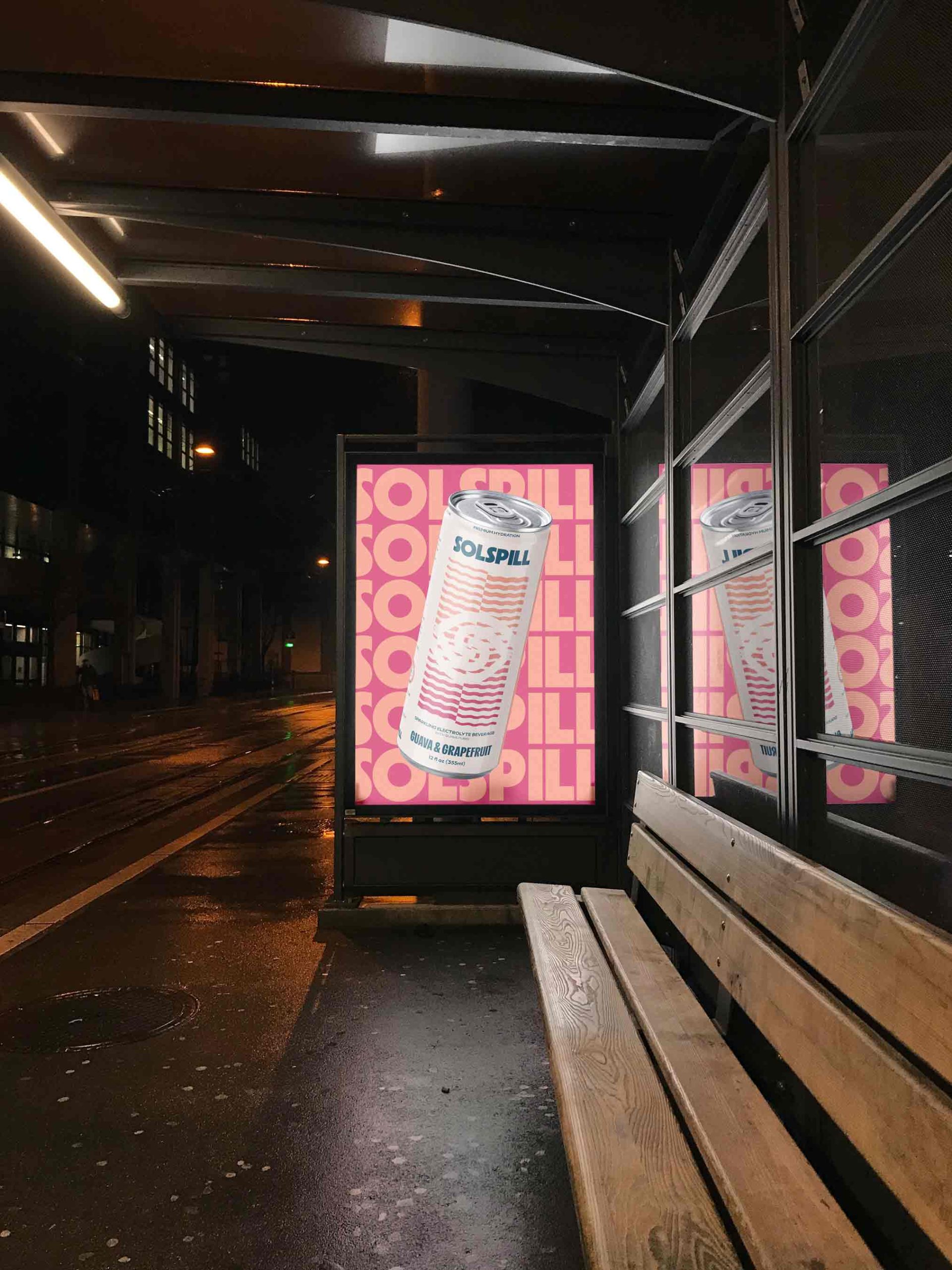
This thinking shaped the entire brand system.The name Solspill reflects this dynamic and expressive positioning. It carries a sense of movement, energy, and spontaneity, aligning with a brand that lives within moments rather than outside of them. Instead of describing the product directly, it suggests a feeling, allowing the brand to operate on a more emotional and aspirational level.The verbal identity reinforces this direction by focusing on experience rather than function. Instead of technical or performance-driven language, the brand communicates through themes of energy, connection, exploration, and presence. It positions Solspill as part of social moments, travel, and everyday experiences, creating a narrative that people can see themselves in.The visual identity translates this strategy into a system that balances clarity with impact. Fluid shapes, controlled contrasts, and a mix of warm and cool tones create a sense of movement and vitality while maintaining a premium and refined aesthetic. This approach allows the brand to stand out without relying on exaggerated or overly aggressive visuals, which are common in the category.Packaging plays a central role in bringing the concept to life. As the main touchpoint, the can was designed to perform both on the shelf and in digital environments. The final result combines strong visual presence with a clean and modern layout, ensuring recognition, desirability, and shareability.
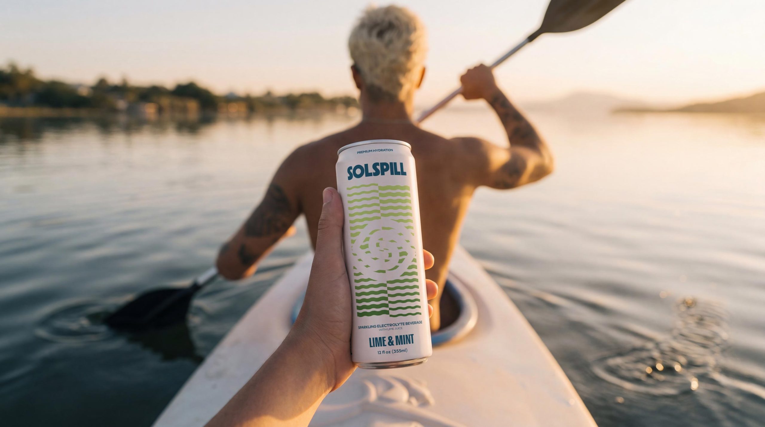
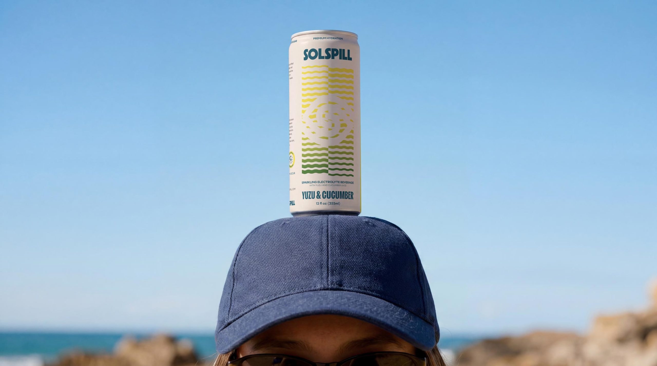
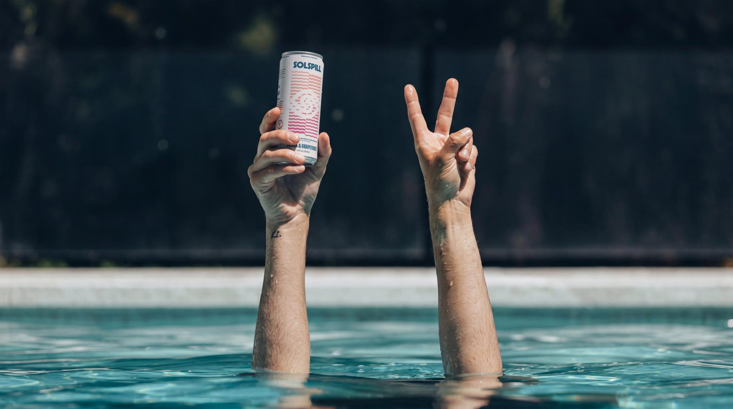
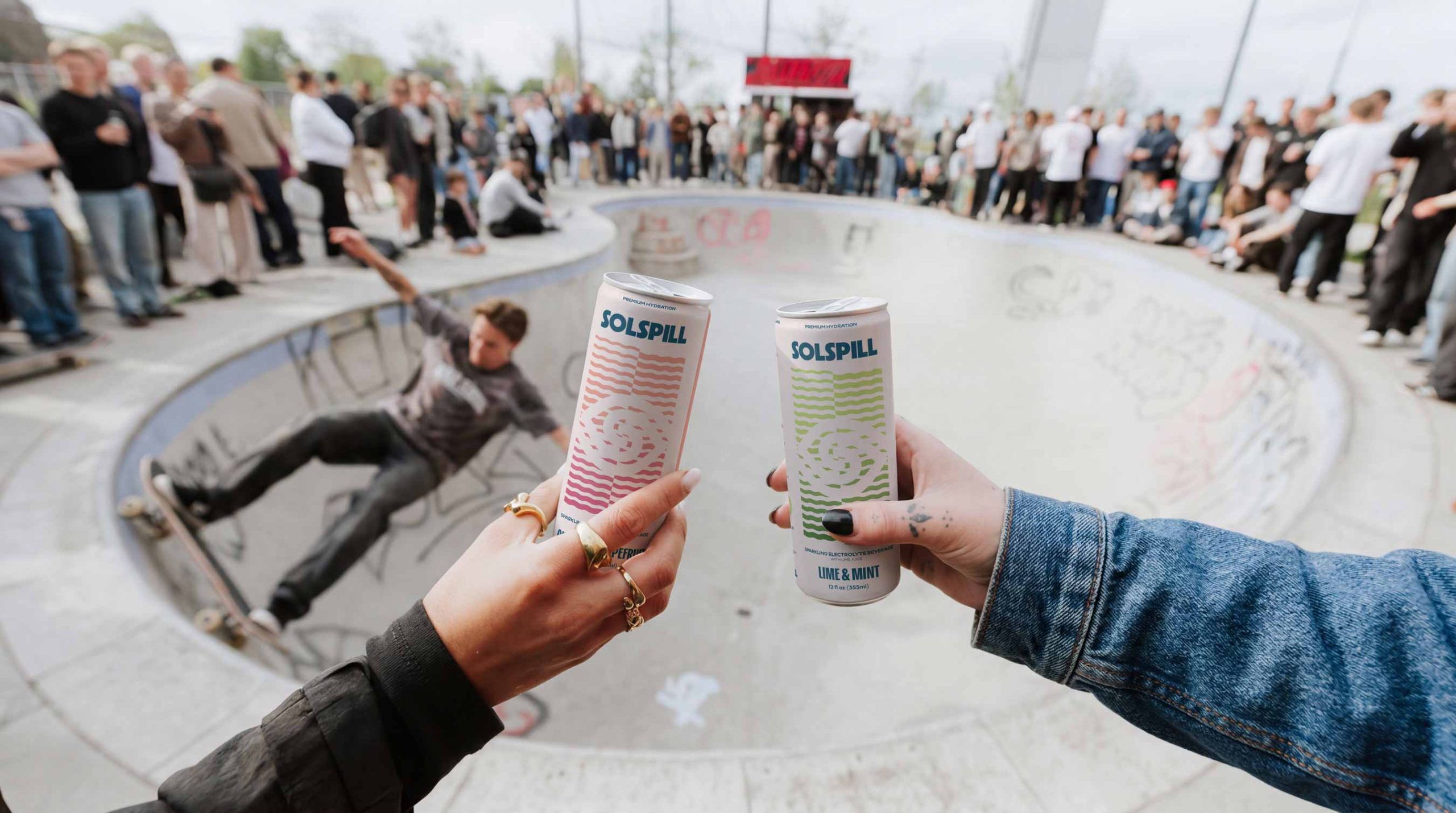
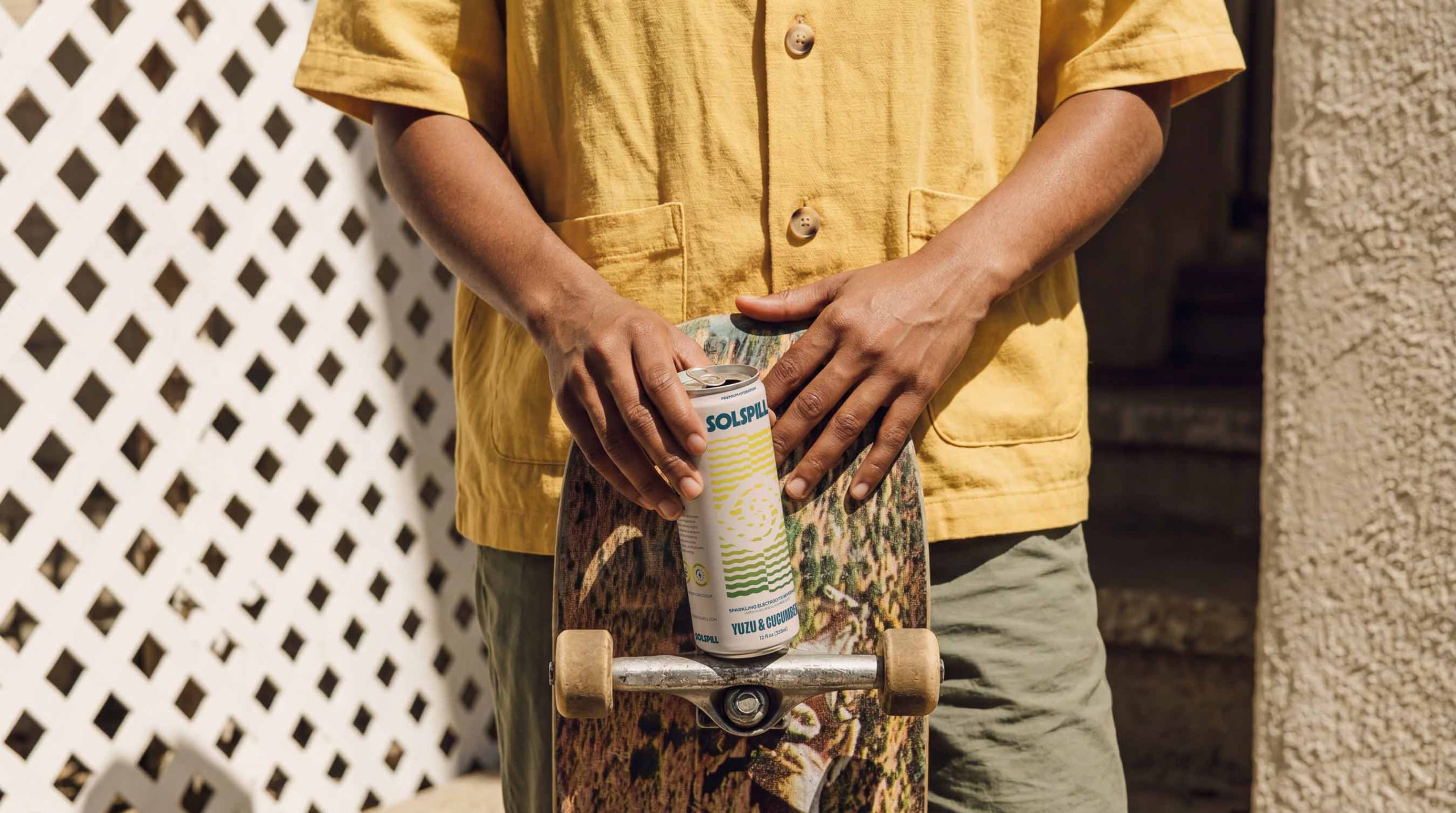
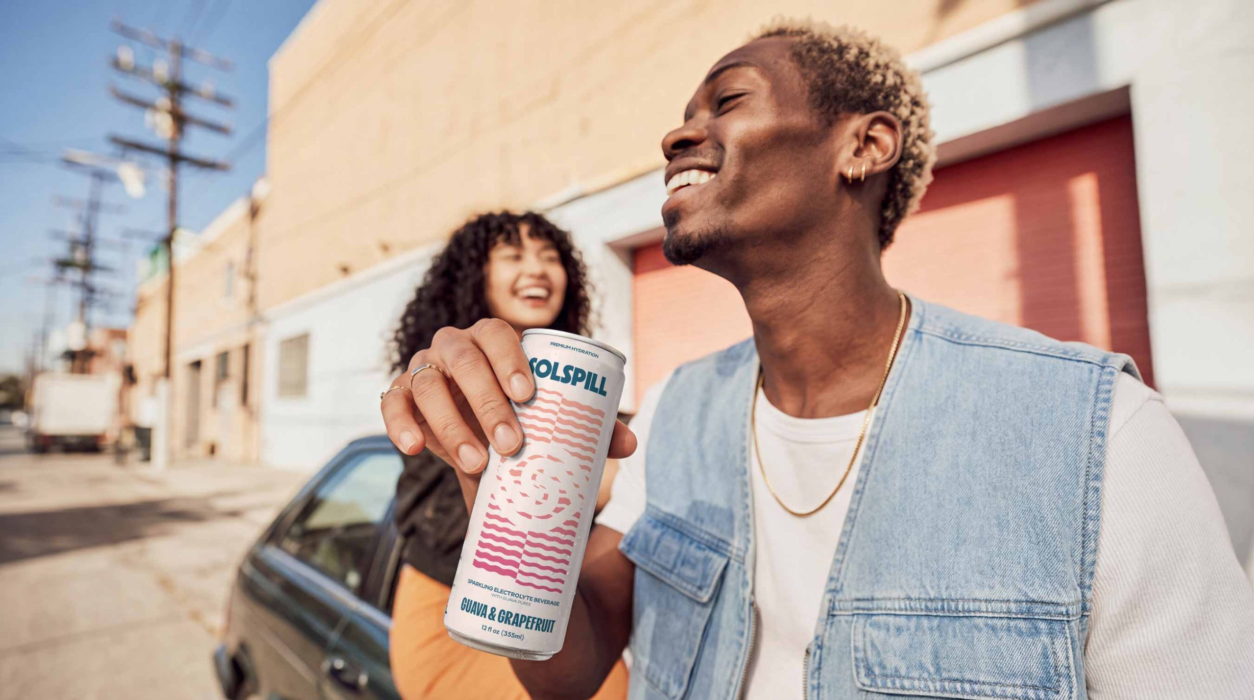
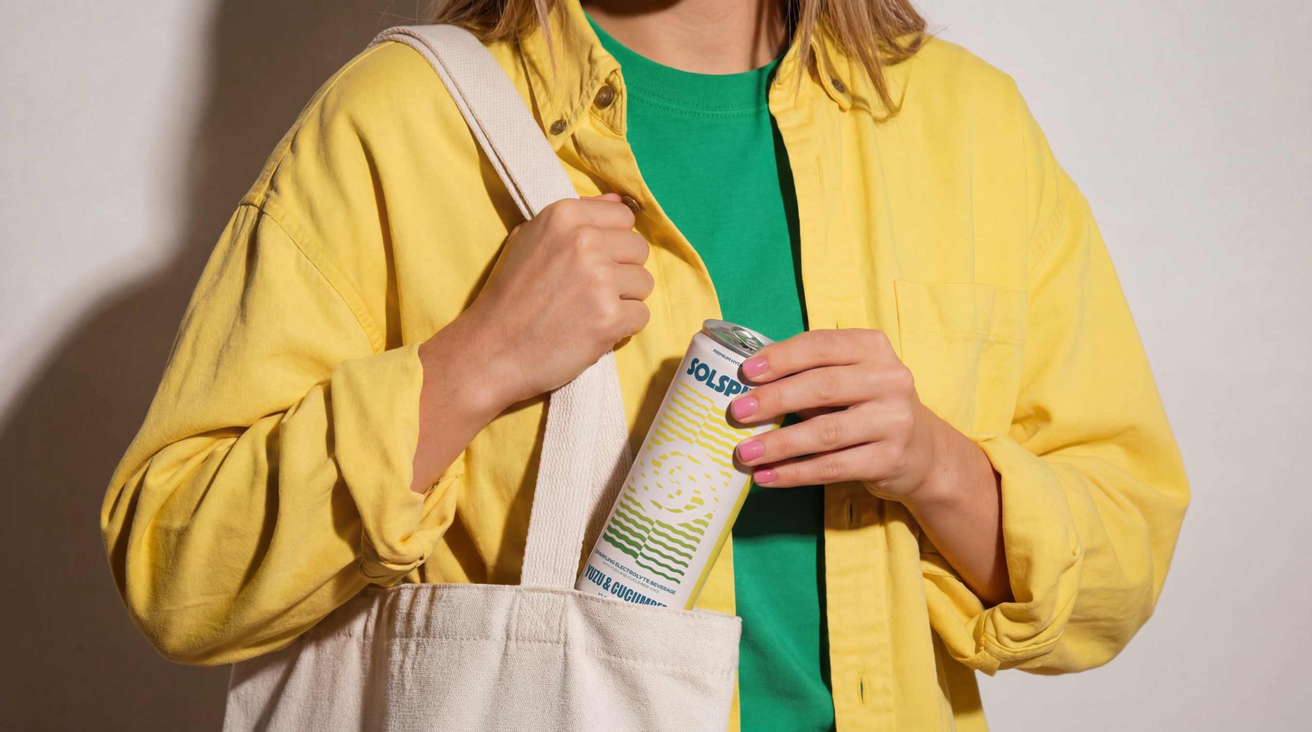
Photography and art direction extend the brand into real-world contexts. Instead of isolating the product, the imagery focuses on people, movement, and social interaction. The drink becomes part of the moment, reinforcing its role as a lifestyle element rather than just a functional product.By aligning strategy, identity, and execution, Solspill establishes a clear position in the market. It operates between hydration, energy, and lifestyle, offering both functional benefits and emotional value. The result is a brand that not only delivers on performance, but also creates meaning, connection, and relevance in the lives of its audience.





 Derrick Lin
 Biaa
Biaa Petitmoulin Studio
 White Bear Studio
 Eva Chistyakova
 monther al omari
 Atipus
 alchimistestudioParis
 oneandother
 bloomburo
 helocrene
 Shapers Studio
 Denver Design
 Aidearte
 andrew.huerta
 softmachine
 airobtq
 Buzz & Co.
 Ruby
Ruby themythographer
 IDNB Inc.
 viktorflr
 Zenpack