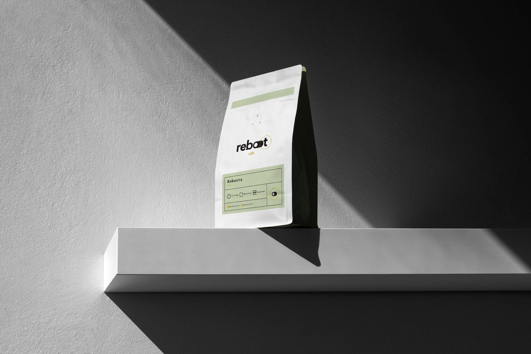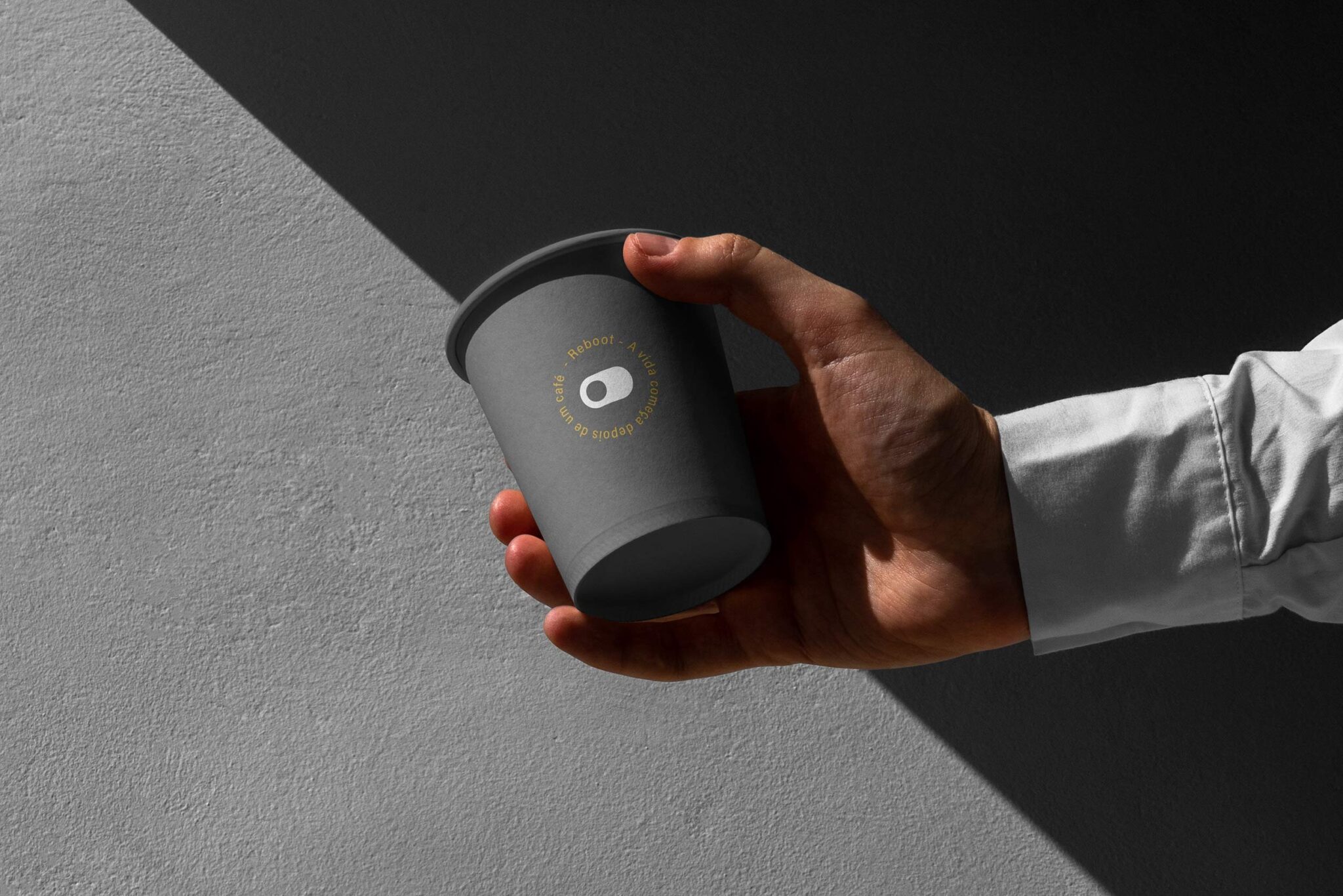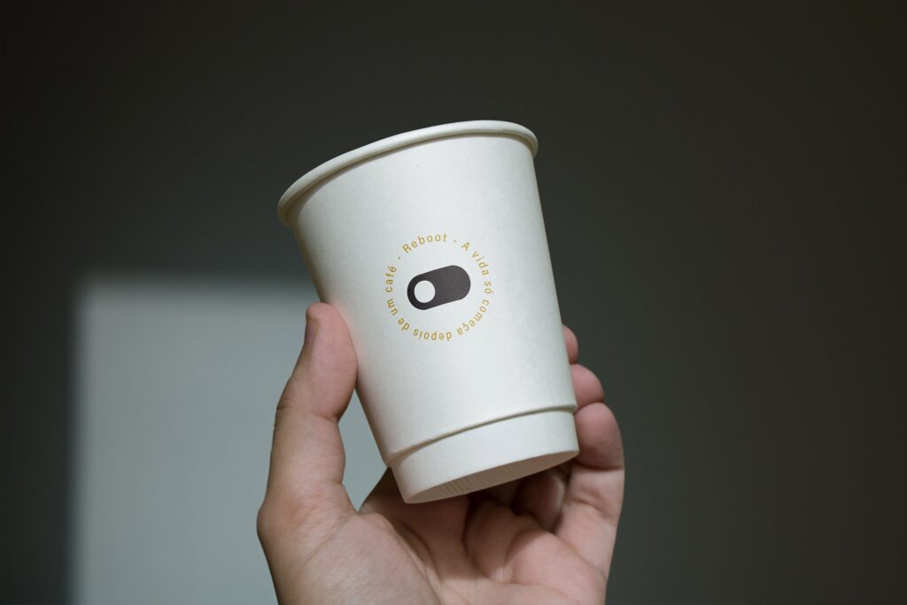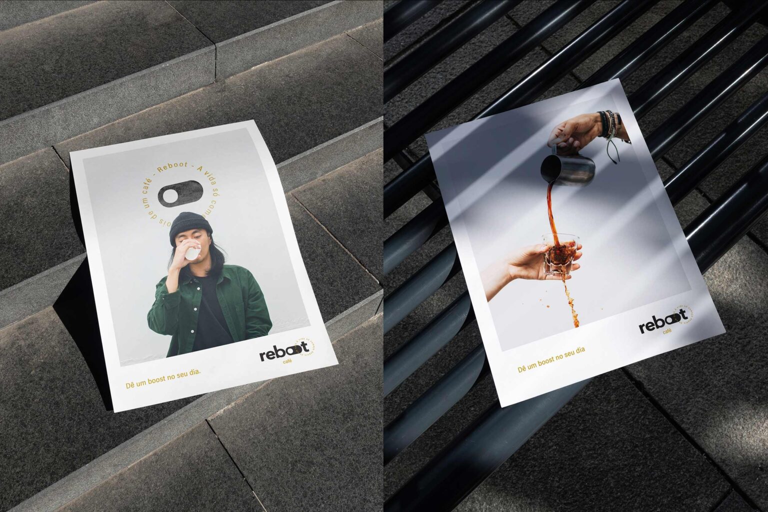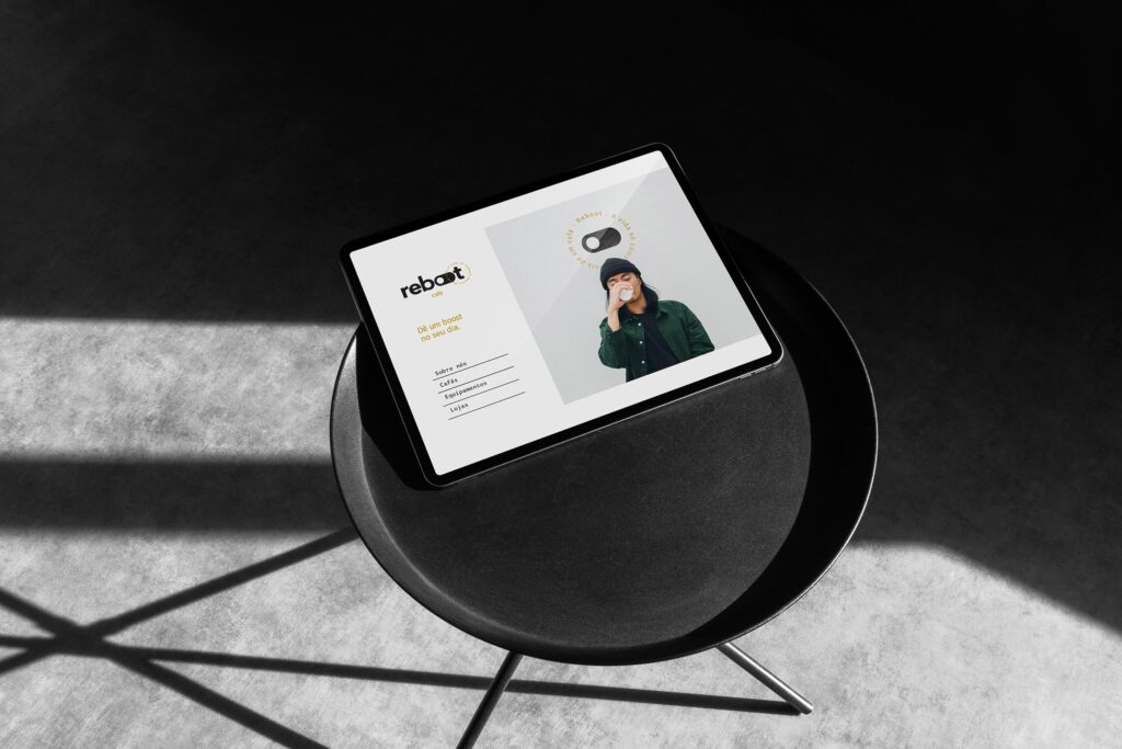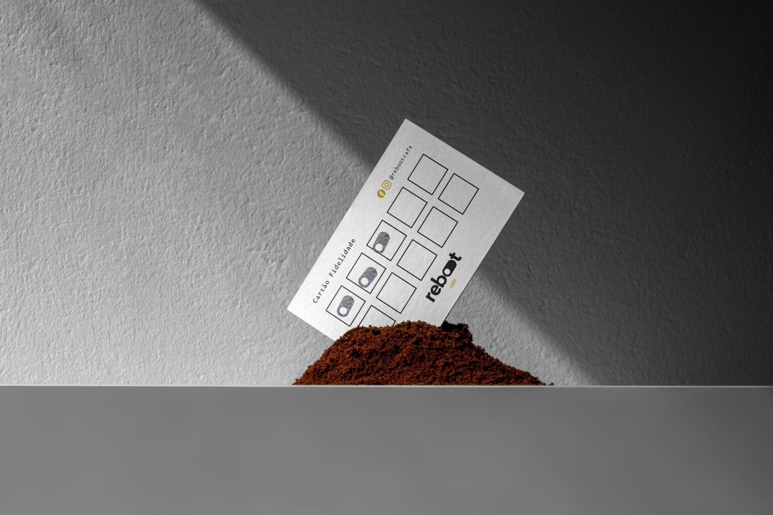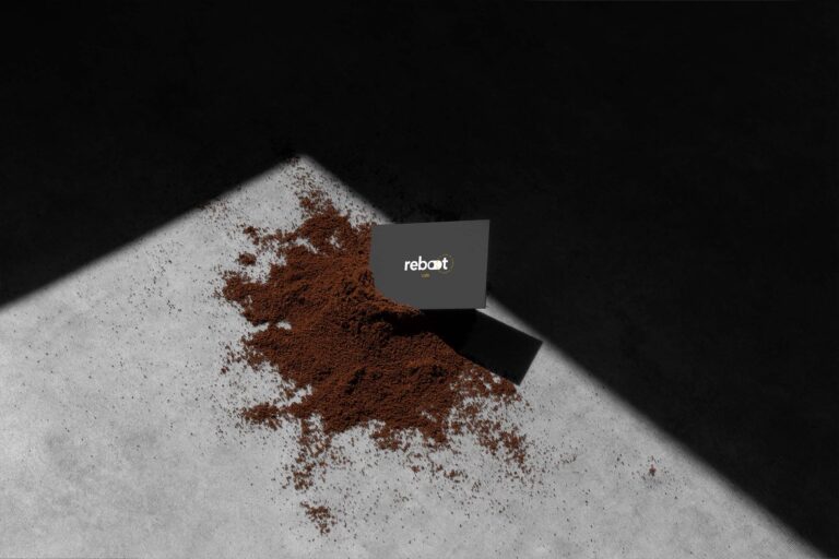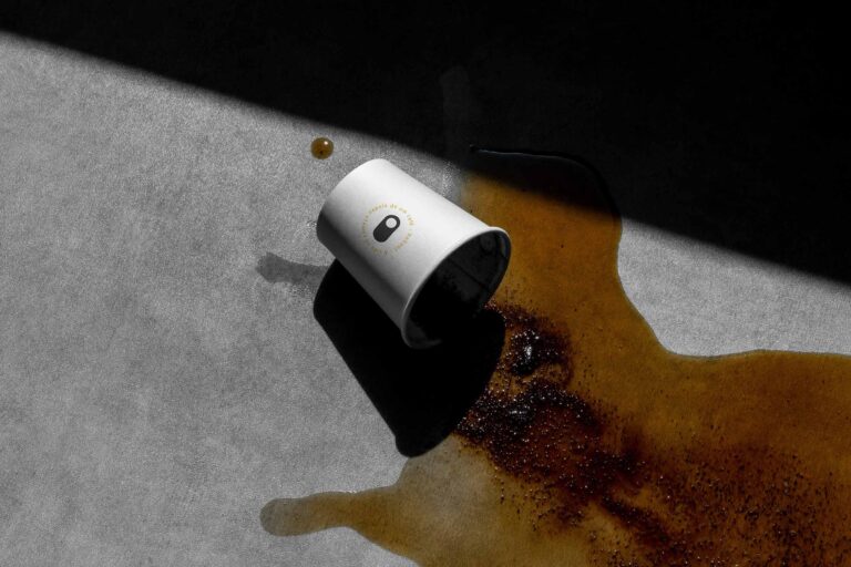
Reboot Cafe offers a minimalist visual identity for its coffee brand, effectively showcasing its values through a sleek and elegant design. The brand’s logo, color palette, and packaging all contribute to its charm. The Reboot Cafe logo features a switch button, reflecting the energizing effects of coffee and conveying the brand’s focus on activity and renewal. The use of black and white creates a harmonious, organized look, emphasizing the brand’s clarity and simplicity.
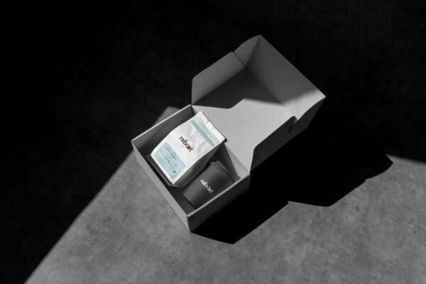
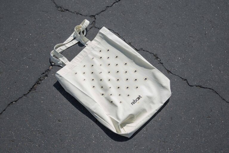
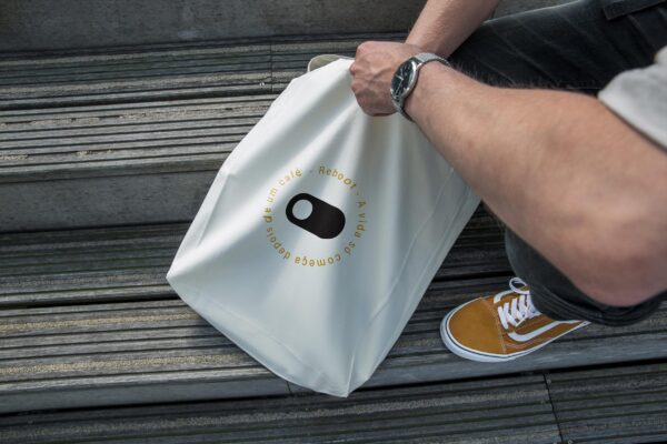
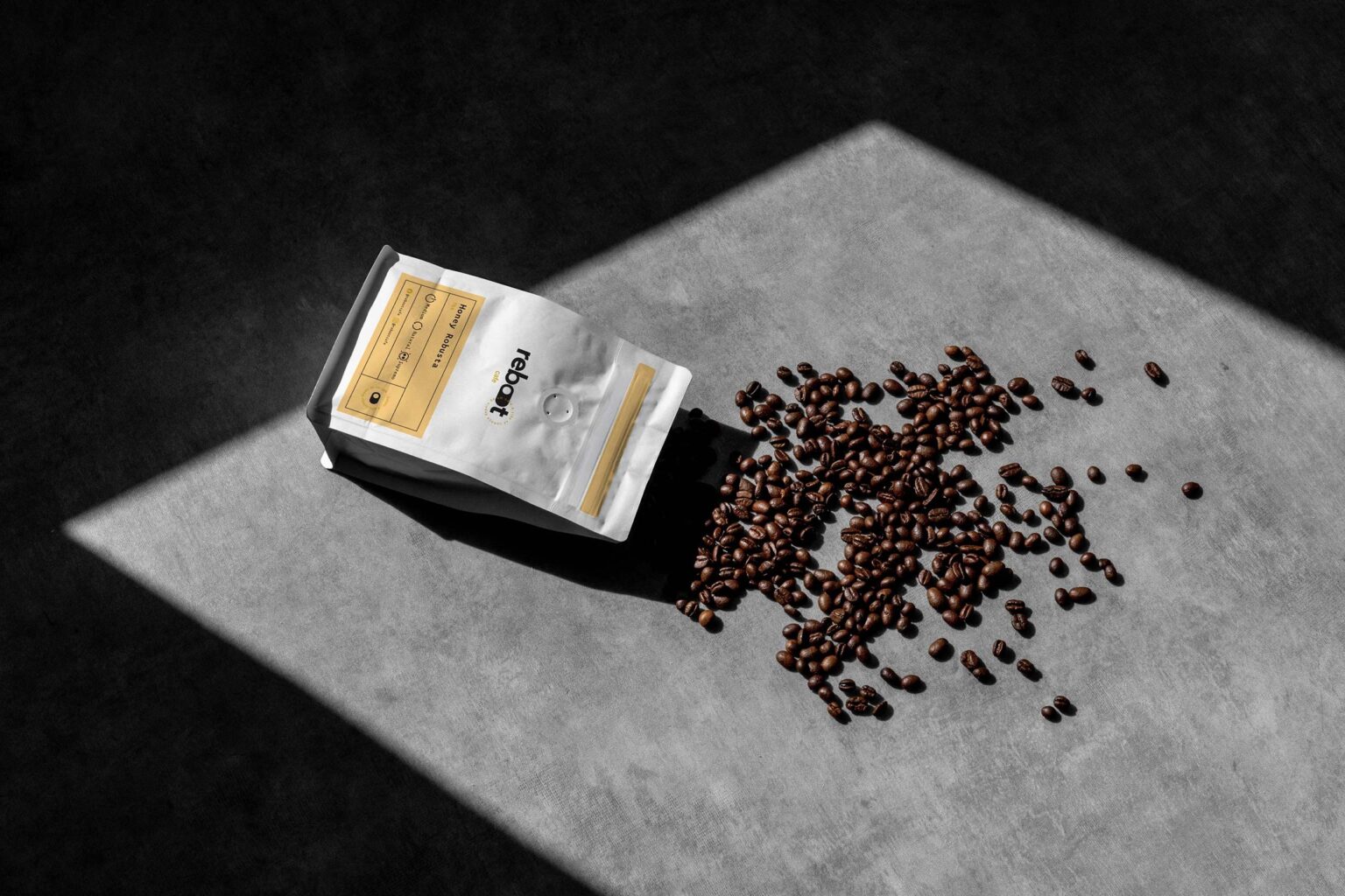
The logo is versatile and adaptable, fitting seamlessly into various contexts such as signage, packaging, and posters, which helps maintain a consistent visual identity. By embracing a minimalist approach, Reboot Cafe prioritizes quality through the use of top-notch ingredients and refined preparation methods. The packaging incorporates premium materials like textured paper and foil stamping, adding a touch of sophistication.
Reboot Cafe’s visual identity showcases precision and attention to detail with its straightforward color scheme and minimalist logo. This cohesive design aligns with the brand’s commitment to quality and modernity. Reboot Cafe’s design choices reflect customer preferences for simplicity, elegance, and sophistication, ensuring the brand’s visual identity resonates with customer expectations.
The minimalist design and high-quality materials give customers easy access to information and a luxurious experience. Reboot Cafe’s branding demonstrates how thoughtful design can effectively communicate a brand’s values, boost its appeal, and strengthen customer engagement. This careful approach to design fosters brand loyalty and helps create lasting connections with customers.