

In the tonic water category, packaging is often driven by visual excess. Layers of information, decorative elements, and bold brand cues compete for attention, creating a crowded and predictable landscape.
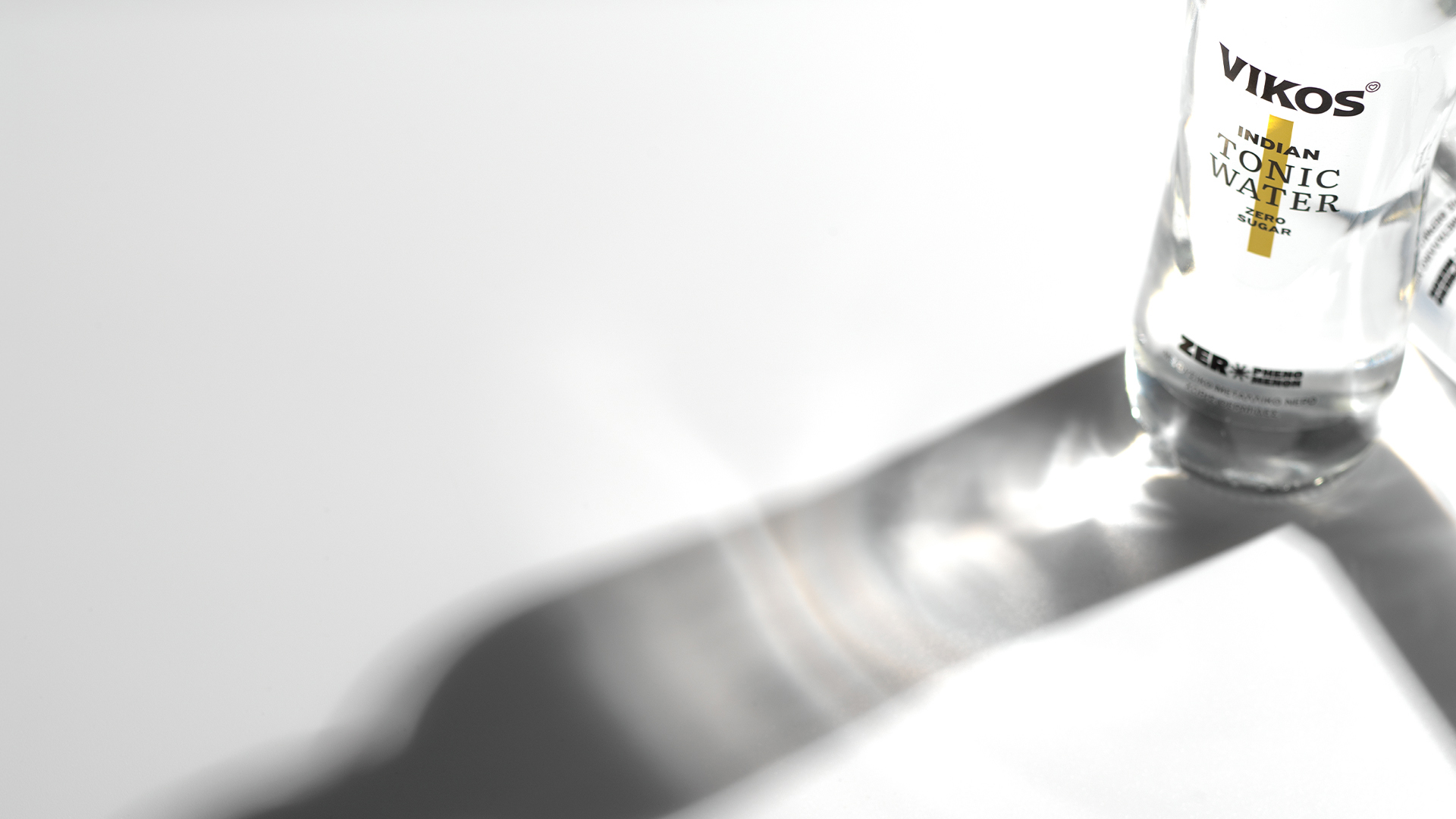
Vikos Tonic Zero takes a different approach. Instead of adding more, the design is built on reduction. The idea is simple: “Zero” is not just a product claim. It becomes the design principle itself.
The transparent liquid is fully revealed and becomes the primary visual. The bottle acts as a neutral frame, allowing the product to define its own presence without distraction.
Typography is treated as a structural element rather than decoration. Information is organized with clarity and balance, creating a calm and precise composition.
Color is used sparingly. Subtle vertical accents differentiate the variants, offering just enough distinction while maintaining the overall purity of the system. The design is applied to Vikos’ existing glass bottle, reinforcing continuity within the brand while introducing a refined and contemporary identity for the new range.
The result is a packaging system that stands out not by being louder, but by being quieter – demonstrating how simplicity can become a powerful tool for differentiation in a saturated category.



 NEV
NEV Stefano Bracci
 Alina
Alina monther al omari
 Lizakjx
 JOAOMARCOSDESIGN
 alchimistestudioParis
 Harriet Neild
 octavio rojo
 宏洛图品牌设计HONGLT
 DESIGN CONCEPTS
 Alexander Skurihin
 Studio K95
 ARMBRAND
 Richa Rai
 houseoferas by Miti
 Agence des Coteaux
 Kushi Eaknath
 Ann Treasa
 Xiao Ning
 krrrrrllii
 babyage
 Deep
Deep