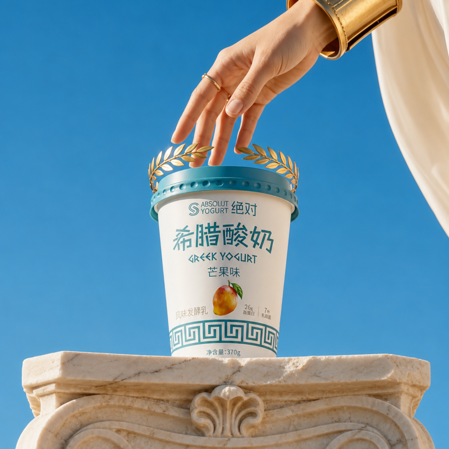

Absolut Greek Yogurt is a dairy packaging concept created for the Chinese market, translating the idea of Greek yogurt into a clean, modern and mythologically charged visual system. The brand turns everyday dairy into a small ritual of freshness, purity and quiet indulgence, a food worthy of the gods.
About
Absolut Greek Yogurt is a line of Greek yogurts created for the Chinese market, including spoonable yogurt, drinking yogurt, and yogurts in easy-to-carry formats. The product line focuses on freshness, high protein content, everyday convenience, and a higher perception of dairy consumption. The challenge was to make Greek yogurt instantly recognizable, desirable, and premium for the modern Chinese consumer, without falling back on the clichés of Ancient Greece or the typical minimalism of healthy eating.
Concept
The central communication idea is “Food worthy of the gods.” Instead of using Greek mythology as decoration, the packaging uses it as a symbolic language. Greek yogurt becomes not just a healthy product, but a modern daily ritual: pure, vibrant, nourishing, and almost mythical in its simplicity.
The design combines three layers:
- Greek cultural memory: columns, laurel, marble, and ornamental geometry.
- Modern Chinese dairy culture: clear hierarchy, functional information, and product clarity.
- Premium lifestyle emotions: blue skies, white surfaces, fresh light, and calm abundance.
The result is a visual world where the product feels simultaneously classic and modern, as if it were somewhere between a Greek temple, a Mediterranean morning, and a modern Asian retail shelf.
Solution
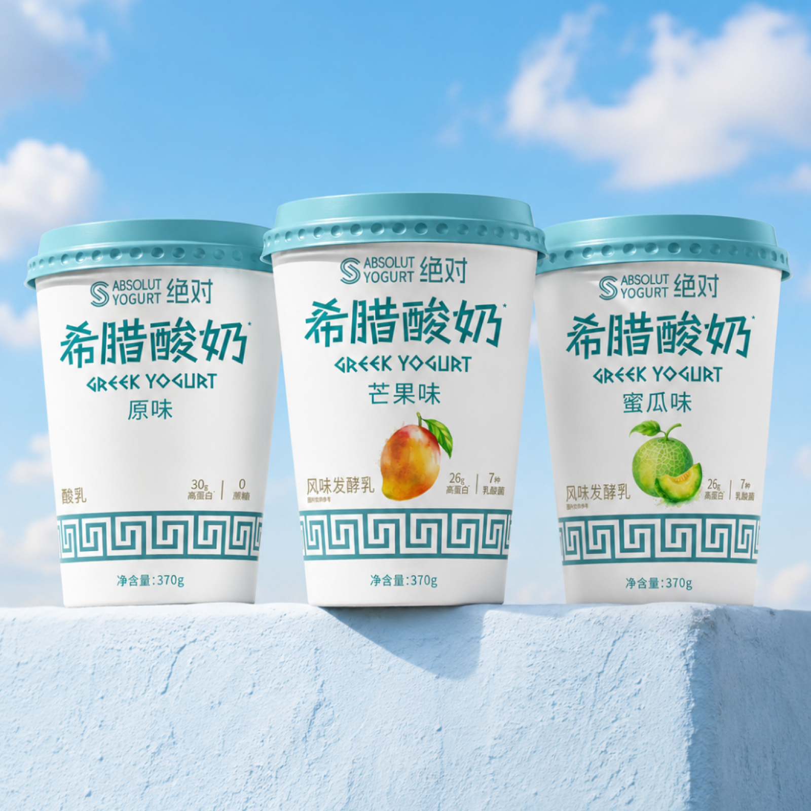
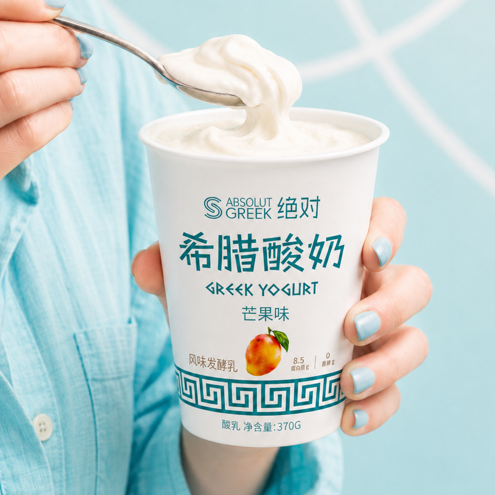
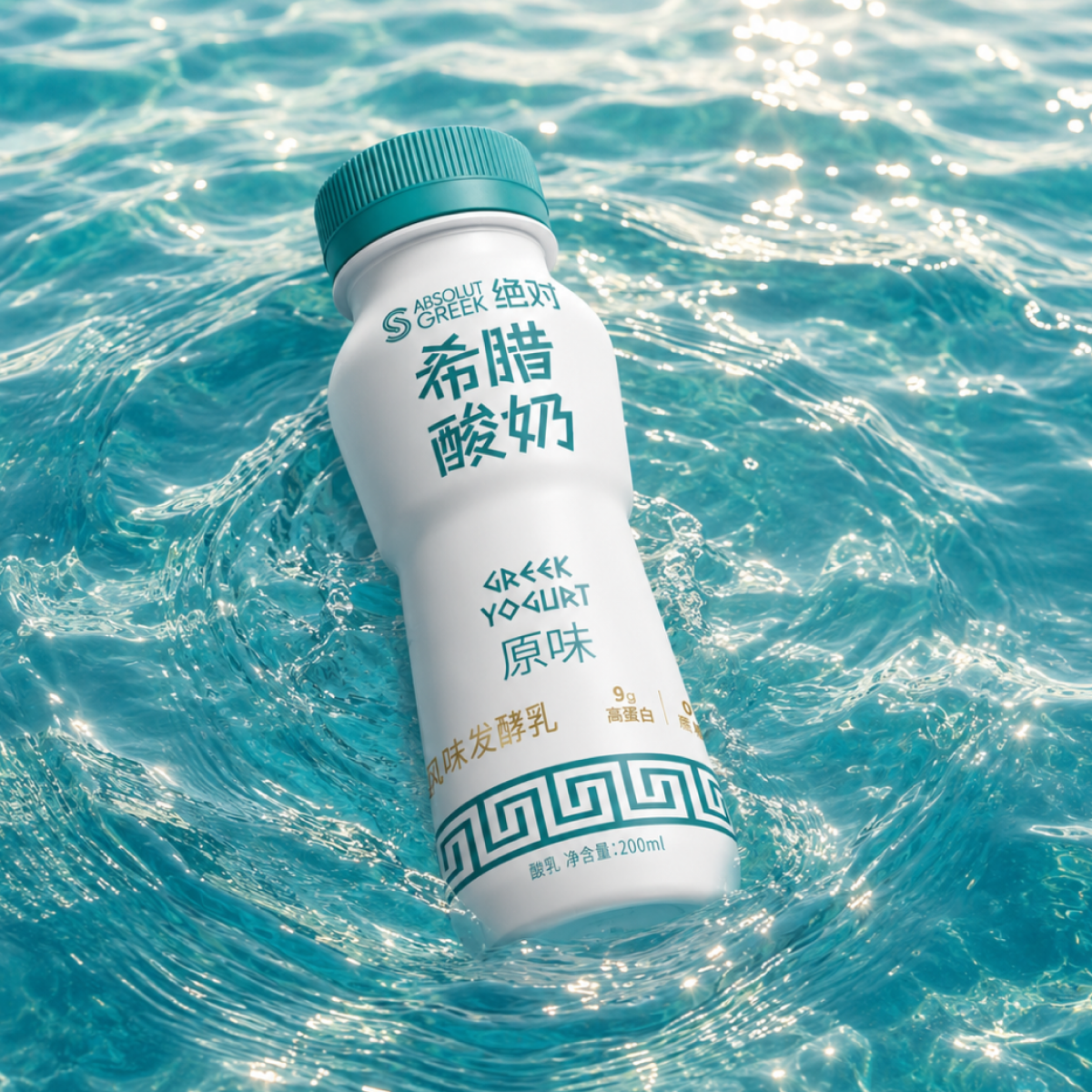
The packaging system is built on a subdued white and turquoise palette, creating a strong association with Greek light, the sea, the sky, and freshness. The white body preserves the purity and freshness of the product, while turquoise details give the line a distinctive appearance on the shelf. The Georgian ornament becomes the main graphic anchor. It serves as both a decorative and structural element, enveloping the packaging like an architectural frieze. This ensures consistency across different formats: cups, bottles, and bags.
The typography combines large Chinese characters with the angular Latin sign for “Greek Yogurt,” giving the product a distinctly local flavor while maintaining the Greek concept. The fruit illustrations are kept small and focused to prevent the packaging from appearing overly busy or overly mass-market.
The visual campaign expands the packaging language, creating a mythological lifestyle universe: yogurt perched on marble columns, crowned with a laurel wreath, floating against a blue sky, held like a ritual object, or surrounded by Mediterranean water. This allows the brand to move beyond simple packaging design and become a full-fledged communication system.
Design Technique
The corporate identity employs a precise balance of minimalism and symbolism:
- White packaging surfaces: purity and milky freshness.
- Turquoise color coding: the Greek sea, sky, and clear category recognition.
- Greek ornament: a repeating element across all formats.
- Large Chinese characters: instant legibility for the local market.
- Subtle fruit accents: clear delineation of flavors without visual overload.
- Architectural advertising imagery: marble, laurel, sky, and water.
- Clean, premium composition: reduces visual noise and enhances consumer appeal.
The system was designed to be flexible across various packaging options while maintaining instant brand recognition.
What’s Unique
The project’s uniqueness lies in how it adapts Greek mythology for a Chinese dairy brand without turning it into a costume.The design doesn’t simply place ancient symbols on packaging. It creates a modern mythology around the product: yogurt as a daily source of purity, energy, and pleasure. Greek references are reduced to their most powerful visual codes: blue, white, marble, laurel, geometry, and sunlight. These codes are then translated into the modern language of everyday products. This makes the product premium yet accessible, cultural yet not heavy, poetic yet commercially understandable.
Result
The final packaging creates a strong, fresh, and recognizable identity for the Greek dairy product line in China. This provides the product with clear shelf positioning, a recognizable visual identity, and a communications platform that can be further developed through packaging, key visual elements, social media content, retail displays, and seasonal campaigns. Absolut Greek yogurt is becoming more than just a dairy product. It’s becoming a small, everyday ritual: pure, vibrant, and worthy of the gods.
Project: Absolut Greek Yogurt
Category: Food / Dairy / Yogurt
Market: China
Design: Anastasia Igolnikova
Year: 2026


 Eva Chistyakova
 Puigdemont Roca
 marianaaworks
 bloomburo
 andreamarinnn
 Alina
Alina Saadmost
 Bruhken
 Maruf Nishat
 Richest Branding Pvt. Ltd.
 Sophiagdotcom
 saifullahmaslool
 Up-Brands
 Atiq Alam
 daniitenaa
 artworkbysofia
 monther al omari
 Valérie Colace
 Tianqii
 Anum
Anum anisameur
 tauqueer
 SOT B&D
 Palashcc
 Derrick Lin