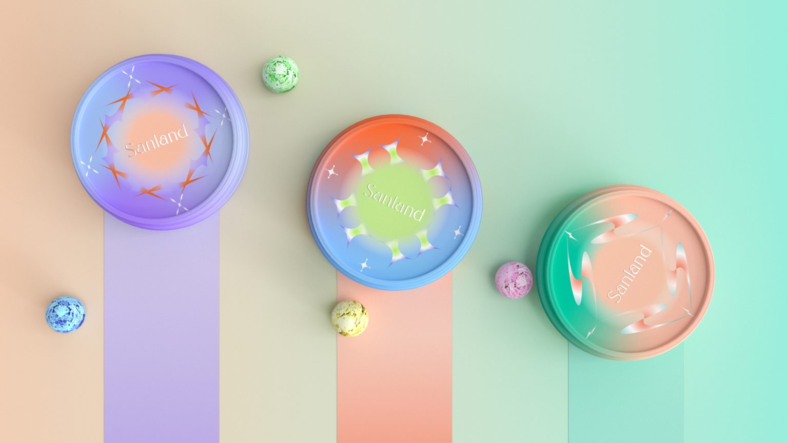

三清空岛零食包装设计
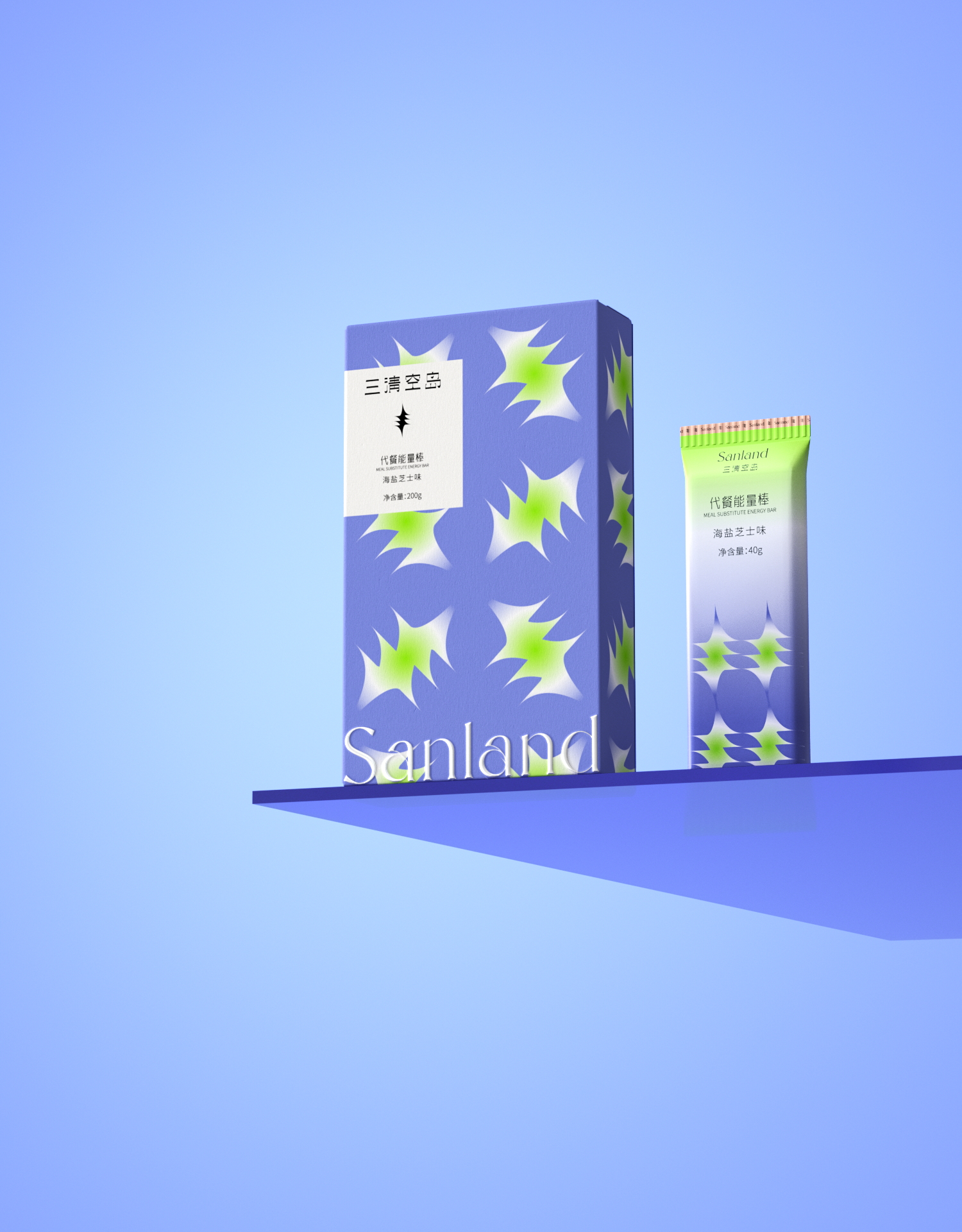
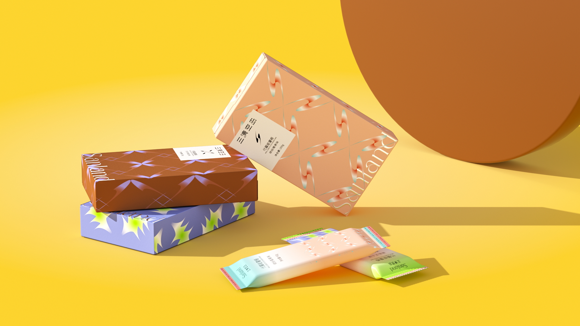
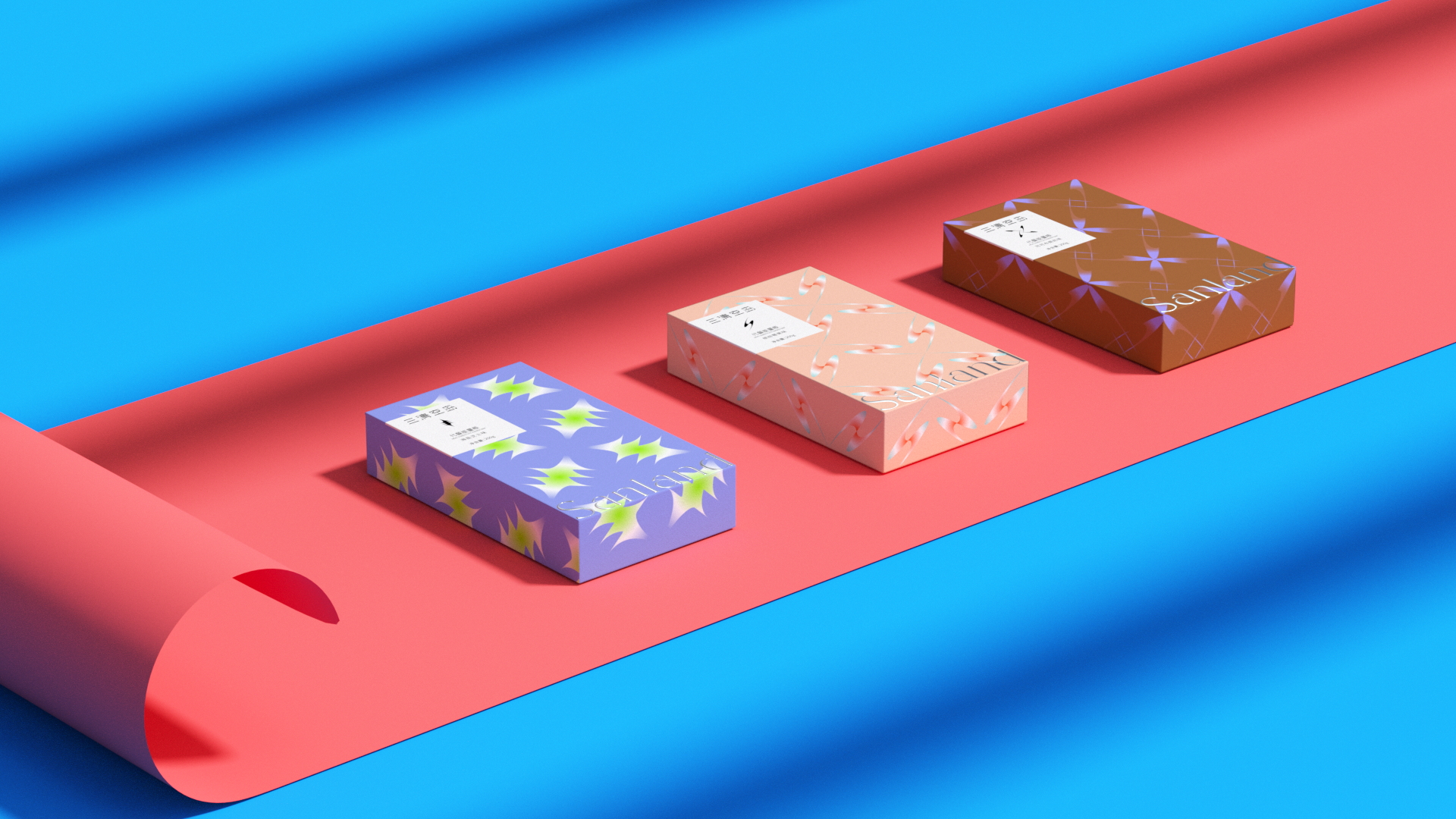
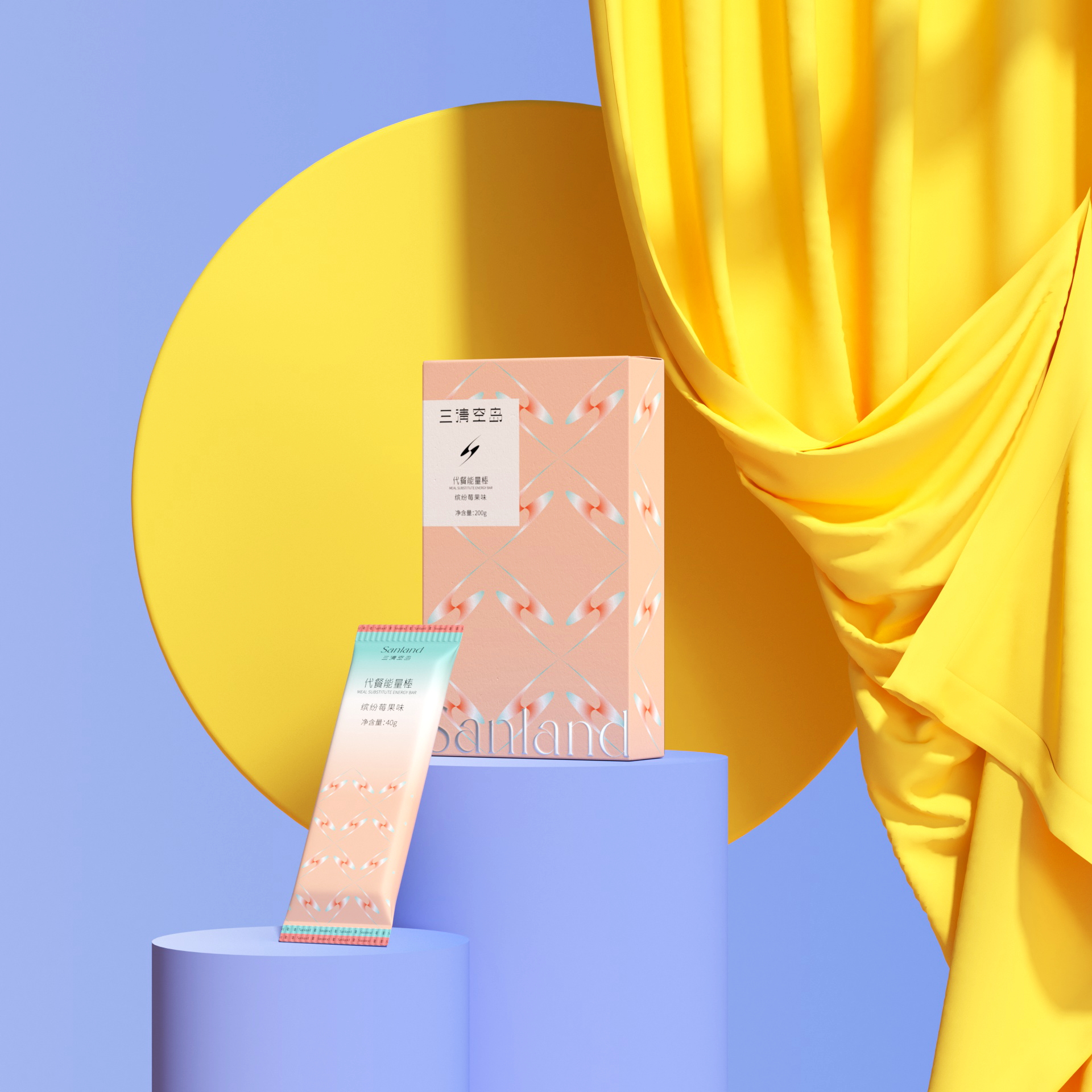
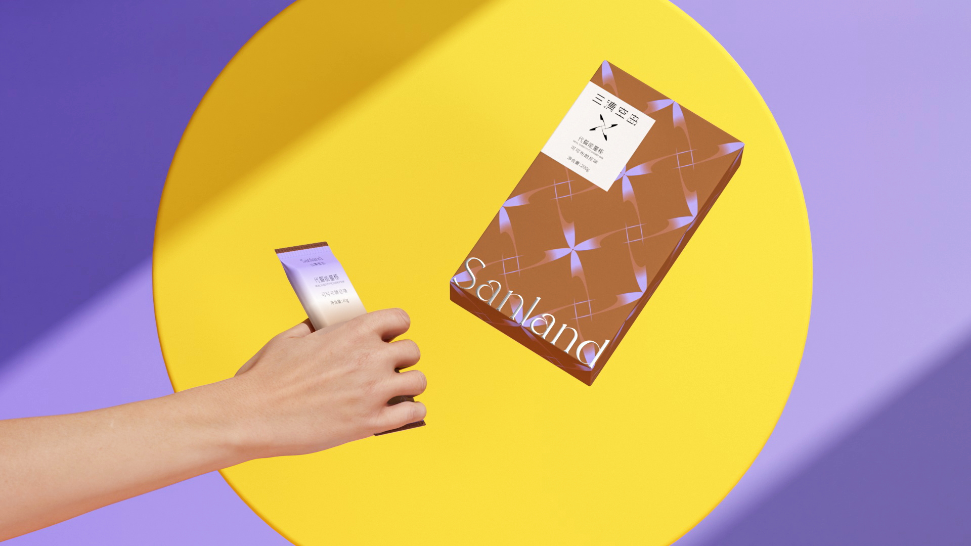
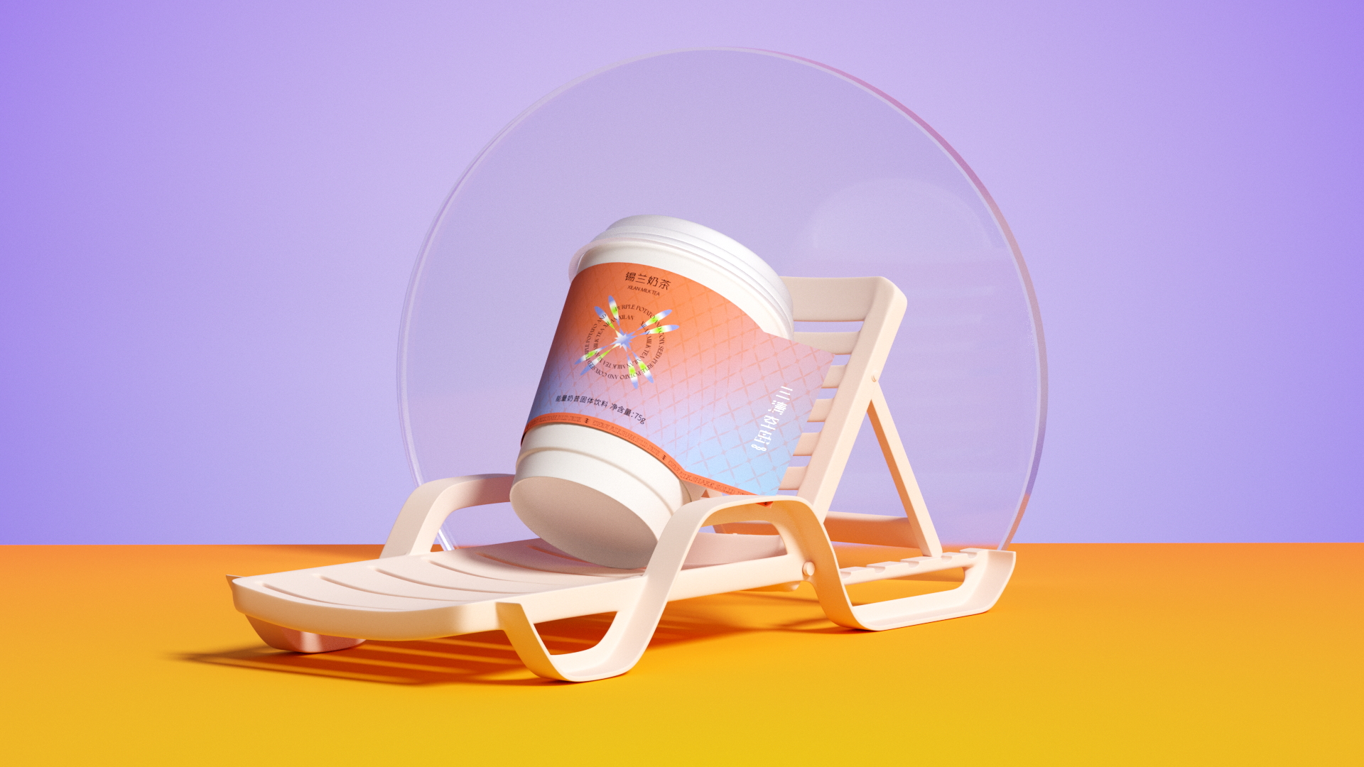
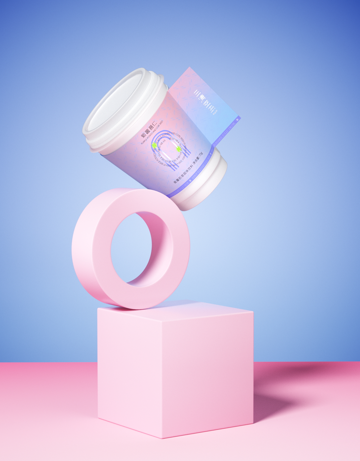
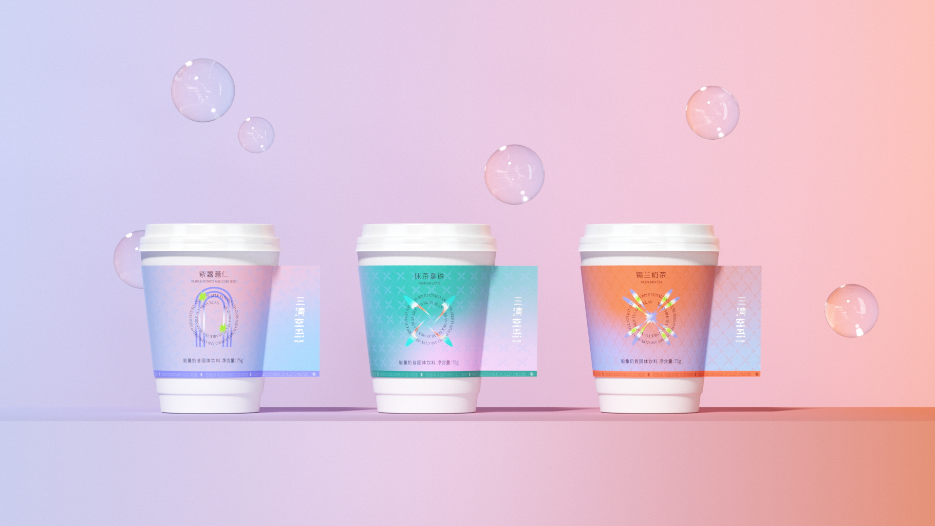
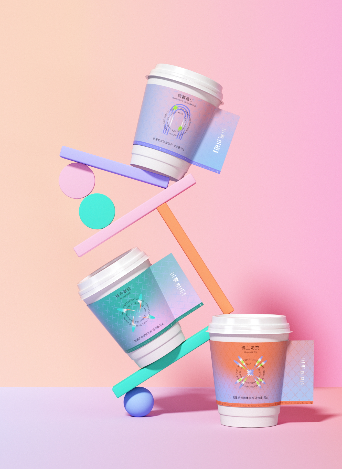
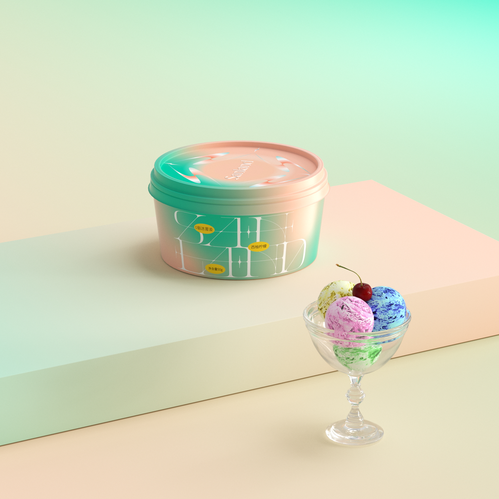
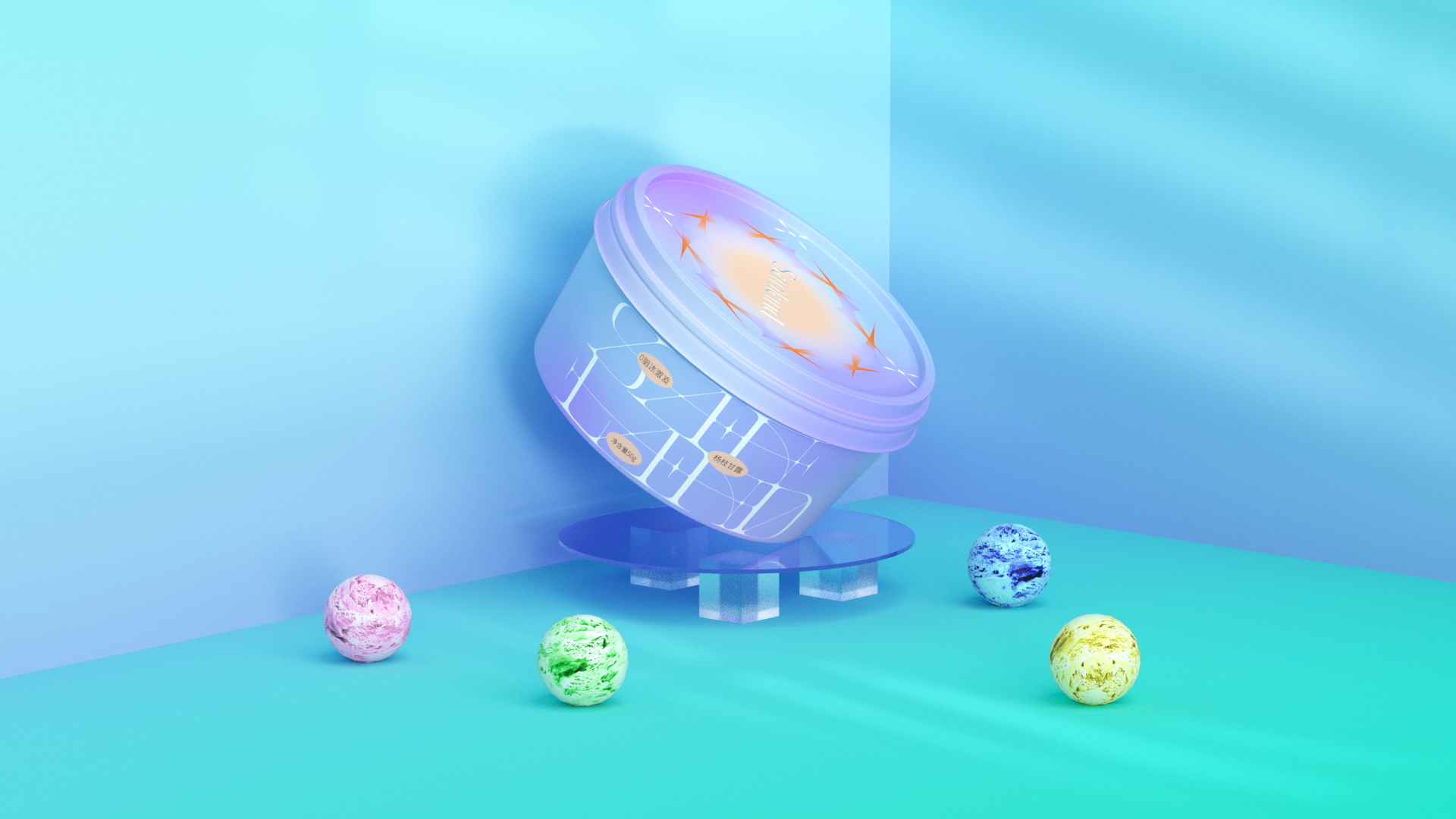
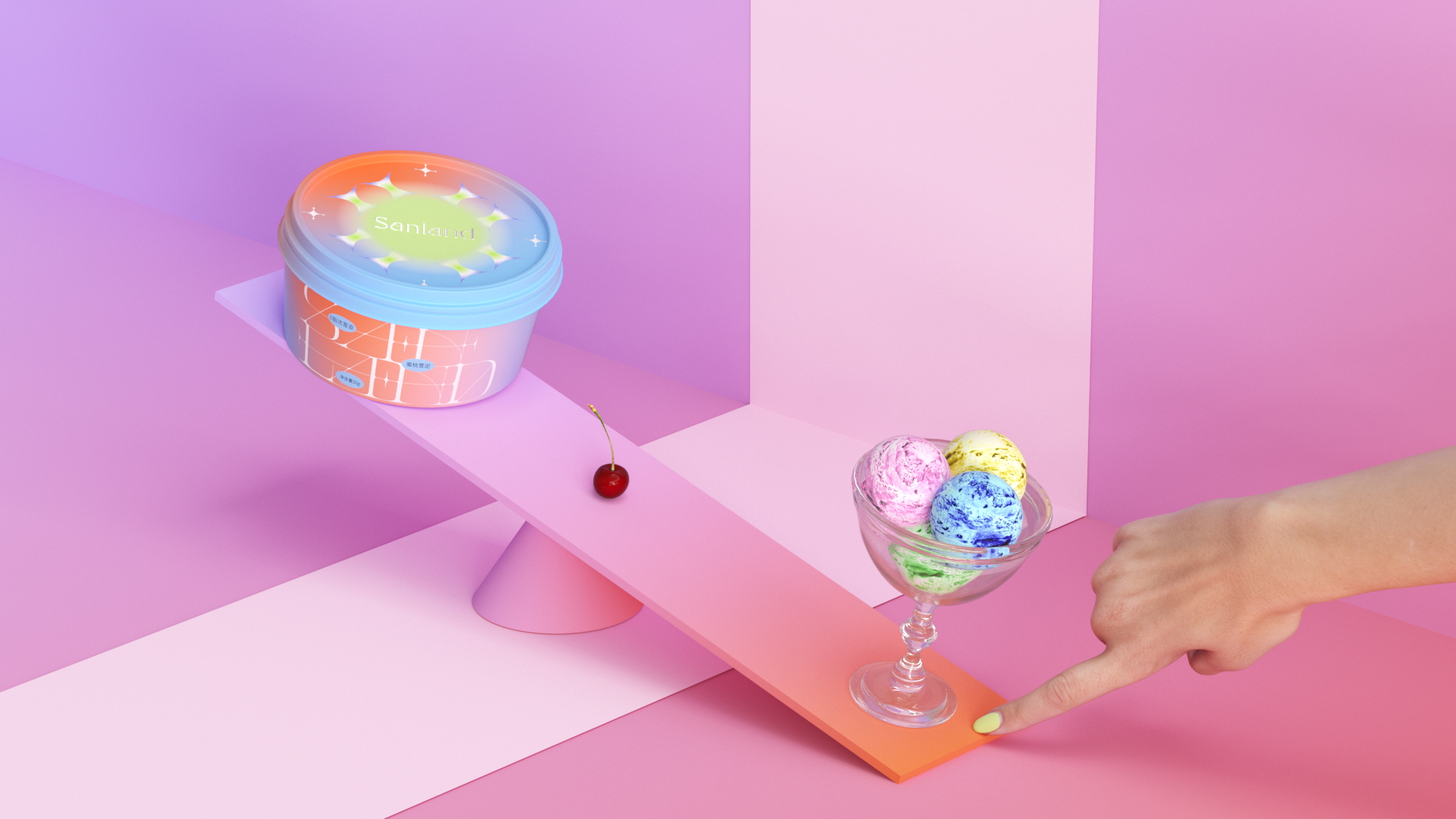
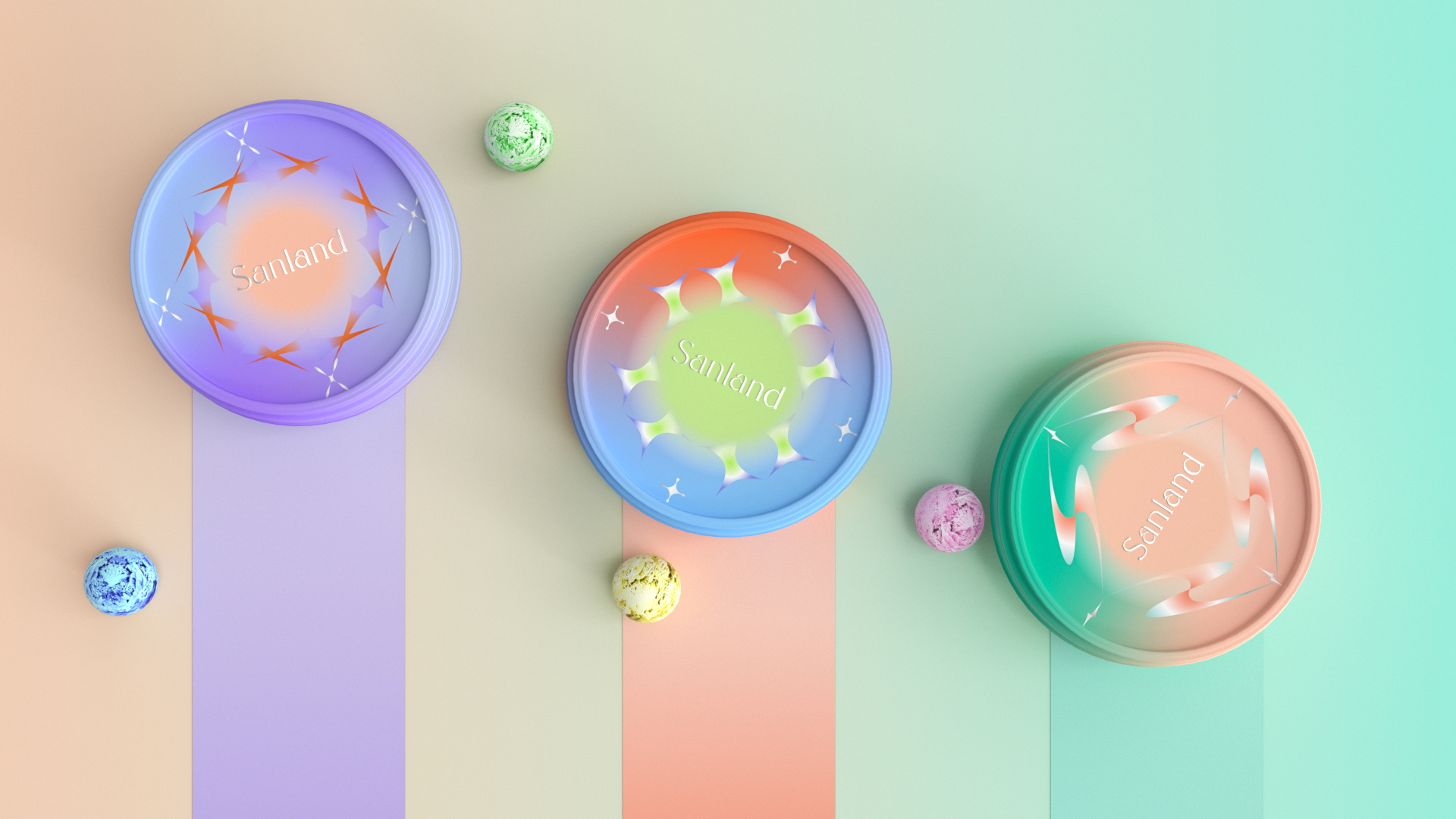
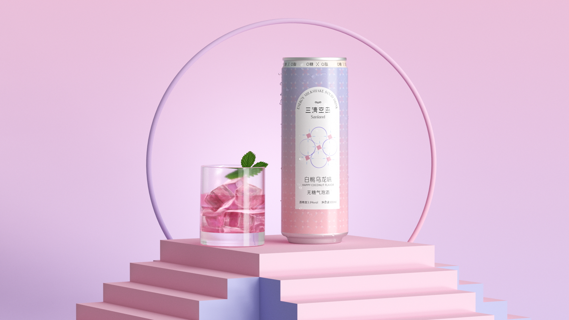
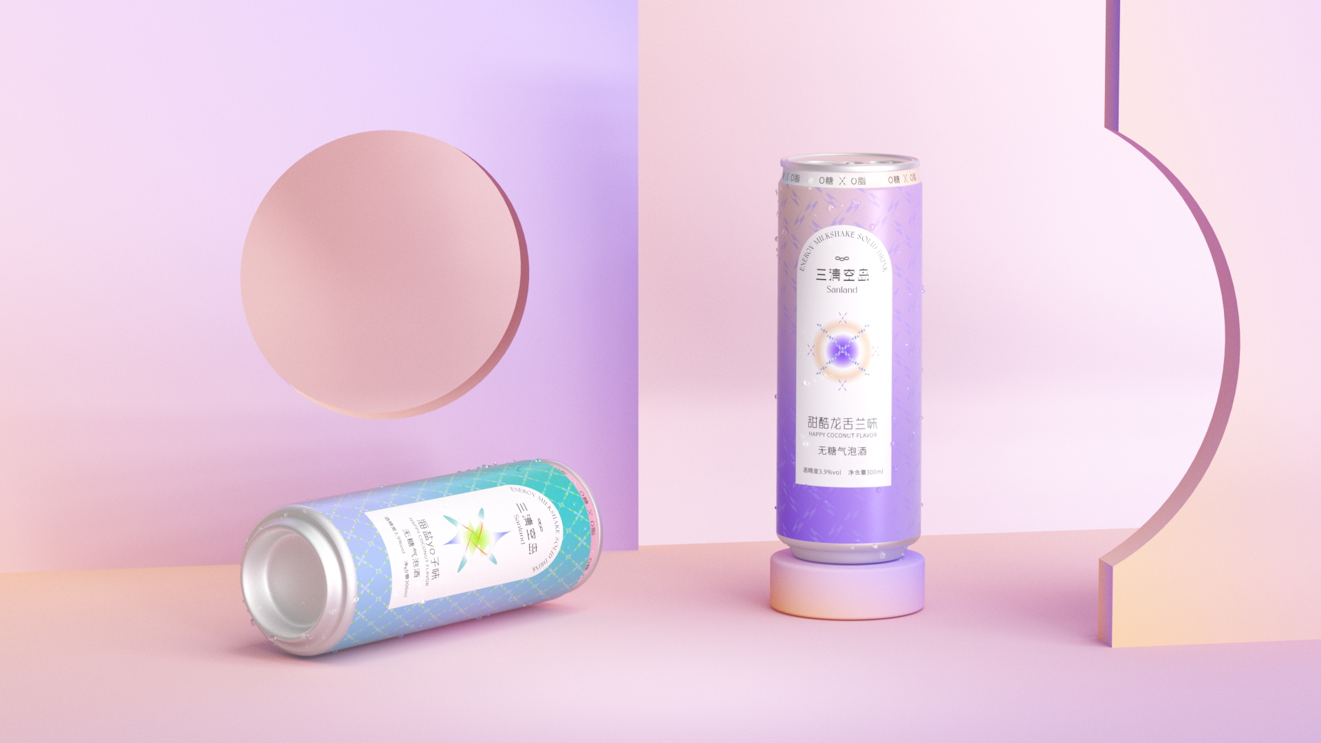
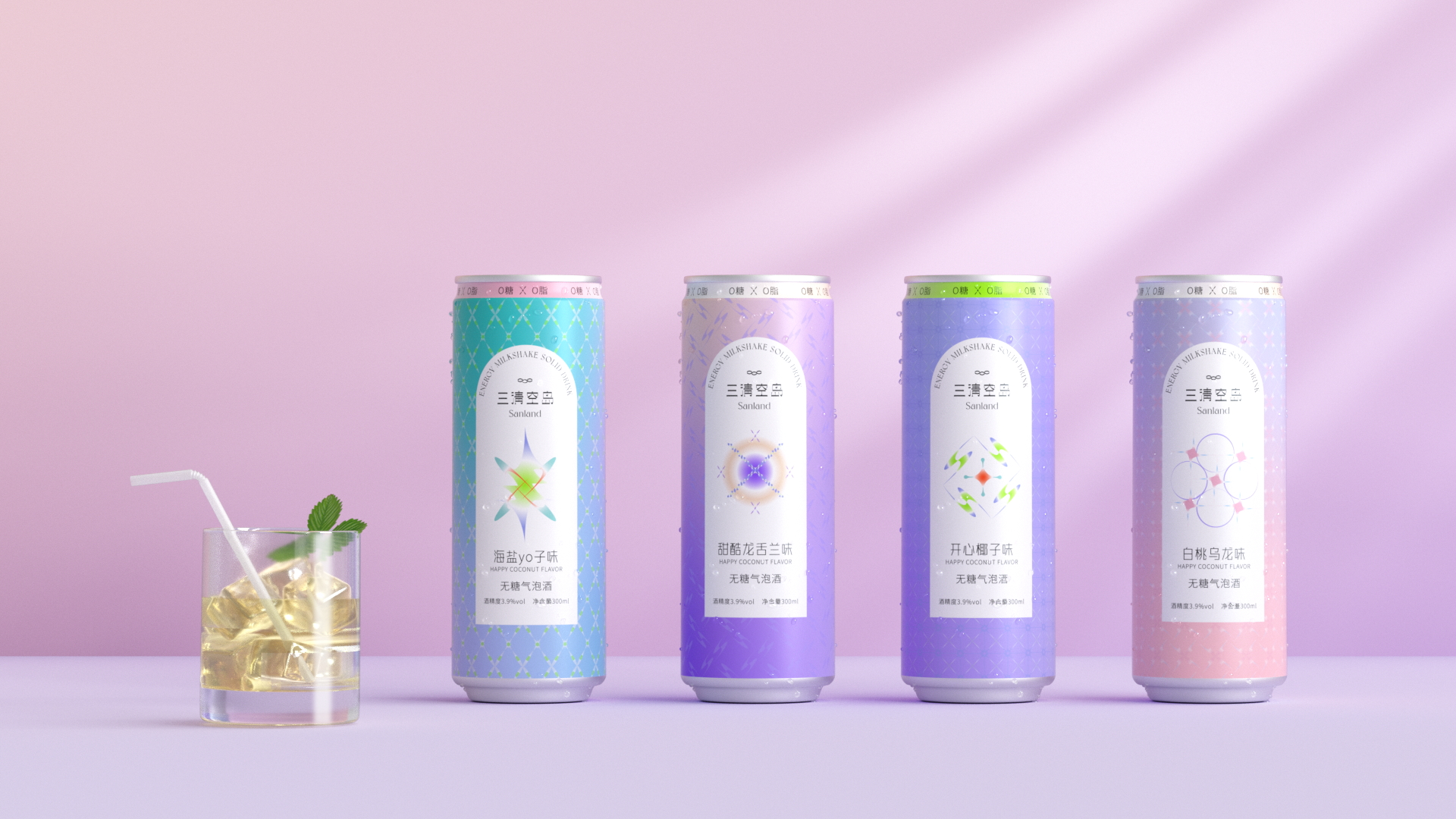
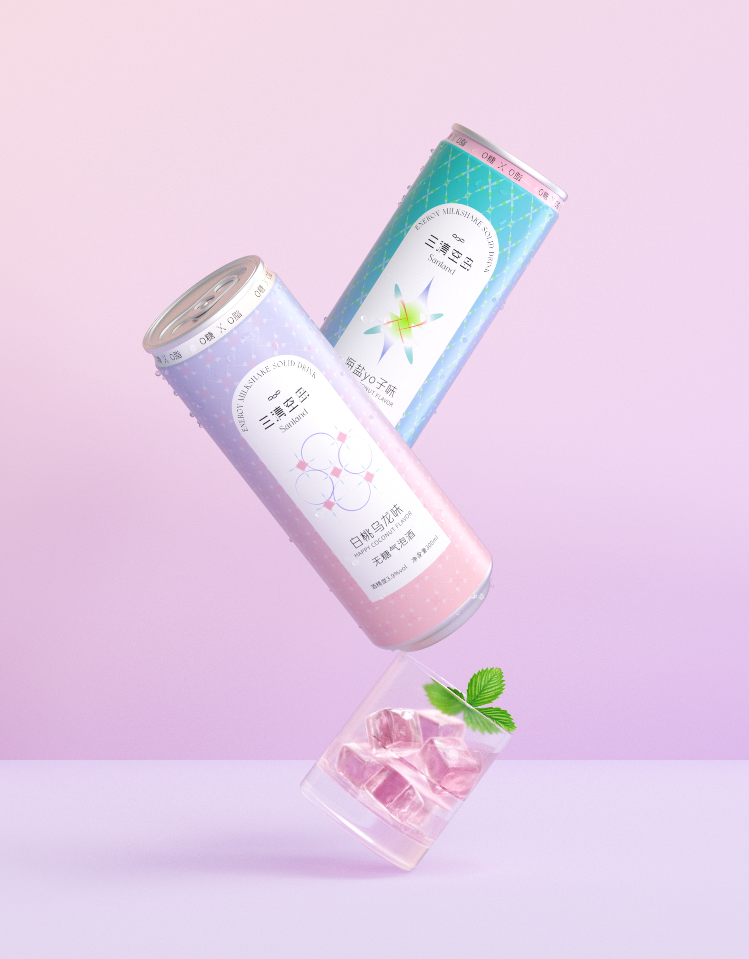
What stands out here is the restraint underneath all that color. Each pattern, whether spiky star bursts, soft ribbons, or geometric lattice, is distinct enough to signal a different product, yet the system holds together through consistent scale and a shared typographic language. The round tins in particular show confident use of gradient: not decorative, but structural, guiding the eye to the center logo naturally. This is joyful packaging that still has a clear design logic behind it.



 krrrrrllii
 babyage
 Deep
Deep monther al omari
 Atiq Alam
 TUERCA Studio
 neo creative studio
 Pinot Agency
 Pixels Studio
 Anastasia Cherepanova | xtramez
 awaiskhadim
 Studio Be Design
 Belova Oksana
 We Craft Studio
 ArtDesignByDIna
 Ananya Taran
 Nadezhda Gorelikova
 orhanirmaktasarim
 WillBe
 Hi estudio
 43oz
43oz Rosario Lo Iacono
 alchimistestudioParis