

The GLP-1 medication category is growing rapidly, and with it an underserved need: a snack bar designed specifically for users whose relationship with hunger, portion size, and craving has changed. Most existing options are too large, too sweet, or wrapped in the same tired wellness-brand aesthetic, performative health rather than genuine support. Tide Treats was developed to fill that gap: a portion-conscious, high-protein bar with a satisfying crisped-rice texture, built for people who want to snack with intention.
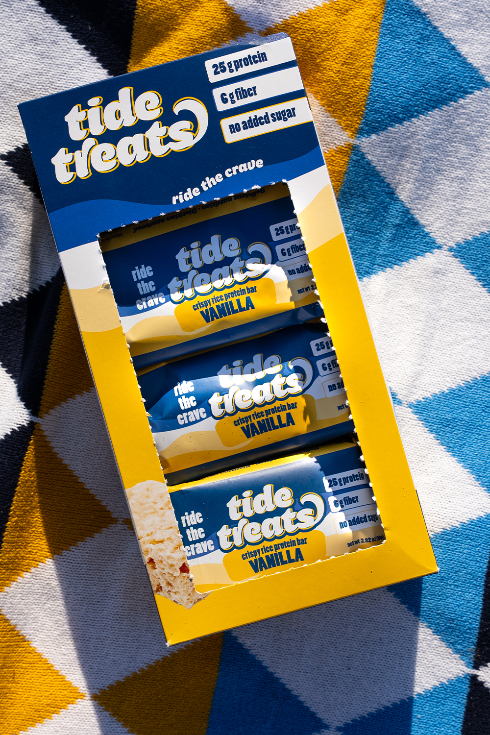
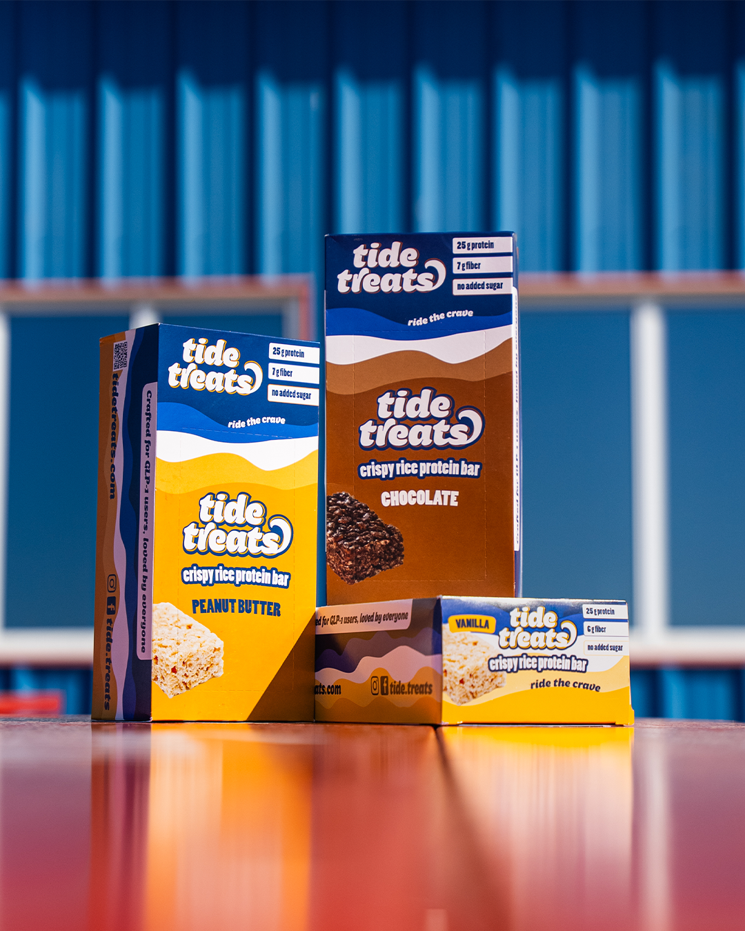
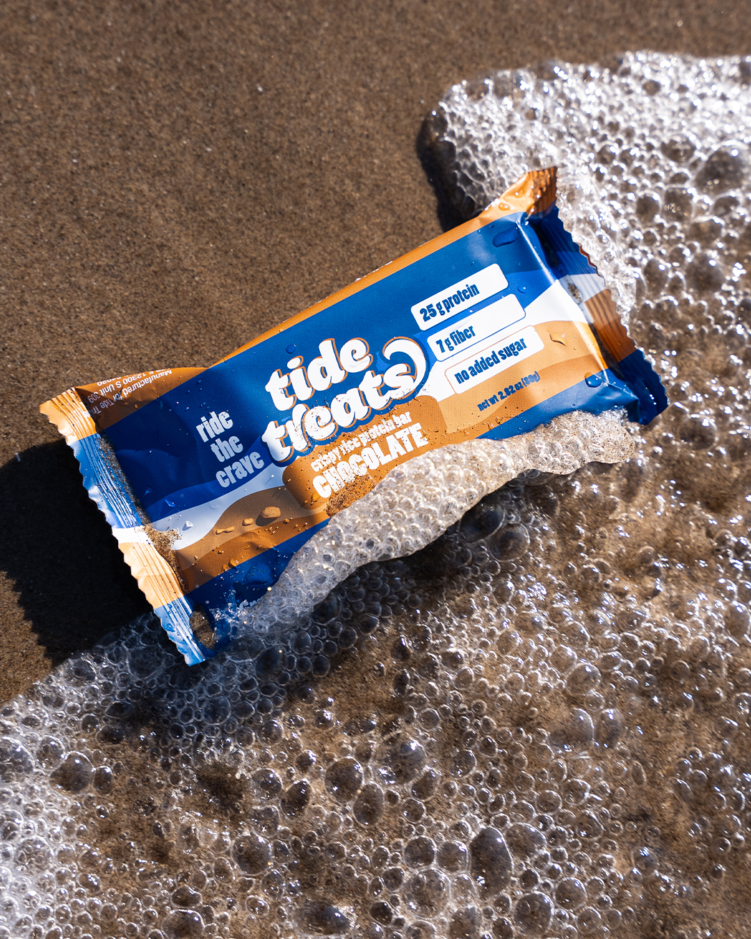
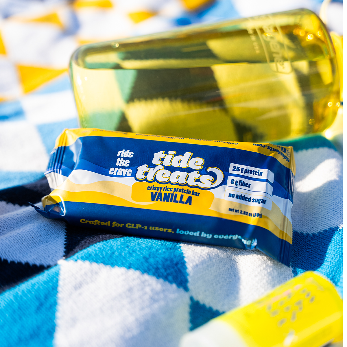
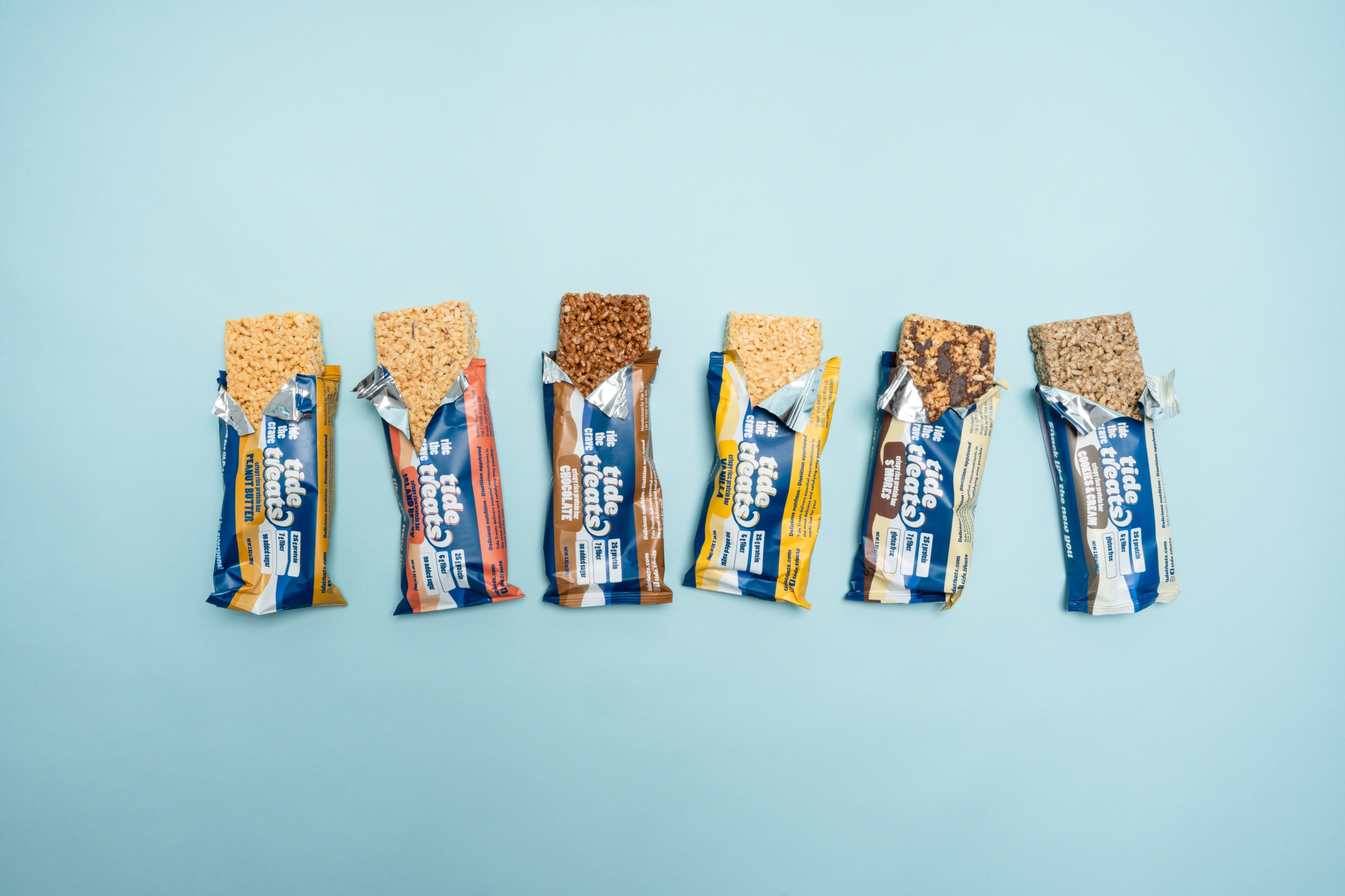
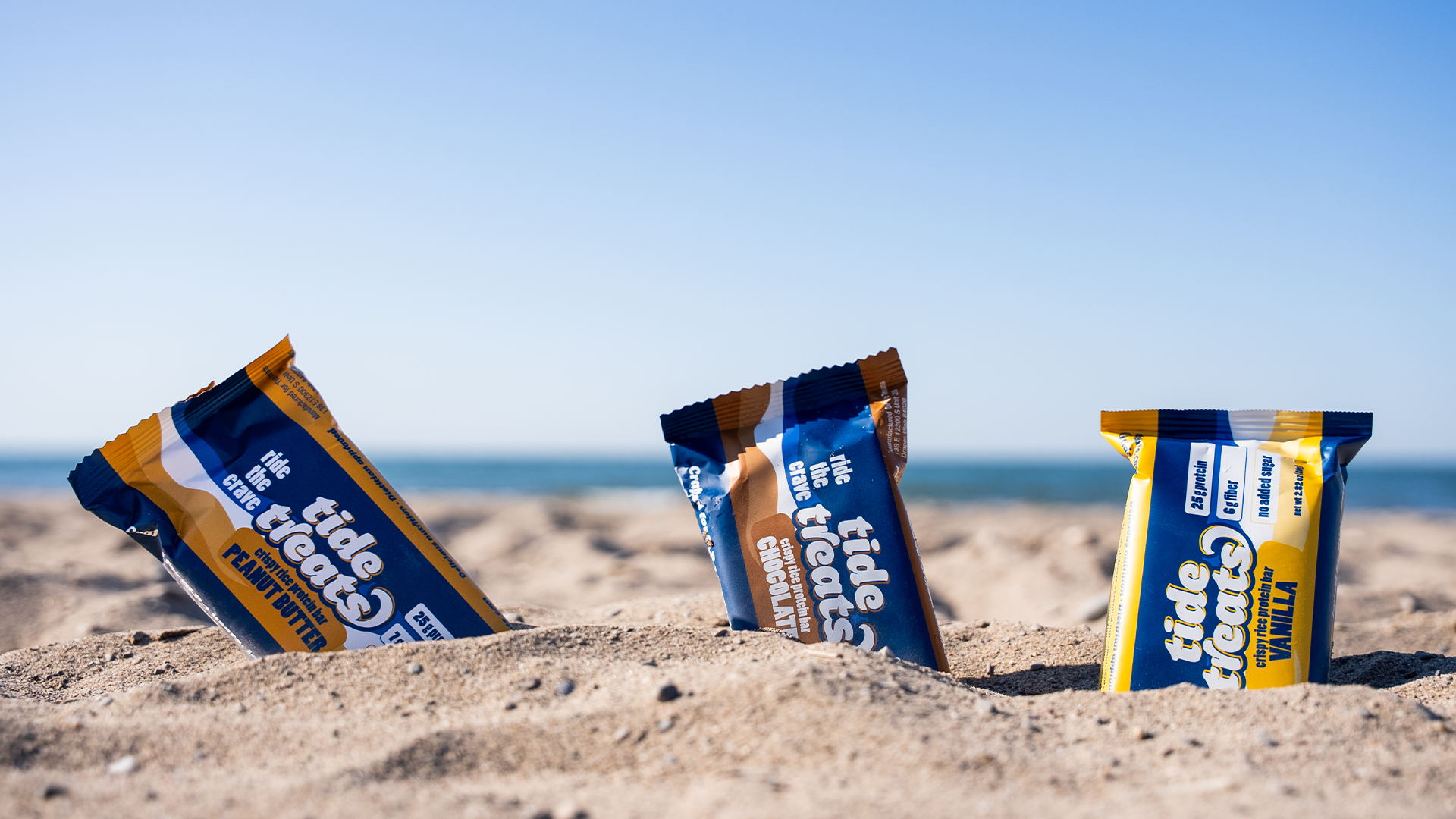
Eye Candy Design developed the brand from the ground up, visual identity, packaging, and retail-ready box system. The name Tide Treats does double duty: it references riding the wave of cravings rather than fighting them, and the brand tagline “Ride the Crave” extends this positioning into messaging that respects the user’s experience without lecturing. The wordmark is confident and clean, bold simplicity over the cluttered visual language typical of the wellness bar category. A unique colour palette differentiates each of the four flavours while the system reads as a coherent family. The design deliberately avoids fitness clichés and gender-coded visual conventions, landing in a space that feels modern, empathetic, and genuinely useful.
The packaging speaks to a specific audience in a language that audience will actually recognise: matter-of-fact, a little personality, and free of the noise that fills the health snack aisle.


 Eva Chistyakova
 Puigdemont Roca
 marianaaworks
 bloomburo
 andreamarinnn
 Alina
Alina Saadmost
 Bruhken
 Maruf Nishat
 Richest Branding Pvt. Ltd.
 Sophiagdotcom
 saifullahmaslool
 Up-Brands
 Atiq Alam
 daniitenaa
 artworkbysofia
 monther al omari
 Valérie Colace
 Tianqii
 Anum
Anum anisameur
 tauqueer
 SOT B&D
 Palashcc
 Derrick Lin