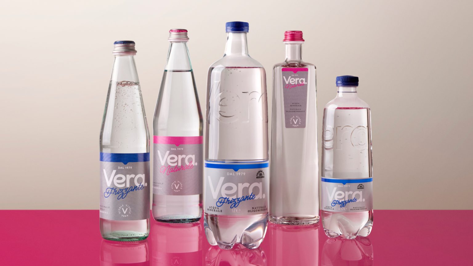

What is this product about?
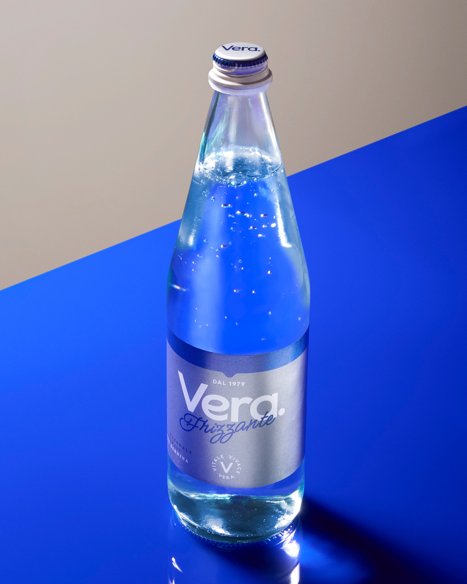
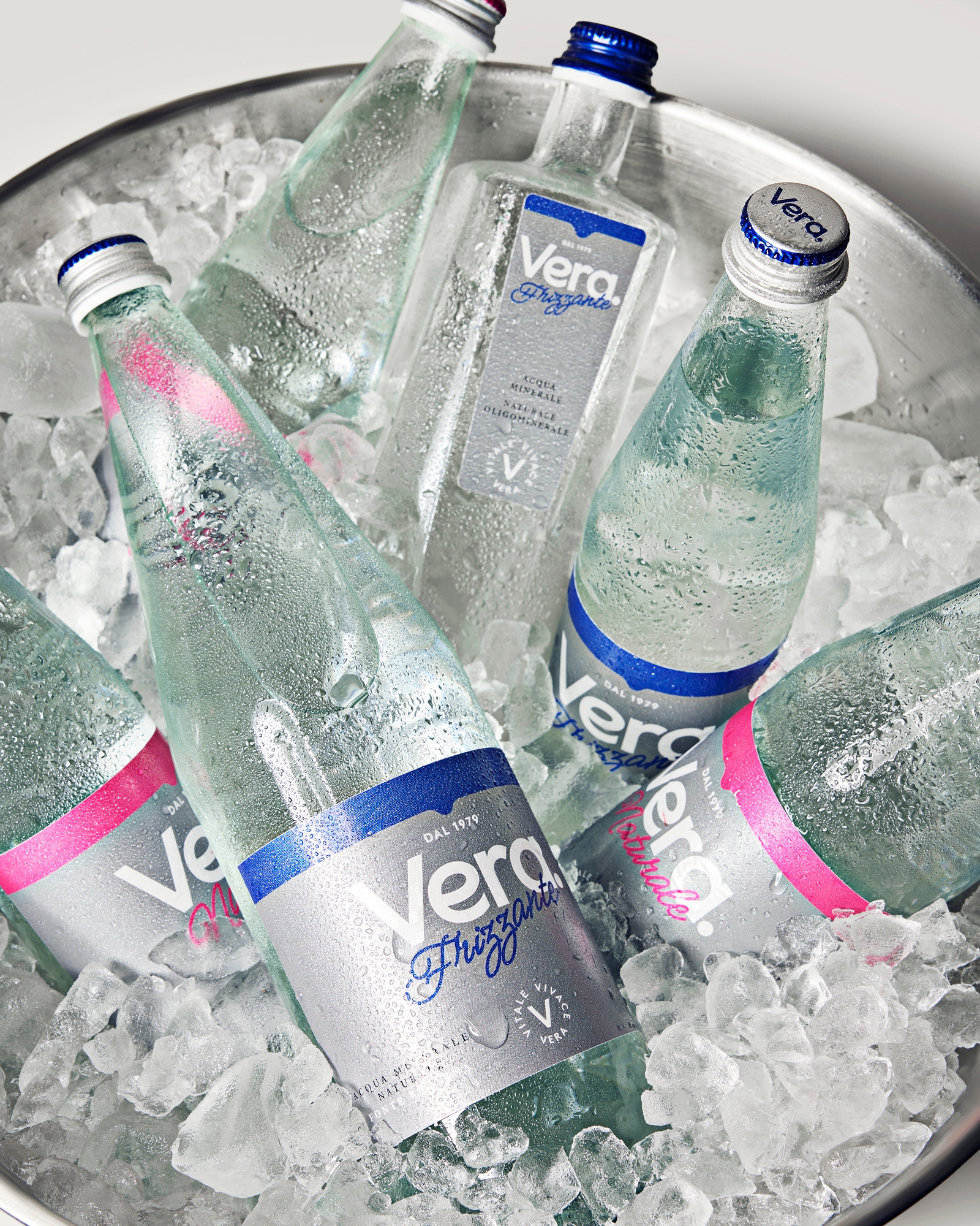
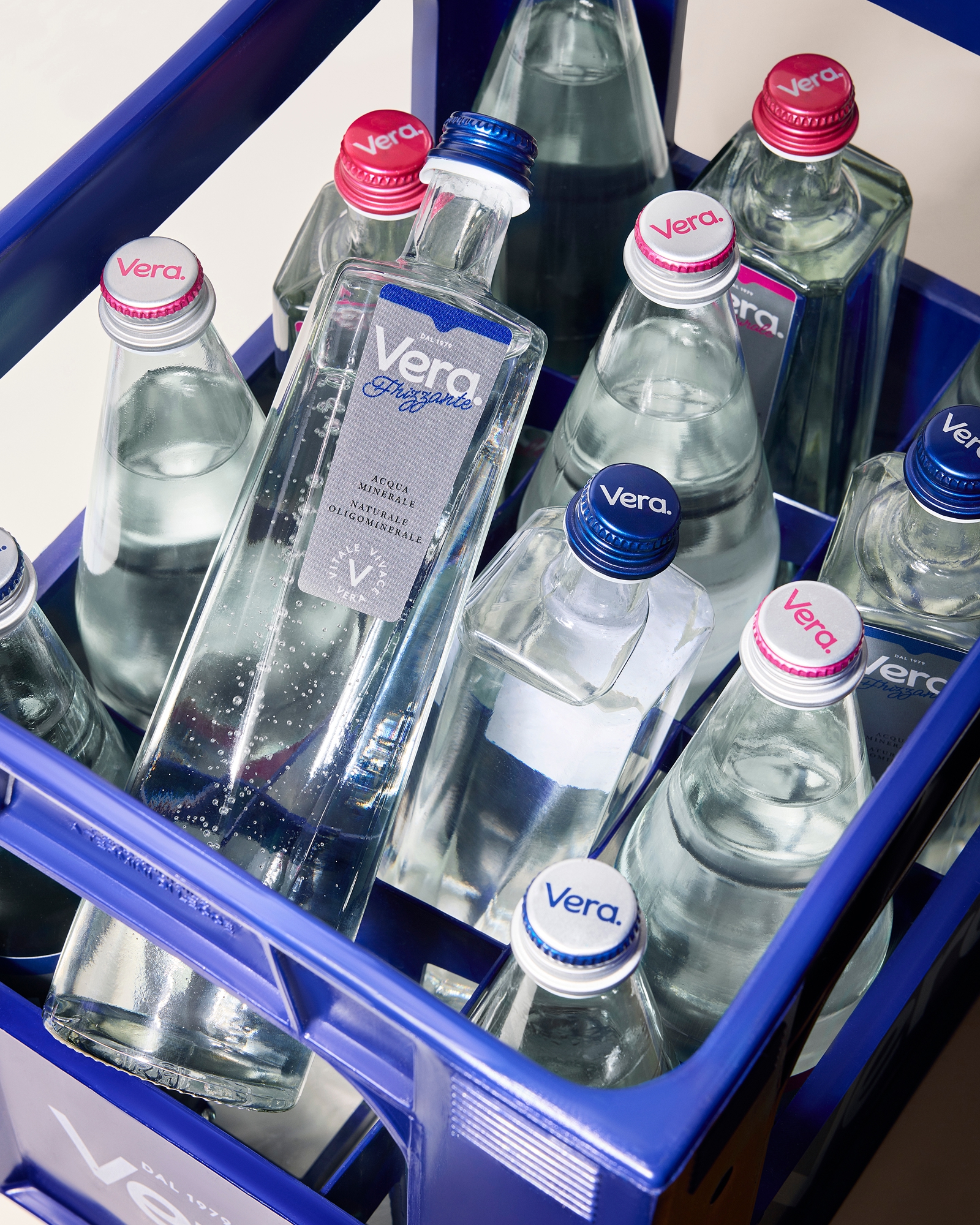
The restyle of the HORECA Acqua Vera bottles, covering both the PET bottle and the glass lines for an everyday commodity.
What is the concept behind the packaging design?
Giving the HORECA Acqua Vera bottles a clear and immediate distinctiveness: elevating while maintaining the practical essence of the product. The keystone was the glass craftsmanship throughout the product lines, treating also PET as if it were glass.
Solution
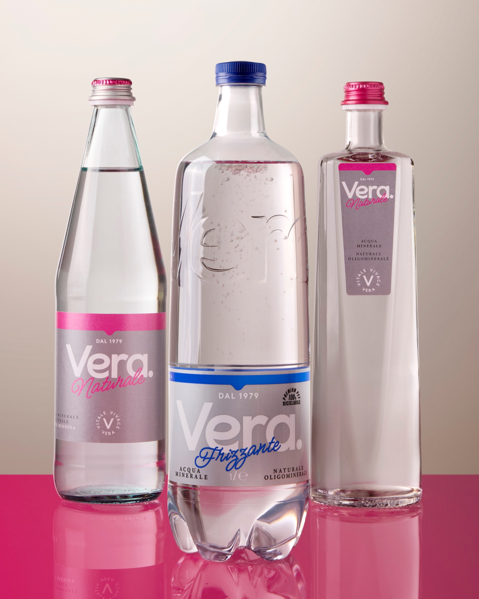
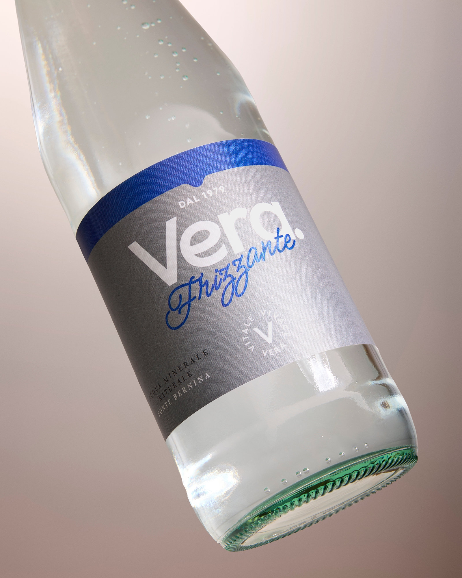
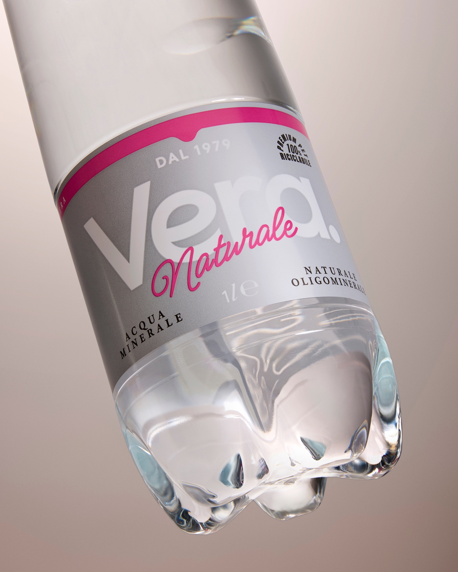
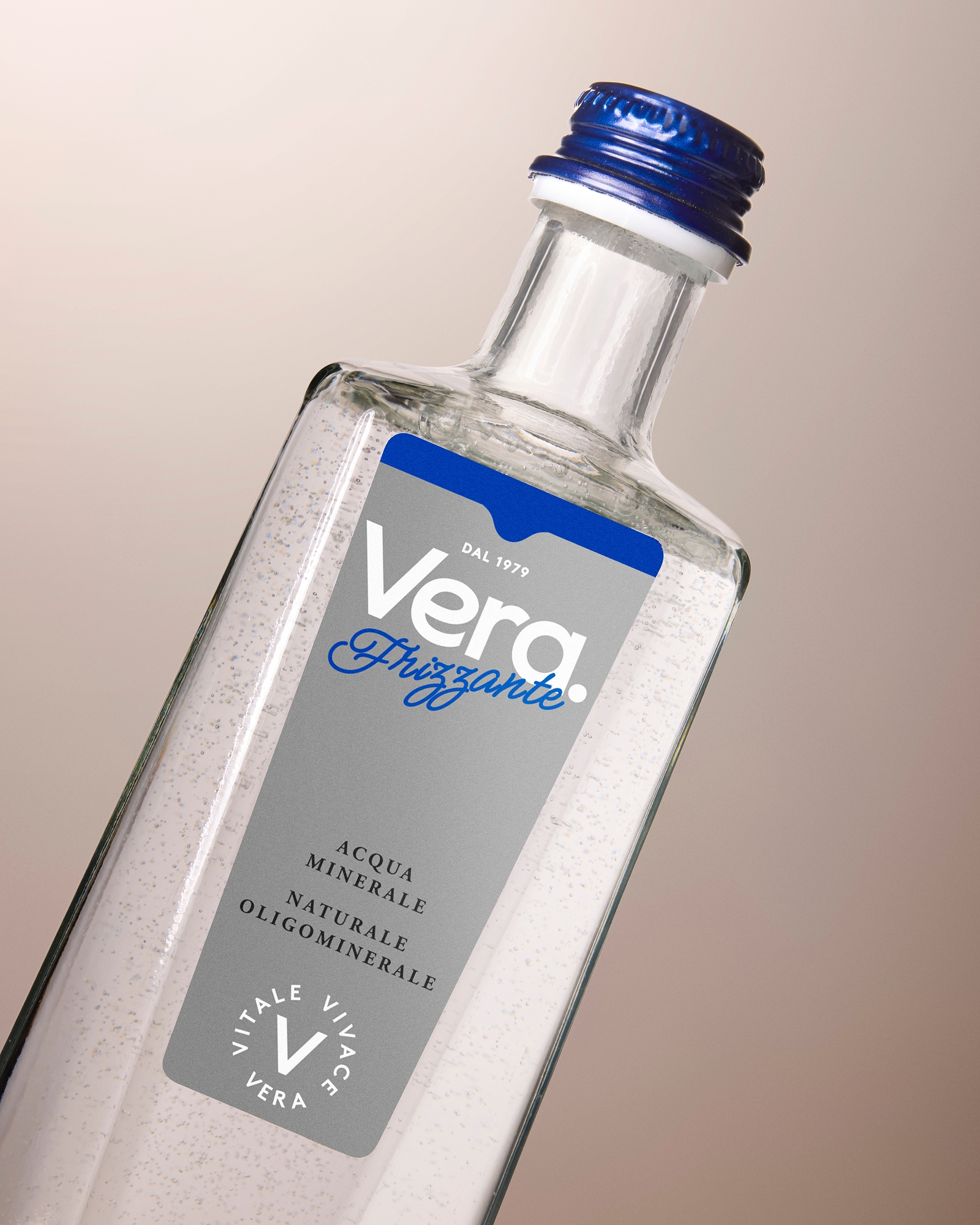
Fine glass craftsmanship has been applied to the PET bottle with its squared shoulders and the embossed logo. As for the restyle of the glass lines, minimal alterations—yet fundamental changes—and small but meaningful details were introduced, like the brighter colours, the secondary font and additional graphic elements, to show with clarity and elegance what’s inside on the outside as well.
The technique used to design the packaging
Employing a sophisticated manufacturing technique for an everyday commodity, where fine glass craftsmanship is applied directly to the PET bottle to create squared shoulders and an embossed logo.
What is unique about your packaging design?
Treating PET as if it were glass. With the square shoulders and the embossed logo, this product line achieves a new standing.
The results
Minimal alterations that resulted in fundamental changes. Greater clarity between one reference and the next means dynamic workflows: a packaging that is not only beautiful, eye-catching and elegant, but practical overall.


 monther al omari
 Alexander Skurihin
 Studio K95
 ARMBRAND
 Richa Rai
 houseoferas by Miti
 Agence des Coteaux
 Kushi Eaknath
 Ann Treasa
 Xiao Ning
 krrrrrllii
 babyage
 Deep
Deep Atiq Alam
 TUERCA Studio
 neo creative studio
 Pinot Agency
 Pixels Studio
 Anastasia Cherepanova | xtramez
 awaiskhadim
 Studio Be Design
 Belova Oksana