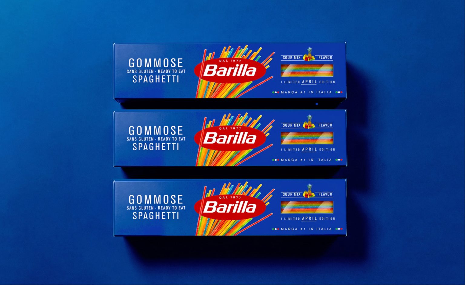

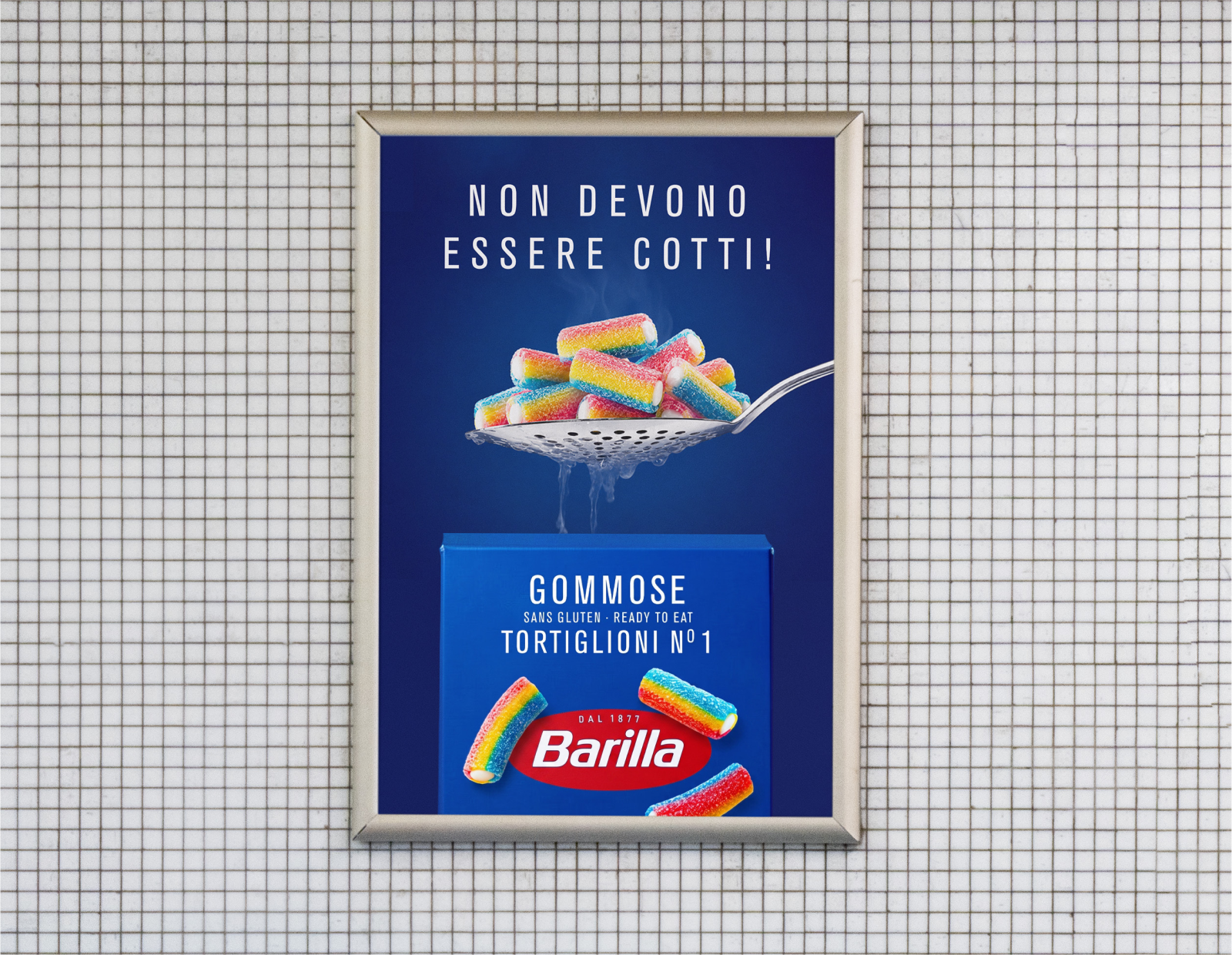
Barilla Gommose is a fictional April Fool’s brand drop that imagines Barilla entering an entirely unexpected category: gummy candy shaped like pasta.
Every April, brands blur the line between reality and fiction with playful product launches. This concept explores how far a recognizable visual identity can go in making an impossible idea feel surprisingly believable.
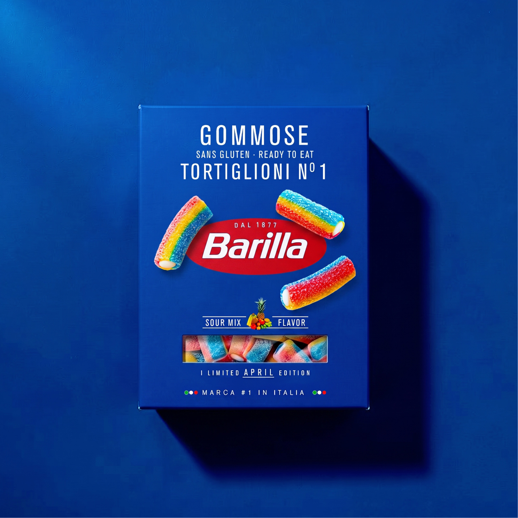
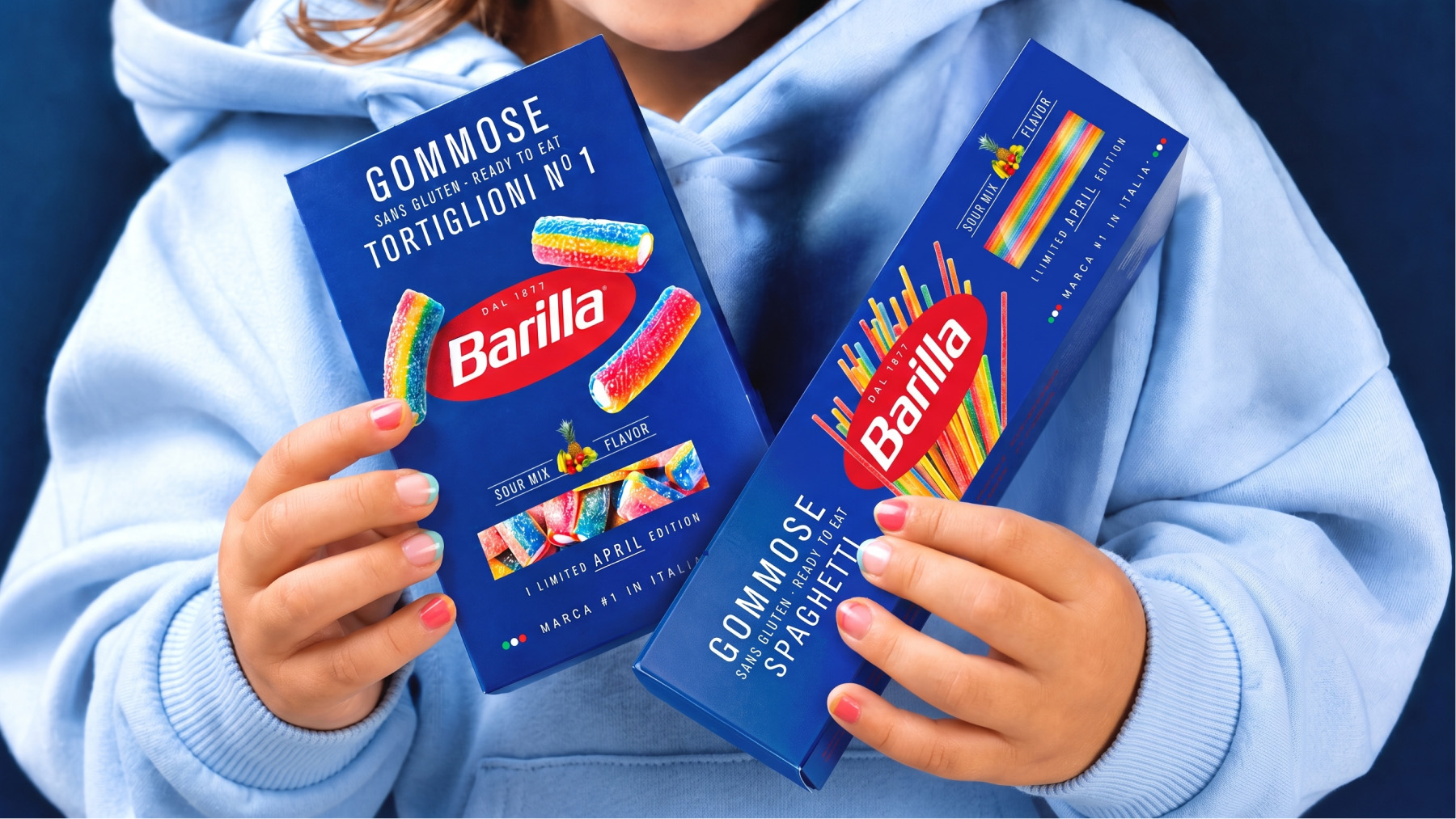
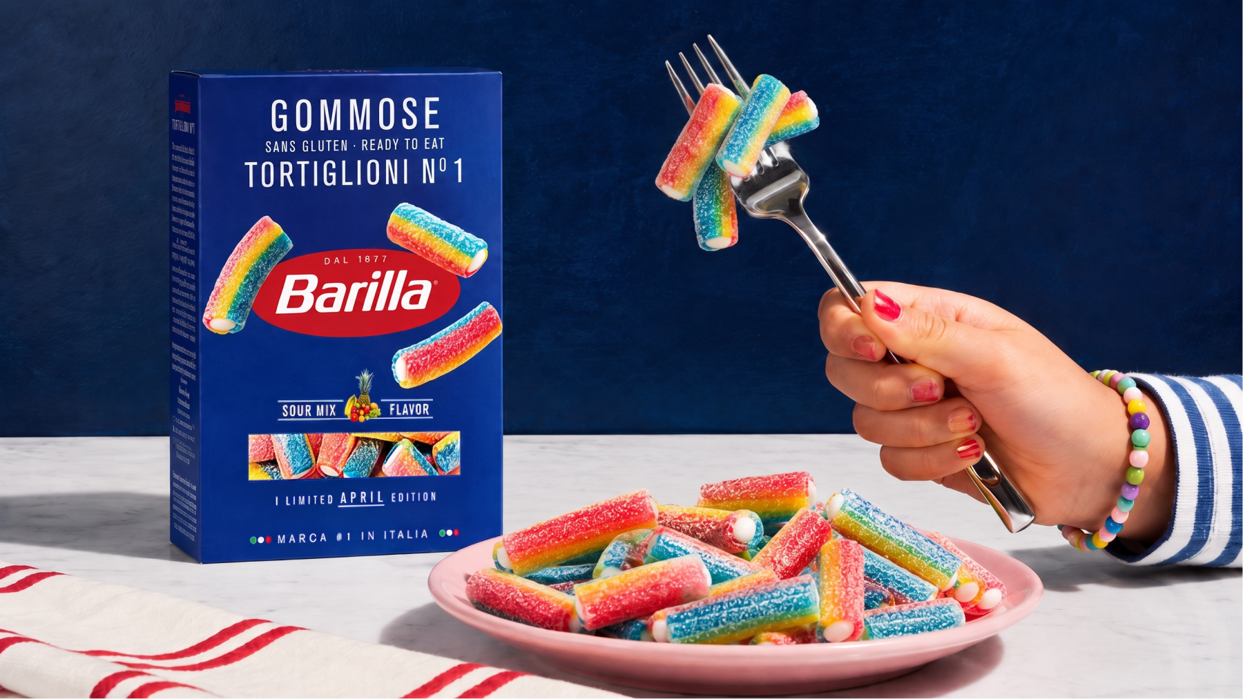
Instead of reinventing the brand, the project carefully preserves Barilla’s iconic packaging system. The familiar blue boxes, typography, composition and product windows remain instantly recognizable, while traditional pasta is replaced with colorful gummy shapes inspired by Tortiglioni and Spaghetti. The contrast between expectation and reality creates the joke without breaking the visual language of the brand.
Barilla Gommose demonstrates how consistent packaging design can become a powerful storytelling tool, making even the most unexpected product feel as though it has always belonged on the shelf.
Curator’s Insight
The strength of this concept is restraint, which is unusual for a joke format that could easily have leaned into visual chaos instead. Nothing about the layout, color blocking, or typographic hierarchy signals parody. The blue field, the oval logo treatment, the product photography window positioned exactly where a pasta shape would normally appear, all of it stays load bearing rather than becoming decorative commentary on the brand.
That fidelity is what makes the substitution work. Swapping spaghetti strands for gummy rainbow strands inside an otherwise unchanged dieline creates a kind of cognitive double take. The eye registers “Barilla” before it registers “candy,” which is the entire mechanism of the joke. If the packaging system had been altered even slightly to wink at the audience, the effect would collapse into generic novelty packaging instead of a believable shelf object.
There’s also a useful lesson here about brand equity as a design asset independent of product category. The concept only works because Barilla’s visual system is distinctive and consistent enough to survive a total product substitution without losing legibility. Few FMCG identities could carry that kind of category jump and still read as unmistakably themselves. That’s less a comment on pasta or candy and more a demonstration of how durable a well built identity system actually is under stress testing, even fictional stress testing.

 NEV
NEV Stefano Bracci
 Alina
Alina monther al omari
 Lizakjx
 JOAOMARCOSDESIGN
 alchimistestudioParis
 Harriet Neild
 octavio rojo
 宏洛图品牌设计HONGLT
 DESIGN CONCEPTS
 Alexander Skurihin
 Studio K95
 ARMBRAND
 Richa Rai
 houseoferas by Miti
 Agence des Coteaux
 Kushi Eaknath
 Ann Treasa
 Xiao Ning
 krrrrrllii
 babyage
 Deep
Deep