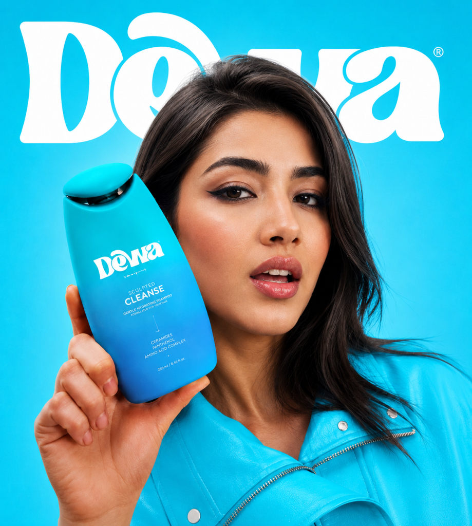

Dewa is a contemporary personal care identity created for a unified collection of hair care and skin care products. The project includes the complete visual system—from brand strategy, logo design, and visual identity to structural packaging design and the final packaging graphics.
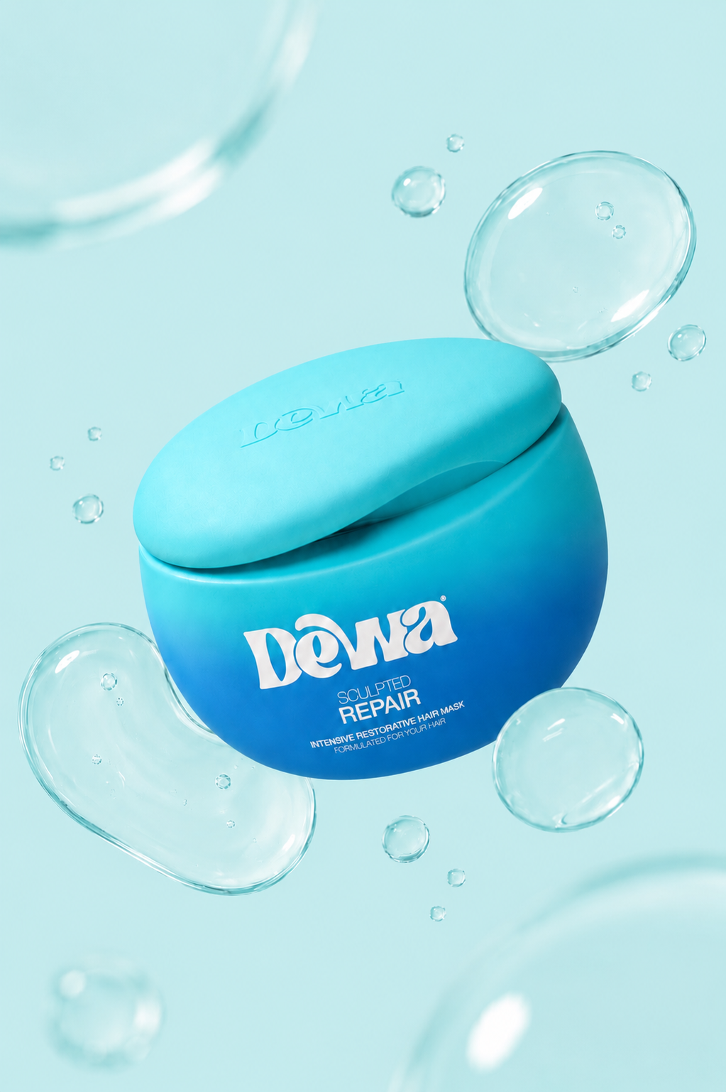
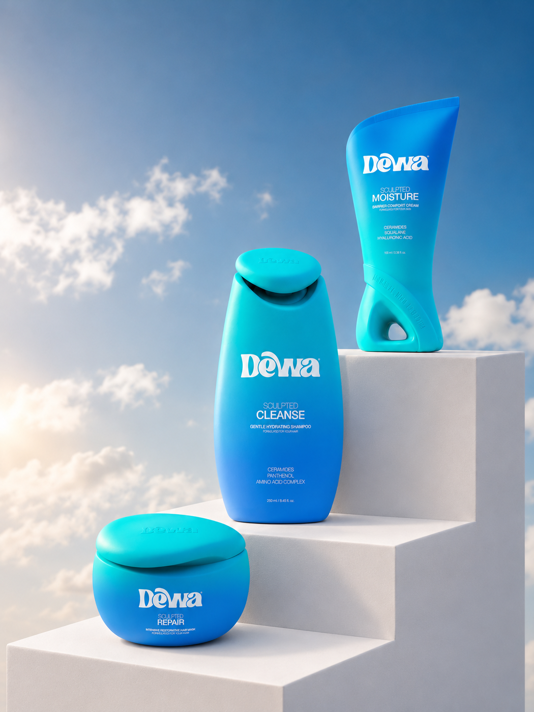
The concept is built around the idea of fluidity. Instead of relying on decorative elements, the packaging itself becomes the visual expression of the brand. Every container is sculpted with continuous, flowing surfaces inspired by the natural movement of liquids, creating a family of forms that feels soft, ergonomic, and immediately recognizable.
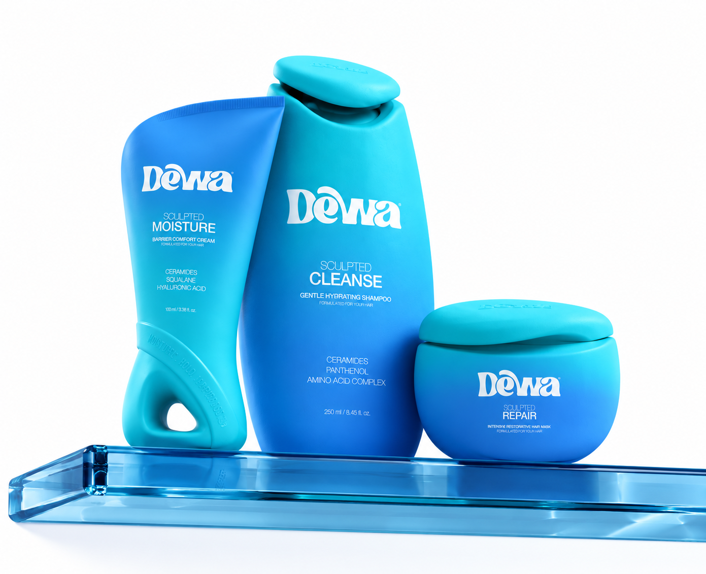
A custom structural language was developed for each package while maintaining a consistent silhouette across the collection. Each product has its own unique geometry, yet all of them belong to the same visual ecosystem through shared proportions, soft transitions and organic curves.
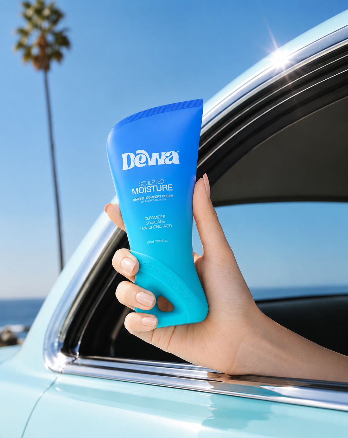
The graphic system follows the same philosophy. Rather than separating the label from the package, a seamless gradient becomes an integral part of the object itself. The transition from turquoise to blue enhances the sculptural volumes, emphasizes depth and movement, and creates a fresh visual identity that connects every product within the range. Clean typography and generous negative space allow the structural design to remain the primary visual focus.
The result is a modern packaging system where branding, structure, and graphics work together as a single design language. The collection aims to stand out through its distinctive fluid forms, tactile simplicity and cohesive visual identity, offering a premium yet approachable presence across both skincare and haircare categories.

 Derrick Lin
 Biaa
Biaa Petitmoulin Studio
 White Bear Studio
 Eva Chistyakova
 monther al omari
 Atipus
 alchimistestudioParis
 oneandother
 bloomburo
 helocrene
 Shapers Studio
 Denver Design
 Aidearte
 andrew.huerta
 softmachine
 airobtq
 Buzz & Co.
 Ruby
Ruby themythographer
 IDNB Inc.
 viktorflr
 Zenpack