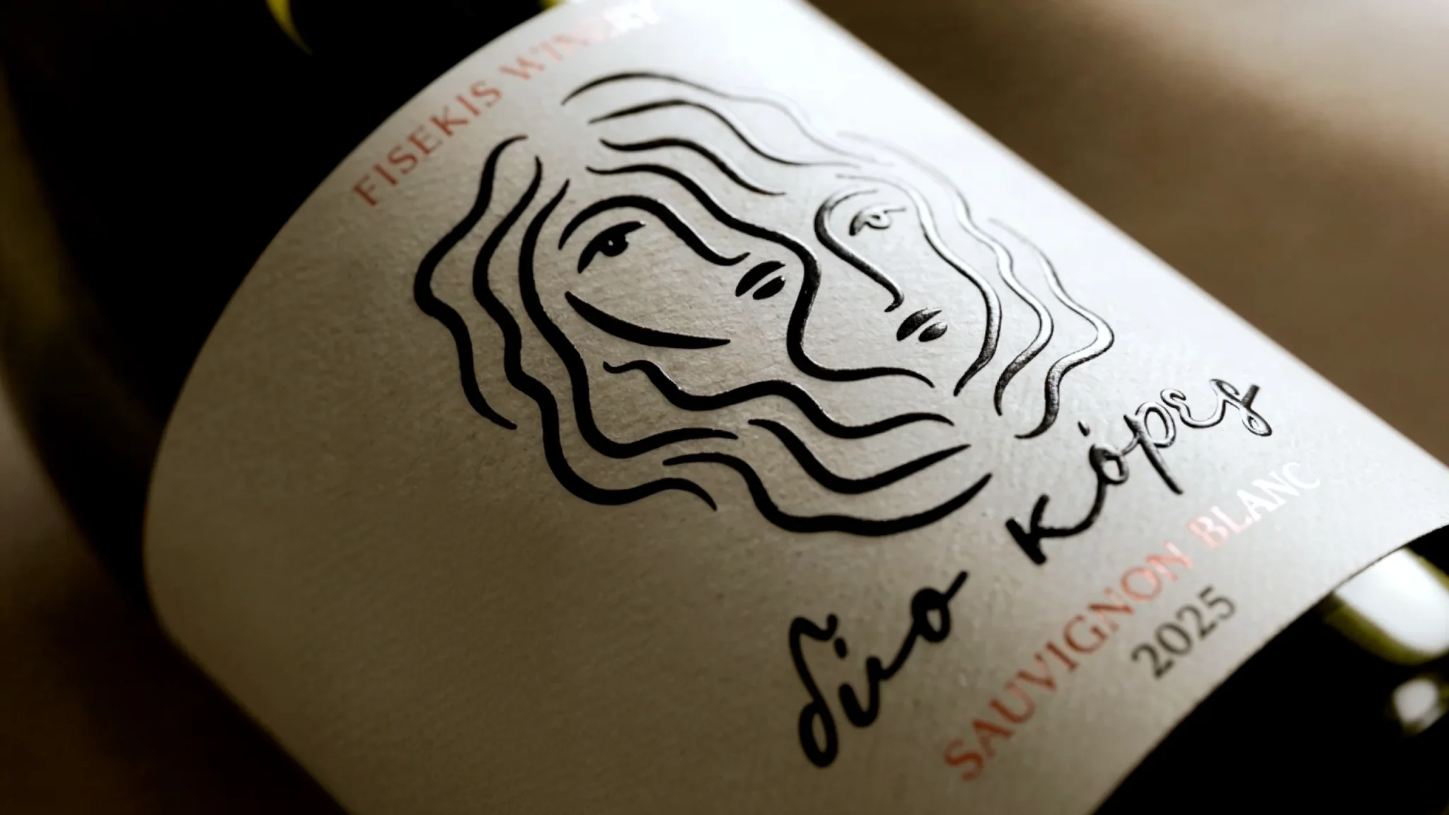

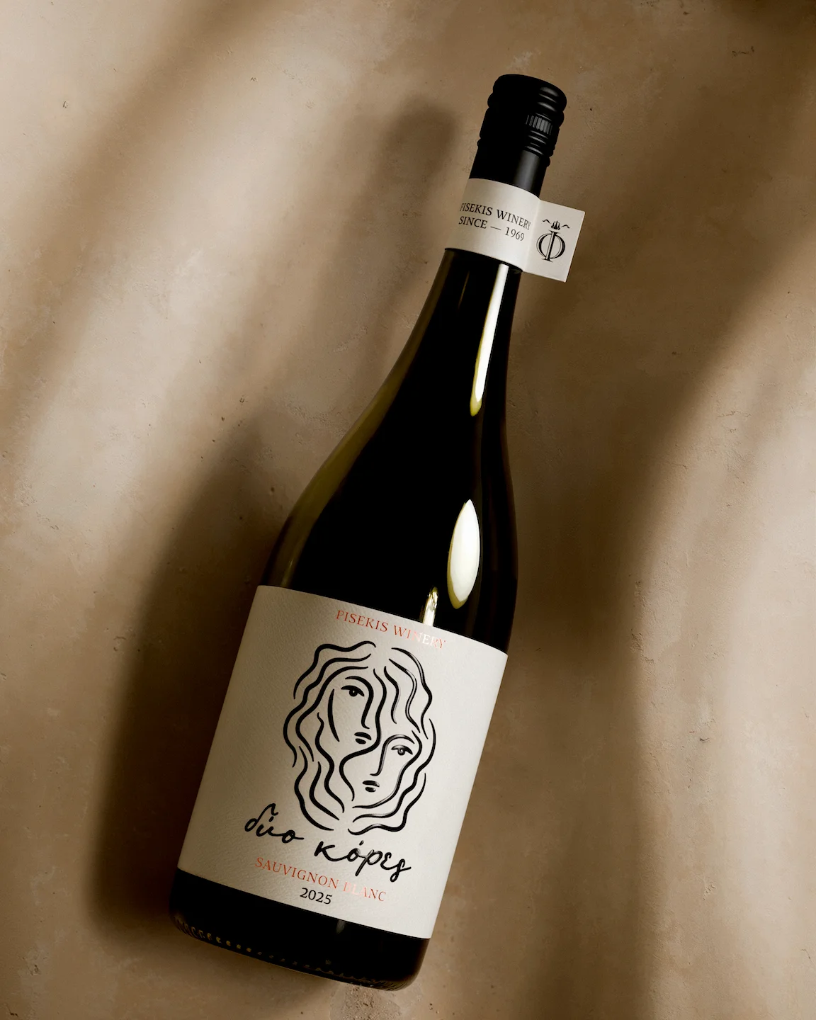
The packaging design for the Dio Kores (Δύο Κόρες) wine unfolds as a visual narrative of bond, where two faces share the same line without losing their individual identity. The figure at the heart of the label was born from the wine’s own name two heads, two gazes, merged within a single mesh of wavy lines.
The illustration holds an unbroken, handmade rhythm; no line repeats, and every curve carries the imperfection and vitality of a sketch, evoking a family narrative rather than a decorative motif. Dyo Kores logotype follows the same logic, hand-lettered in a slanted, unsteady script that reads as a signature rather than bottle typography.
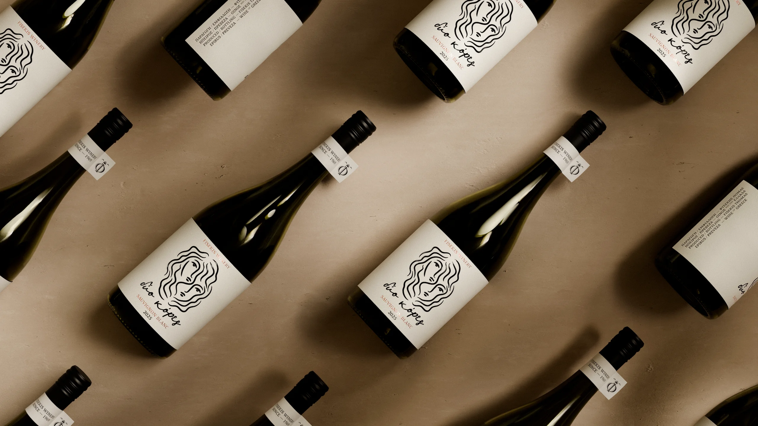
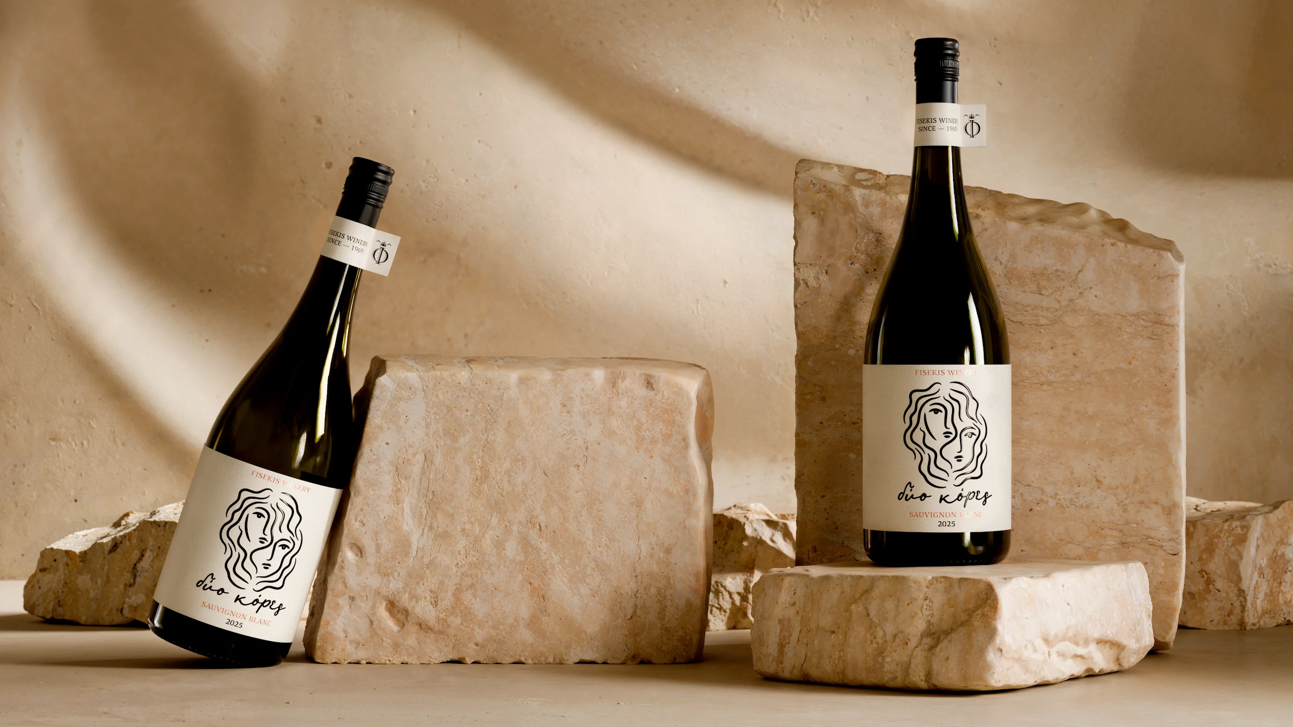
For the label, we chose a premium self-adhesive paper, its texture recalling the stone and limestone of Epirus region in Greece, allowing the figure to lead within the space. Foil stamping brings out fine details across the label, while on the bottleneck the winery’s identity is distilled into a single Φ monogram.
The figure of the two faces, functions as the label’s central narrative element, translating the wine’s name into image without the need for words.
Curator’s Insight
The risk with any illustrated face on a wine label is that it becomes decoration, a pretty image sitting on top of the product rather than doing any work for it. This label avoids that by making the illustration the argument. The two faces aren’t paired with the name Dio Kores, they are the translation of it. Remove the word entirely and the bottle still tells you what it’s called.
That single-line technique is doing more than setting a mood. By refusing to let any curve repeat, the illustration behaves less like a logo and more like a gesture, something drawn once and left alone. That decision is what keeps two overlapping faces from reading as busy or cluttered. The line has one job, describing where one identity ends and the other begins, and it never breaks rhythm to do anything else.
The lettering follows the same rule as the illustration. A slanted, uneven script reads as handwriting, not typography, which matters here because the whole label is arguing for intimacy over polish. Pair that with a stone-textured stock and foil detailing, and the tactile experience reinforces the same idea the illustration already made: this is a personal mark, not a manufactured one.
The transferable principle: when a design concept is genuinely strong, restraint is what proves it. One image, one line technique, one monogram. The label trusts the idea enough to not decorate around it.





 Affogato Brand Design
 Backbar Studios
 hello ocean
 POSH FMCG BRANDING
 Luciana
 Valérie Colace
 marjusguza
 Z9BKAdsgn
 Lilith Sivolenko
 Daria Levina
 Masha Kulichkova
 monther al omari
 Yana Chernova
 Atiq Alam
 ezgidesignstudio
 Pips Marin
 Antonia Skaraki
 Ezi Brand Design
 Kanishka Chhajer
 Zachary Kent
 SOT B&D
 Normal studio
 Garry Veda