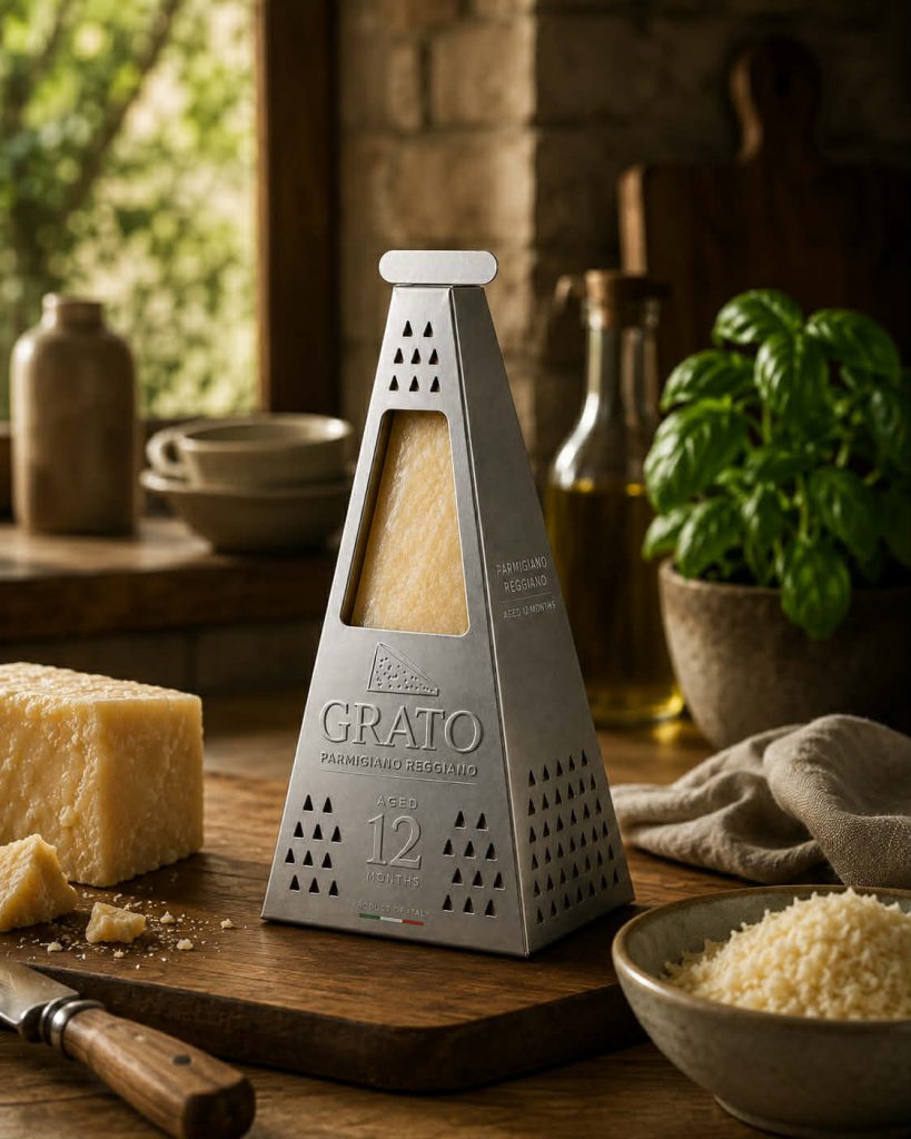

GRATO — Parmigiano Reggiano
Some products are so iconic that they already have a universal symbol. Parmigiano Reggiano has the wheel. Grated cheese has the grater.
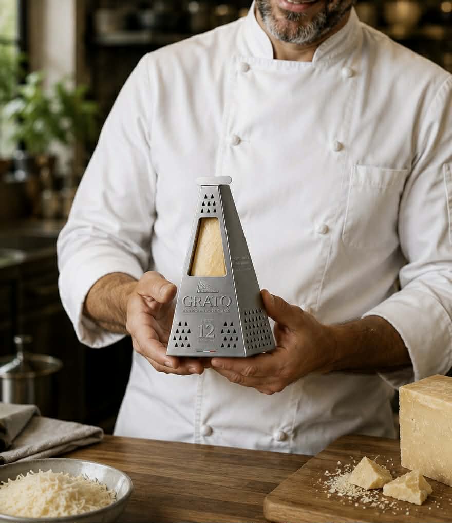
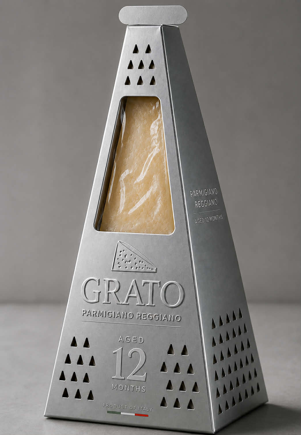
Rather than decorating the package with illustrations or traditional Italian cues, GRATO merges these two identities into a single object. The packaging itself becomes the grater.
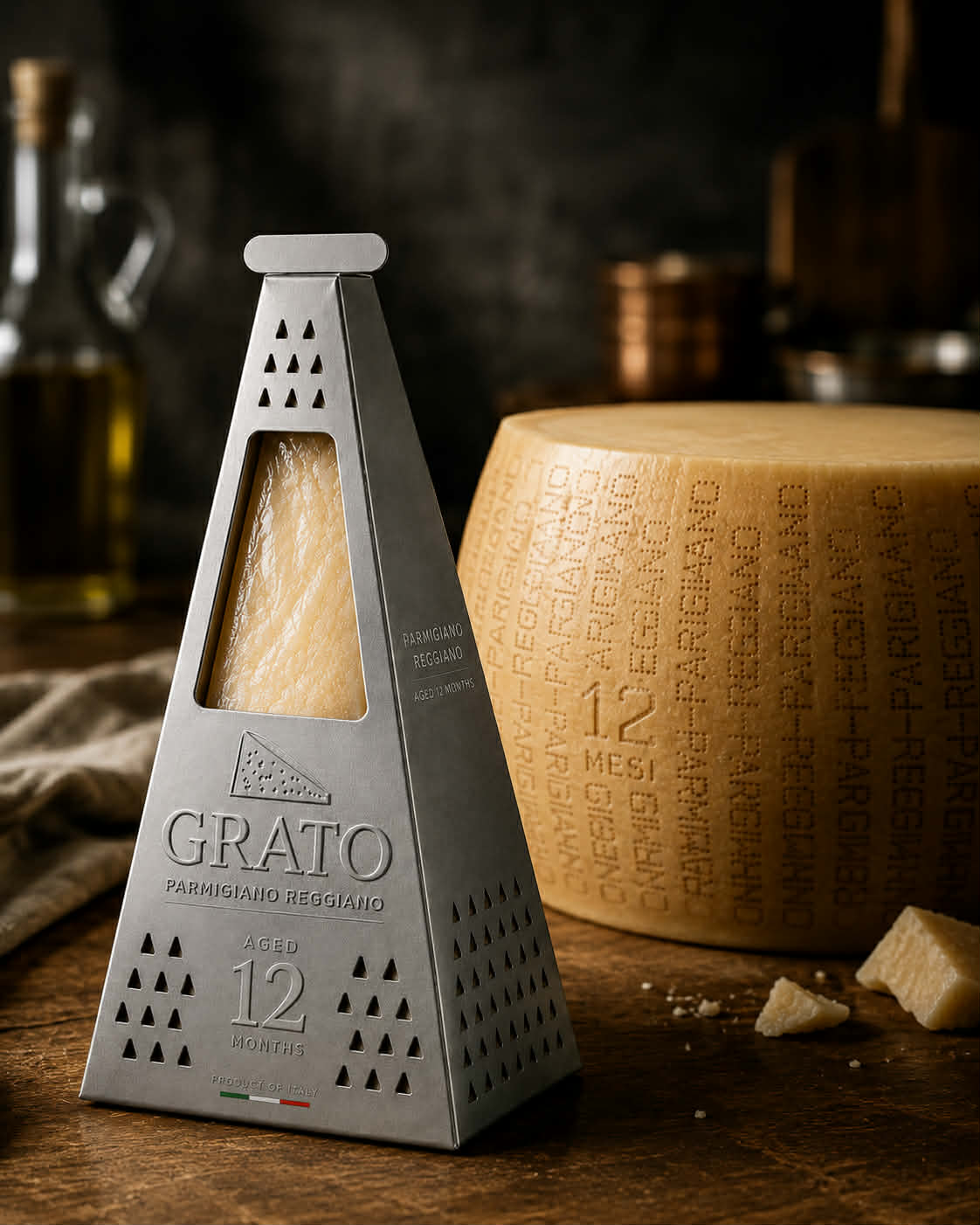
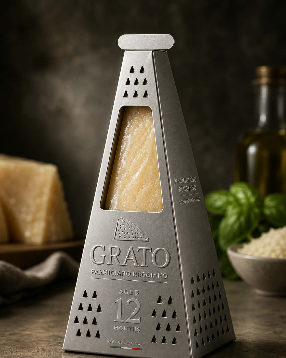
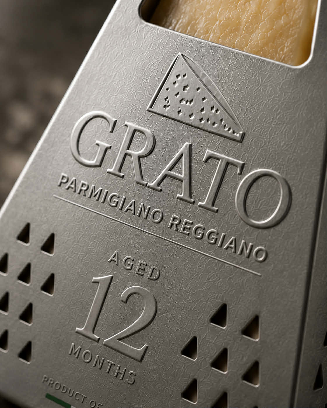
Its pyramidal structure reproduces the silhouette of a classic kitchen grater, while precisely cut triangular perforations wrap around every face. They are not decorative elements but visual cues borrowed directly from the tool used to prepare the product. A large die-cut window reveals the authentic texture of the cheese, allowing the Parmigiano to become the hero of the design.
The metallic finish reinforces the illusion of stainless steel, transforming a simple paperboard pack into an object that feels instantly familiar in every kitchen. The tactile embossing, restrained typography and monochromatic palette allow the product itself to provide warmth and colour, creating a premium identity rooted in honesty rather than excess.
Instead of adding graphics to explain the product, the structure tells the story. At first glance, consumers recognize a grater. A second look reveals that it is actually the packaging. This moment of surprise creates an immediate emotional connection while reinforcing the product’s purpose.
GRATO demonstrates how structural packaging can move beyond protection to become a memorable brand asset, turning an everyday kitchen utensil into a distinctive retail experience where function, symbolism and storytelling merge into one iconic form.
 Derrick Lin
 Biaa
Biaa Petitmoulin Studio
 White Bear Studio
 Eva Chistyakova
 monther al omari
 Atipus
 oneandother
 bloomburo
 helocrene
 Shapers Studio
 Denver Design
 Aidearte
 andrew.huerta
 softmachine
 airobtq
 Buzz & Co.
 Ruby
Ruby themythographer
 IDNB Inc.
 viktorflr
 Zenpack
 Wessam Hussien
 samarabdelmonem