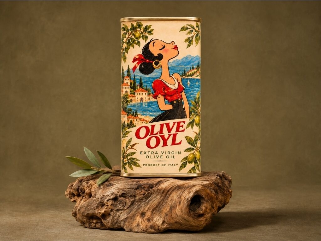

Childhood cartoons tend to come back to us in fragments. The plot of an episode may be long forgotten, but we can still picture the way a character tilted her head or recognize her from a few lines. Olive Oyl, from Popeye, has that kind of silhouette. Her long neck, dark bun and lifted chin were the starting point for this packaging concept for Italian extra virgin olive oil.
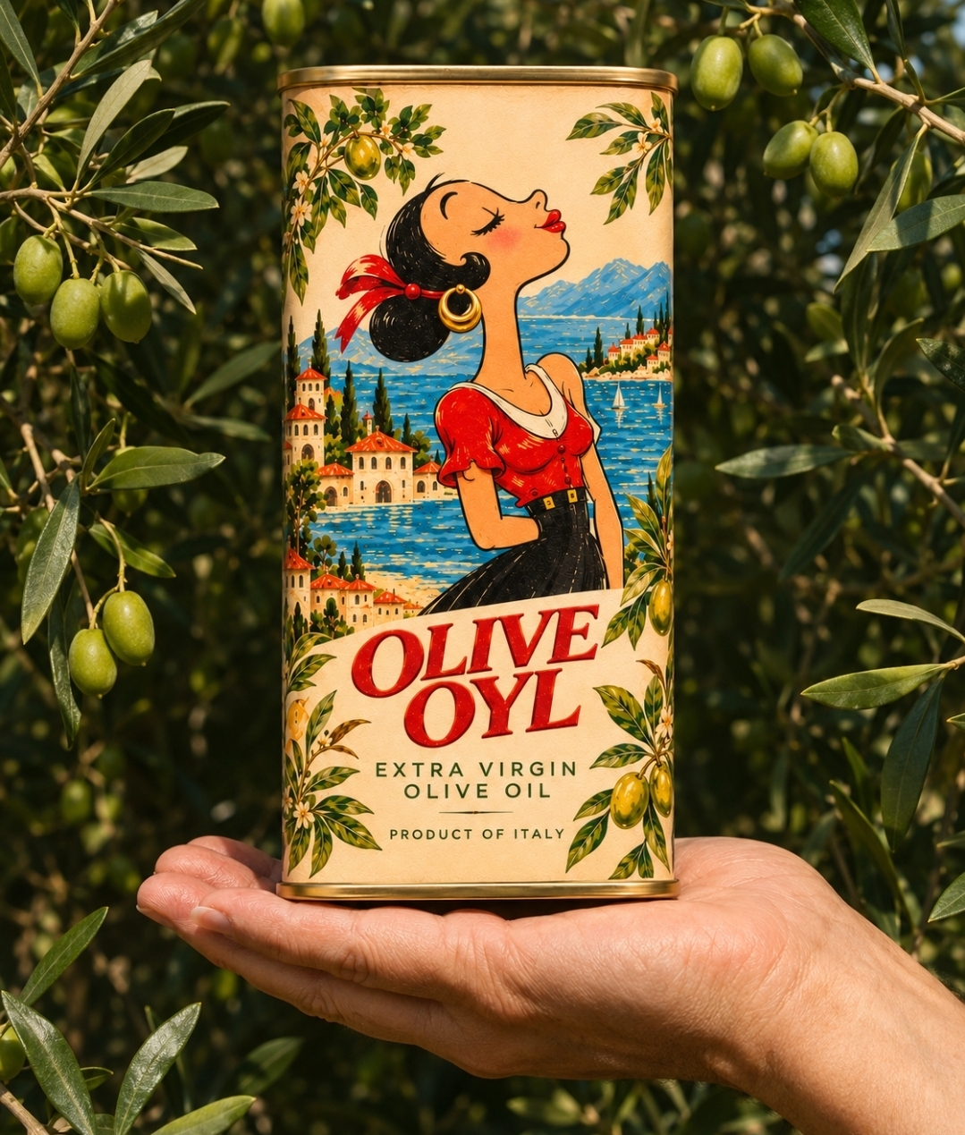
The play on her name gave the project its first spark. The more interesting question was what it would feel like to meet her again in an everyday object. On the tin, Olive Oyl has her eyes closed and her face turned upward, as if taking a moment to feel the sun. Her red ribbon and gold hoop catch the eye, and the curve of her profile keeps something of the expressiveness that made her so memorable on screen. There is a little humour in recognizing her on a tin of olive oil, and a little tenderness in seeing her somewhere so far removed from the television set.
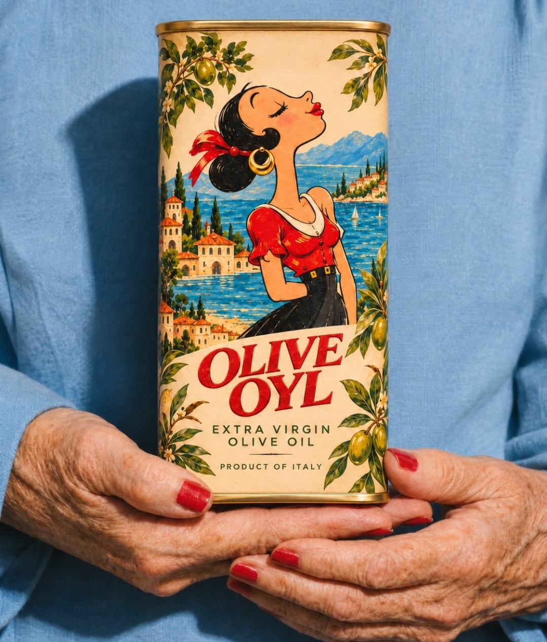
The setting borrows from vintage Italian travel posters. A blue harbour opens behind her, with terracotta roofs and slender cypresses tracing the shoreline. The water and village sit behind her silhouette, while olive branches lead the eye around the composition and over the rounded corners of the tin. At the bottom, the landscape gives way to a warm ivory field. The name is set in large red serif lettering over two lines, echoing the red of her blouse and ribbon. That repetition ties the illustration to the typography and gives the front panel a clear focal point even from a distance.
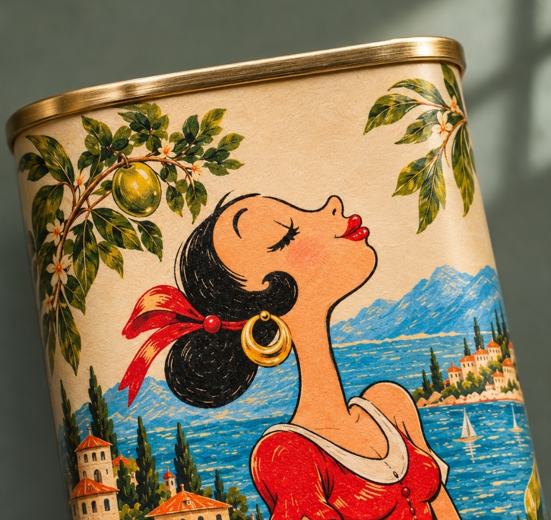
The tall, narrow metal tin gives the portrait room to breathe. Its proportions draw the eye from the face down to the name, and the gold-toned rolled rims give the illustration a crisp edge. In close-up, the fine grain of the printed surface and the reflection along the rim show how differently the ink and the metal respond to light.
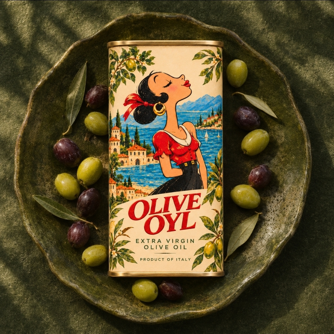
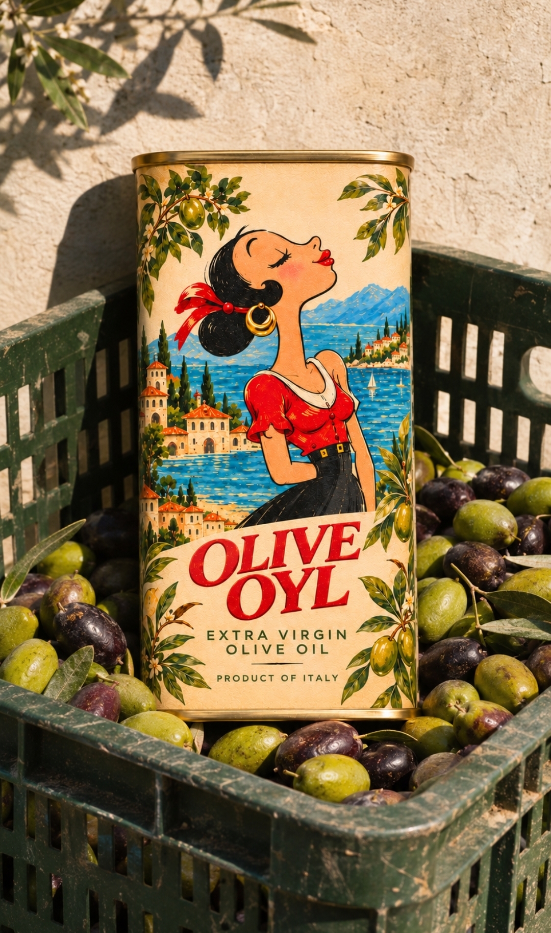
The image series takes the tin from a stone wall overlooking an olive grove to a harvest crate filled with freshly picked fruit. In one photograph, it rests in the palm of a hand among the branches. In another, it is seen from above, surrounded by green and purple olives. The wider frames give the product a setting, while the close-ups bring attention back to the expression on her face and the small details of the print.
The moment at the heart of the project is the brief pause when someone recognizes Olive Oyl before they read her name. For anyone who grew up watching Popeye, picking up the tin might bring back a little of how it felt to watch those cartoons as a child.
 VERONIKA KISELEVA
 al margen
 Jasgul
 Abhijith Madhu
 mariee
 Modern Theory
 Tancybox
 WINK®DESIGN
 impprintz
 Chainhouse
 rufydesign
 White Candy Design
 Just Design
 bmd group
 Laurie Offer
 medok4r
 Nouna design
 CreativeWise
 ANNA ONISHCHENKO
 Denomination
 VANESA GARCÍA ESTUDIO
 Julia Persuk
 Kingdom & Sparrow