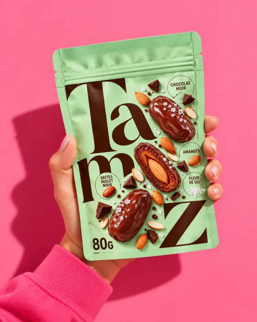

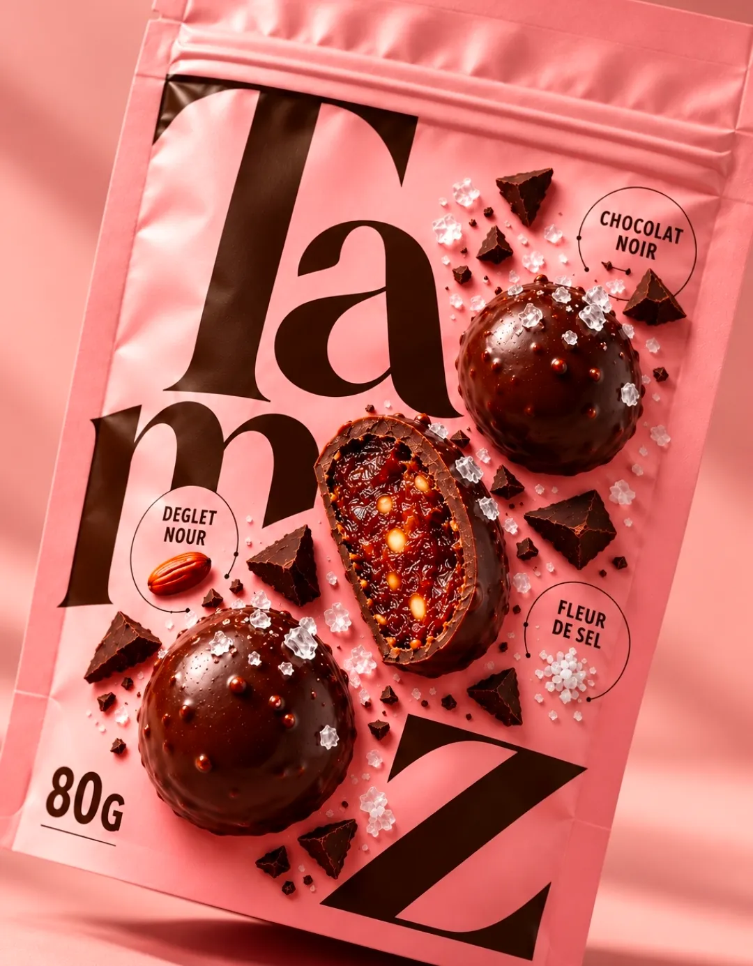
TAMZ reimagines the date through a bold, playful and contemporary packaging identity.
Combining premium Deglet Nour dates, crunchy almonds, peanuts and rich dark chocolate with a delicate touch of sea salt, TAMZ transforms a timeless ingredient into an irresistible modern snacking experience.
The creative challenge was to celebrate the product’s natural richness while breaking away from the conventional visual codes of date-based snacks.
The Design Concept
Big typography. Bold colors. Pure indulgence.
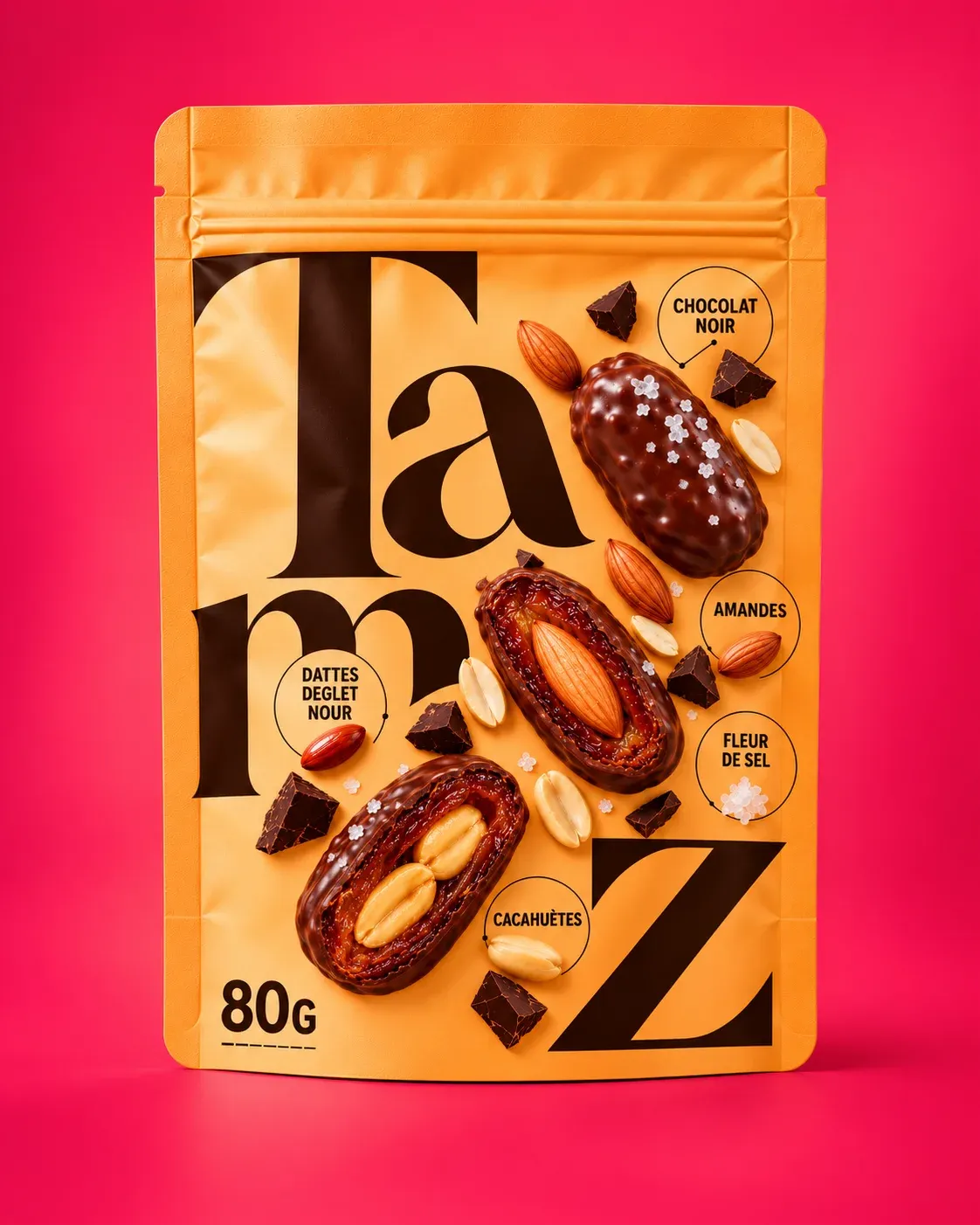
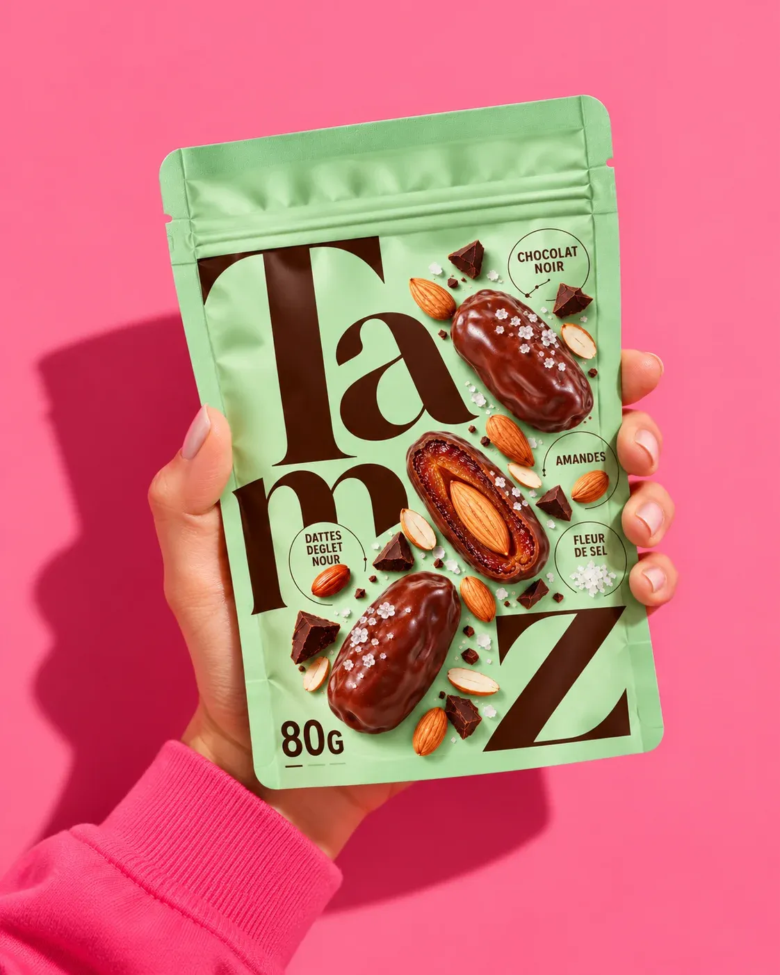
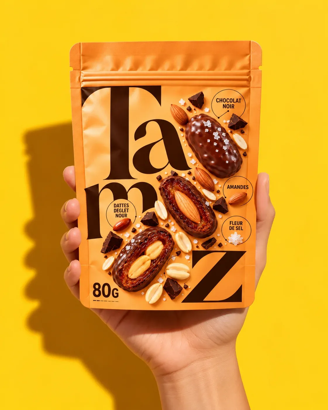
At the heart of TAMZ’s identity lies an oversized, expressive typographic system. The brand name becomes the main graphic element, extending across the packaging to create a confident and instantly recognizable shelf presence.
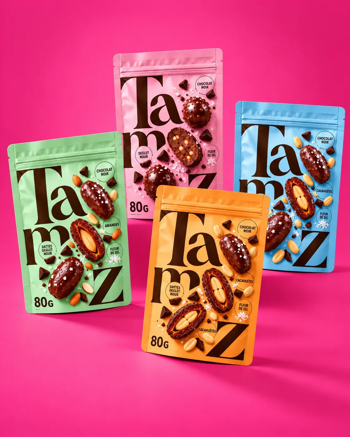
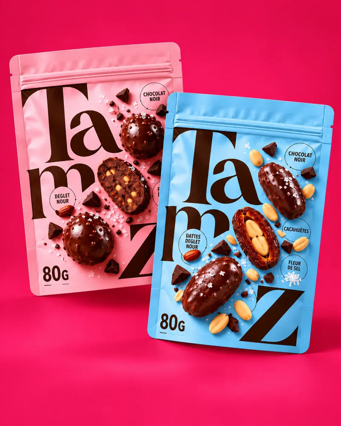
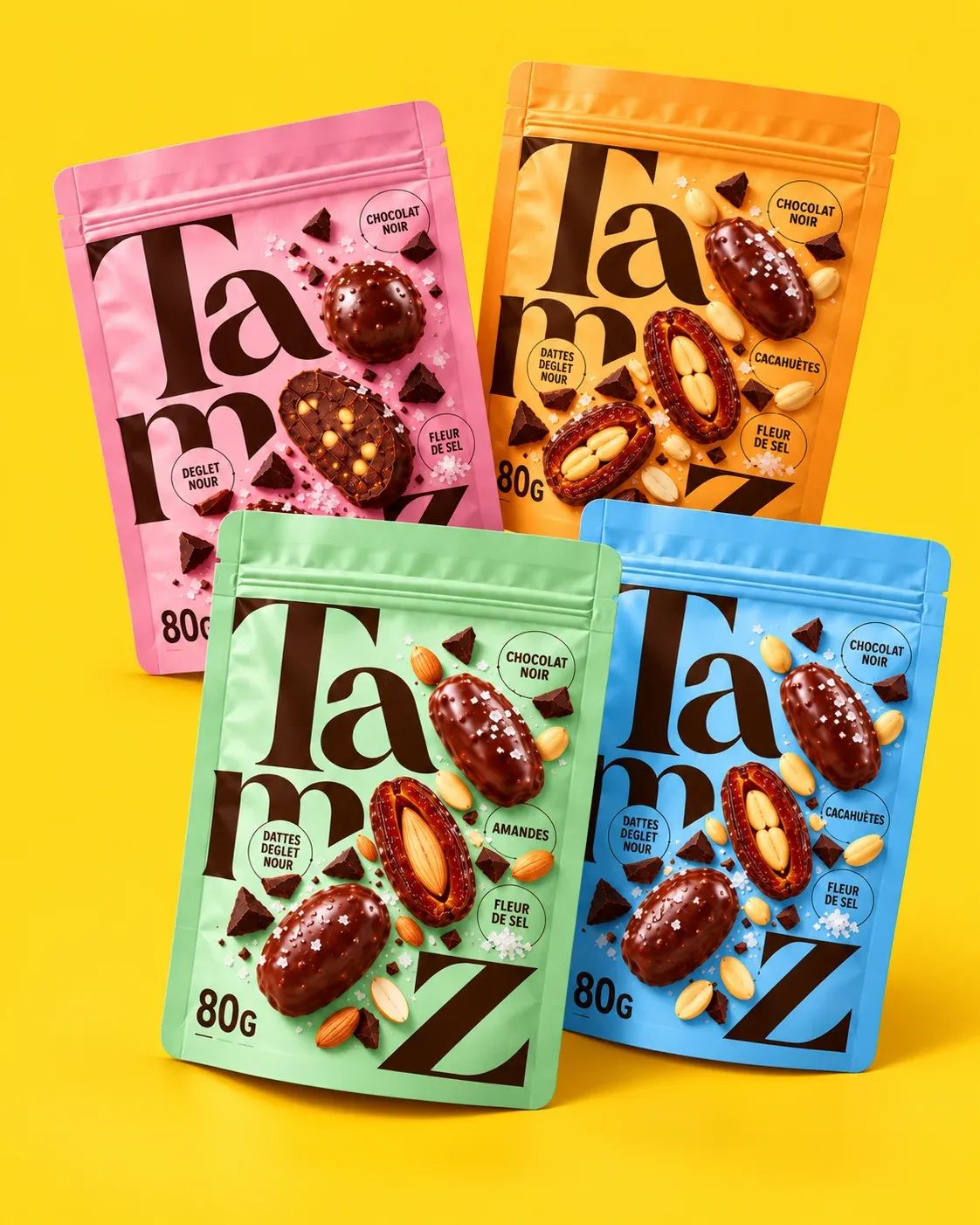
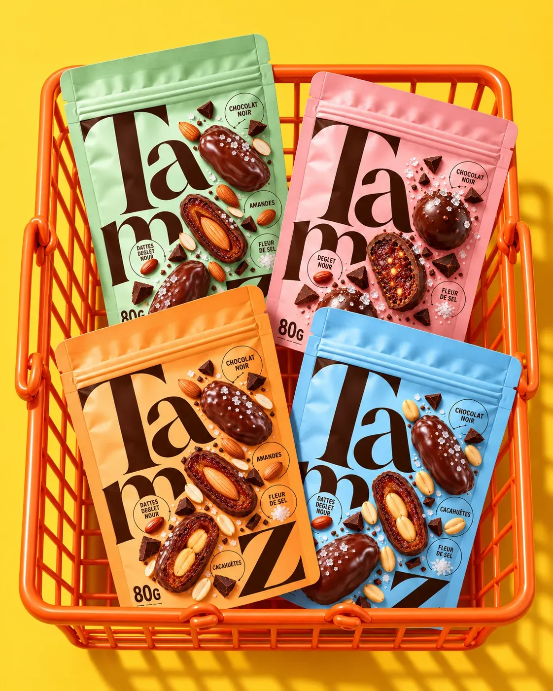
A vibrant palette of pastel pink, mint green, electric blue and warm orange gives each variety its own personality while maintaining a cohesive visual identity.
Hyper-realistic product imagery reveals the richness of the ingredients: glossy chocolate coatings, golden dates, crunchy nuts and delicate sea salt crystals.
The contrast between monumental dark typography, playful colors and appetizing food photography creates a distinctive visual language that feels both premium and accessible.
Four Flavors. One Bold Identity.
The collection features four indulgent experiences:
- Pink: Chocolate-covered date bites with sea salt.
- Green: Chocolate-covered dates filled with almonds.
- Blue: Chocolate-covered dates filled with peanuts.
- Orange: A delicious mix of almond- and peanut-filled dates coated in dark chocolate.
Beyond Packaging
TAMZ is more than a snack. It is a fresh expression of everyday indulgence.
By combining authentic ingredients with expressive design, TAMZ creates an identity designed to stand out on shelves, connect with a new generation of consumers and bring a fresh perspective to the date-based snack category.
Naturally delicious. Boldly designed. Made to stand out.
 Derrick Lin
 Sophiagdotcom
 Sofia Nikishina
 studionerius
 monther al omari
 Monroe
 KateChachava
 Snob Duck
 宏洛图品牌设计HONGLT
 Studio Six F
 Just Design
 New Century Design
 VIEWPOINT
 Abbydraw Designs Unique Conceptual Branding & Packaging Designing Ideas
 BexNelson
 Vladimir Shmoylov
 Kris
 Agence des Coteaux
 Julia M.
 Rabia zouina
 www.branding.uz
 Diego Alves do Amaral
 studioaslihan
 Minim Brand Design