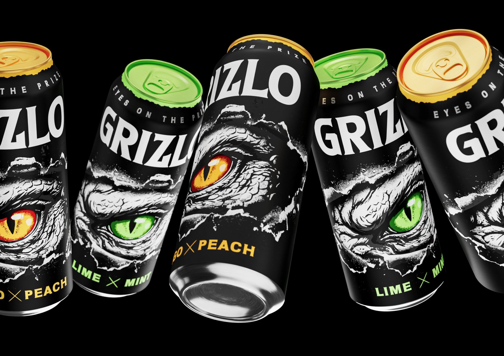

Grizlo is an energy drink built around the idea of primal strength, focus, and the instinct of a hunter. The name combines the sound of “grizzly” with a short, sharp modern brand rhythm that is easy to remember. It evokes associations with wild nature, endurance, and an unstoppable inner energy.
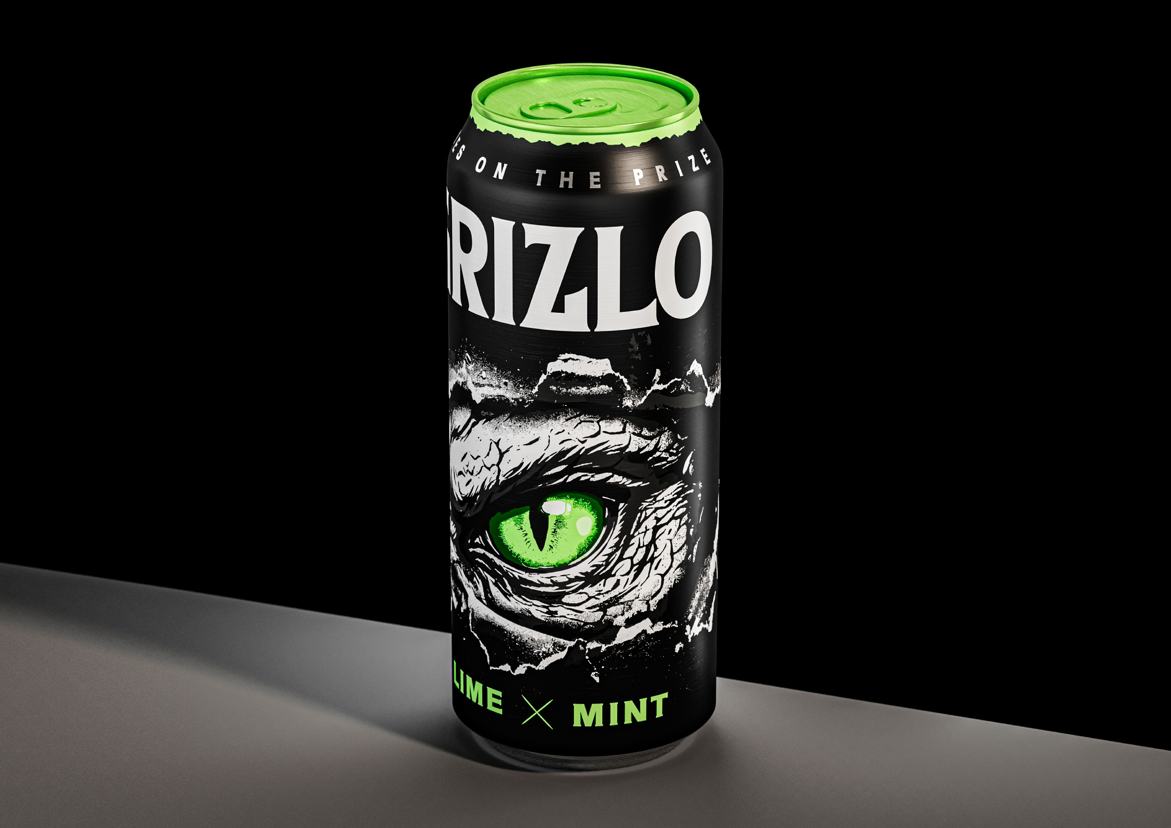
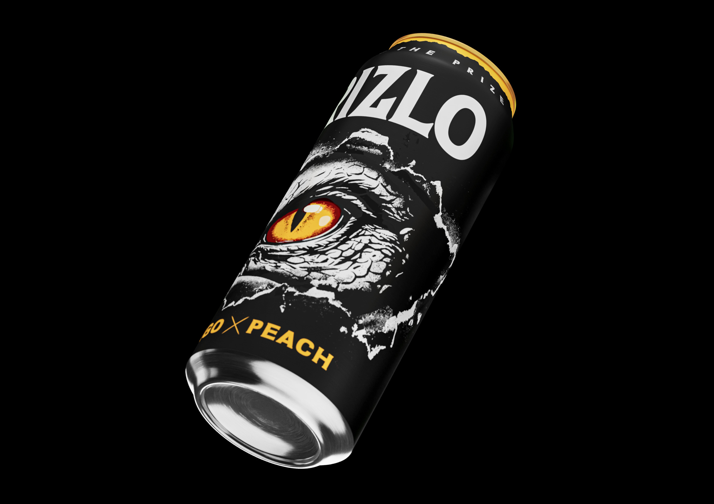
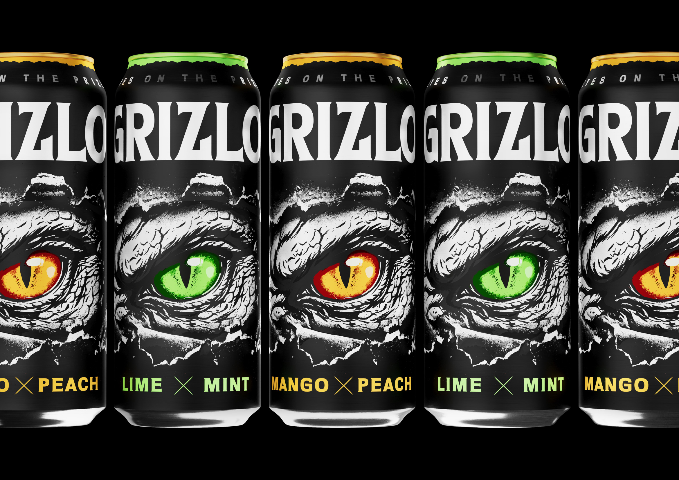
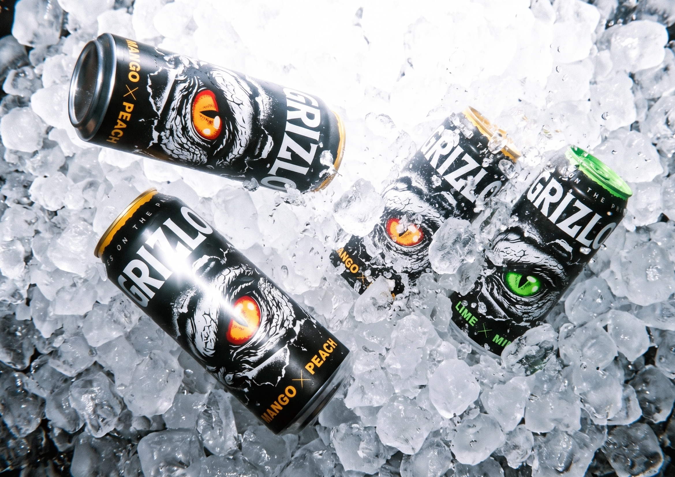
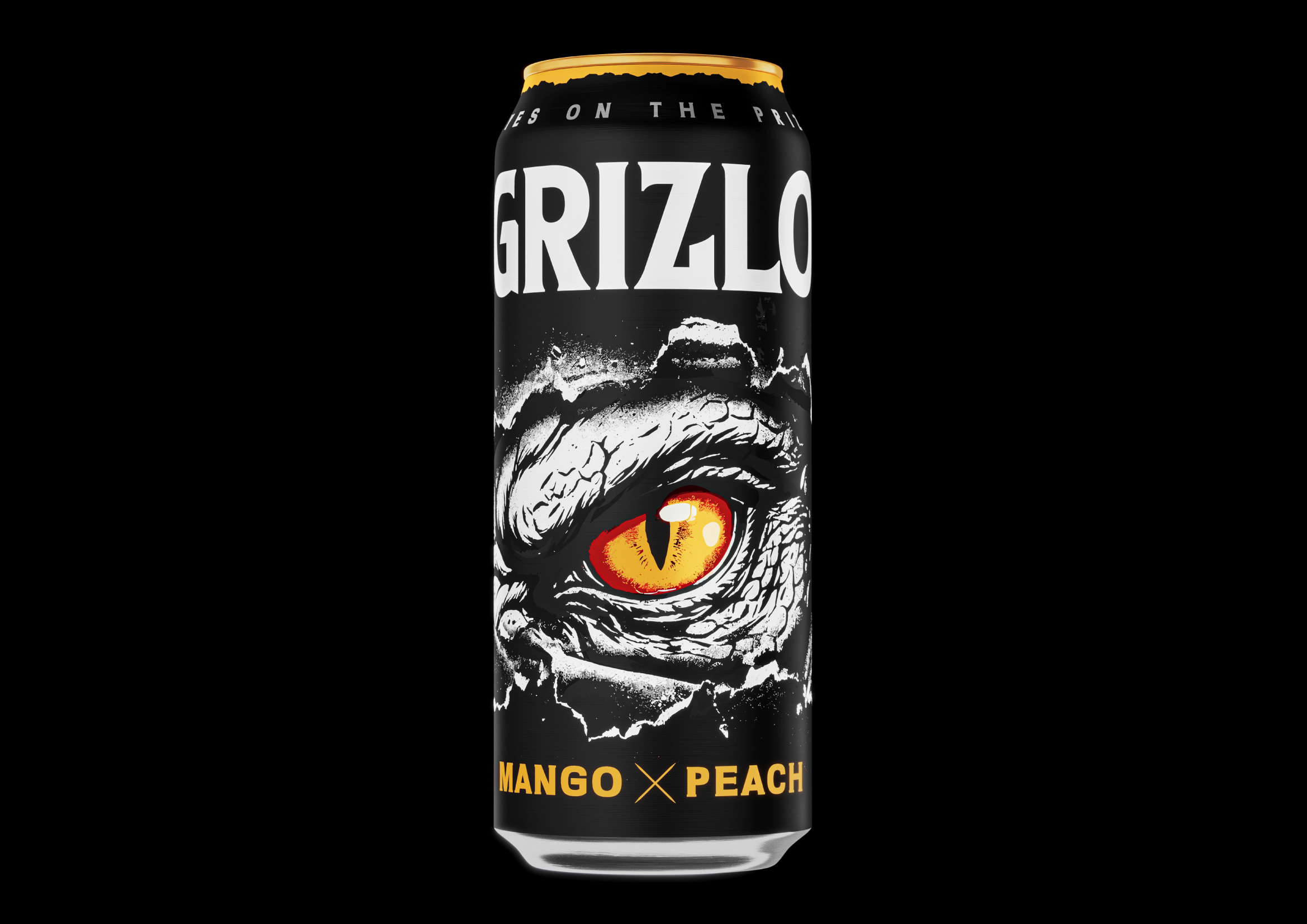
The central design element is a predator’s gaze that appears to break through the surface of the can. The torn texture creates a sense of a fractured reality, as if a living force is trapped beneath the metal and about to break free. The bright eye colors not only distinguish different flavors in the lineup but also serve as a powerful focal point on the shelf.
From a marketing perspective, the design is built for instant recognition. Large contrasting elements, minimal visual noise, and a dominant central image allow the product to stand out even from a distance. This visual approach defines the brand’s character and creates an emotional connection with the consumer before the first sip.
Curator’s Insight
What makes this can work is restraint paired with a single point of aggression. Most of the surface stays in matte black, refusing to compete with itself, so the torn illustration reads as an event rather than decoration. The cracked, paper like tear at the edges of the eye does double duty: it suggests concealment and exposure at once, giving the artwork a sense of motion even in a static print.
Color is doing the SKU differentiation here instead of pattern or layout changes, which is a smart economy of design. Keeping the black base and torn illustration identical across the range while swapping only the iris hue means the whole lineup reads as one unmistakable family from ten feet away, and a shopper can still pick their flavor at a glance up close. That’s a harder balance to strike than it looks, since many multi flavor lines either over differentiate and lose shelf cohesion, or under differentiate and become hard to shop quickly.
The wordmark placement also earns a mention. Sitting high and compact, it avoids fighting the illustration for dominance, letting the brand name function almost like a stamp of authenticity rather than the hero element. That hierarchy choice signals confidence, the design trusts the imagery to carry the brand’s personality without needing type to reinforce it.

 Derrick Lin
 Biaa
Biaa Petitmoulin Studio
 White Bear Studio
 Eva Chistyakova
 monther al omari
 Atipus
 alchimistestudioParis
 oneandother
 bloomburo
 helocrene
 Shapers Studio
 Denver Design
 Aidearte
 andrew.huerta
 softmachine
 airobtq
 Buzz & Co.
 Ruby
Ruby themythographer
 IDNB Inc.
 viktorflr
 Zenpack