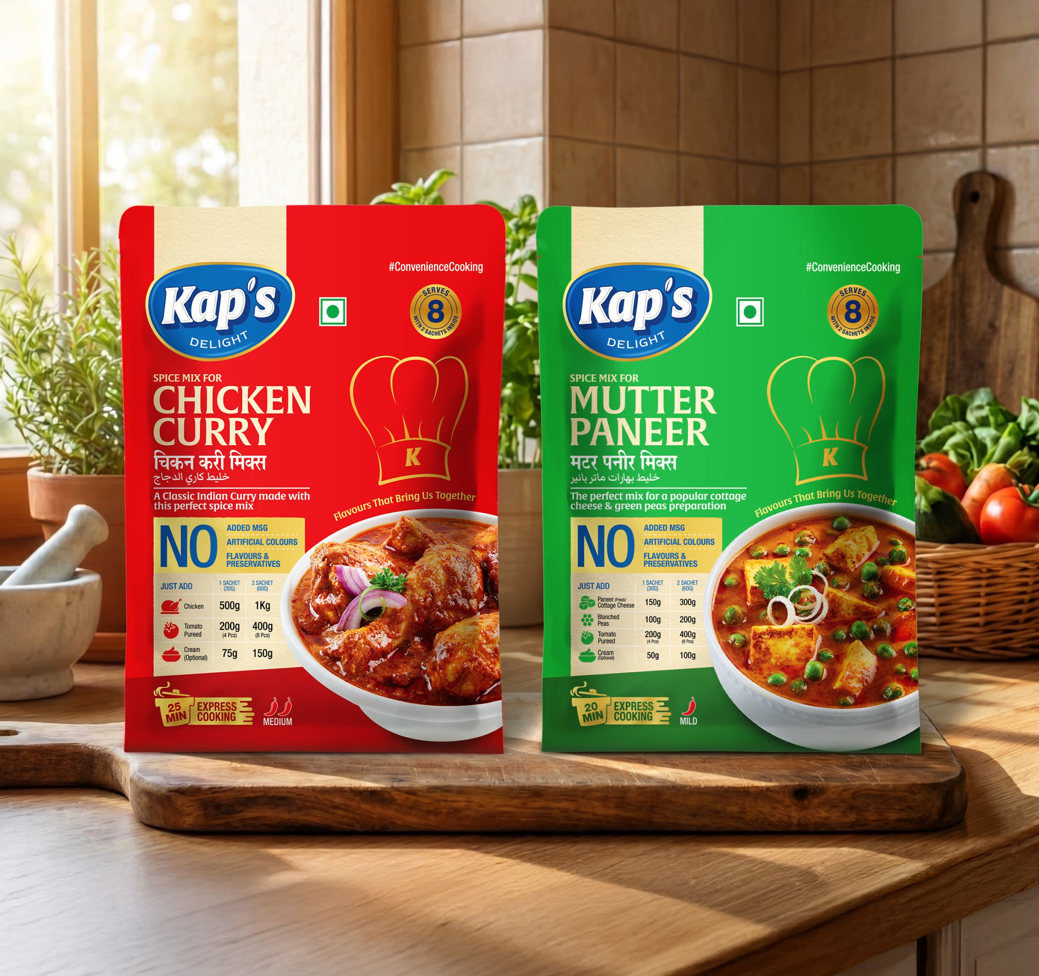

Kap’s Delight — Masala Packaging Design
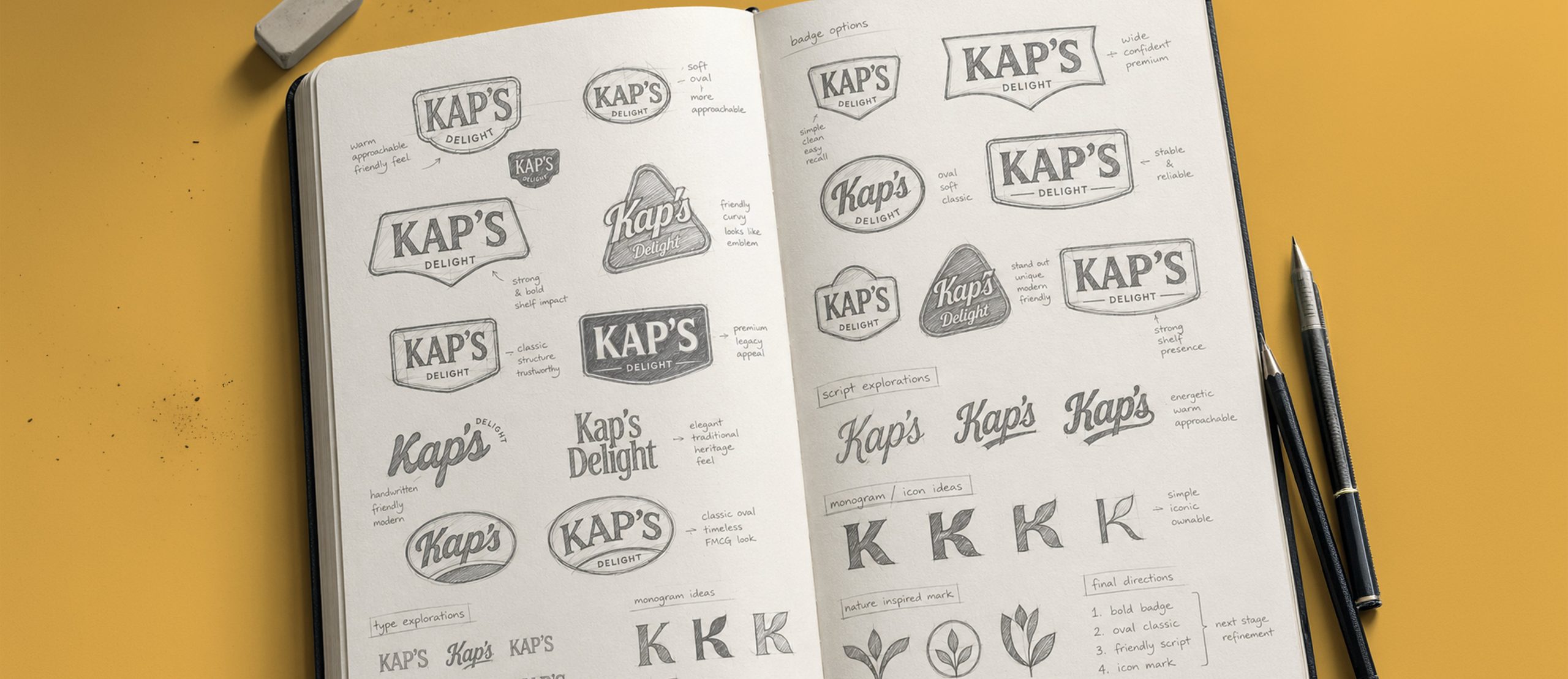
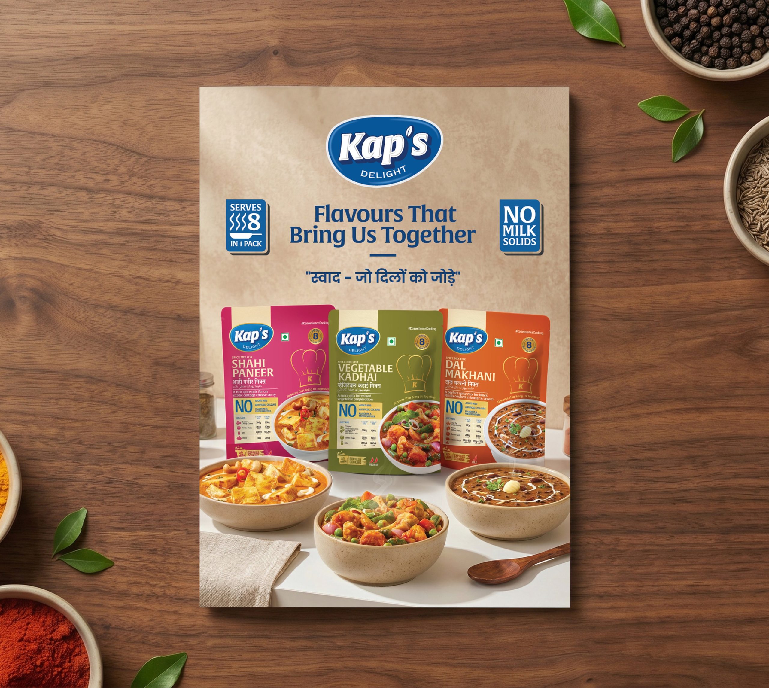
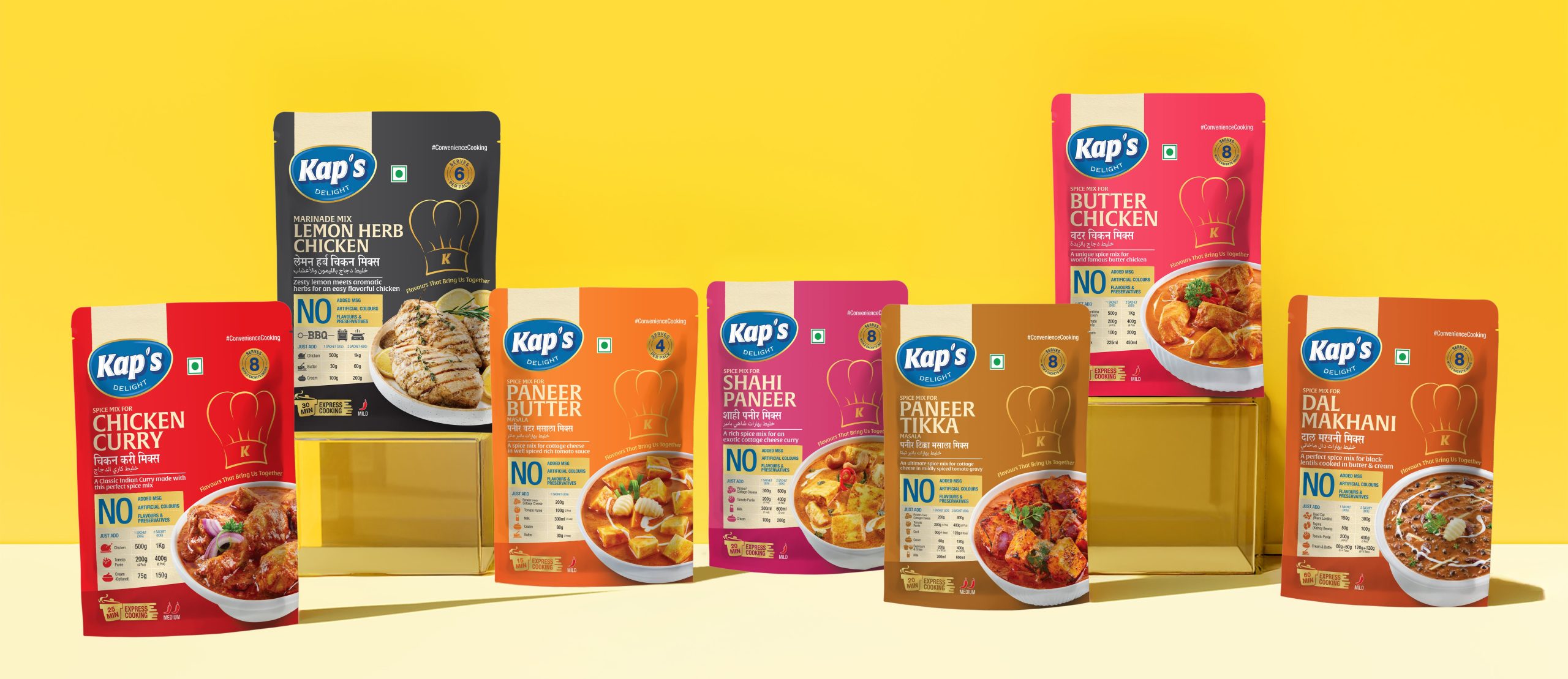
Kap’s Delight is a spice-led masala brand created for kitchens that value depth, aroma, and everyday flavour. Richest Branding was brought on to design a packaging system that could hold its own on a crowded spice-aisle shelf while unifying a wide range of masala variants under one cohesive brand identity.
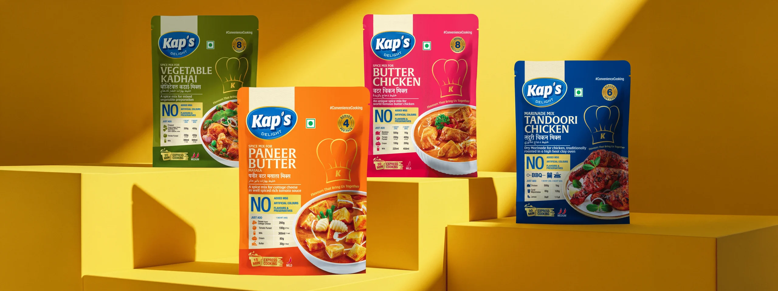
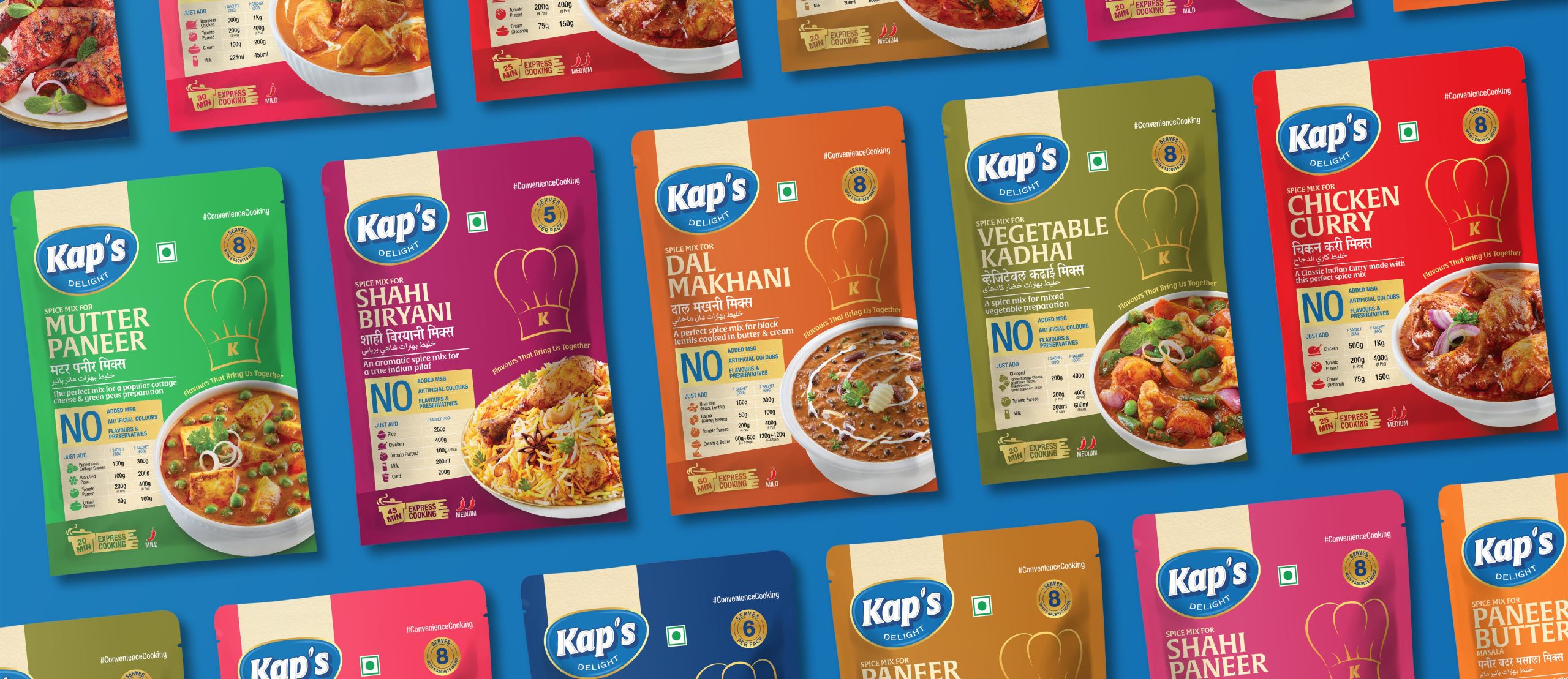
In the masala category, purchase decisions happen fast, driven largely by trust and shelf presence. The challenge was to create packaging that clearly differentiated each variant while keeping the full range visually connected rooted in tradition, but distinct from the generic, cluttered look common in the category.
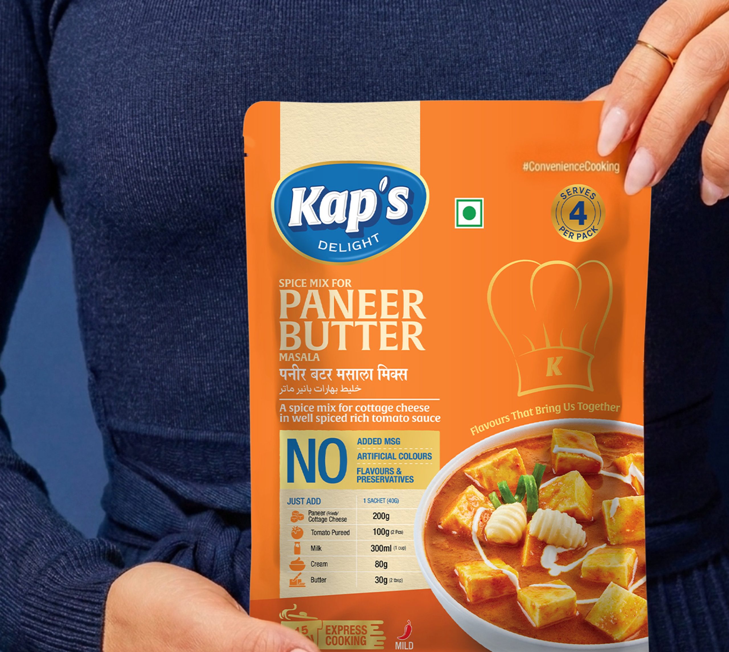
The packaging system was anchored in one core idea: flavour with authenticity. Bold colour cues and a structured visual hierarchy were drawn directly from the character of each spice blend, resulting in a design language that feels premium, familiar, and trustworthy at a glance.
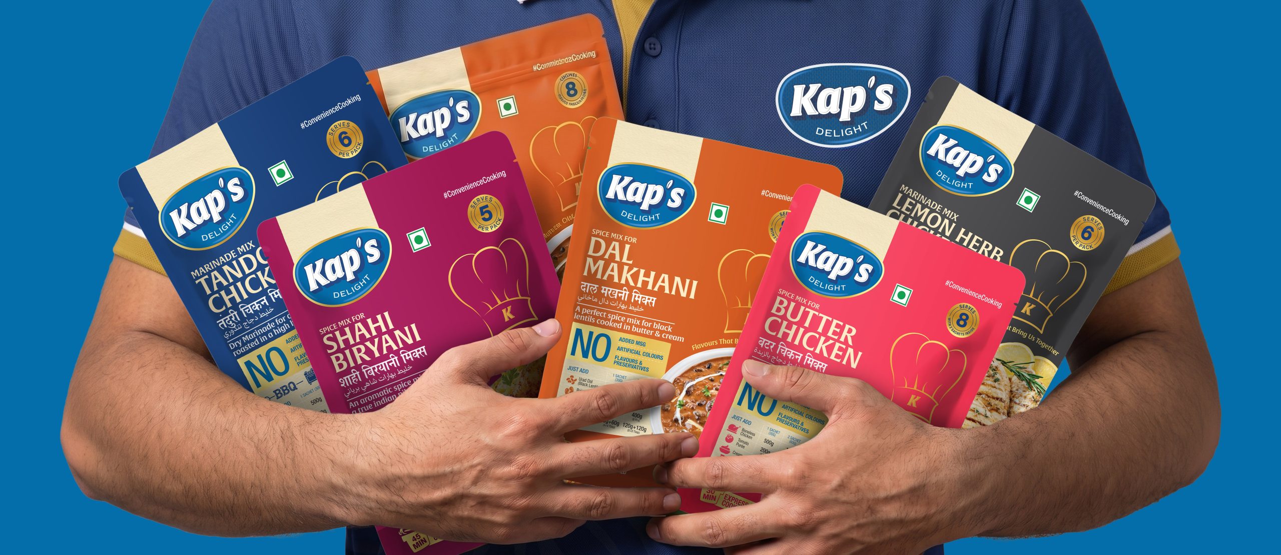
The process started with a study of Kap’s Delight’s full masala range to determine how each variant could carry its own visual signature without breaking from the larger system. This shaped a packaging architecture built around strong product naming, clear ingredient visibility, and deliberate colour differentiation extended consistently across packs, labels, and marketing collateral.
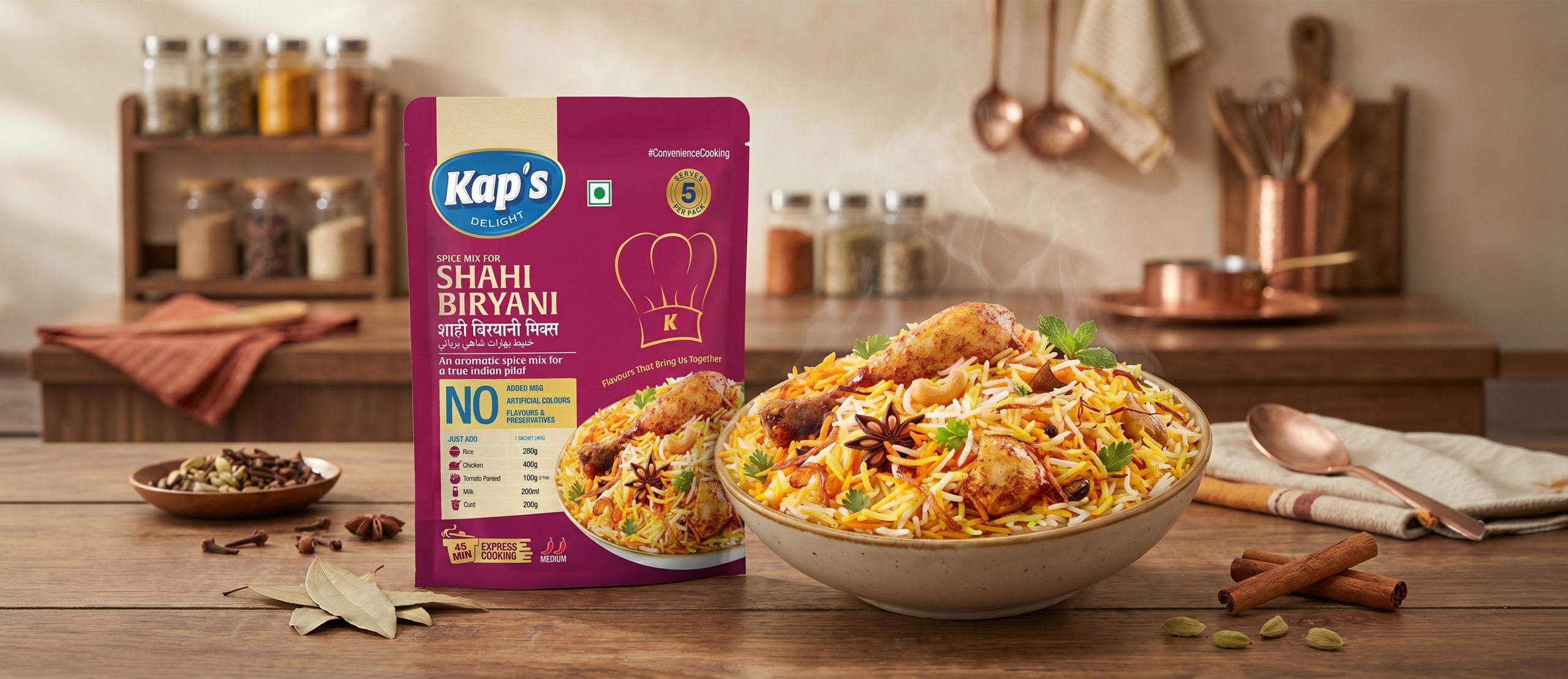
The final packaging gives each masala variant its own distinct identity while keeping the full range instantly recognisable as one family. Bold, clear, and flavour-forward, the design helps Kap’s Delight build stronger shelf recall and positions it as a dependable, vibrant brand for the modern kitchen.




 Derrick Lin
 Axiniya Knyazeva
 Hadi Samir
 Atiq Alam
 Furt Goods
 宏洛图品牌设计HONGLT
 Ampersand Creative
 Modern Theory
 Palashcc
 neo creative studio
 Valérie Colace
 Anshuman
 Archi Jain
 DESIGN CONCEPTS
 Shapers Studio
 jamajkajakub
 tamara barakat