

Title: Wildora: Packaging Built to Taste Like the Truth
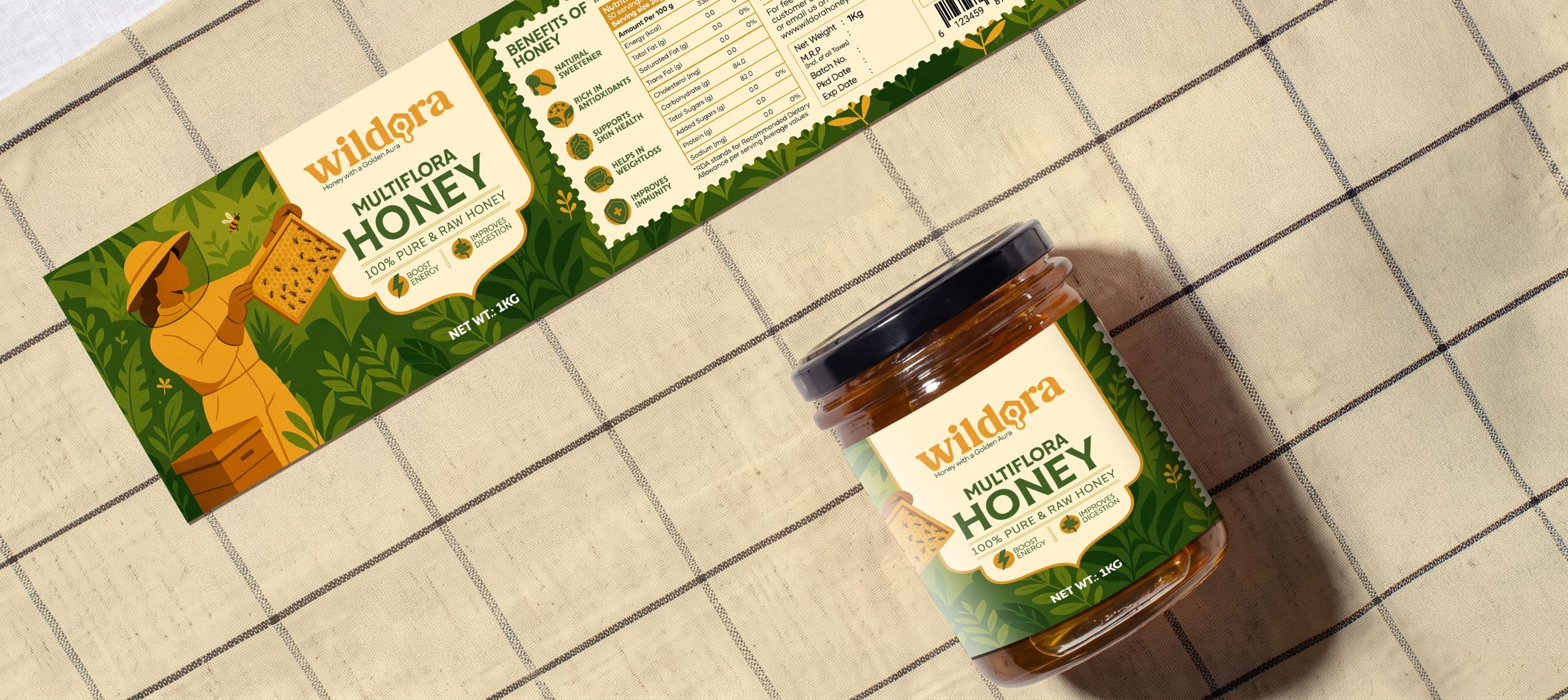
Description: Open most raw honey jars on the shelf and you’ll see the same visual playbook, kraft textures, hand-lettered scripts, faux-rustic stamps, all trying to convince you the honey inside is real. Wildora didn’t want to convince anyone. It wanted the packaging itself to be the proof.
We began where the product begins, with the honey’s raw, multiflora origin, and let that inform every material and mark on the pack rather than defaulting to category clichés. Purity, origin and warmth became the three forces shaping the system, expressed through a honey-toned colour palette that mirrors the product itself and a typographic voice that feels clean, modern and unmistakably confident. The packaging had to look premium without losing the rawness that makes the honey worth trusting in the first place.
That tension is where the design earns its keep. Every label, every surface, every structural decision was built to let the honey’s character come through, nothing decorative for decoration’s sake, nothing added just to look “artisanal.” The system reads as honest at arm’s length and holds up just as well up close, on the shelf, in hand, and across every digital extension of the brand.
What stands on shelf today isn’t just packaging, it’s a promise kept in amber and gold. Wildora proves that when a brand’s story is genuinely pure, the packaging doesn’t need to dress it up, it just needs to get out of the way and let that truth shine through.



 Lisa Pokrovskaya
 Simple Studio
 Studio Unbound
 David Byerlee
 M&A CREATIVE AGENCY
 alchimistestudioParis
 monther al omari
 Studio Be Design
 LogoSayLove
 agenciabud
 Shustova p
 mutta
mutta @Allenarts13
 Sirka Agency
 Atiq Alam
 Dozen Agency
 j.substance
 SCD
SCD Cristian Lepore | crilep Copia
 Chris Creative Works