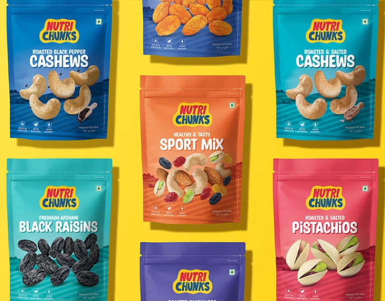

Nutri Chunks: Turning ‘Healthy’ Into Something Worth Reaching For
Every wellness brand hits the same wall: shoppers assume healthy means bland, and tasty means guilty. Nutri Chunks refused to choose a side, and that’s exactly where our work began.
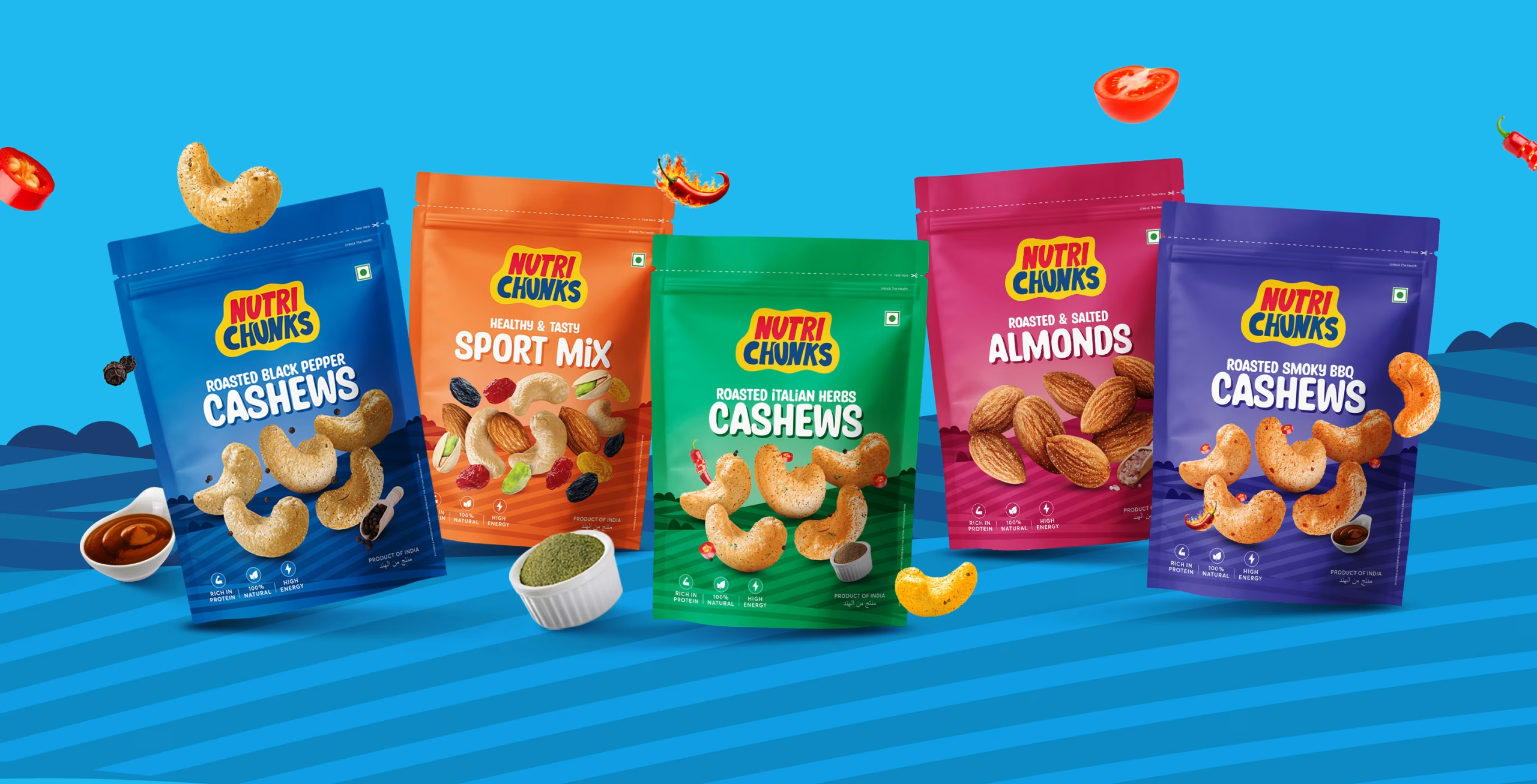
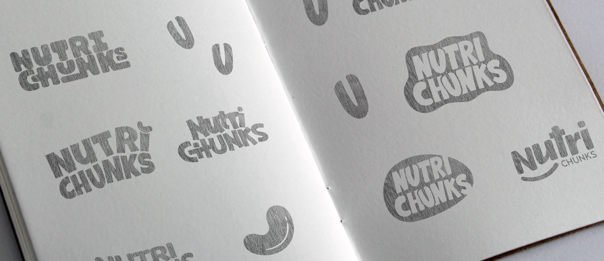
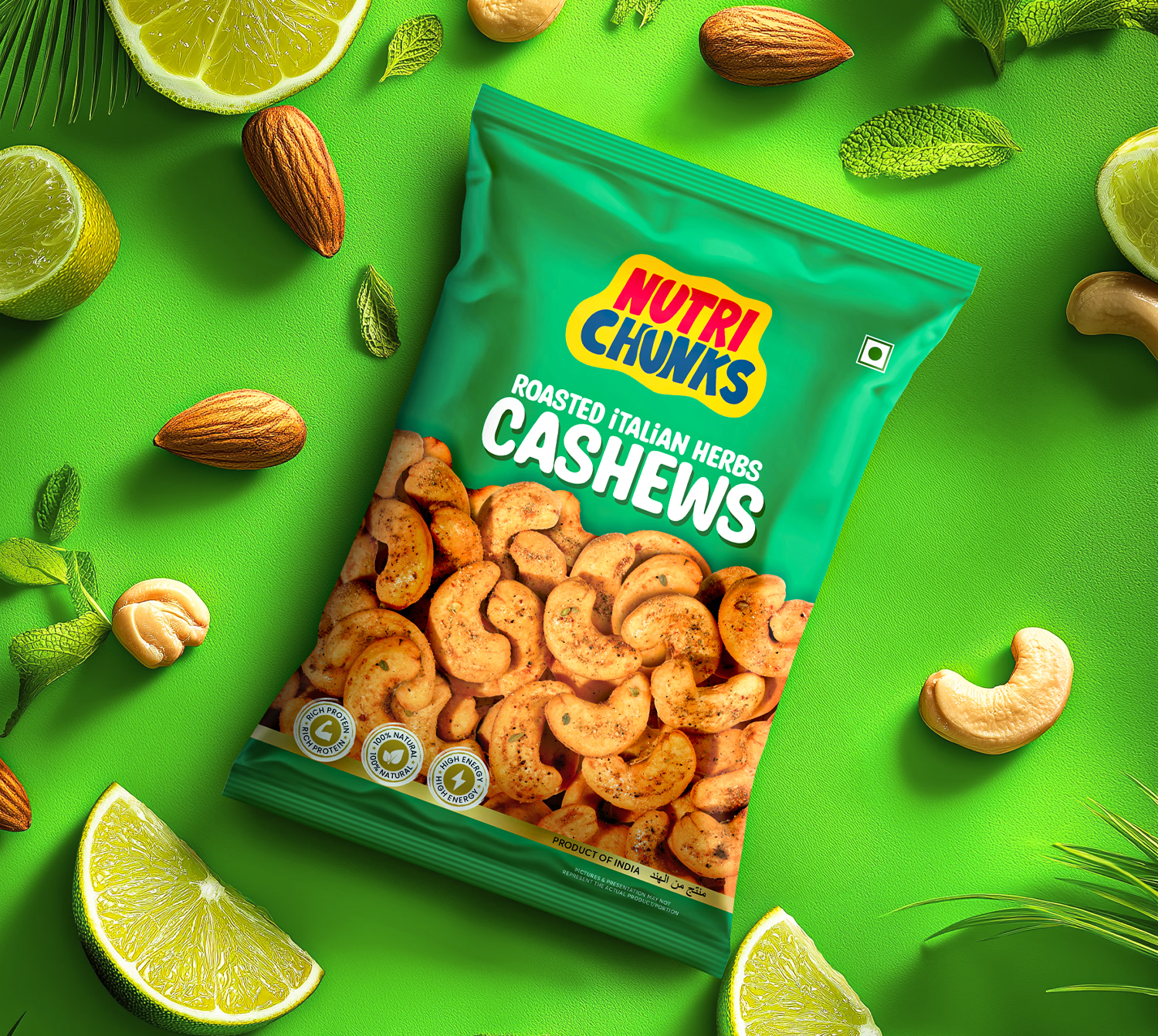
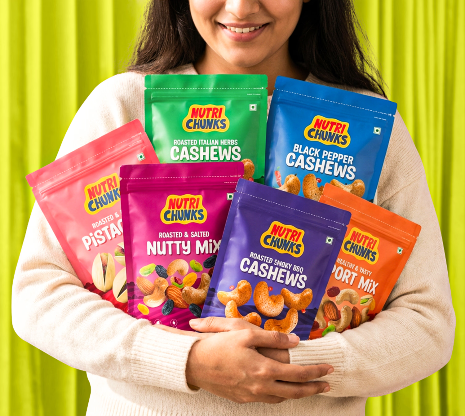
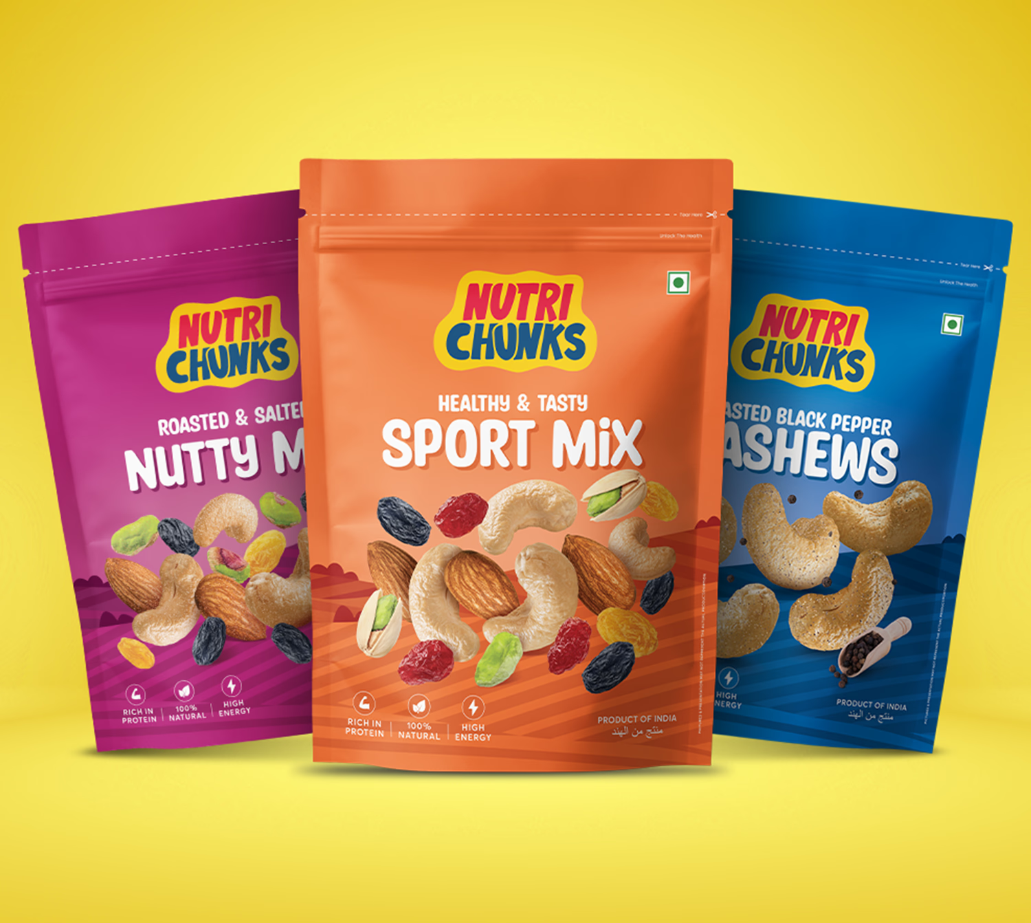
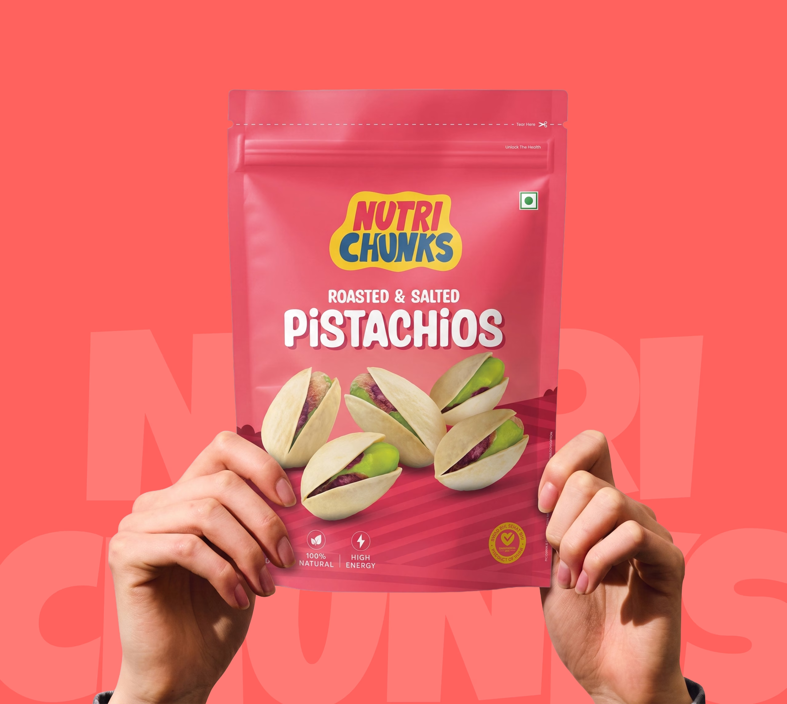
We started by living inside the brand’s full flavour range, understanding what made each variant distinct before we designed a single element. That understanding became our compass: build one visual system flexible enough to carry every flavour, yet disciplined enough to feel like a single, unmistakable brand. From there, we shaped an identity around three qualities we knew shoppers reach for instinctively, clarity, colour and confidence, letting clean typography carry the credibility and vibrant, flavour-coded colour carry the appetite appeal.
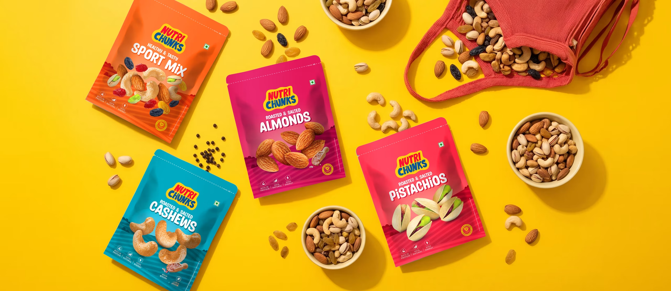
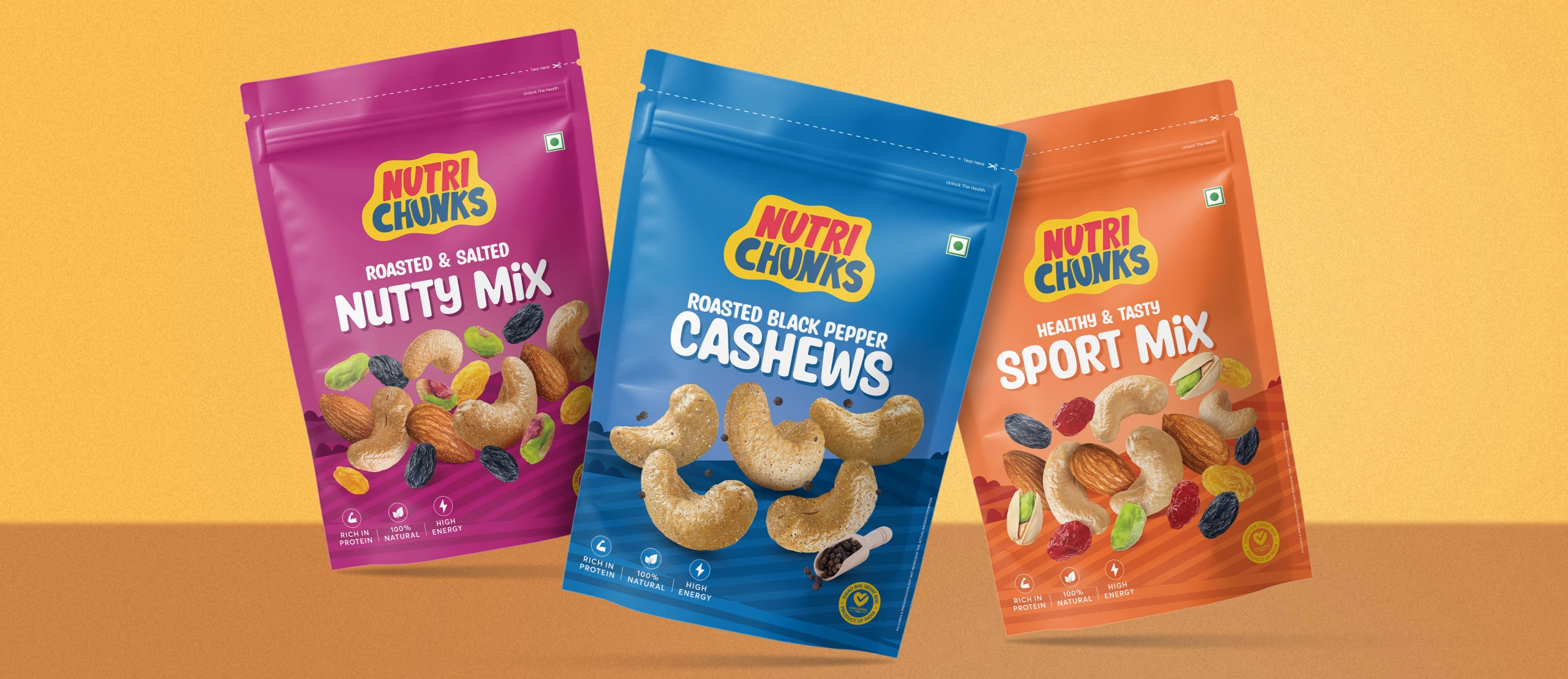
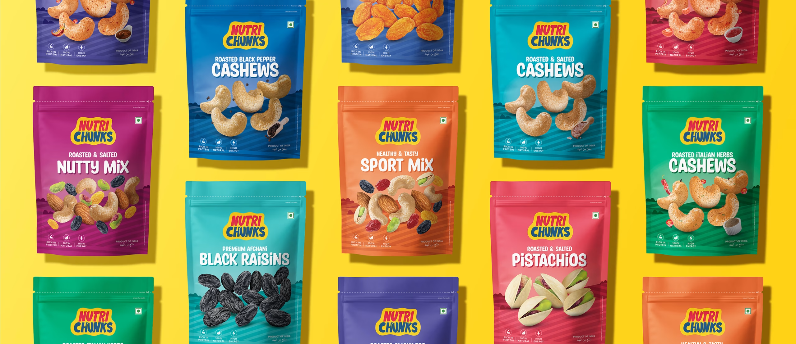
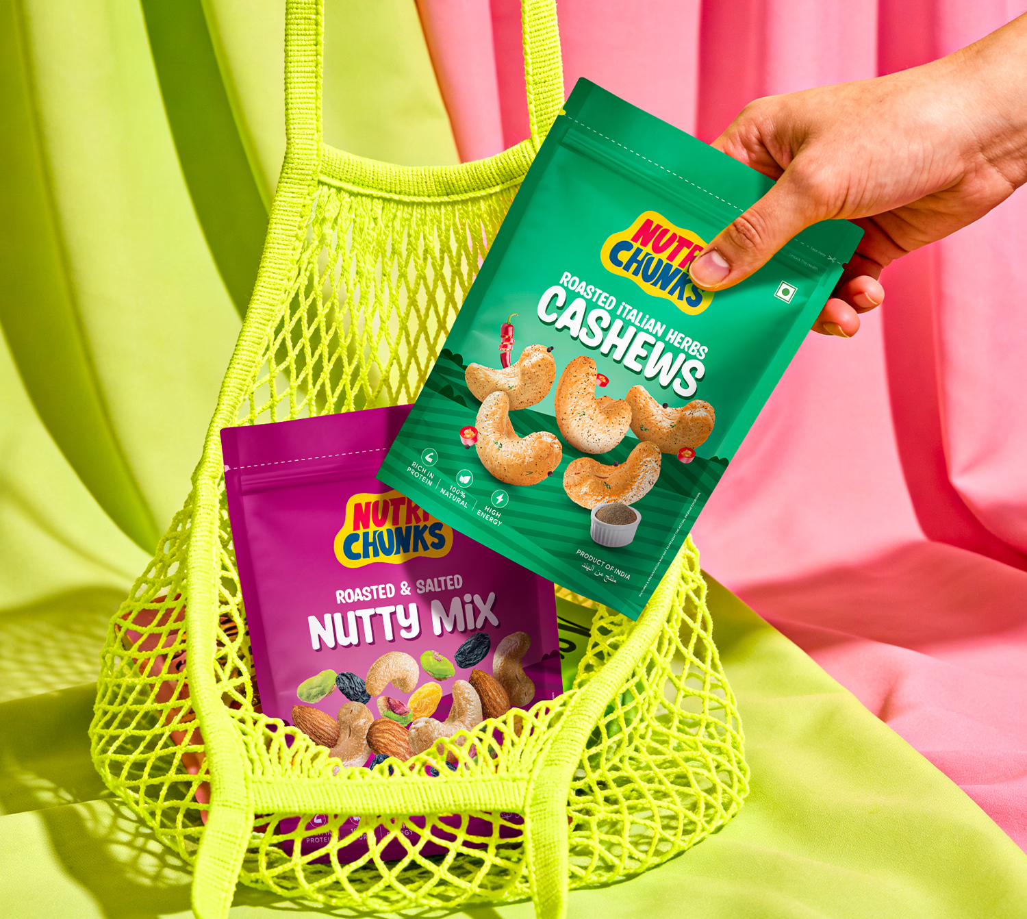
Packaging became where the story truly came together. We built an architecture that lets buyers navigate the entire range at a glance, colour by colour, flavour by flavour, while every pack, label and marketing touchpoint stayed true to one consistent voice. Nothing about it felt clinical. Nothing about it felt like it was trying too hard. It simply felt honest, inviting and ready to be picked up.
Watching that system come alive on shelf, consistent, colourful and instantly trustworthy, is what makes this project one we’re proud to have built. Nutri Chunks now stands as proof that health and craving were never opposites to begin with, just a story waiting for the right identity to tell it.


 Derrick Lin
 Biaa
Biaa Petitmoulin Studio
 White Bear Studio
 Eva Chistyakova
 monther al omari
 Atipus
 alchimistestudioParis
 oneandother
 bloomburo
 helocrene
 Shapers Studio
 Denver Design
 Aidearte
 andrew.huerta
 softmachine
 airobtq
 Buzz & Co.
 Ruby
Ruby themythographer
 IDNB Inc.
 viktorflr
 Zenpack