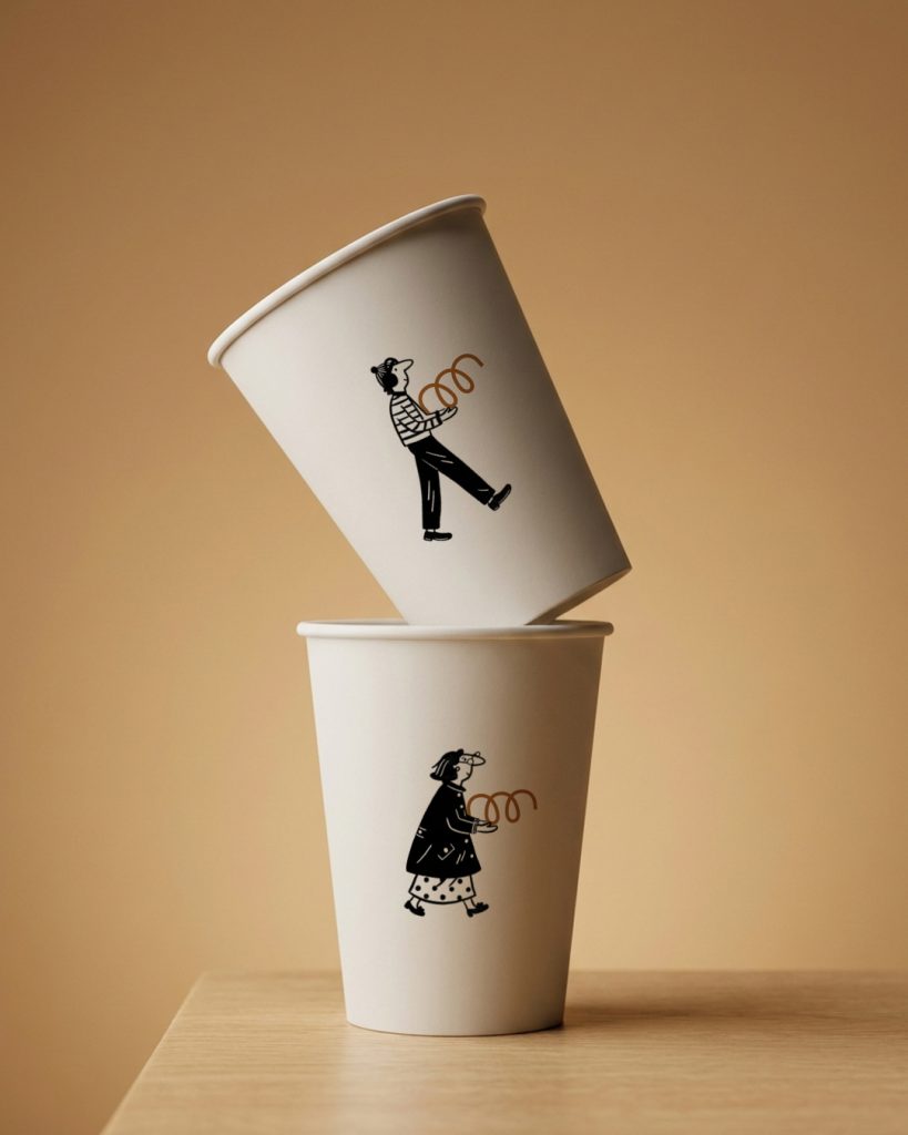

Many brands choose to illustrate their products. We decided not to.
Since the croissant is already represented in the logo, we turned the symbol itself into the protagonist of the illustrations. Instead of depicting the product, the characters interact with the brand’s own identity, allowing every bag, box, and cup to reinforce brand recognition.
A simple decision that transforms a familiar asset into a distinctive visual language.
Credits
Creative Direction & Brand Identity: Another Monday
Illustrations: Angelina Montero
Client: La Croissantería
Curator’s Insight
What stands out here is a refusal of the obvious move. Bakery packaging almost always leans on appetite appeal, close-up product shots or literal renderings of what’s inside the bag. This system does the opposite. By lifting the spiral mark out of the logotype and giving it a life of its own, the identity becomes self-referential rather than descriptive. The characters are selling recognition of the mark itself, a subtler and arguably more durable strategy to run across a full packaging system. It also quietly solves a production problem: one illustrated element, endlessly recombined across cups, bags, and boxes, keeps the visual system cheap to scale without diluting it. The result reads closer to an editorial illustration practice borrowed from lifestyle branding than anything typical of the bakery category.


 Affogato Brand Design
 Backbar Studios
 hello ocean
 POSH FMCG BRANDING
 Luciana
 Valérie Colace
 marjusguza
 Z9BKAdsgn
 Lilith Sivolenko
 Daria Levina
 Masha Kulichkova
 monther al omari
 Yana Chernova
 Atiq Alam
 ezgidesignstudio
 Pips Marin
 Antonia Skaraki
 Ezi Brand Design
 Kanishka Chhajer
 Zachary Kent
 SOT B&D
 Normal studio
 Garry Veda