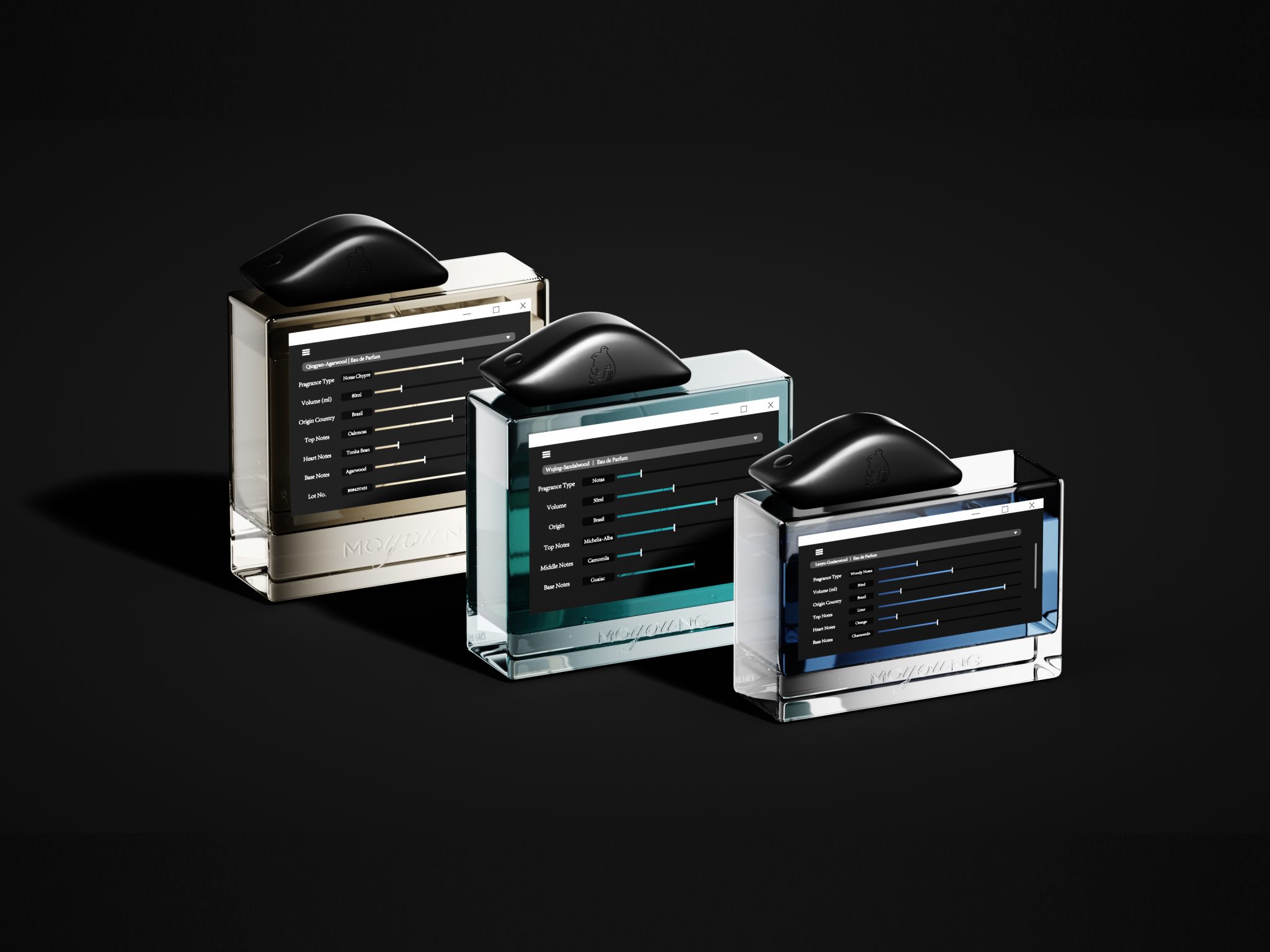

MOYOUNG香水瓶型设计
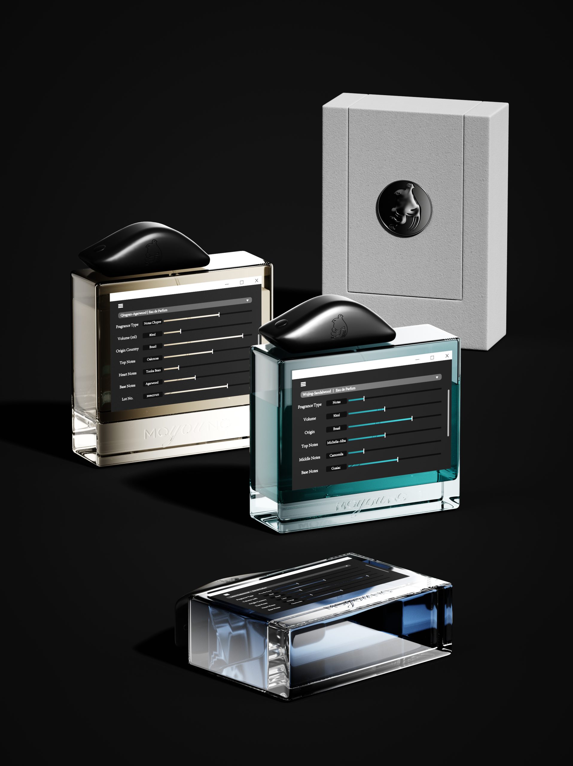
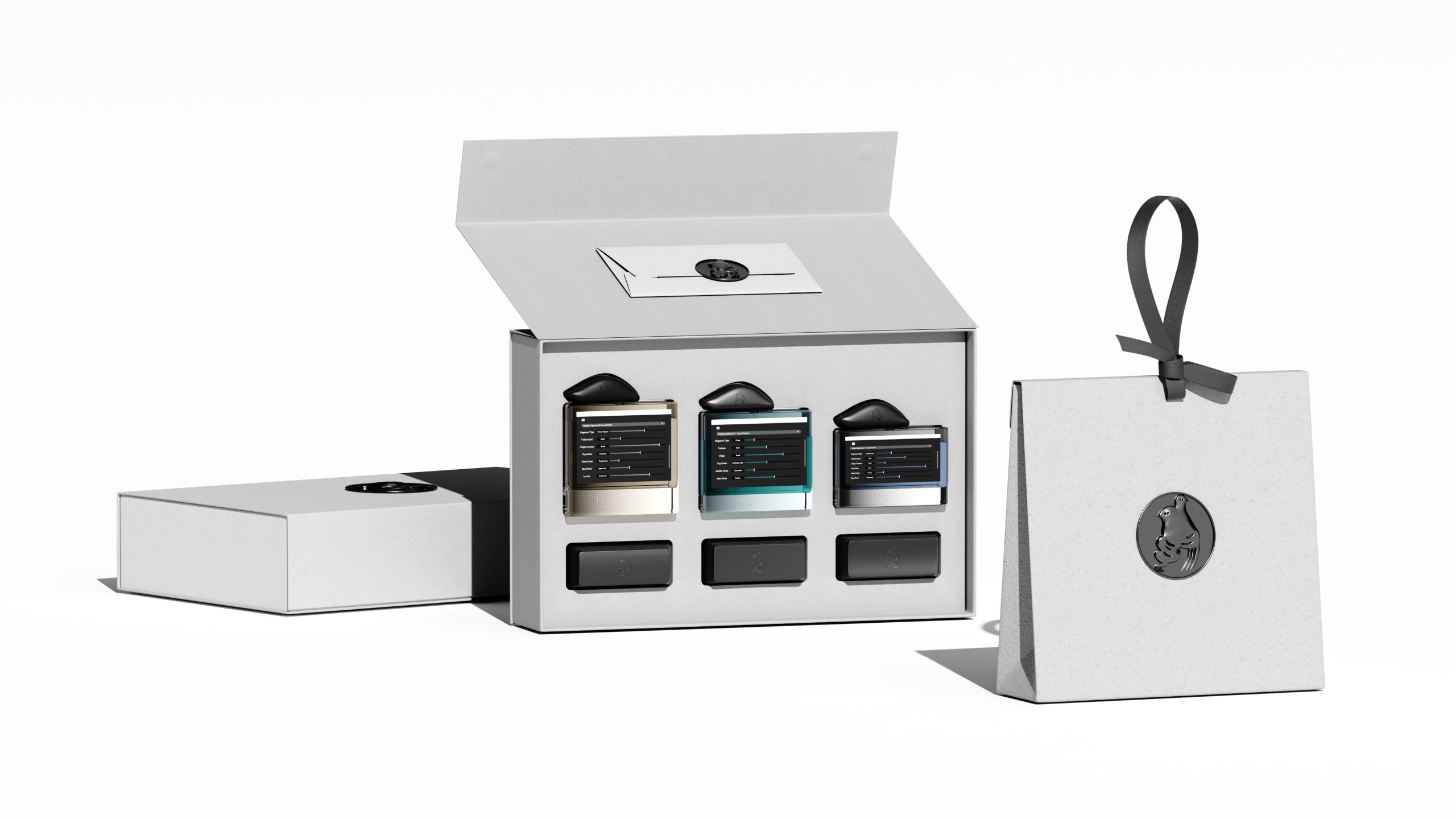
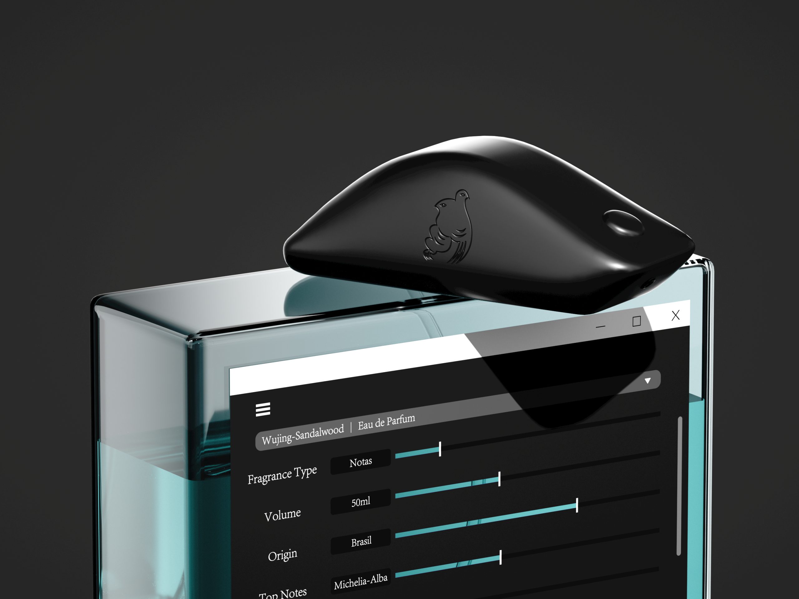
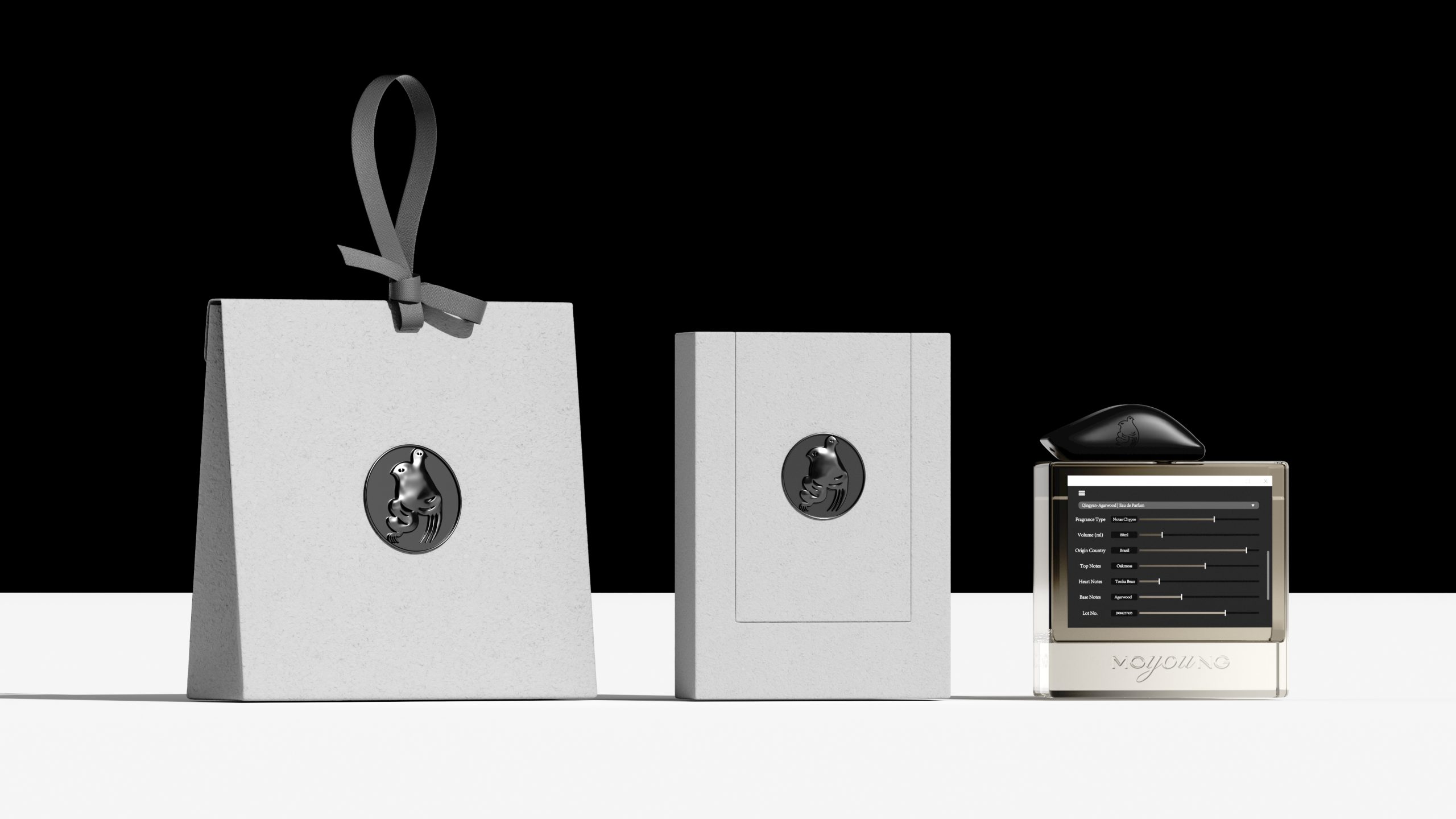
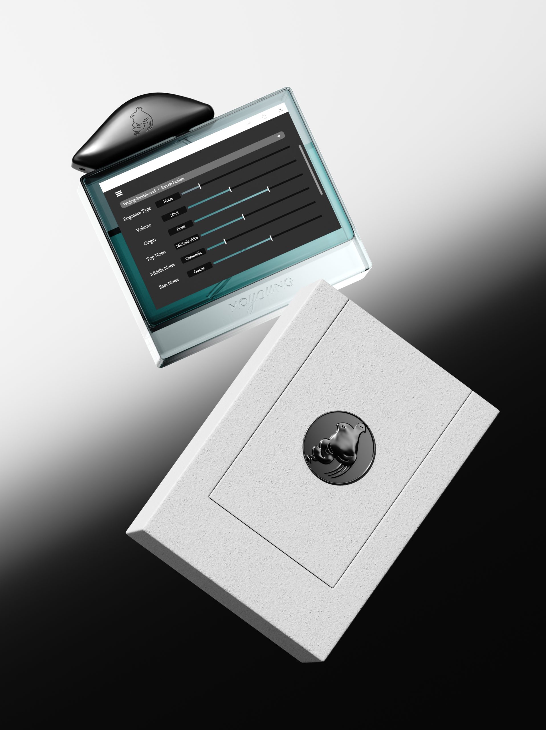
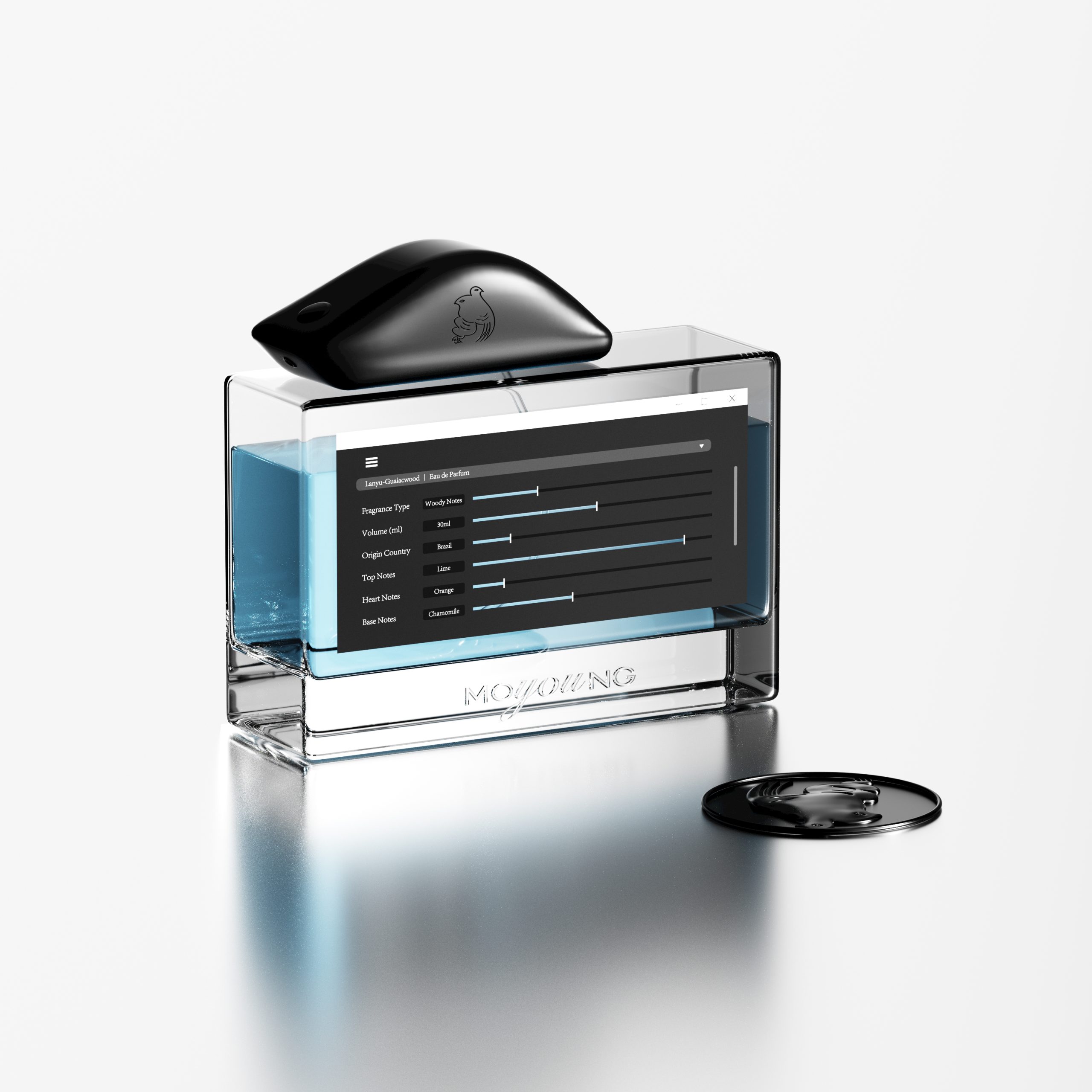
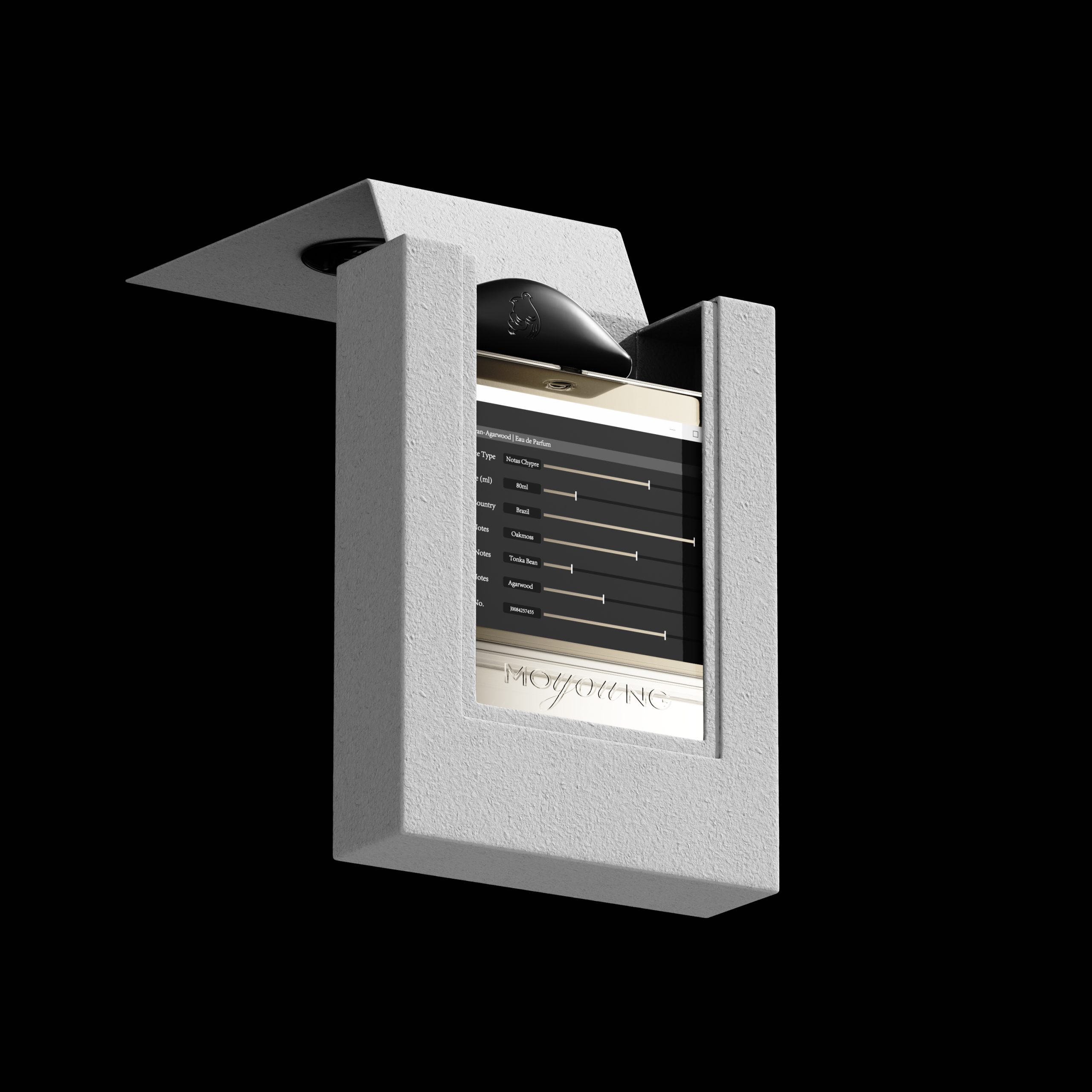
For the MOYOUNG fragrance line, the design team took an unexpected route: turning each bottle into a literal interface. Rectangular glass forms hold a sunken digital panel etched right into the surface, complete with a scroll bar, dropdown menu and sliders that read like screenshots frozen in glass. It’s a clever nod to how people actually shop for scent today, through spec sheets and dropdown menus rather than smell. The rounded caps, sculpted like small dark stones, soften the otherwise technical language of the panel below. Each colorway, sand, teal and cool blue, corresponds to a distinct scent family, giving the trio a coordinated but individually readable identity. It’s packaging that treats information design as the decoration itself, playful, a little tongue in cheek, and unmistakably modern.








 agarcia studio
 Wynand88
 Eva Chistyakova
 Maria Bukhtilova
 estudiomarciano
 monther al omari
 Thirst
 Maruf Nishat
 Gray Matter Studio
 Julia Jay
 Modern Theory
 Furt Goods
 Fluid
Fluid alchimistestudioParis
 Ancora
 Mostafa Abdelmawla Ali
 MewKittyDraw
 Studio Shala
 43oz
43oz Lucid mk2
 Atiq Alam
 IDEOLOGO
 Open Strategy & Design