
Olegario – Craft Beer Label Design
THE OPPORTUNITY
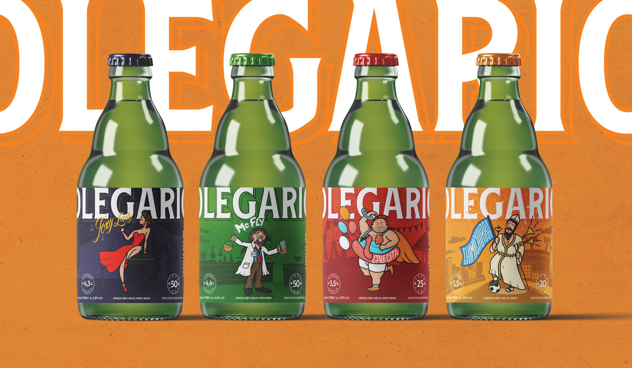
Olegario, a craft brewery based in Mendoza, Argentina, approached me to develop a distinctive label system for their beer line in 2025. The goal was to create a stronger emotional connection with consumers through a series of four unique illustrated characters, each expressing a different personality trait while feeling part of the same brand universe.
The challenge was to build a visual identity that felt playful, colorful, and approachable, but with enough sophistication to appeal to more discerning beer drinkers. The brand needed to stand out on shelf, generate instant empathy, and communicate character without losing a sense of quality and refinement.
THE SOLUTION
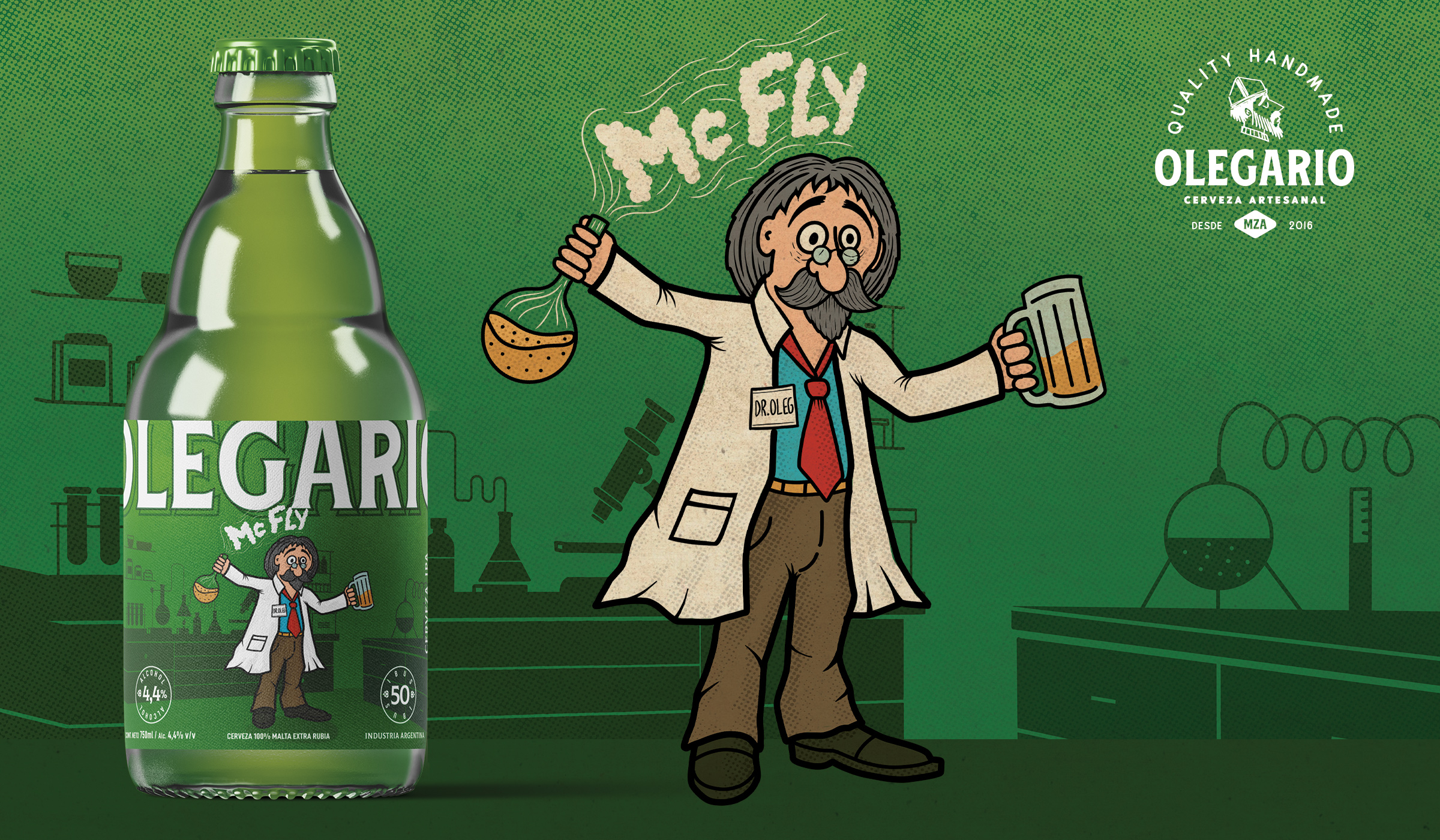
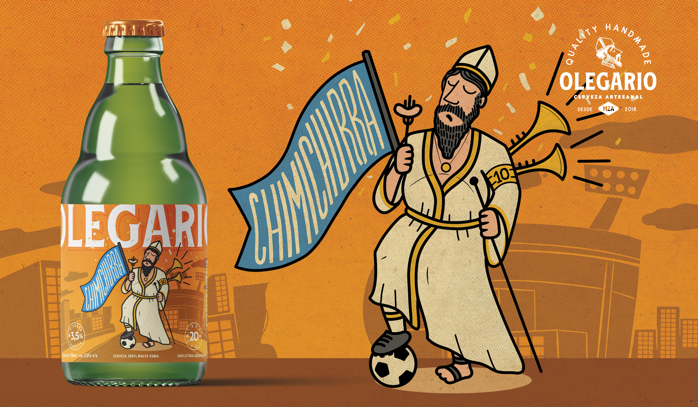
I developed a label system centered around four original characters, each designed to reflect a distinct attitude and personality. While every illustration had its own identity, the collection was carefully built as a cohesive family through consistent graphic language, composition, and tone.
The visual direction combined vibrant color palettes, expressive character work, and friendly storytelling with a more polished design approach. This balance allowed the brand to feel fun and memorable, while still projecting a level of sophistication aligned with a premium craft beer experience.
The result was a bold and engaging packaging system that helped Olegario connect with consumers on a more human level. The labels feel lively, approachable, and full of personality — designed not only to attract attention, but to build affinity with the brand and invite people into its world.
Client: Olegario Brewery
Services: Packaging Design, Character Design & Label System Development
Year: 2025
Curator’s Insight
The real design problem this system solves is one of range without fragmentation. Four wildly different characters, each with their own color story and narrative tone, could easily read as four separate products rather than one beer line. What keeps them unified is the discipline sitting underneath the illustration: identical top band placement for the oversized OLEGARIO wordmark, a consistent circular alcohol percentage badge, matching bottle count indicators, and a uniform illustration style even as subject matter shifts from a lounge singer to a football fan mid-celebration.
That structural repetition is what allows the character work to take real risks. The illustrations lean fully into caricature, exaggerated proportions, loose linework, saturated color blocking, without the brand losing cohesion, because the grid holding each label together never moves. It is a useful reminder that personality-driven packaging systems need more rigidity elsewhere, not less, once the visual content itself becomes this expressive.
The color-coded cap system also does more work than it first appears to. Each character gets a distinct cap color tied to their label field, which gives the line quick visual sorting on shelf or in a fridge case without requiring any text. For a craft beer brand trying to build recognition through repeat purchase, that kind of at-a-glance differentiation matters more than it gets credit for, especially in a category where drinkers often reach for a familiar color before they read a name.






 Derrick Lin
 salutifg
 ADStudio
 WeAreDepot
 Manuvila
 Yellow Umbrella Creative
 Toka
Toka Studio Zak
 Atiq Alam
 monther al omari
 Modern Theory
 Sirka Agency
 DESIGN CONCEPTS
 Eva Chistyakova
 Puigdemont Roca
 marianaaworks
 bloomburo
 andreamarinnn
 Alina
Alina Saadmost
 Bruhken
 Maruf Nishat
 Richest Branding Pvt. Ltd.
 Sophiagdotcom
 saifullahmaslool
 Up-Brands