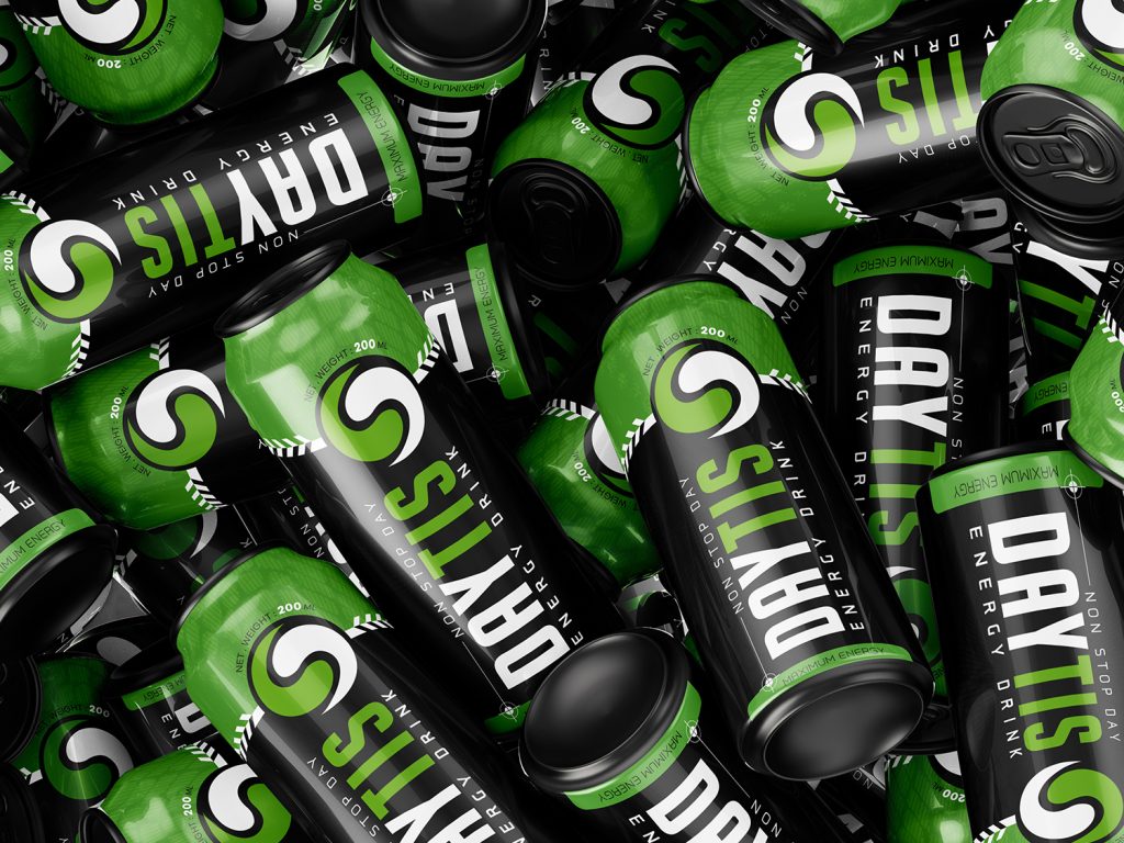

Daytis Energy Drink | Packaging Design
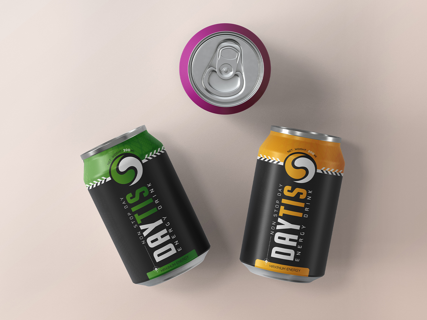
This packaging was designed to create a bold, modern, and energetic visual identity that reflects the dynamic nature of an energy drink. The matte black background conveys strength, premium quality, and confidence, while the vibrant yellow and green accents act as flavor identifiers, enhancing shelf visibility and helping consumers quickly distinguish between product variants.
The bold vertical typography introduces a strong sense of movement and energy, reinforcing the brand’s active personality. Positioned at the top of the composition, the logo serves as the primary focal point, ensuring immediate brand recognition.
A high-contrast color palette, clear visual hierarchy, and minimalist layout work together to improve readability while maximizing shelf impact in a competitive retail environment. The packaging was also developed as a modular design system, allowing future flavor extensions through simple color variations while maintaining a consistent and recognizable brand identity.
This project demonstrates the balance between aesthetics, functionality, and branding strategy—where packaging goes beyond visual appeal to become a powerful marketing tool that enhances perceived value and creates a memorable consumer experience.
#PackagingDesign #BrandIdentity #GraphicDesign #EnergyDrink #CanDesign #VisualIdentity #Packaging #Branding #CreativeDesign #AdobeIllustrator




 AzadehMomenisani
 Affogato Brand Design
 Backbar Studios
 hello ocean
 POSH FMCG BRANDING
 Luciana
 Valérie Colace
 marjusguza
 Z9BKAdsgn
 Lilith Sivolenko
 Daria Levina
 Masha Kulichkova
 monther al omari
 Yana Chernova
 Atiq Alam
 ezgidesignstudio
 Pips Marin
 Antonia Skaraki
 Ezi Brand Design
 Kanishka Chhajer
 Zachary Kent
 SOT B&D
 Normal studio
 Garry Veda