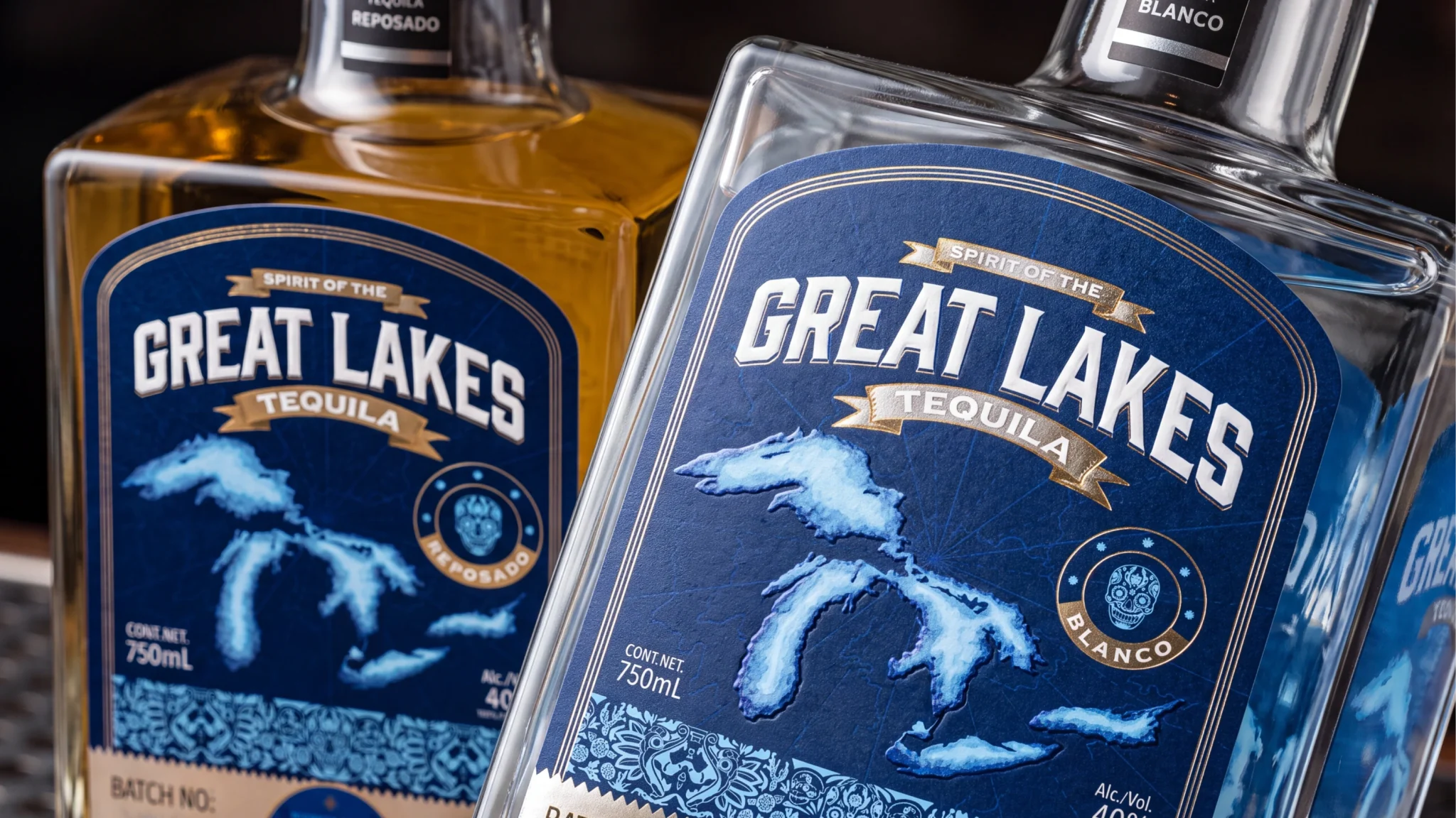

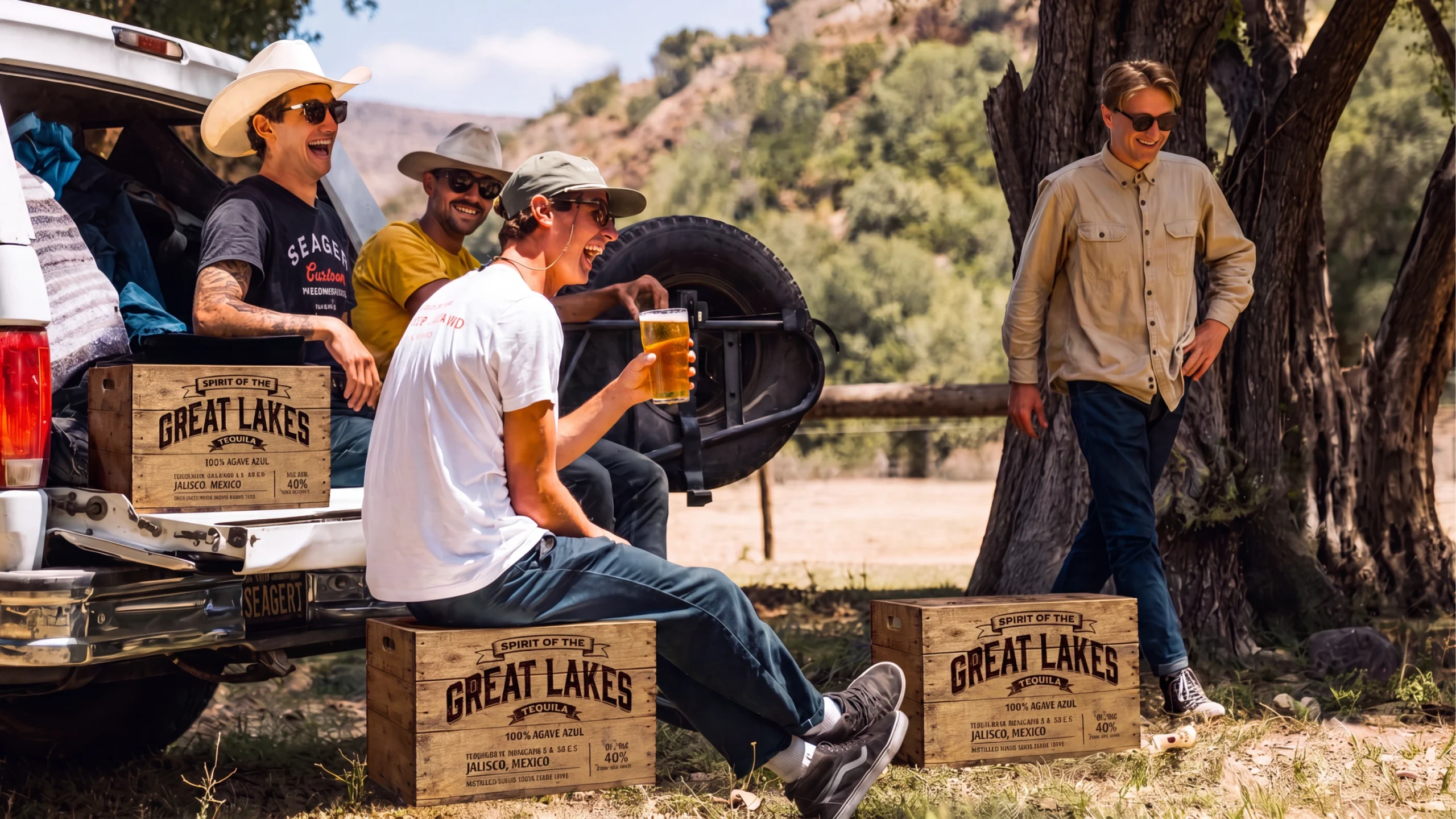
Grande Lagos is a premium tequila distilled from blue agave in Jalisco, Mexico, and sold in Michigan, built to feel like it genuinely belongs to both places at once. Confetti developed the complete brand identity and packaging system across three expressions: Blanco, Reposado, and Anejo.
The brief carried real risk. Michigan’s relationship with its landscape is deeply specific, and Mexican craft heritage, the agave tradition, Day of the Dead iconography, deserved far more than surface-level treatment. The bottle also had to work as a souvenir: specific enough to place, premium enough to gift, rich enough that a stranger understood what they were holding on sight.
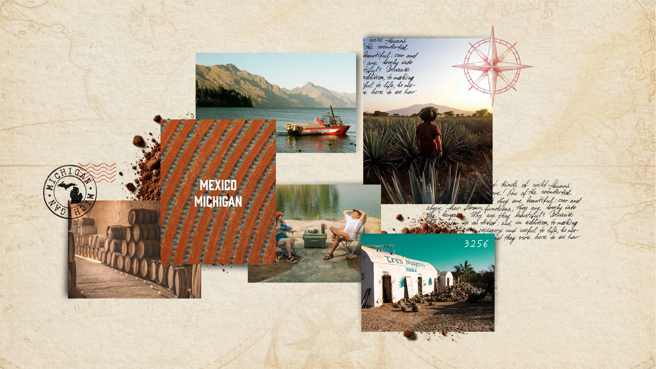
Before any design work began, Confetti anchored the brand to a single archetype, the Explorer: someone who goes looking for things worth finding and brings them back with care. That lens shaped every decision that followed.
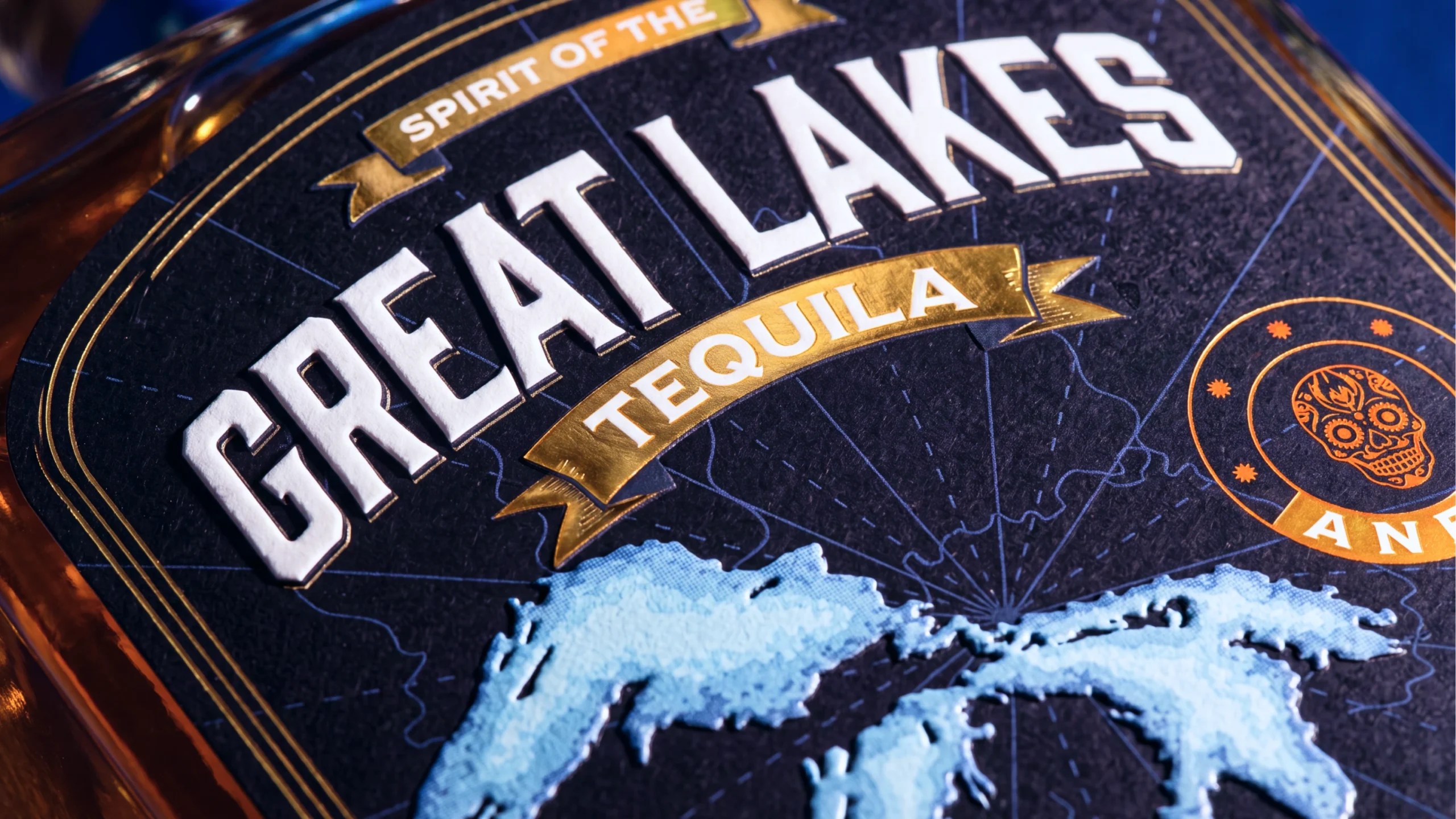
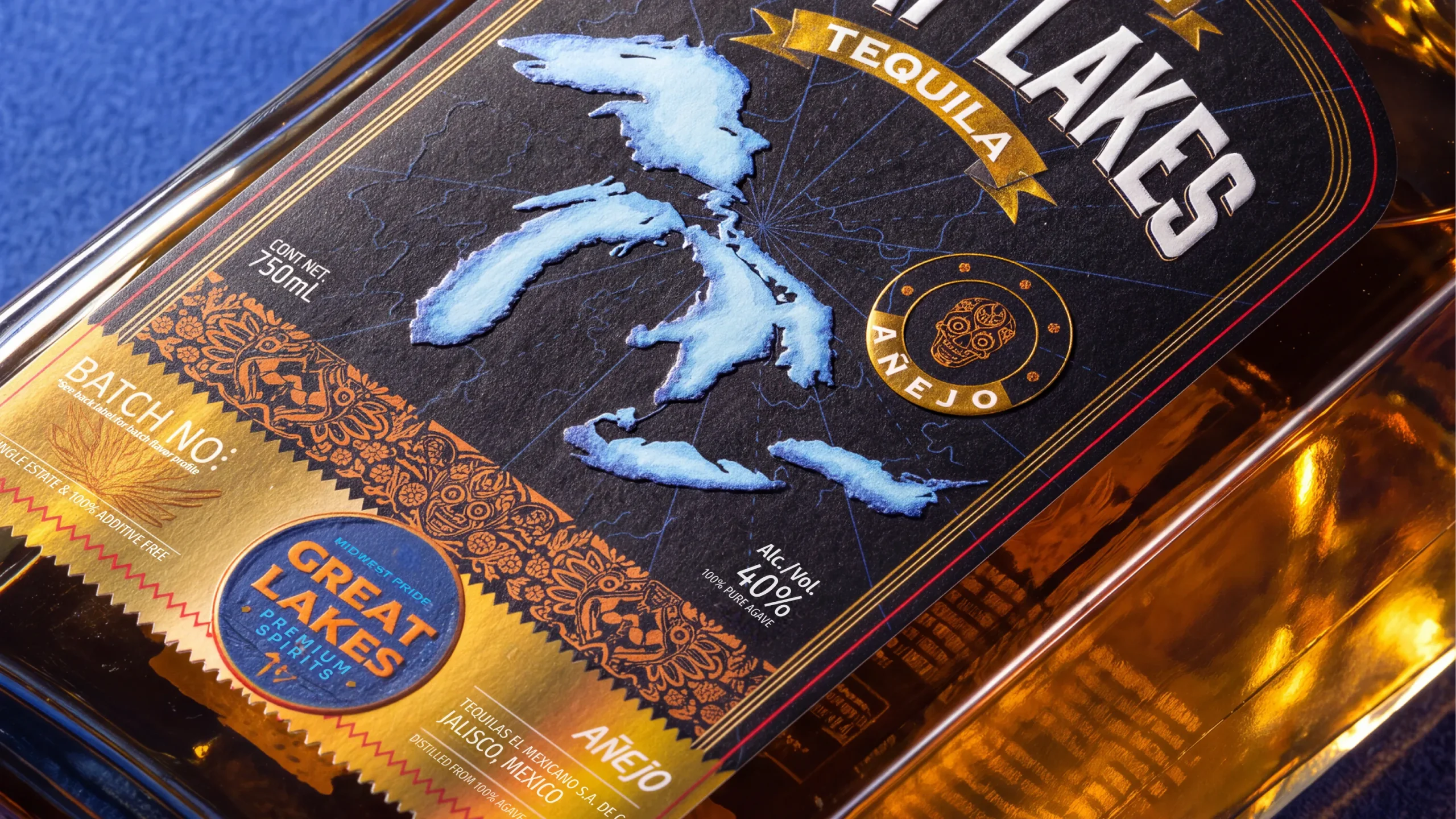
Rather than placing Michigan and Mexico side by side, the visual system weaves them into the same frame: Great Lakes topography, pine trees, mountains, and compass motifs alongside agave illustrations and Day of the Dead skull details. Layering would have made the brand look like it was about two places; weaving made it feel like it came from both.
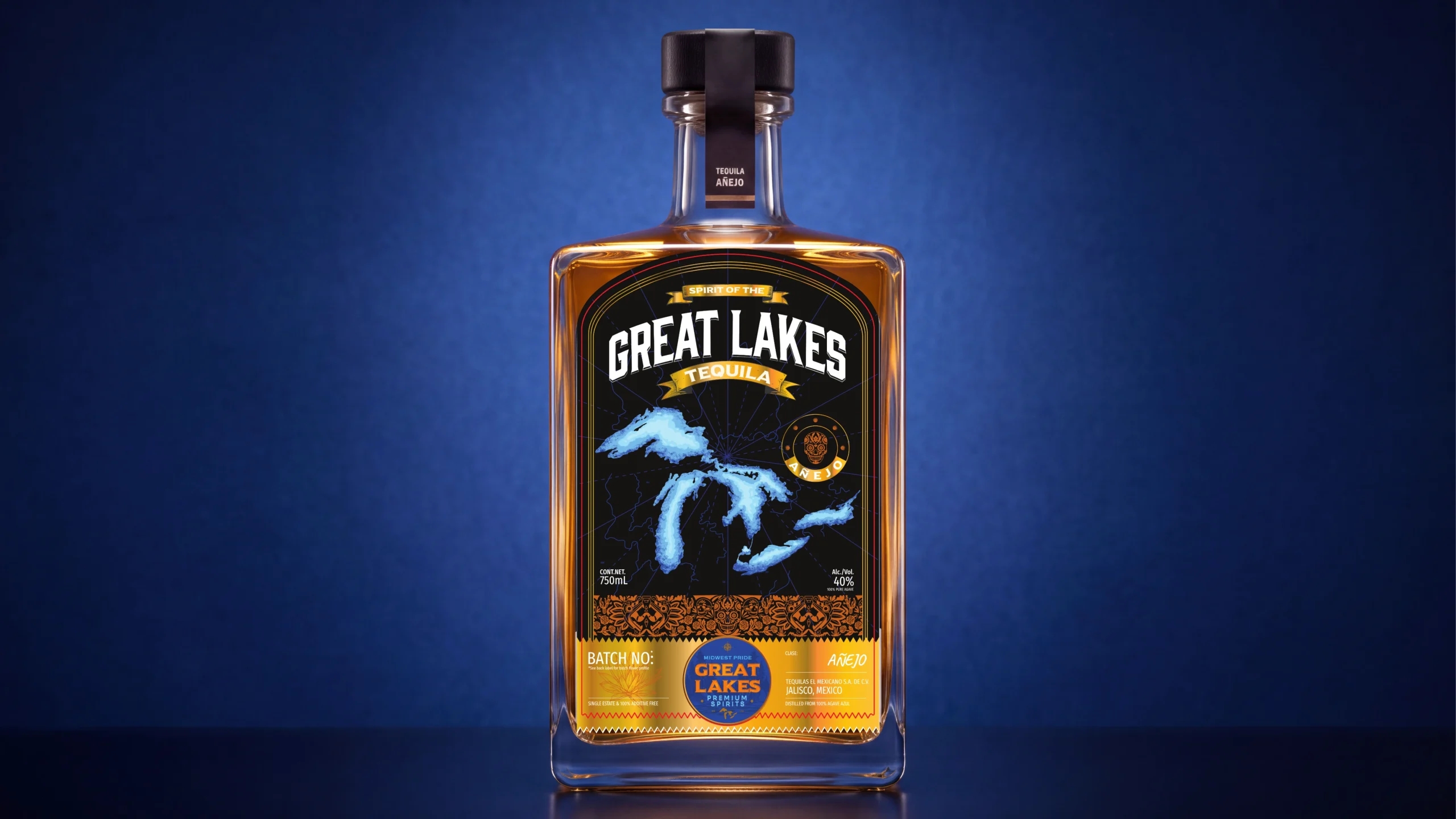
Every label decision served the souvenir instinct, rich enough to reward close inspection, considered enough to feel crafted, the kind of object someone keeps long after the bottle is empty. Blanco, Reposado, and Anejo each hold their own visual character while reading as a family on the shelf, with the design progressing from light to deep the way the spirit ages.
The result: a brand Michigan is proud to claim and Mexico would recognize the respect behind, holding two identities together where most attempts collapse into one.
Curator’s Insight
Cross-cultural spirits branding tends to fail in one of two directions. Either the second culture becomes decoration bolted onto a template that was never built to hold it, or the two references get placed in separate zones on the label so nothing has to actually reconcile. This label avoids both by refusing to let either reference sit alone anywhere on the bottle.
Look at how the Great Lakes outline is rendered. It is not printed flat as a map icon, it is textured and shaded like a cartographic engraving, sitting inside a compass rose grid that reads as much like the linework on a tequila crest as it does a lake chart. Below it, the agave and skull motifs are cut with the same density and line weight as the topography above. The two vocabularies are drawn in the same hand, which is what makes them read as one system instead of two logos sharing a label.
The color logic reinforces this. Warm amber and copper carry the agave and Día de los Muertos references, cool blue carries the lake water, and both sit against the same matte black field with the same gold foil treatment on the banners. A shared palette across referential systems that would otherwise pull toward different visual traditions is doing a lot of quiet work here.
There is also a legibility decision worth noting for anyone doing three-tier product families. Blanco, Reposado, and Añejo do not just change the accent color, they progress in depth and warmth the way the liquid itself darkens with age. The packaging system is tracking the product, not just labeling it.



 agarcia studio
 Wynand88
 Eva Chistyakova
 Maria Bukhtilova
 estudiomarciano
 monther al omari
 Thirst
 Maruf Nishat
 Gray Matter Studio
 Julia Jay
 Modern Theory
 Furt Goods
 Fluid
Fluid alchimistestudioParis
 Ancora
 Mostafa Abdelmawla
 MewKittyDraw
 Studio Shala
 43oz
43oz Lucid mk2
 Atiq Alam
 IDEOLOGO
 Open Strategy & Design