

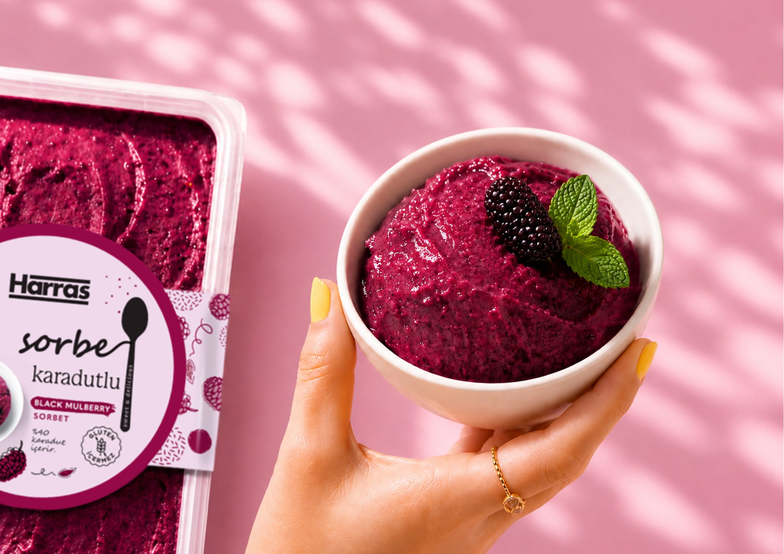
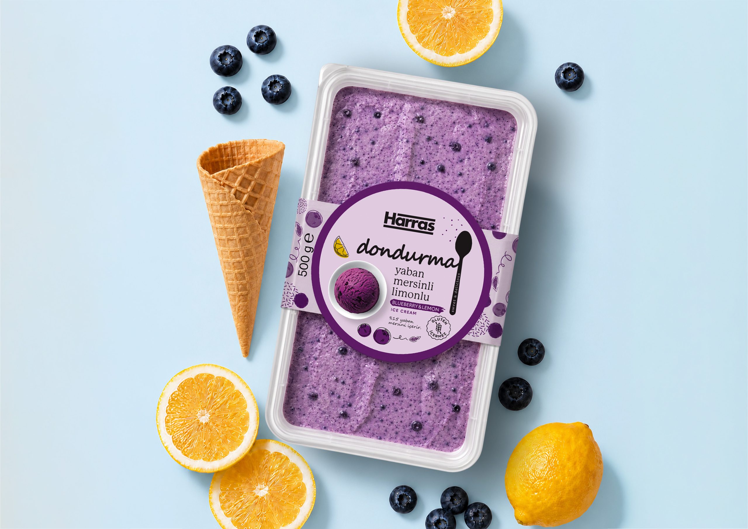
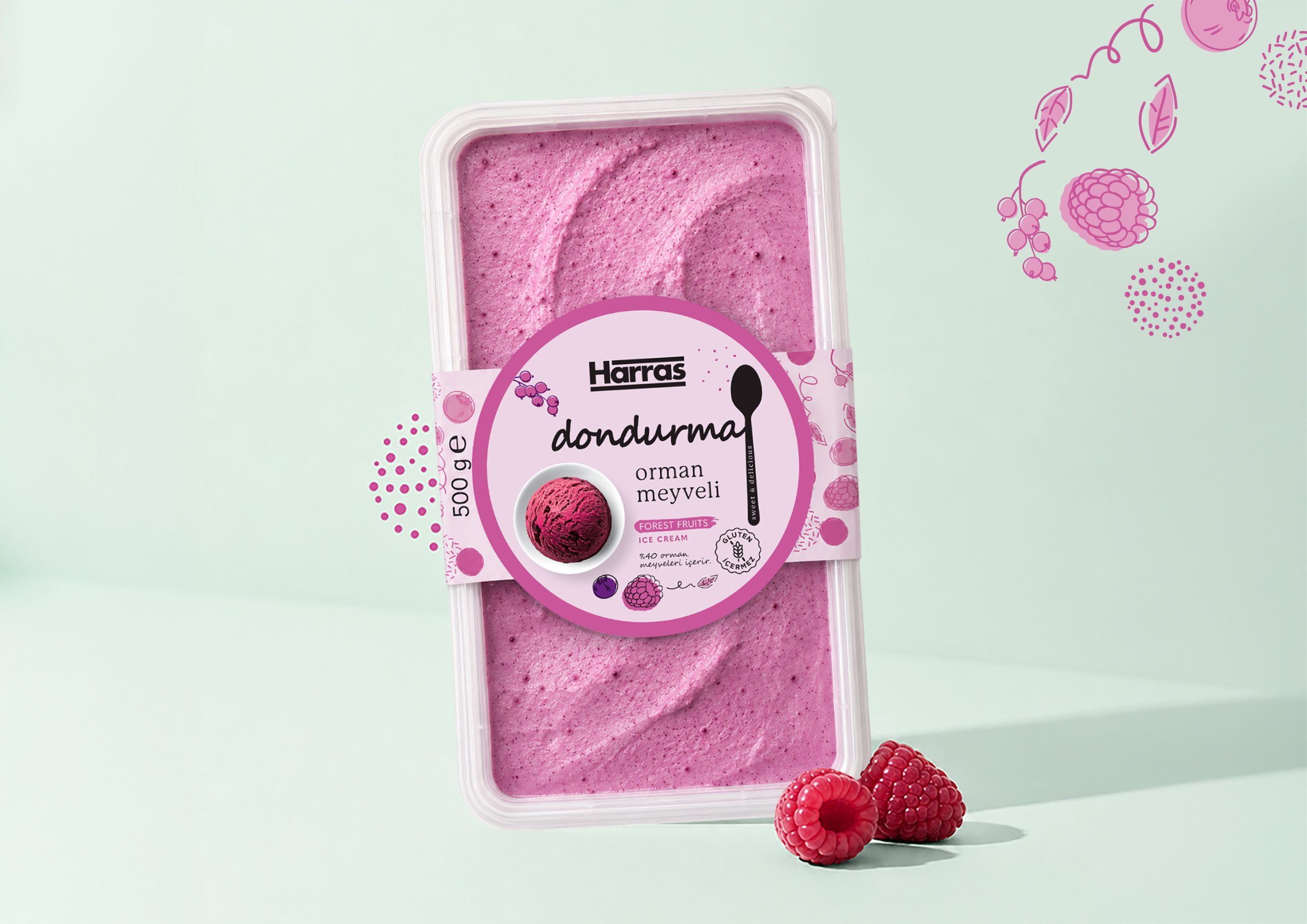
For the Harras Ice Cream & Sorbet range, we created a distinctive packaging system that gives every flavour its own recognizable personality while preserving a strong family identity. The design was built around a simple idea: expressing freshness, fruit intensity and indulgence through a clean yet vibrant visual language. Each flavour is defined by its own colour palette, while expressive fruit illustrations and handwritten-inspired typography create a warm, contemporary and appetizing appearance. The centrally positioned product image enhances flavour recognition, while the fruit-inspired graphics establish a flexible visual system that unifies the entire range. This approach allows each product to communicate its individual character while remaining unmistakably part of the same product family. The result is a colourful and contemporary packaging series that transforms freshness, fruit and flavour into a memorable visual identity with strong shelf impact.
 Derrick Lin
 Biaa
Biaa Petitmoulin Studio
 White Bear Studio
 Eva Chistyakova
 monther al omari
 Atipus
 alchimistestudioParis
 oneandother
 bloomburo
 helocrene
 Shapers Studio
 Denver Design
 Aidearte
 andrew.huerta
 softmachine
 airobtq
 Buzz & Co.
 Ruby
Ruby themythographer
 IDNB Inc.
 viktorflr
 Zenpack