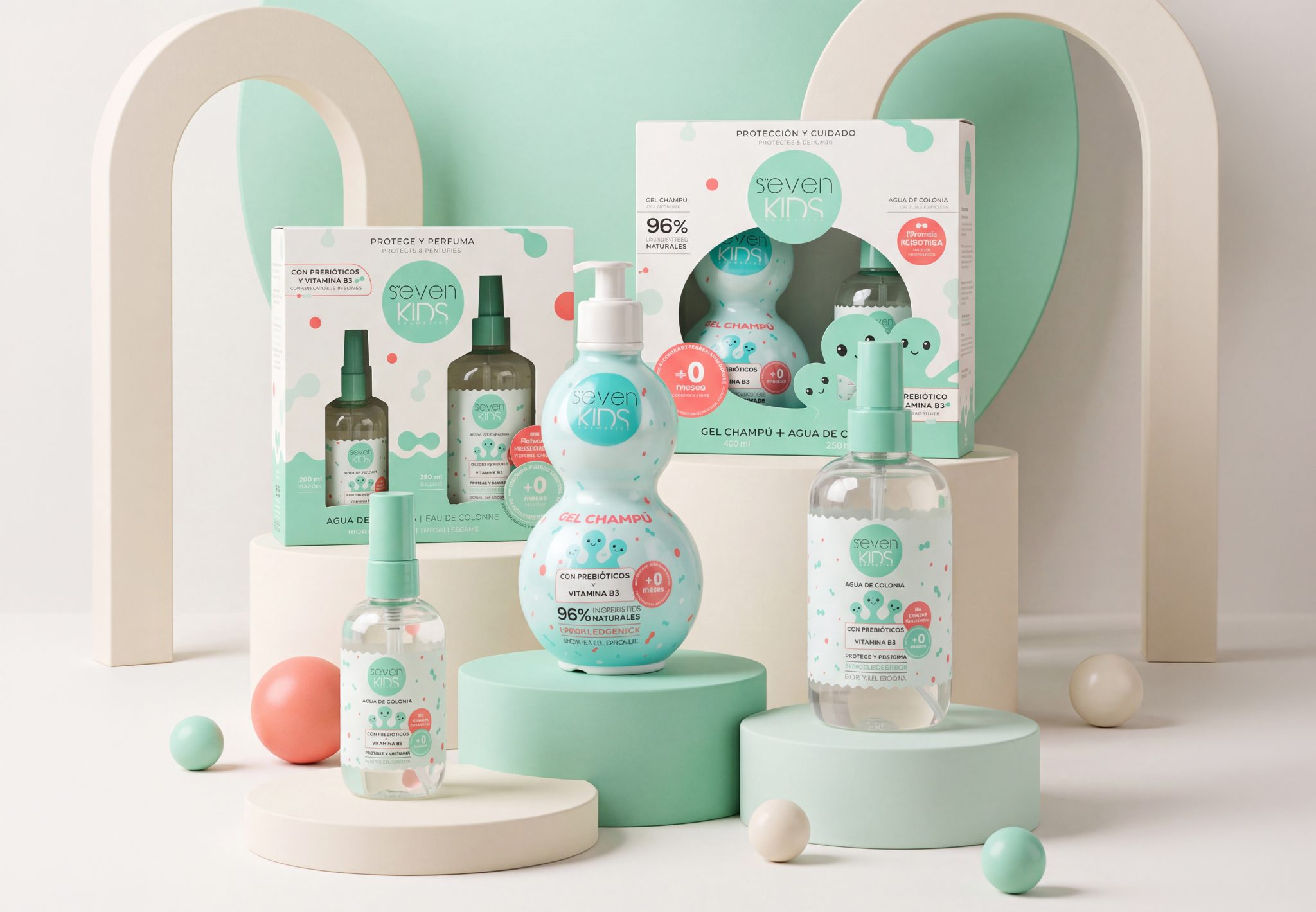

The graphic ecosystem of the skin microbiome.
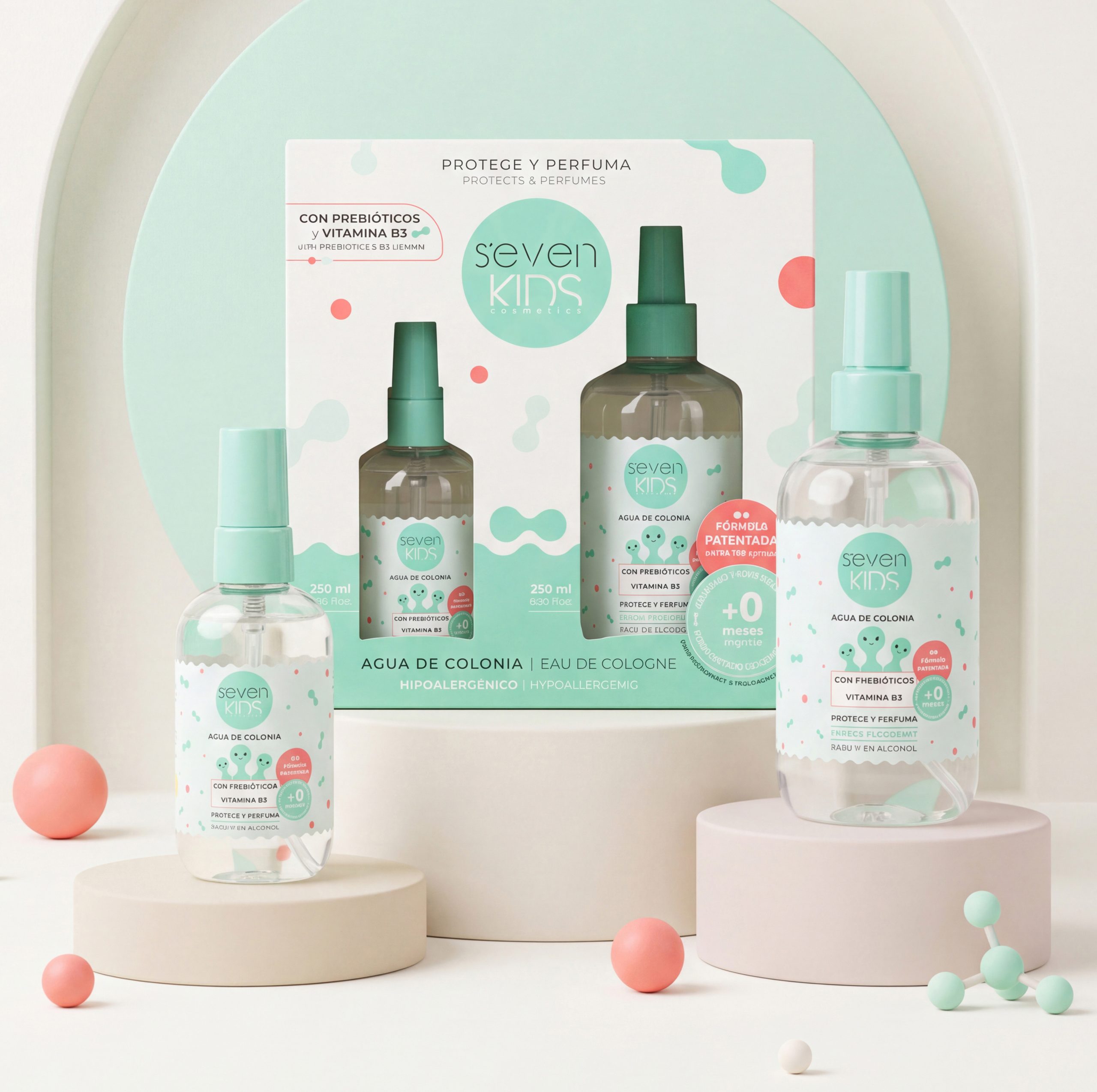
The graphic concept of this product line translates dermatological science into organic, fluid, and approachable shapes. The morphology of the primary packaging—from the curves of the gel bottle to the spherical caps—directly evokes prebiotic patterns, creating a cohesive system that connects the formula, the packaging, and the graphic design.
Educational text on secondary packaging:
The back of the box acts as an educational guide for parents and children. Prebiotics and vitamin B3 are personified as protectors (“microbiome superheroes”) that visually explain the skin’s barrier function. This illustration humanizes the product’s science, turning the packaging into a learning tool during bath time.
Contrasting finish: Matte UV + Selective Gloss UV.
To emphasize the biological concept on the secondary packaging, a silky-touch matte UV finish was applied to the entire box, combined with a selective spot gloss UV varnish over the prebiotic graphic elements.
This technique creates a dual effect: a tactile contrast that evokes skin hydration and a play of reflections that highlights the active iconography when light hits the product at the point of sale.




 Studio Zak
 Ander Sanchez
 Atipus
 Widarto Impact
 hovski
 Ohmybrand
 CreativeWise
 Rauf Karaev
 Hooperstudio
 La Nube de Ideas
 Modern Theory
 Akim Melnik Design Studio
 preflightcreative
 Seyf El Haq Menouer
 Badraddine Attik
 Samriddhi Ravi
 Alessandro Ammaturo
 Amblr Studio
 vladlenalevit
 Sis Tsarukyan
 monther al omari
 alchimistestudioParis
 designsbysukaina
 About House of Ta
 Amjad Battal