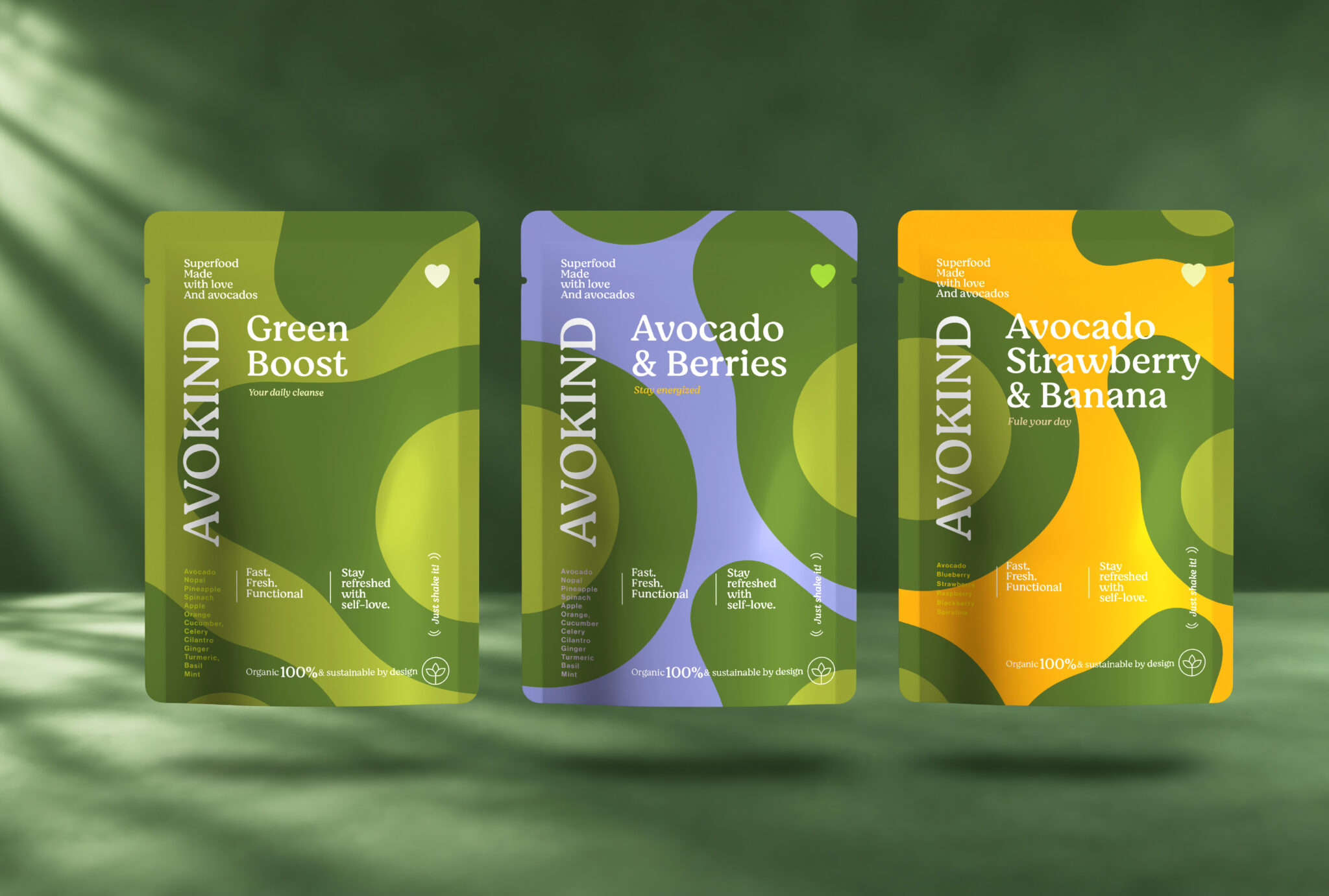

AVOKIND — Brand Identity & Packaging
We love creating brands. But what we love even more is giving them a personality that’s impossible to confuse with anyone else.
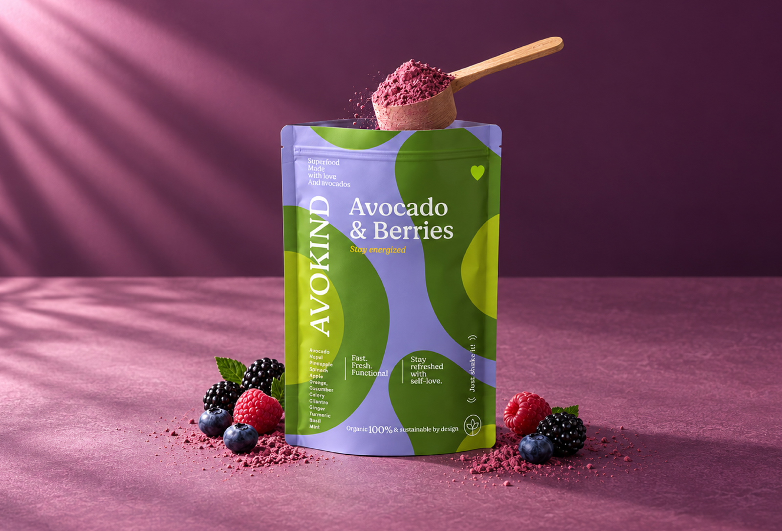
AVOKIND starts with the avocado and grows into a vibrant visual universe built around freshness, energy and self-love.
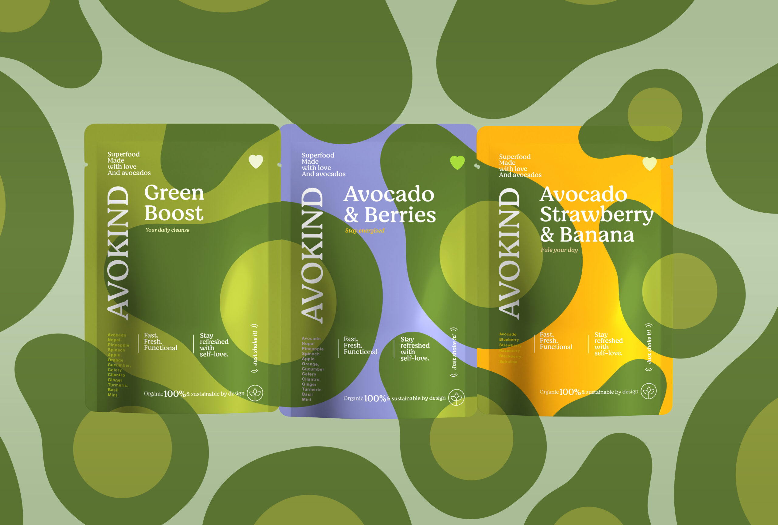
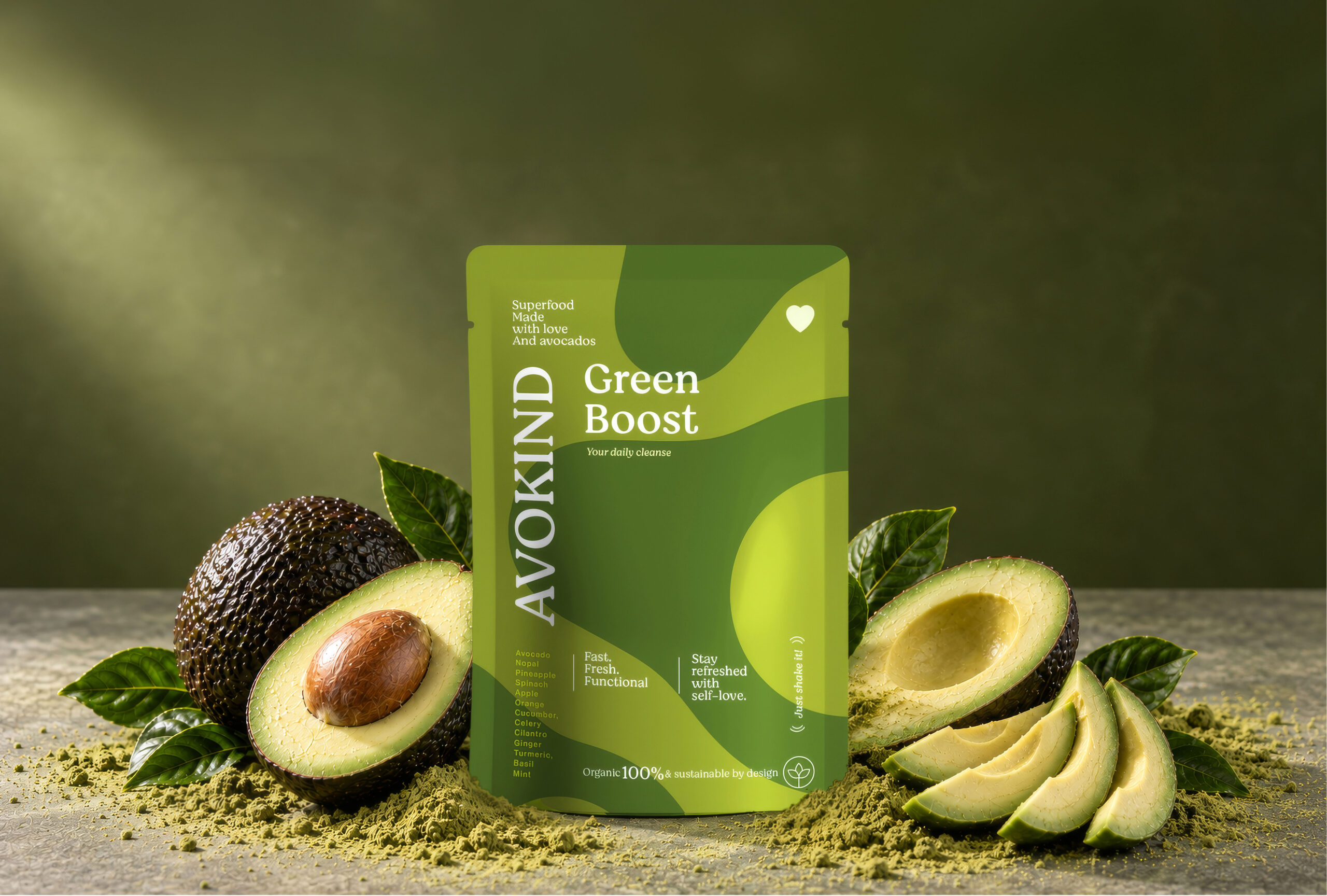
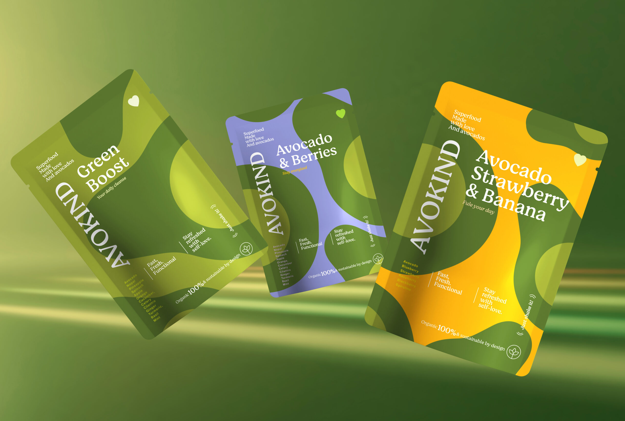
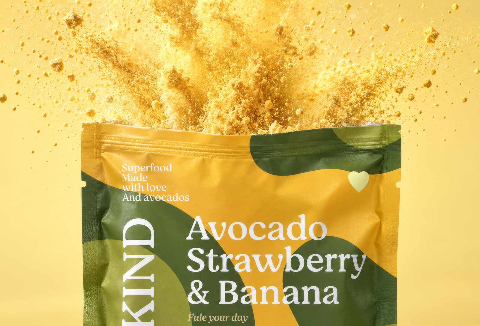
Inspired by the organic shapes of the fruit itself, the identity combines bold color, fluid forms and expressive typography to create a packaging system that feels fresh, playful and instantly recognizable. Each flavor develops its own personality through a distinctive color palette, while remaining unmistakably part of the AVOKIND family.
From the brand identity to the packaging, every element works together to turn a functional superfood product into something with character — designed not only to stand out on the shelf, but to be remembered.
Branding you notice. Packaging you crave. A brand you remember.
AVOKIND — Fast. Fresh. Functional
Team:
CCO: Charly Arias
Brand Leader: Julie Houtevelts
Art Director: Tony Agüero
ThePrime® — carias@theprimemx.com
2025© All Rights Reserved
 Derrick Lin
 VincoStudio
 lisakaplina
 CreativeWise
 alchimistestudioParis
 Adriana Adamo
 tauqueer
 MAISON D'IDÉE Prague
 Pixels Studio
 Atchayaa
 DESIGN CONCEPTS
 hello ocean
 monther al omari
 the Labelmaker
 alamgirbrands
 kat bres
 Vantablack Studio
 GruppoSaida
 studiorevv
 grafisercreative
 Kate Reichel
 UPRISE