

Marqués del Palmar: A Story Aged in the Barrel
Inside the cellars of Destilerías Marcelino lay an extraordinary asset that still lacked an identity of its own: a brandy drawn from barrels with more than a century of aging. The commercial opportunity had essentially been written by time itself. Until then, the distillery had specialized in producing spirits for third parties, but this exceptional liquid offered the chance to build a brand around both the product and the family history behind it. Rooted in El Palmar, Murcia, the project brings Marcelino González to the forefront as its narrative thread: a figure remembered as a benefactor of his community and an essential part of the family legacy. The creative challenge was to translate memory, aging, and provenance into visible signals of value before the consumer ever opened the bottle.
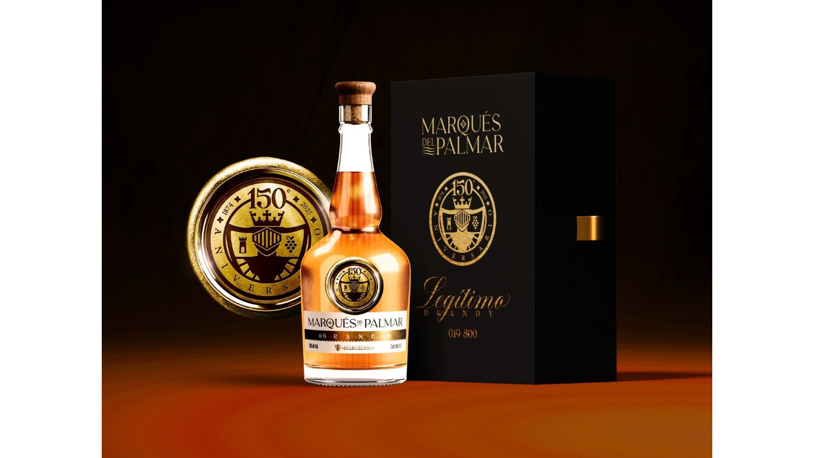
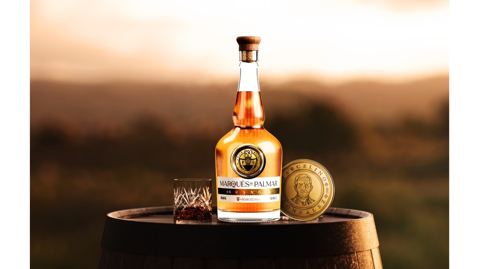
Marqués del Palmar emerges from this lineage. The name connects Marcelino’s legacy with El Palmar and adopts a deliberately classical graphic language: refined serif typography, editorial compositions, and metallic details reminiscent of medals, commemorative coins, and seals of origin. Marcelino’s portrait appears within a medallion that functions almost like a historical signature, surrounded by a visual repertoire of coats of arms, grapes, barrels, glasses, fingerprints, and emblems that extend the narrative without overwhelming the identity. The 150th anniversary adds another layer to the system, reinforcing the brand’s relationship with permanence and heritage. Gold serves a precise purpose here, giving physical form to age, ceremony, and legitimacy within a visual universe dominated by black, ivory, and amber tones.
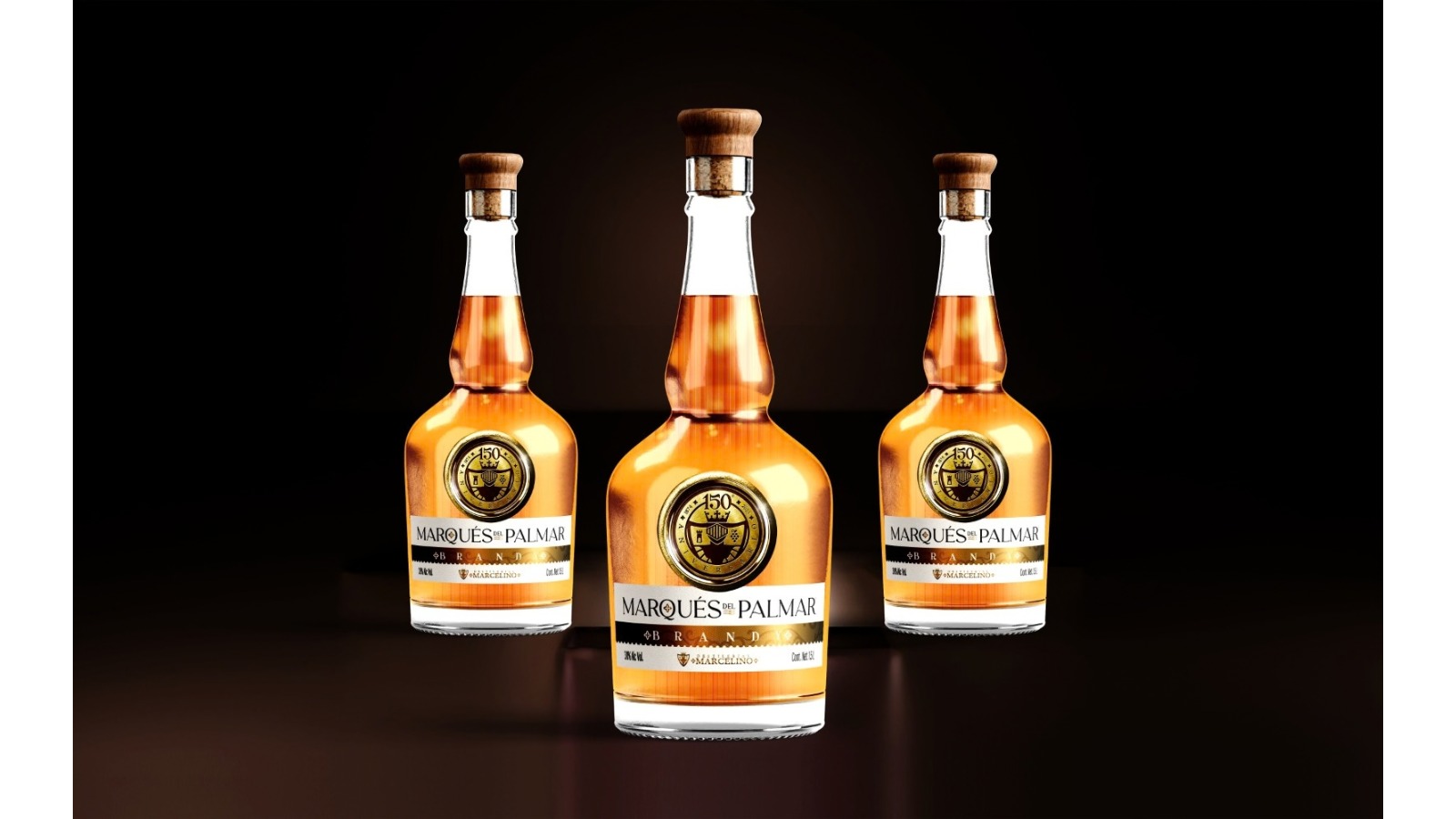
The packaging condenses this strategy into a few deliberate gestures. A tall, slender bottle leaves the amber color of the brandy fully visible; the clean neck and wooden closure add tactility, while the oversized medallion on the front gives the bottle an almost commemorative presence. The horizontal label uses generous areas of light space, black typography, and gold detailing, reserving visual drama for the seal and the central band. In the premium presentation, a vertical black box carries the logo and emblem at a larger scale through gold finishes, creating a natural transition between spirit, gift, and collectible object. Even the bottle numbering becomes part of the exclusivity narrative, reinforcing the idea of a limited production connected to a specific moment in the distillery’s history.
The result transforms an exceptional inventory into a legible brand asset. The age of the brandy stops being a hidden fact inside the cellar and begins to appear in every decision: the medallion, the anniversaries, the typography, the materials, and the way the bottle is presented. That coherence allows Marqués del Palmar to enter luxury codes while preserving the specific history that gives the brand its meaning. Design organizes the past and makes it commercially relevant in the present. After more than a century inside a barrel, time finally finds a visible form.



 krrrrrllii
 babyage
 Deep
Deep monther al omari
 Atiq Alam
 TUERCA Studio
 neo creative studio
 Pinot Agency
 Pixels Studio
 Anastasia Cherepanova | xtramez
 awaiskhadim
 Studio Be Design
 Belova Oksana
 We Craft Studio
 ArtDesignByDIna
 Ananya Taran
 Nadezhda Gorelikova
 orhanirmaktasarim
 WillBe
 Hi estudio
 43oz
43oz Rosario Lo Iacono
 alchimistestudioParis