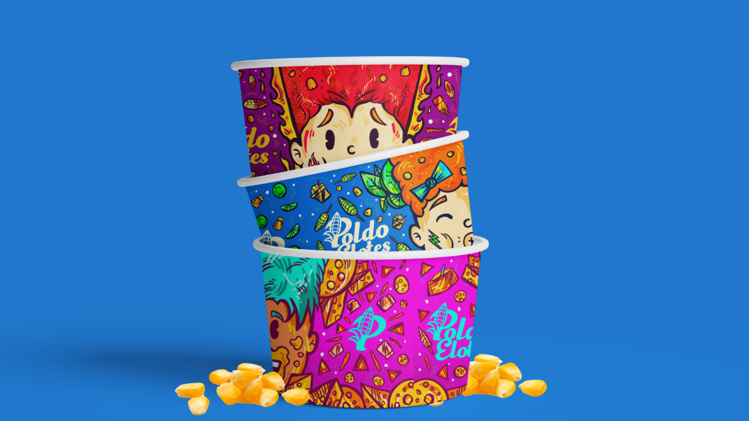

Elote and esquites are part of a food culture defined by its ingredients, its street stalls and, above all, the personalities of those who prepare and serve them. For Poldoelotes, the challenge was to translate that familiarity into an identity that would distinguish the business without losing its grassroots character. Drawing inspiration from traditional hand-painted Mexican signs, the project established an outgoing, cheerful and traditional personality, supported by colloquial language that feels familiar to its customers. The design opportunity was clear: make the street-stall experience recognisable on a cup, a sign or a vehicle, even before anyone tastes the product.
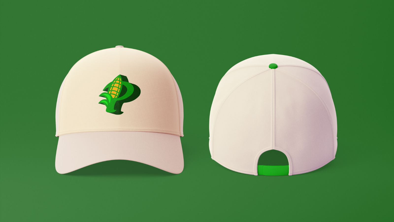
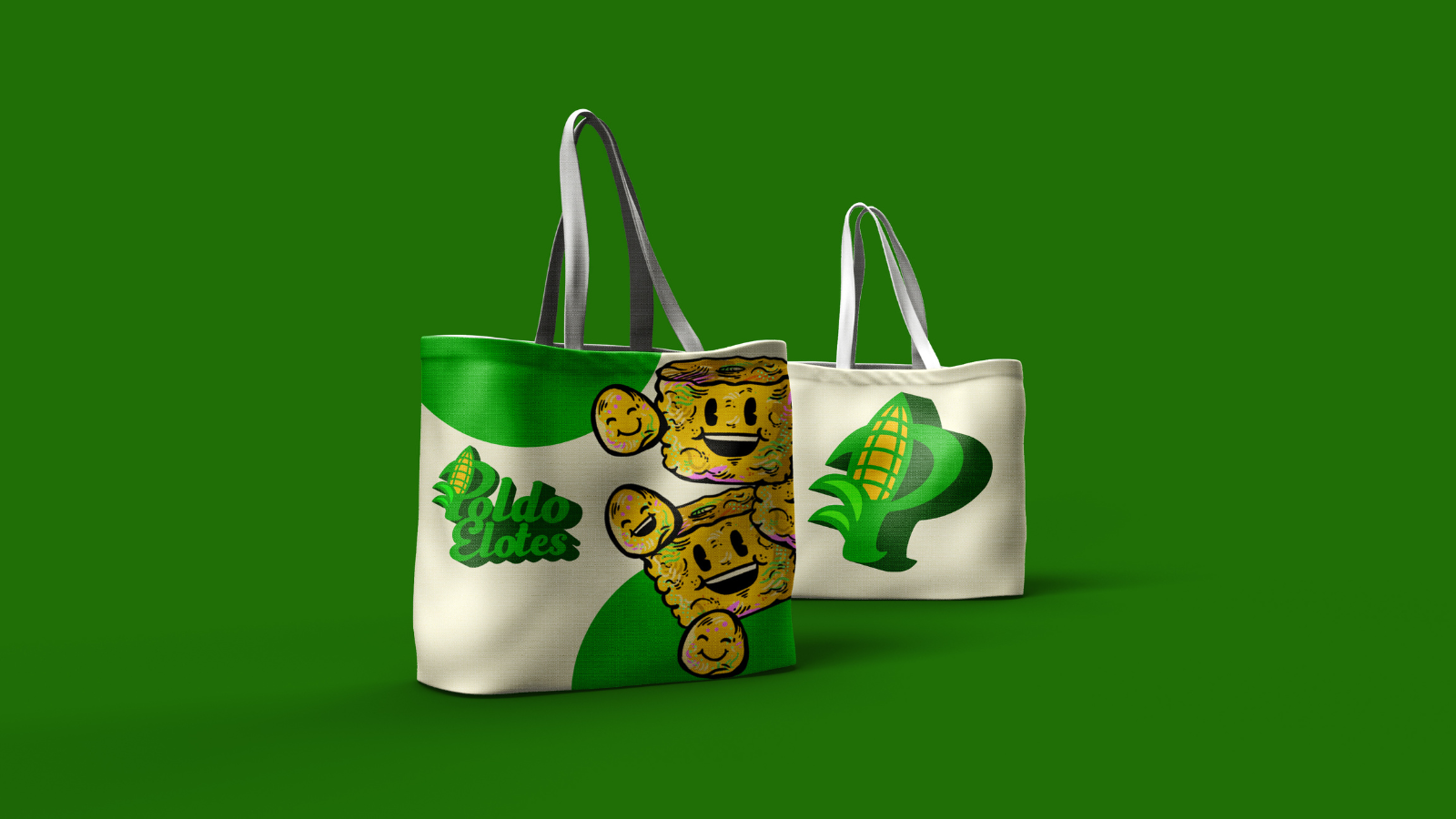
The identity begins with a typographic gesture closely tied to the product. An ear of corn is integrated into the name’s initial letter, creating a standalone symbol designed to remain recognisable wherever the full logo cannot fit. Green dominates the visual identity, accompanied by yellows and a cream background that evoke corn and Mexican vernacular graphics. Expressive lettering is paired with a functional secondary typeface, while the brand guidelines establish proportions, clear space and variations to maintain legibility. This discipline is particularly useful for a brand that needs to work equally well on small surfaces and on signage visible from the pavement.
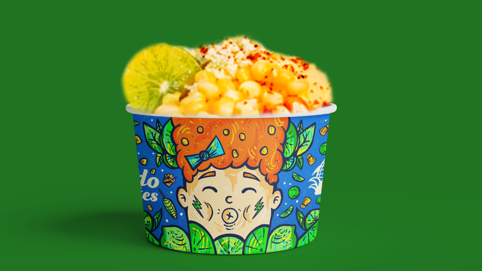
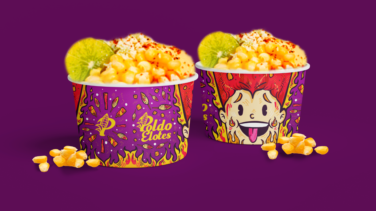
Illustration gives the system its most distinctive character. Corn cobs, esquites, prepared corn dishes and other products take on faces, gestures and exaggerated expressions, like characters from a hand-painted sign coming to life. On the esquites cups, the project takes the idea further: faces and their reactions to a craving fill almost the entire surface, surrounded by vibrant colours and small graphic elements. The packaging becomes a communication medium that accompanies the product as it is enjoyed and can appear naturally in a photograph. The same visual language extends to canopies, bags, aprons, caps, illuminated signs, delivery vehicles and mobile vending units. The brand gains mobility while retaining its visual identity.
Poldoelotes finds its identity in a contemporary interpretation of something deeply familiar. Corn shapes the symbol; humour defines the relationship with customers; and the illustrations make the products recognisable while supporting a versatile communication system. The proposal brings these elements together in an identity that can accommodate different sales formats and maintain a consistent presence across them. Its commercial impact will depend on implementation, but the strategic intent is clear: preserve the business’s approachable character while building a distinctive visual signature. In a category where cravings often drive decisions within seconds, a recognisable face can make the memory last much longer.



 Derrick Lin
 Biaa
Biaa Petitmoulin Studio
 White Bear Studio
 Eva Chistyakova
 monther al omari
 Atipus
 alchimistestudioParis
 oneandother
 bloomburo
 helocrene
 Shapers Studio
 Denver Design
 Aidearte
 andrew.huerta
 softmachine
 airobtq
 Buzz & Co.
 Ruby
Ruby themythographer
 IDNB Inc.
 viktorflr
 Zenpack