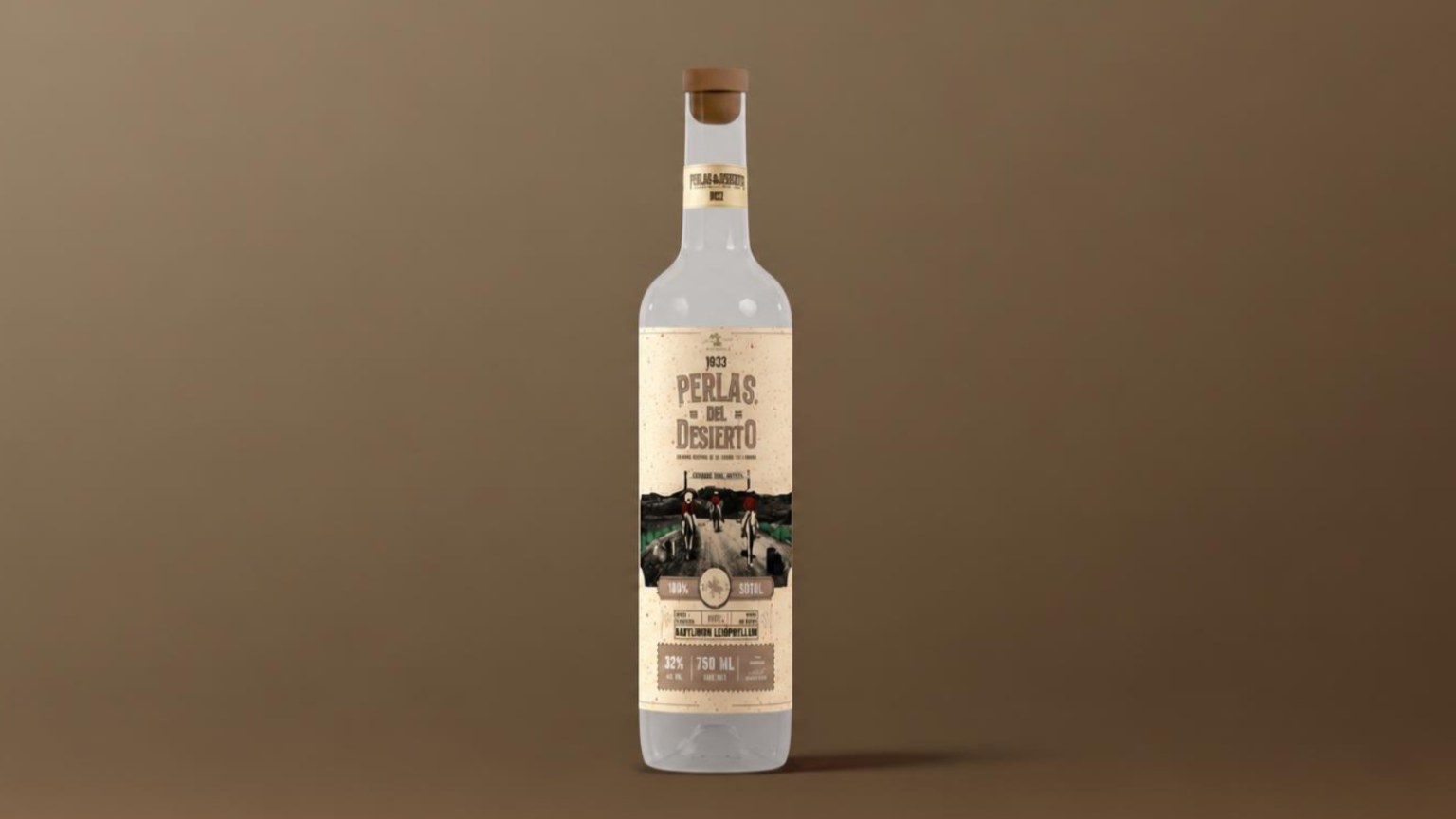

Perlas del Desierto: Northern Mexico Engraved on a Bottle
Some products derive much of their value from their origin, but that origin needs to become visible when they reach an unfamiliar shelf. Perlas del Desierto, a brand of artisanal sotol, liqueurs, and cream liqueurs connected to Coyame del Sotol, Chihuahua, faced precisely that challenge. Its 2025 redesign proposal sought to strengthen recognition in the premium segment and develop an identity capable of connecting with consumers across Mexico and potential U.S. border markets. The starting point was rich in character: a spirit associated with the desert, traditional production methods, and a northern Mexican culture with a powerful visual presence. The task was to translate that heritage into a contemporary brand identity that could remain recognizable across different product lines.
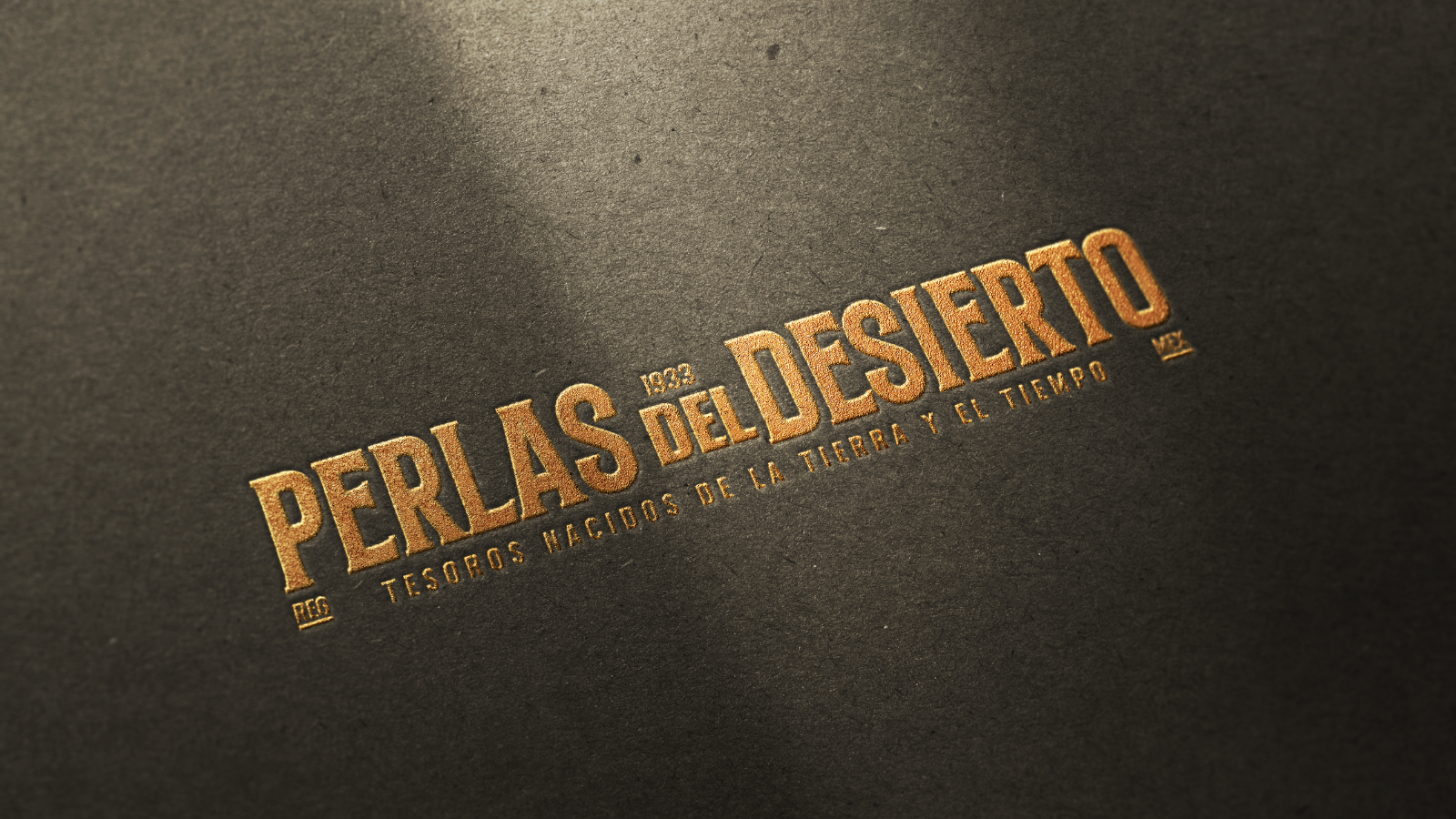
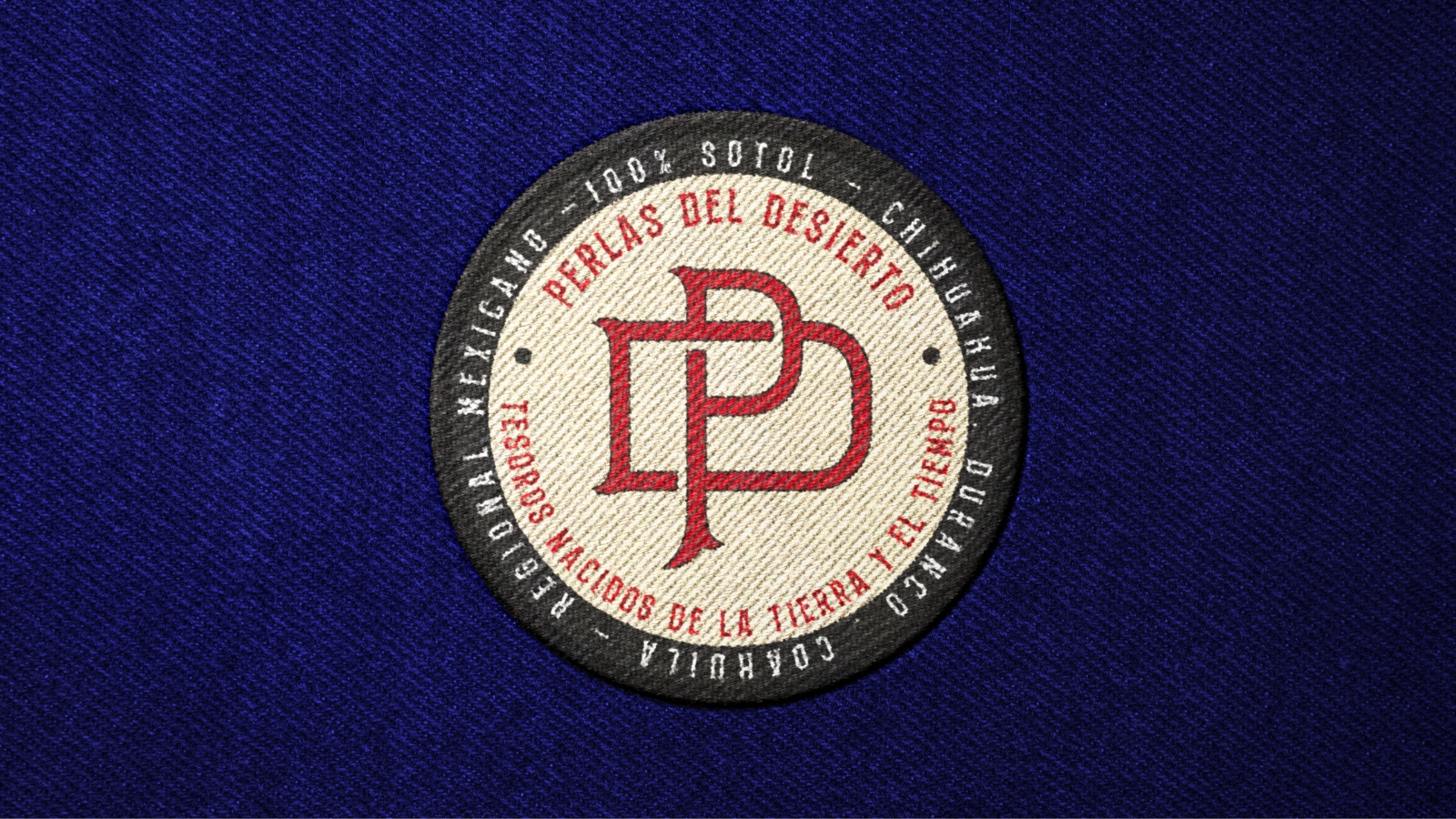
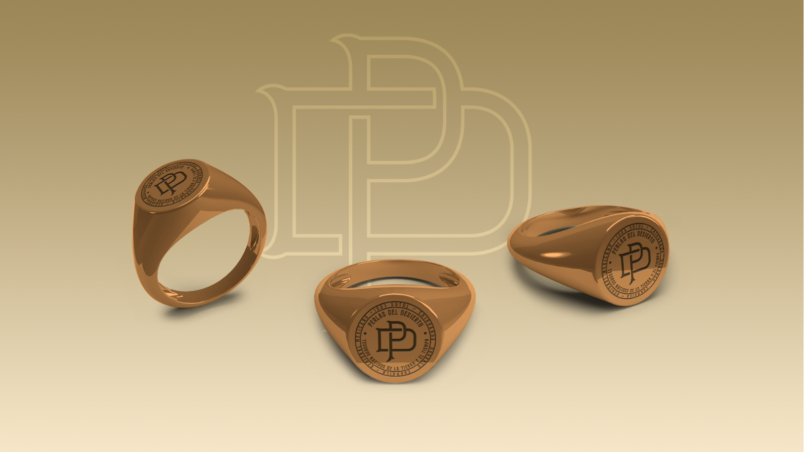
The creative direction draws on Western visual language through a perspective rooted in the territory. Tall, bold typography recalls cantina signage and Old West printed materials; brown, red, beige, and black form a warm palette evocative of dust, earth, and wood. The name takes center stage in vertical and horizontal compositions, accompanied by an interlocking monogram and circular emblems that allow the identity to work at different scales. The year 1933 appears as a narrative element within the graphic system, alongside the tagline “Treasures Born of Earth and Time.” Don Julián also plays a role as the protagonist of a brand story that embodies hard work and a connection to the land. Together, typography, symbols, and storytelling establish a restrained yet expressive personality that stands apart without relying on generic luxury codes.
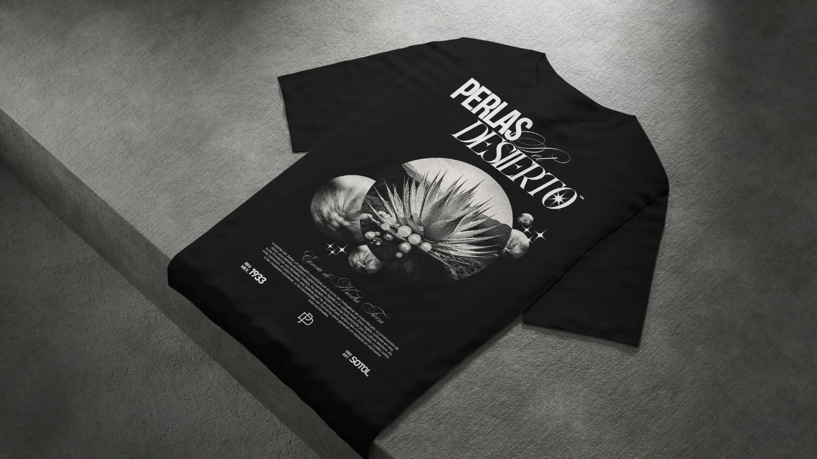
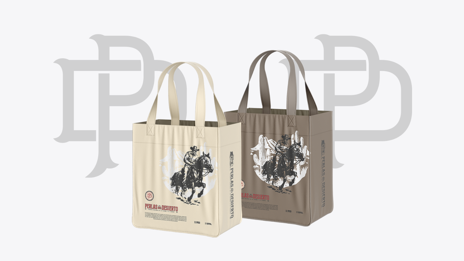
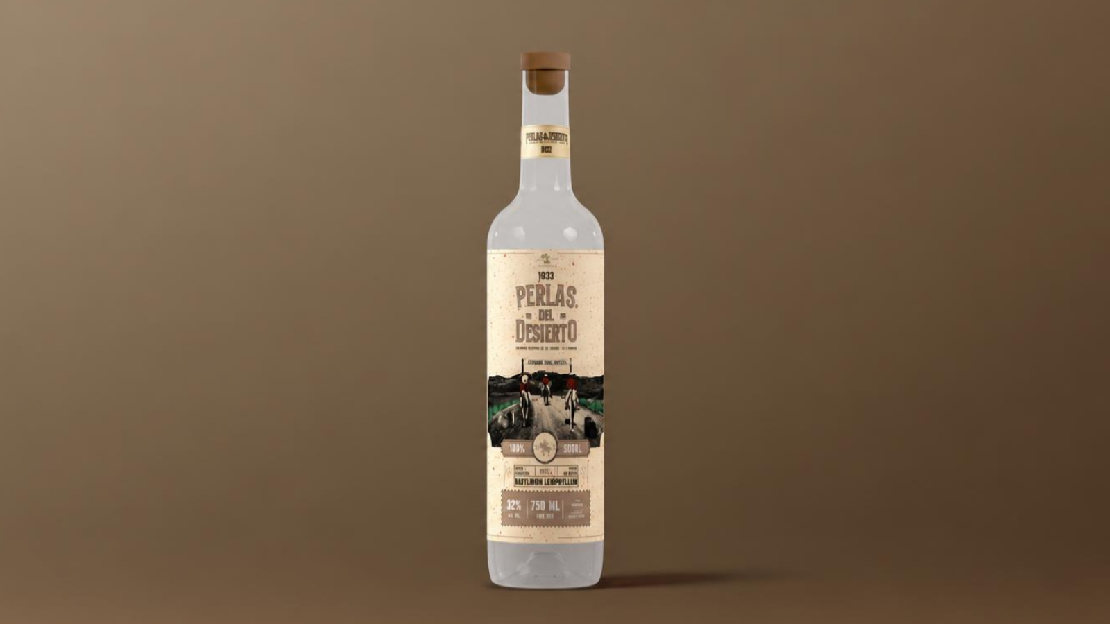
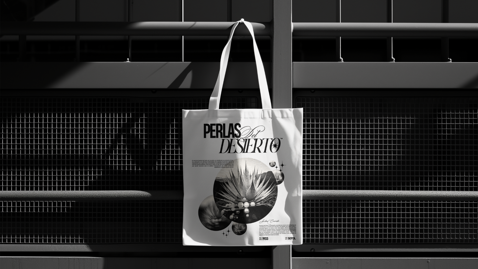
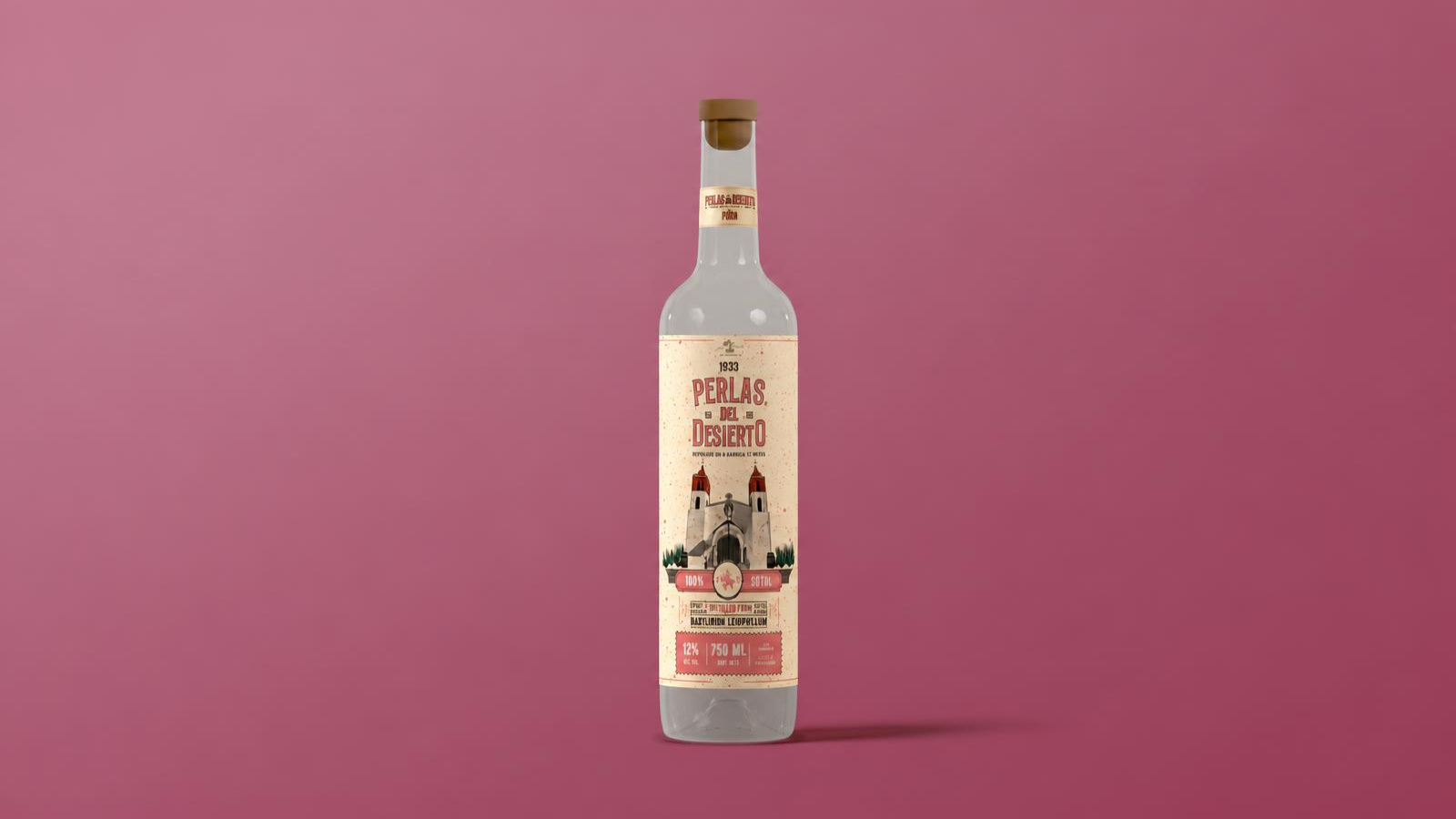
The labels carry the project’s most significant visual decision. Using a hatching technique reminiscent of antique engravings, the design depicts two landmarks in Coyame: the town’s church for the sotol cream liqueurs and the road leading into the town for other expressions of the spirit. Horseback riders, barrels, and sotol plants complete the scenes. On tall, slender bottles, these images become miniature portraits of the territory; the typographic structure and color fields distinguish varieties such as pine nut, walnut, marzipan, pistachio, and piña colada while preserving a cohesive product family. The visual universe is also explored across cans, shipping boxes, bags, textiles, and accessories. These conceptual applications demonstrate how an identity originating on a label could retain its character across different materials, formats, and commercial settings.
Perlas del Desierto presents an approach to building value around a specific place of origin. Illustration makes the territory identifiable; the label architecture organizes the portfolio; and the system of brand marks and emblems provides continuity for future applications. Its eventual commercial performance will depend on production, distribution, and consumer response—factors the presentation does not measure. What the project does establish is a visual language that allows the brand to reach beyond Coyame without erasing the details that connect it to its birthplace. At the heart of every bottle remains the same landscape: a road stretching through the desert toward the possibility of reaching further.

 hello ocean
 monther al omari
 the Labelmaker
 alamgirbrands
 kat bres
 Vantablack Studio
 GruppoSaida
 studiorevv
 grafisercreative
 Kate Reichel
 UPRISE
 Modern Theory
 By siddika
 MAISON D'IDÉE Prague
 Kinshuk Bainss
 Palashcc
 www.branding.uz
 Hutton Creative
 DESIGN CONCEPTS
 Tancybox
 habiba hatem
 Up-Brands
 sayadworks
 Kingdom & Sparrow
 furtgoods
 Si me preguntas