
REINA Brand Concept
Haircare, mid-market segment
Core Concept
“Accessible elegance with professional results.”
REINA makes high-quality haircare a standard for modern women rather than a privilege reserved for the premium market. The products avoid unnecessary complexity while offering thoughtfully developed formulas and stylish presentation.
The emphasis is on clear, easy-to-understand benefits—shine, smoothness, volume and repair—and on the idea that good haircare should be part of an everyday ritual rather than a special occasion.
Brand Values
Accessibility. Mid-range pricing, with formulas and results comparable to professional product lines.
Transparency. Packaging communicates clear promises such as “for shine,” “for volume” and “for repair,” without overwhelming consumers with technical terminology.
Style without pretension. Minimalist design that looks sophisticated and appropriate both in the bathroom and on a retail shelf, while also appearing attractive in social-media content.
Effectiveness. Focused formulas without unnecessary filler: every product is designed to address a specific need.
Target Audience
Women aged 25 and above who value their time and want predictable results: they want to wash their hair quickly and achieve a polished, well-groomed appearance without complicated styling.
Urban women with busy schedules involving work, exercise, meetings and travel, whose hair needs to remain neat and presentable in any situation.
Value-conscious consumers who prioritise the balance between price and performance. They are unwilling to pay extra for elaborate packaging and marketing but expect products to deliver genuine results.
Consumers who follow haircare trends without chasing niche launches. They prefer clearly defined categories such as “for volume” and “for smoothness,” supported by familiar and trusted ingredients.
Logo Description
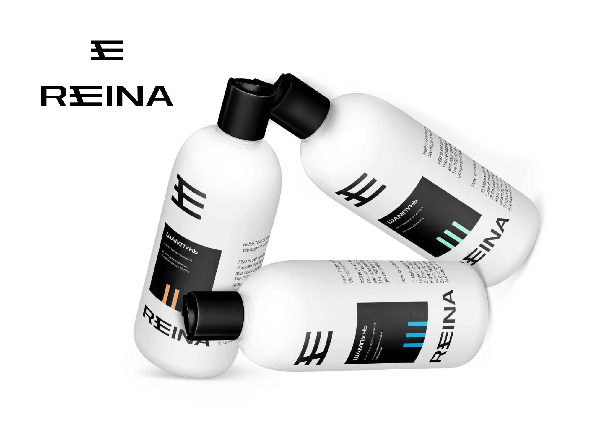
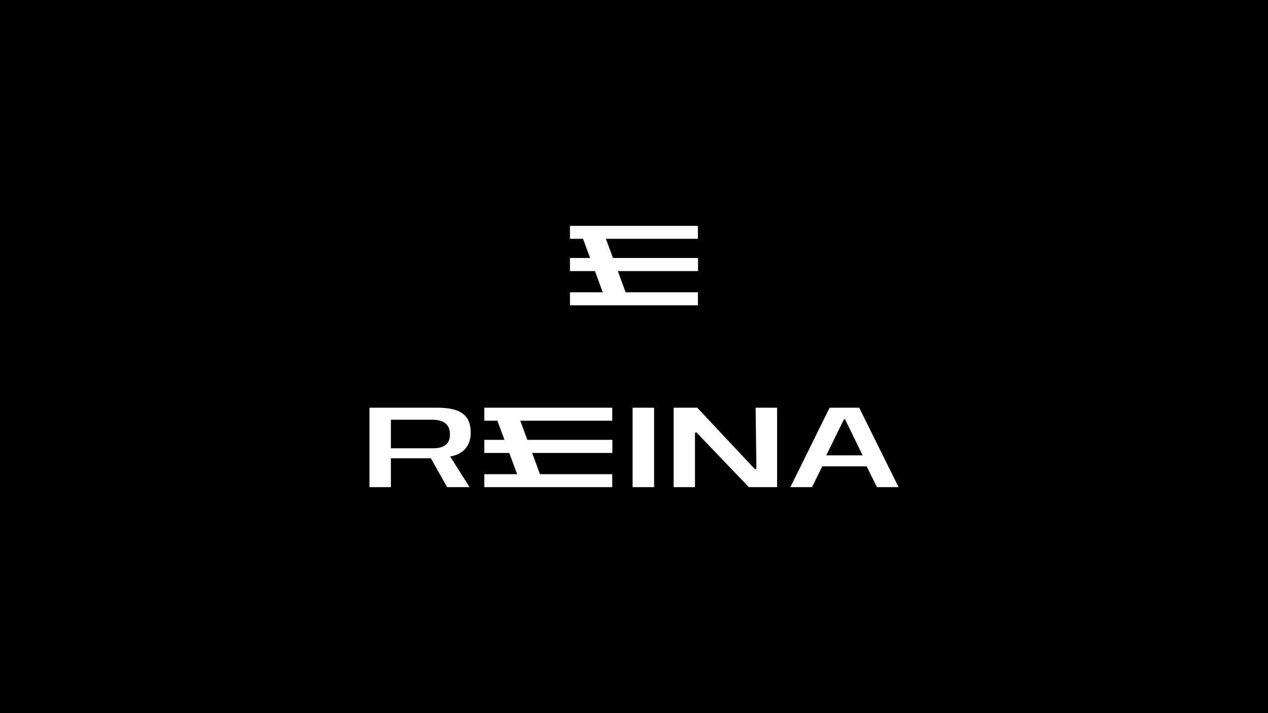
The REINA logo embraces the aesthetics of quiet luxury and minimalism. It communicates modernity, confidence and understated elegance appropriate for the mid-market segment.
Composition and Elements
Vertical structure. The symbol is positioned directly above the brand name, creating a sense of balance and stability while conveying status without excessive decoration.
Graphic symbol. The abstract mark consists of horizontal bars of varying lengths. It does not depict a literal image but can be interpreted as rhythm, layers or steps. This abstraction allows for several associations: the structure of hair, layers of care, levels of quality or even a stylised crown—a reference to reina, meaning “queen.”
Brand typography. The name is set in a bold sans-serif typeface with large, confident letters and precise geometric forms. The typography conveys reliability and modernity while remaining legible at smaller sizes, including on crowded retail shelves.
Integration of the symbol into the typography. The graphic motif is repeated within the letter E in REINA, creating a visual connection between the symbol and the wordmark. This makes the logo feel cohesive and memorable.
Monochrome palette. The black-and-white treatment reinforces the identity’s versatility, allowing the logo to work effectively across different backgrounds and materials, from matte plastic to glossy labels.
Packaging Design
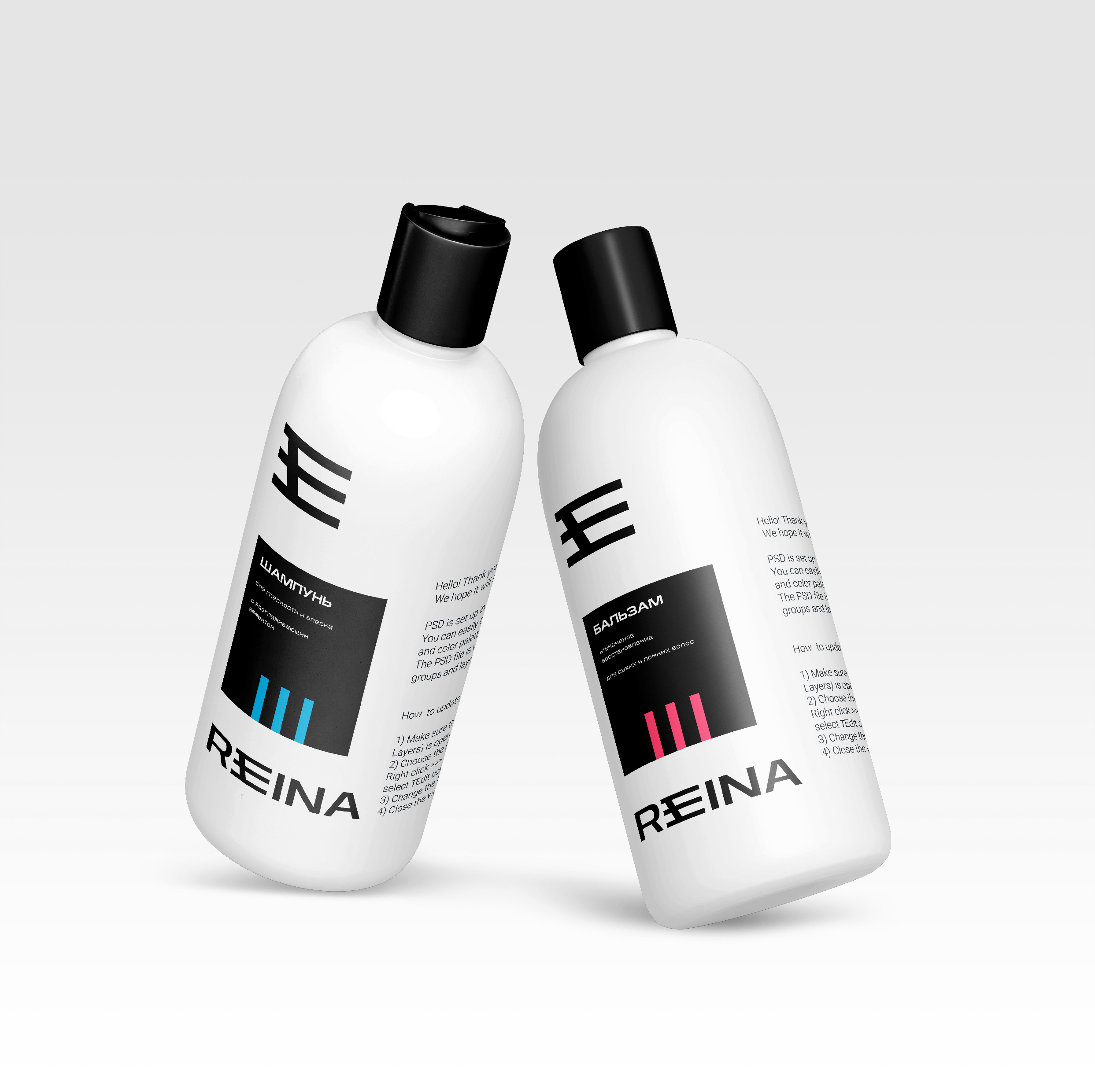
REINA’s packaging style can be described as “restrained minimalism with a graphic accent”: concise, contemporary and easy to identify on the shelf.
Key Characteristics
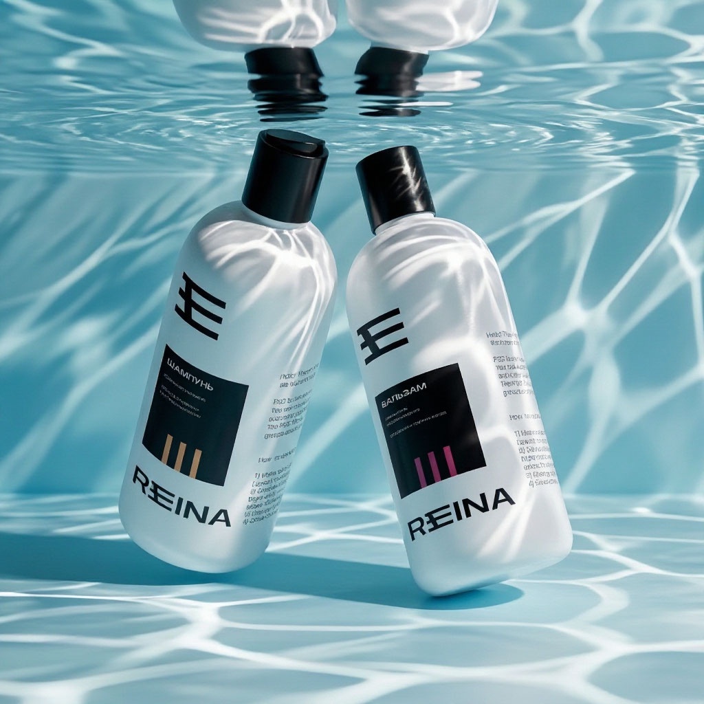
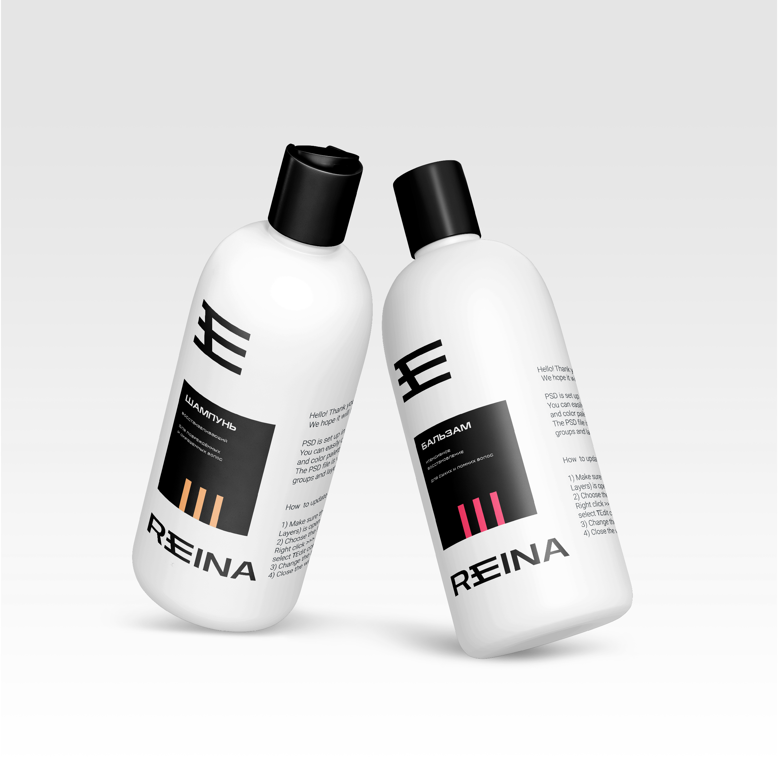
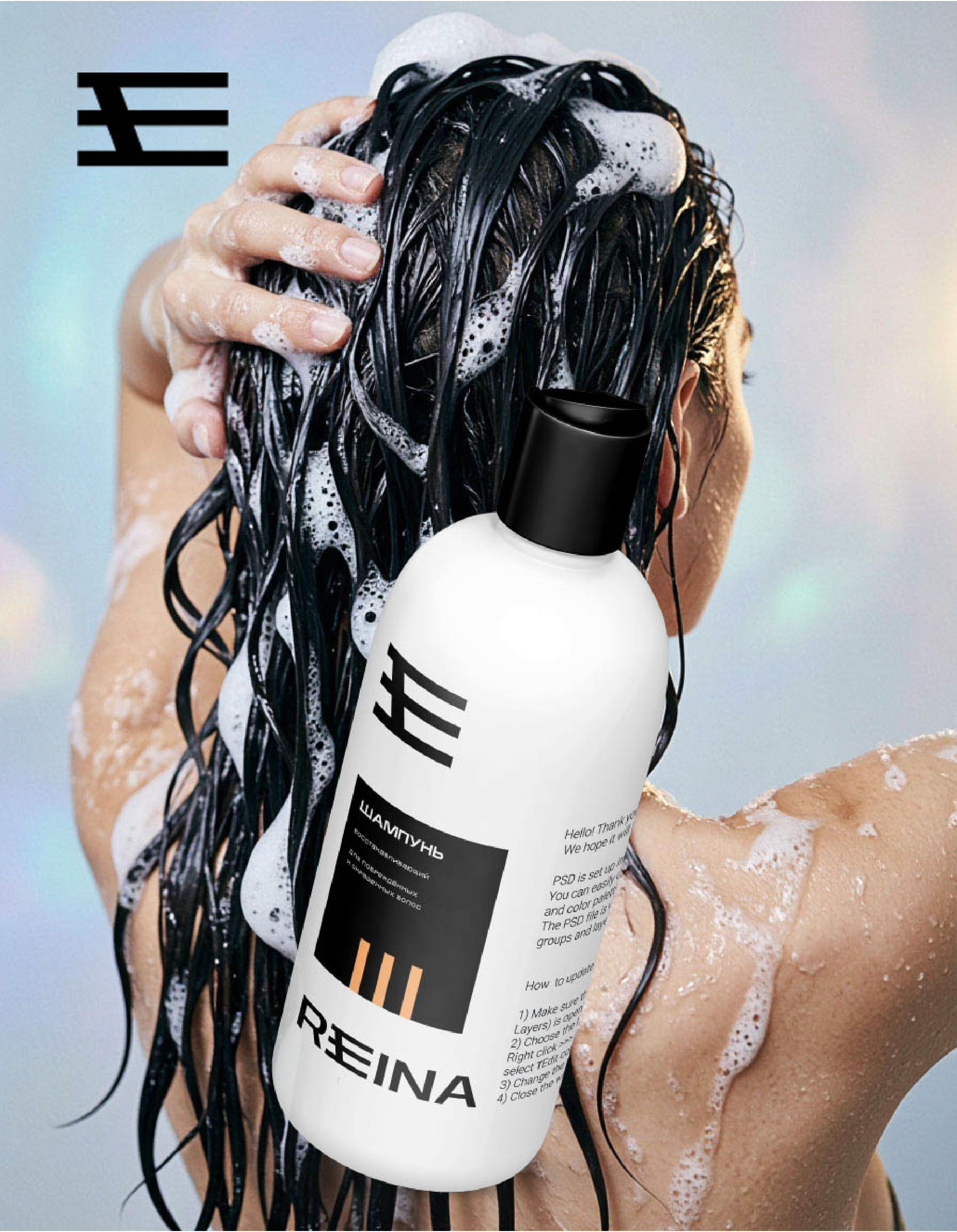
Monochrome foundation. A matte white bottle paired with a black cap creates a clean, almost clinical contrast that immediately evokes professional haircare and hygiene.
Confident typography. The REINA name is presented in a bold, geometric sans-serif typeface. It communicates confidence and technical precision while remaining legible from a distance.
The graphic mark as a brand identifier. The abstract three-bar symbol above the name acts as a visual anchor. Minimal yet recognisable, it can be interpreted as a stylised crown—referencing reina, meaning “queen”—layers of care or the structure of hair.
Accent colour markers. Thin coloured elements appear within the black product-information panel: green bars identify the shampoo, while yellow bars distinguish the conditioner. This provides a simple but effective way to differentiate product categories and introduce visual energy without overloading the design.





 Derrick Lin
 Biaa
Biaa Petitmoulin Studio
 White Bear Studio
 Eva Chistyakova
 monther al omari
 Atipus
 alchimistestudioParis
 oneandother
 bloomburo
 helocrene
 Shapers Studio
 Denver Design
 Aidearte
 andrew.huerta
 softmachine
 airobtq
 Buzz & Co.
 Ruby
Ruby themythographer
 IDNB Inc.
 viktorflr
 Zenpack