

PLIÉ is a conceptual branding and packaging project for a light ice cream brand inspired by the grace and elegance of ballet.
The concept explores the connection between the lightness of ice cream and the fluidity of dance, translating this idea into a refined yet playful visual identity.
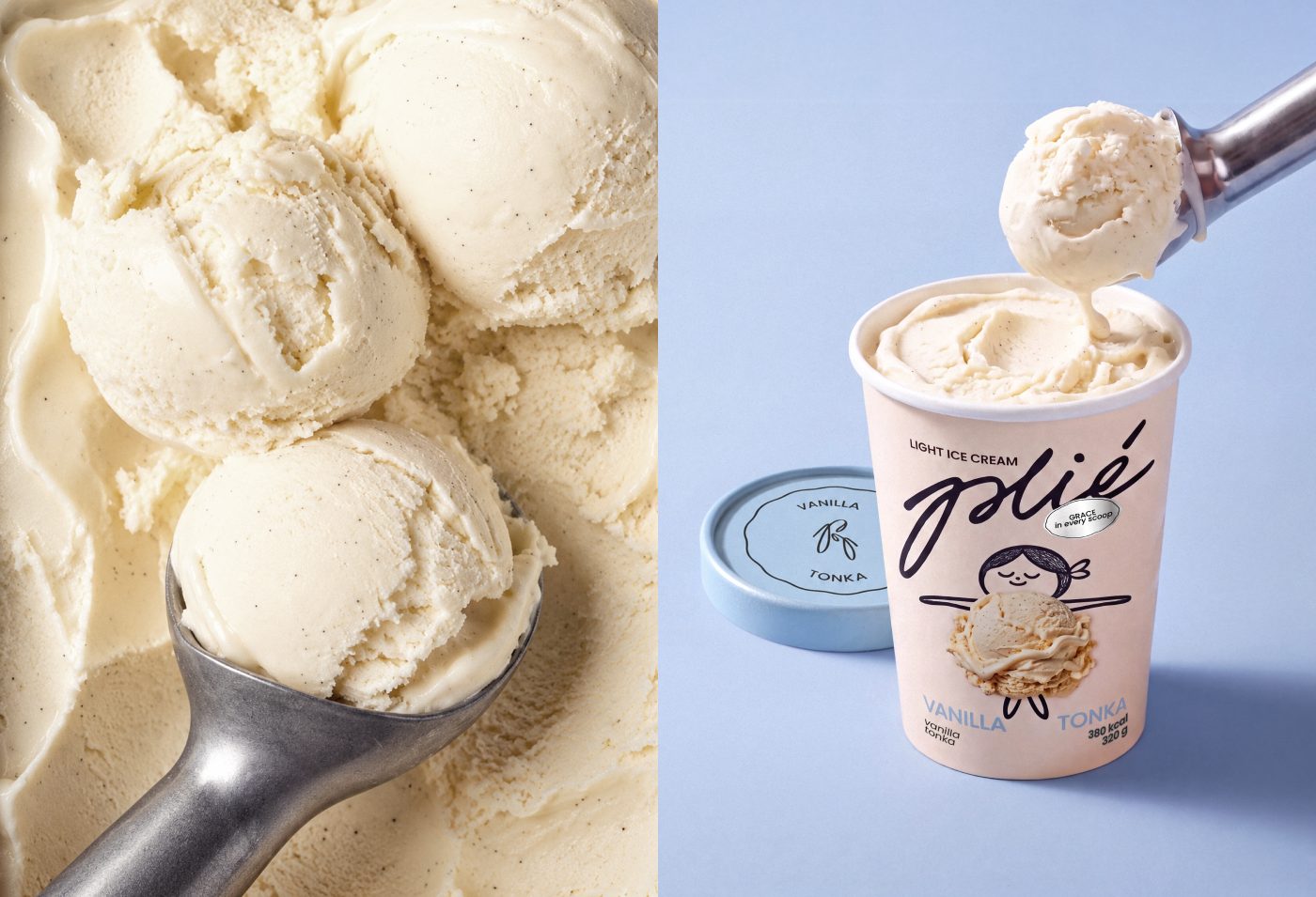
The brand identity combines expressive typography with a distinctive graphic mark based on the Cyrillic letter “P,” the first letter of the brand name in Russian. Its shape evokes ballet pointe shoes, connecting the brand’s visual language to its central inspiration.
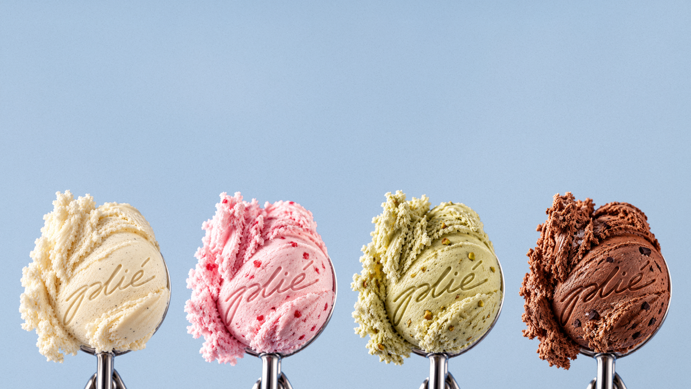
The packaging system features four flavors, each distinguished by a soft pastel color: Strawberry Rosé, Vanilla Tonka, Pistachio Cardamom, and Dark Cocoa. The palette creates a recognizable visual system, while silver accents introduce a subtle premium feel.
Through typography, color, and art direction, PLIÉ creates a cohesive brand world that balances elegance, lightness, and indulgence.
Curator’s Insight
The central problem for a light ice cream is how to signal restraint without the austerity of diet-aisle design. Plié solves it by letting the product complete the illustration. A loose line-drawn dancer supplies the head, arms and a single standing leg, while a real scoop photographed in place becomes her tutu. The cup stays a quiet blush neutral and flavor is carried by the lid and the name, so a stack reads as one ensemble from a distance. Calories are printed plainly beside the weight, which places the lightness claim in the information hierarchy instead of leaving it to the slogan. Small gestures, such as the hand-stamped flavor circle on the lid, keep the system warm. When a product has no natural character, the contents can become part of one.




 NEV
NEV Stefano Bracci
 monther al omari
 Lizakjx
 JOAOMARCOSDESIGN
 alchimistestudioParis
 Harriet Neild
 octavio rojo
 宏洛图品牌设计HONGLT
 DESIGN CONCEPTS
 Alexander Skurihin
 Studio K95
 ARMBRAND
 Richa Rai
 houseoferas by Miti
 Agence des Coteaux
 Kushi Eaknath
 Ann Treasa
 Xiao Ning
 krrrrrllii
 babyage
 Deep
Deep Atiq Alam