
S34 GIN — A Shared Origin
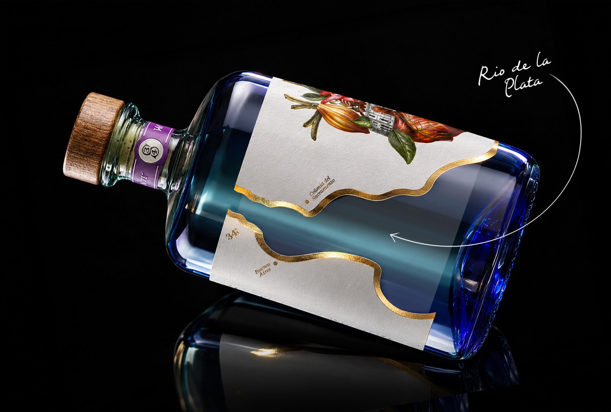
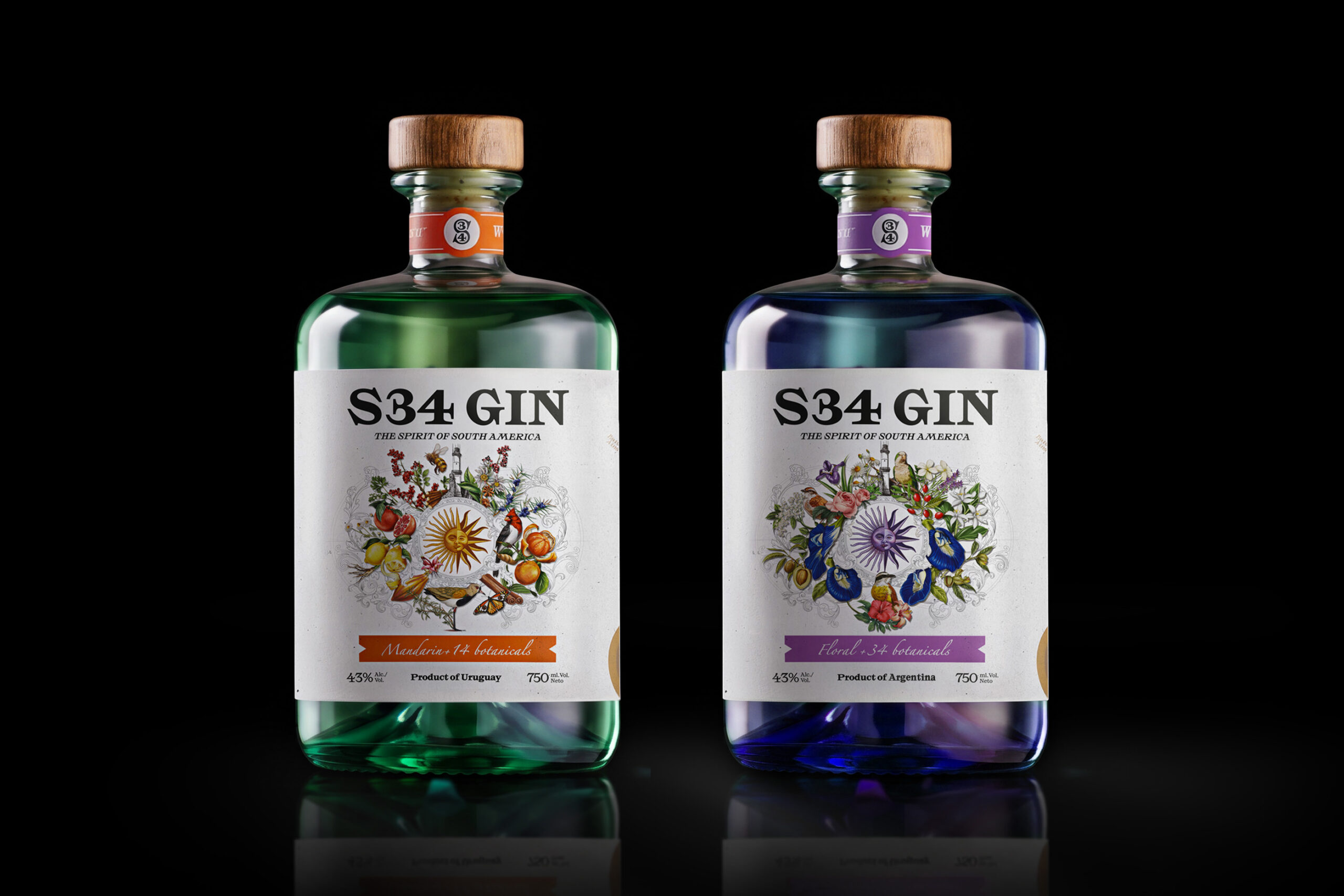
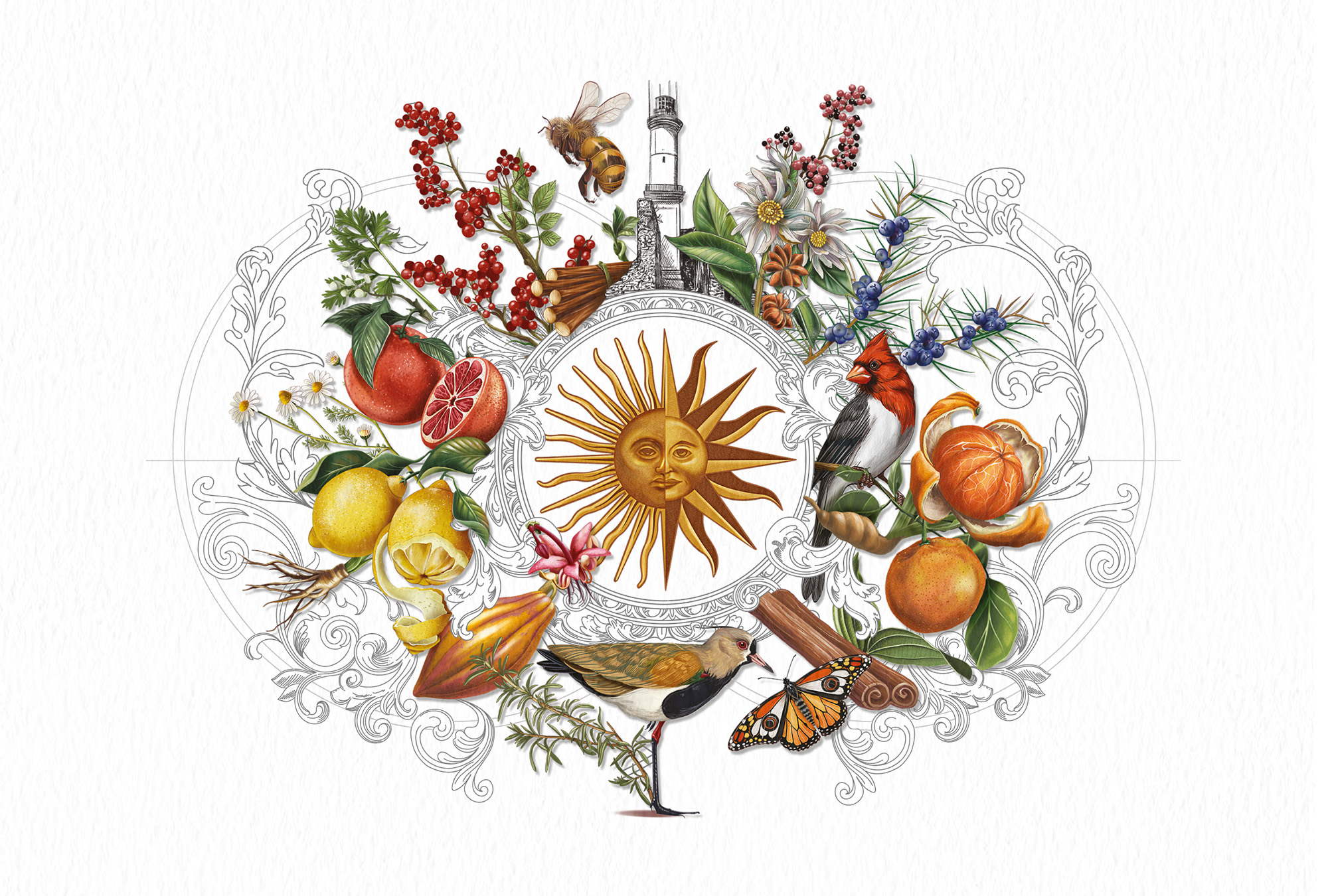
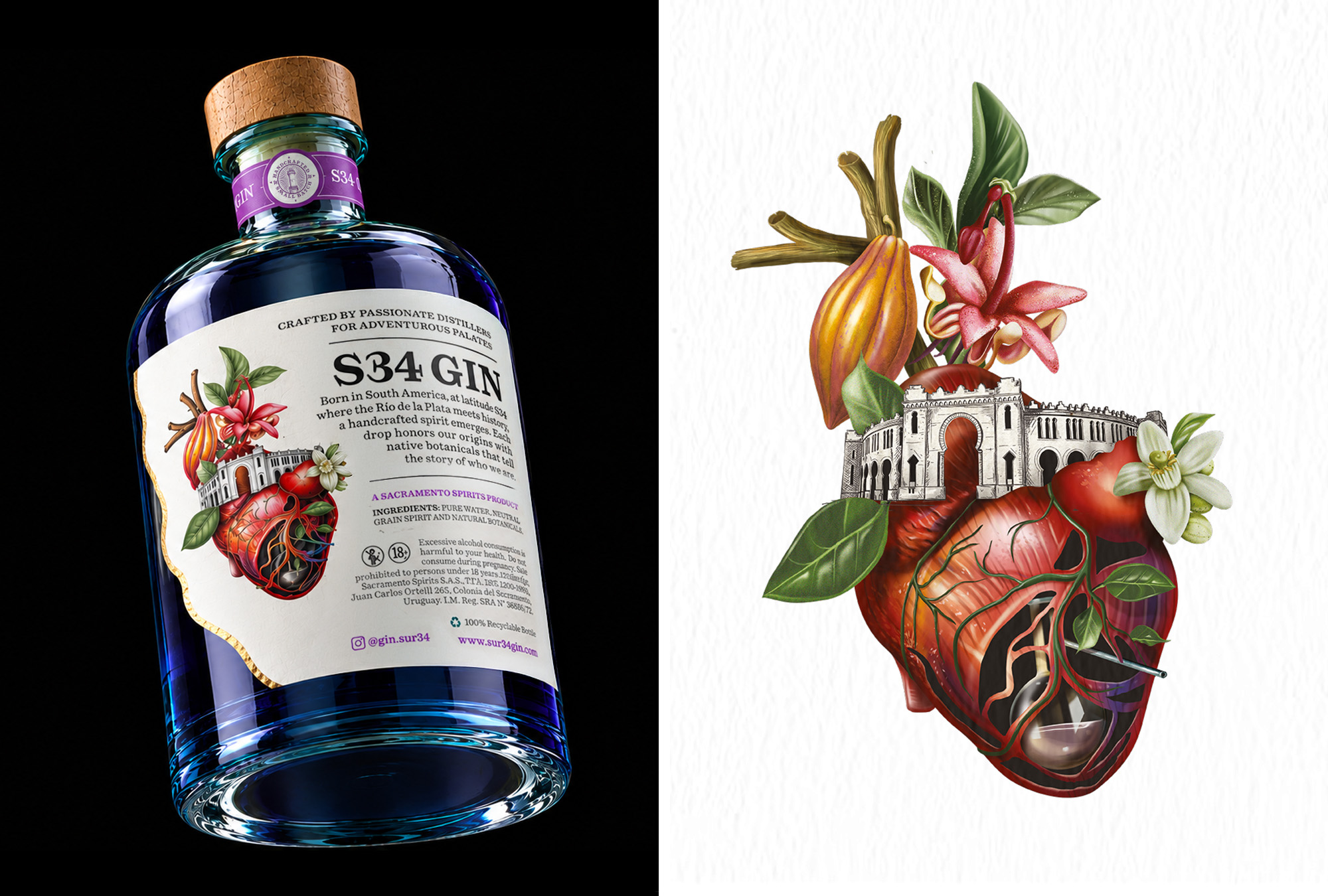
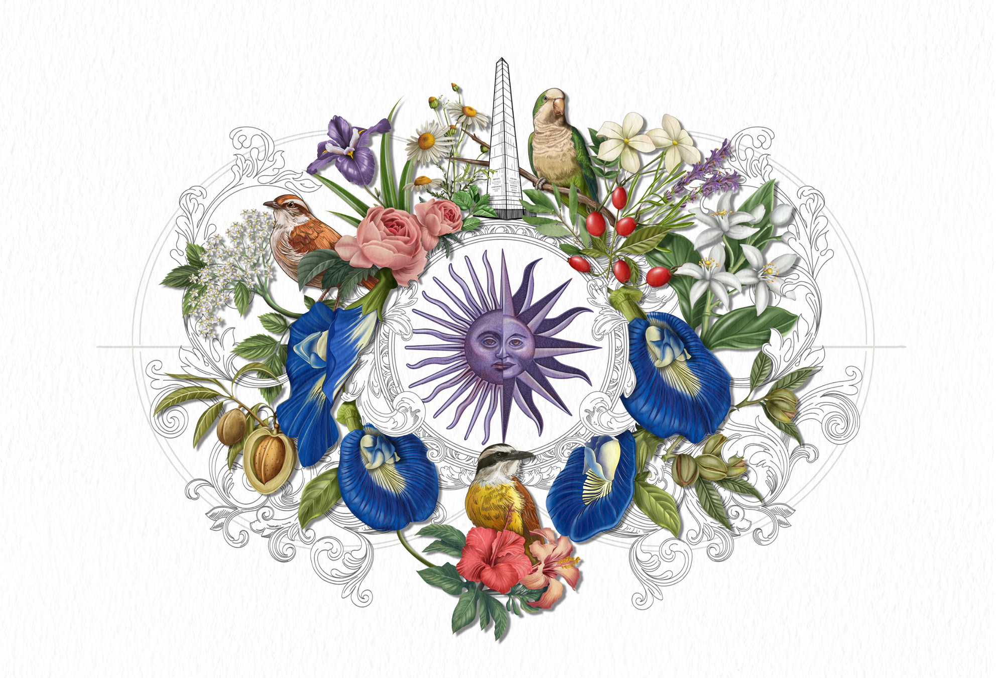
S34 Gin draws inspiration from the roots of its two founders, one from Argentina and the other from Uruguay. The visual direction explores this shared origin through elements that reflect the culture, landscapes, and natural richness of both countries.The Río de la Plata inspires the custom die-cut shape of the label, while the fusion of the suns from both national flags, along with architectural landmarks, local flora, and fauna, brings the visual universe to life.The number 34 also plays a part in the concept, referencing geographic coordinates and inspiring the use of maps and naturalist illustrations. Each element contributes to telling the story behind the brand and the places that are part of its origin.
Curator’s Insight
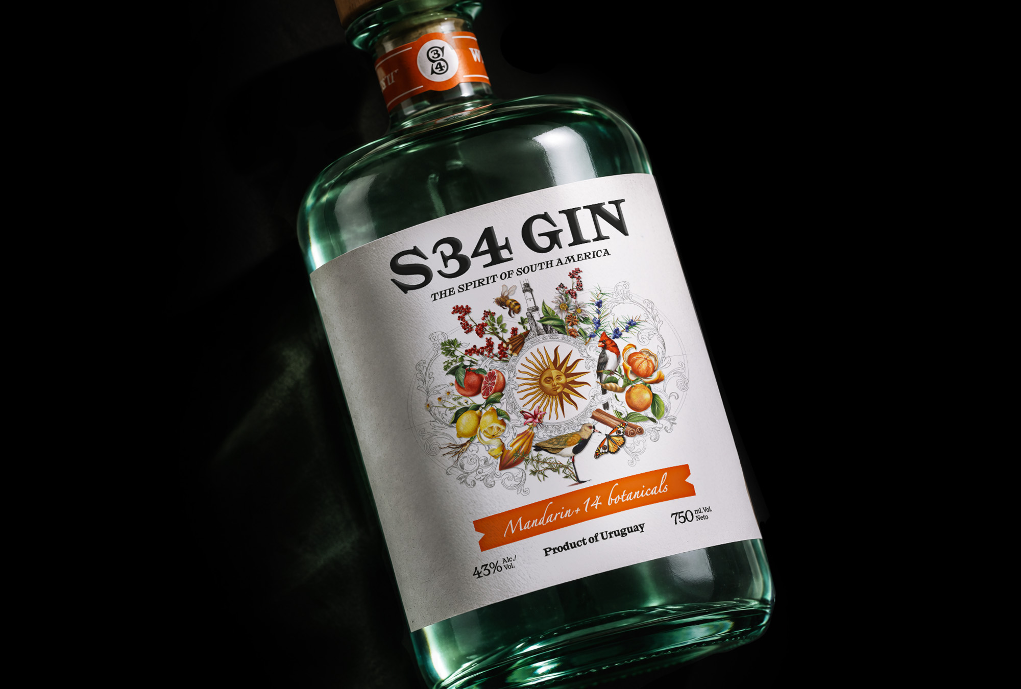
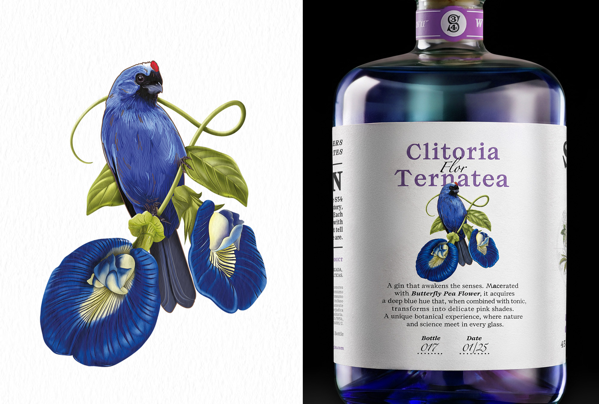
The strongest move here is what the label leaves out. The die-cut cuts the paper along the river, so the liquid shows through the gap and the product itself fills the space of the water. The gold foil traces both edges of that gap, which makes the opening read as a deliberate drawn line and not as missing label. The system also scales well across the range. The engraving-style illustration and warm, toothy paper stay constant, while color shifts through the glass, the neck band and the type. The blue variant adds a hand-filled bottle number and date, which suits a small-batch spirit.
 lunapanda
 Tridimage
 Analoguecreative
 lettera7
 alchimistestudioParis
 Lana B
 Colossal
 Pivot Studio
 M&A CREATIVE AGENCY
 monther al omari
 Anastasia Cherepanova | xtramez
 Hollóka Grafikai Műhely / Graphic Design Studio
 BOLD branding
 Antonia Skaraki
 Pâmella Lorrany
 Z9BKAdsgn
 Francesco Paternoster
 b1studio.ro
 Chris Creative Works
 Boordon
 Dmitriy Kuzovlev
 Brand Society
 yasharpic