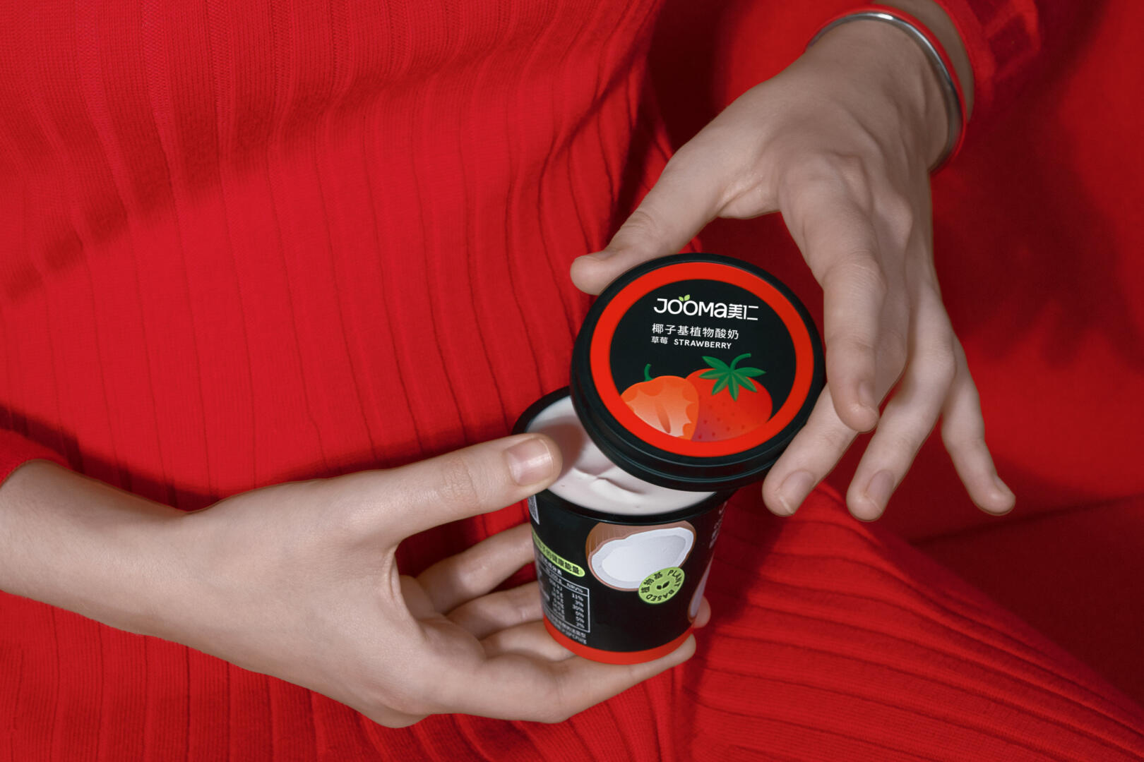
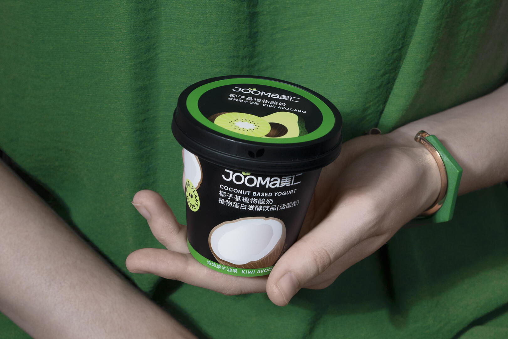
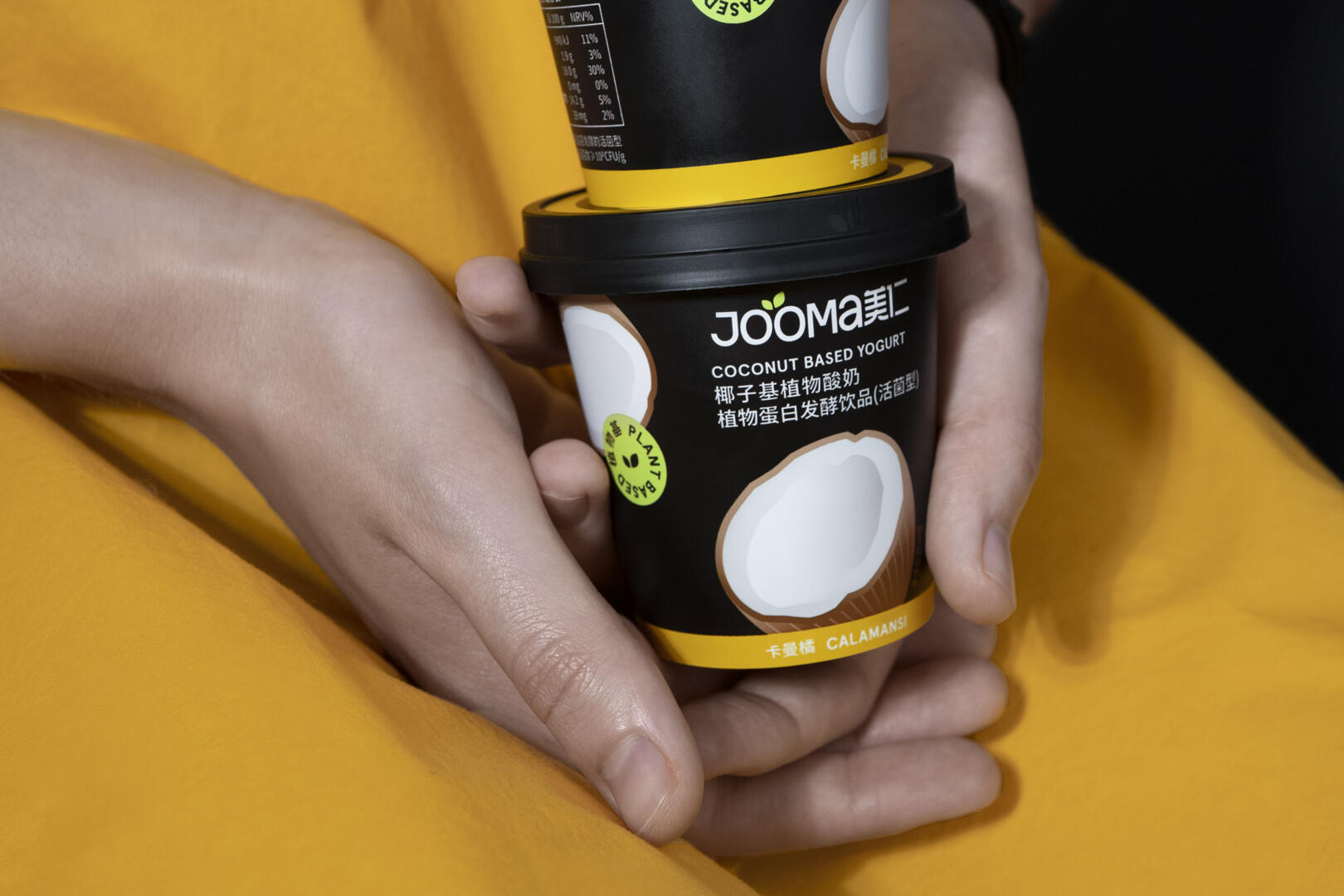
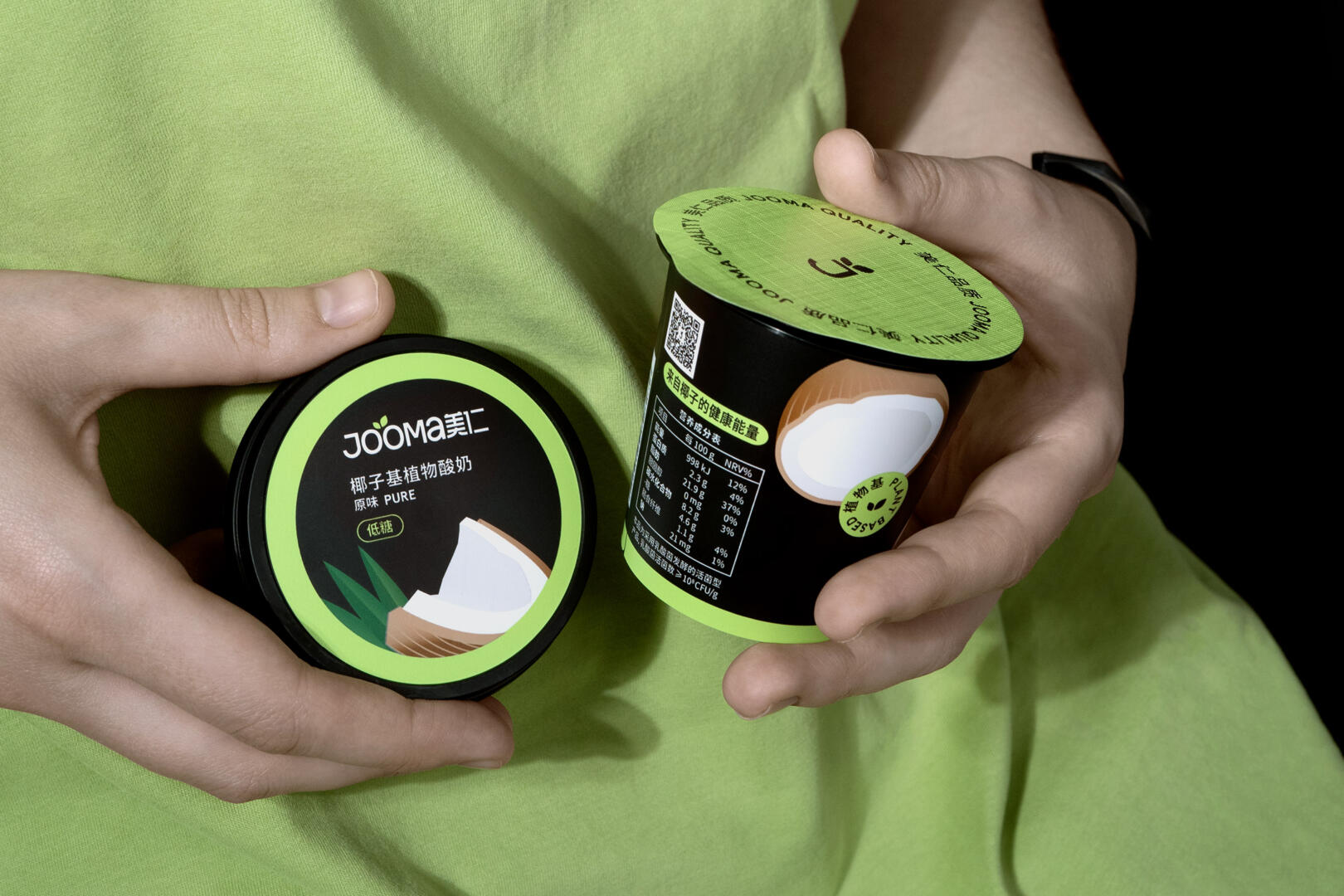
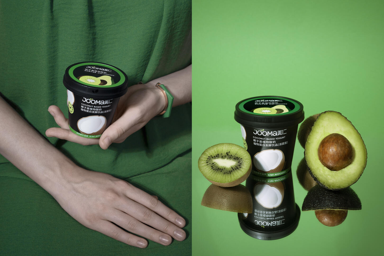
German/Chinese brand Jooma 美仁 has been one of the first to introduce plant-based yogurts on the Chinese market. Starting out with an almond-based product line, they have recently added a line of coconut-based yogurts to even better match the taste preferences of their consumers.
With the new product architecture came the need for a rebrand to account for a growing number of flavors and variations. We’ve helped Jooma develop a structured visual system to set up their current product lines and build upon them in the future.
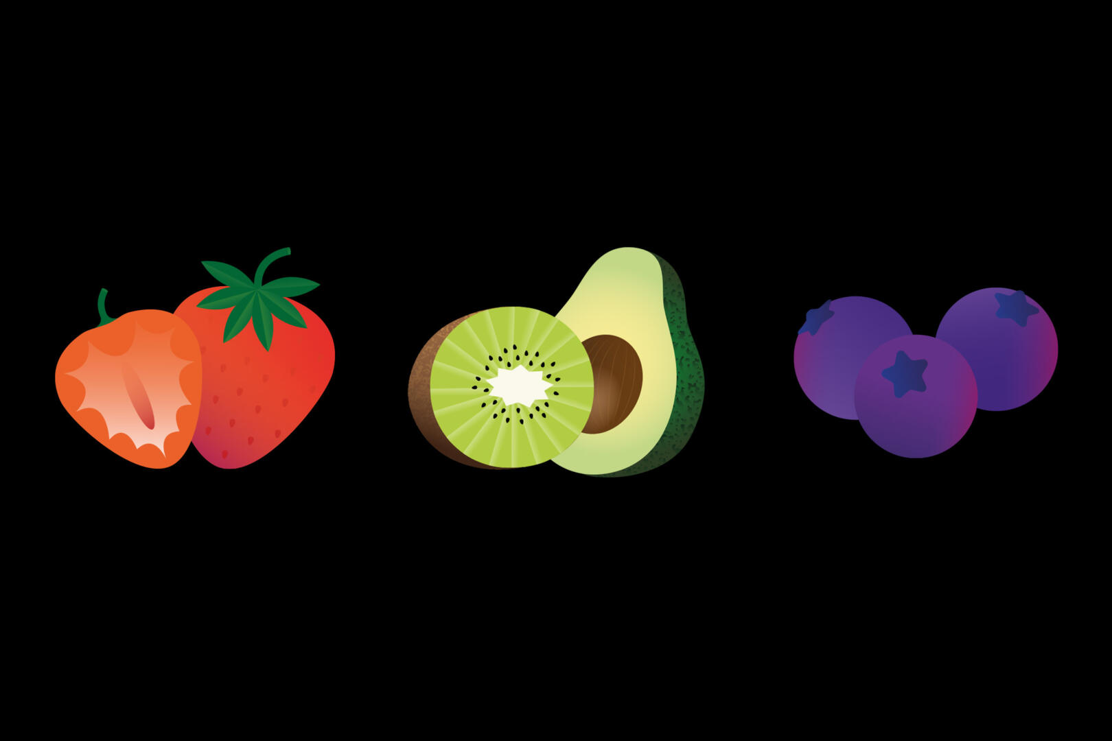
A brushed-up logo and clear typographic grid give the brand a stronger, more contemporary look. Going with black as the main color clearly sets the Jooma apart from others in the dairy aisle. Bespoke illustrations and a palette of bold secondary colors help distinguish the different flavors.