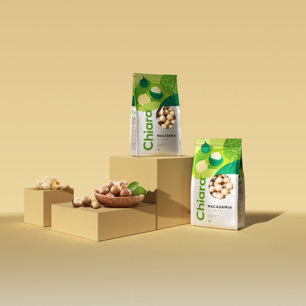
Chiara is an IDOCEAN food brand that specialises in organic and nutritious food items, mostly a range of nuts and seeds. Chiara is positioned as a high-end brand, targeting customers who are youthful, vibrant, and well-paid, as well as those who are interested in health and nutrition.
Chiara sent us the following request for the product’s packaging design:
Suitable for adolescents who delight in bright colours but must maintain a sense of sophistication and simplicity. Most importantly, the consumer must comprehend what they are purchasing. The packaging design on the shelves must be able to effectively convey the story of the product.
Chiara’s product lines include: whole grain oats, organic chia seeds, macadamia nuts and roasted cashews.
The solution we propose is to use organic forms to depict the contents of the package, such as oats, chia seeds, macadamia nuts, and so forth. The choice of colour is also meticulously considered in order to make the product stand out, especially when the product lines are displayed close to each other on the shelf, using a spectrum of vivid colours suited for each product line. Warm colour ranges are used in combination with neutral colours for helping the colour scheme harmonise and capture buyers’ attention.
Use organic shapes to illustrate product composition, meeting the subtle and simple element that the brand requires. Combined with a harmonious colour scheme, we have recounted the product story from sunny oat fields to appealing purple chia seed blooms to attractively harvested and roasted cashews.
The layout is designed with plenty of white space, and the package information is properly organised, adding to the design’s elegance. This design will make it easier for customers to grasp product information and will convey the impression that this is an exquisite product that stands out from others on the shelves. Furthermore, utilising a die-cut technique to disclose what is contained within the box allows customers to quickly identify the real form of product and firmly demonstrate the quality of the product sealed inside the package.
We also make the CHIARA logo stand out on a large area instead of horizontally on the packaging, which helps enhance brand recognition by allowing buyers to instantly recognise this brand on the shelf even from a distance.


