About the Brand:
“Integhub” is an innovative project designed to provide integrative solutions for companies and organizations through an efficient central platform. Even the brand name is reflective of its deep vision: “Integ” comes from the concept of integration, meaning bringing together systems and applications into one coherent framework. Meanwhile, “Hub” means centrality and connectivity, which indicates the platform’s role of being a central hub in smoothing processes and improving communication between the different components. The project intends to make operations simple and achieve seamless integration that nurtures efficiency and innovation in the digital ecosystem.
Challenges:
The greatest challenges were to design a logo that would clearly depict the concepts of centrality and integration in the simplest and most attractive way. Moreover, it was very important for the visual identity to convey the ideas of connectivity and integration, thus underpinning the concept of the logo and further expressing the vision of the brand.
Solutions:
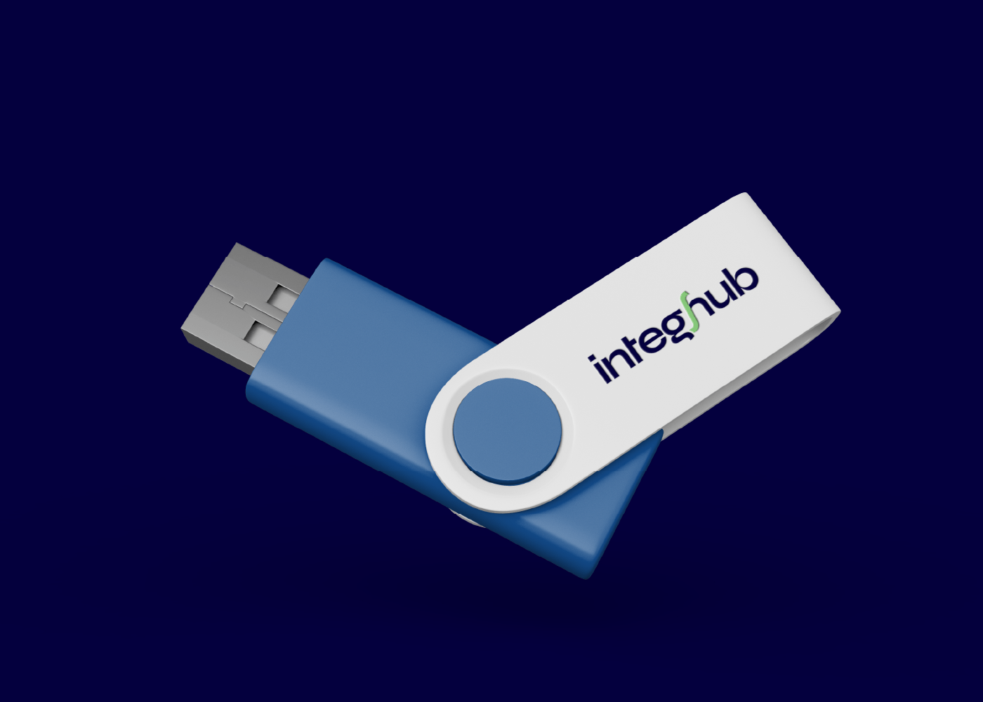
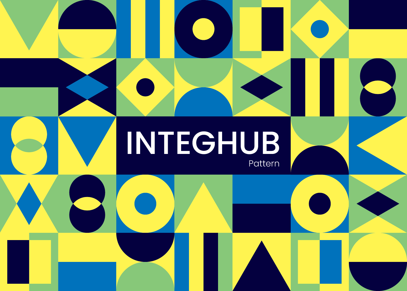
We did an in-depth analysis to understand the vision and objectives of the brand, which allowed us to translate those into a unique visual identity. We designed a logo focused first and foremost on typography, adding to it a symbolic icon integrated into the text, representing integration and serving as a link between the two parts of the name “Integhub.” We also picked modern and harmonious colors reflecting the tech field while conveying professionalism and innovation. We also developed geometric-based visual patterns to further brand the identity, thereby communicating effectively the ideas of integration and connectivity.


