Scream n Chill: A Bold Treat with a Loud Personality
Scream n Chill is more than just an ice cream brand — it’s a world of wild adventures, tailored for a young, thrill-seeking audience. Each variant transforms the act of snacking into a sensory story, with flavors and characters designed to surprise, delight, and excite. It’s chaotic. It’s expressive. It’s unapologetically loud — the way ice cream should be when you’re a kid.
Conceptual Packaging
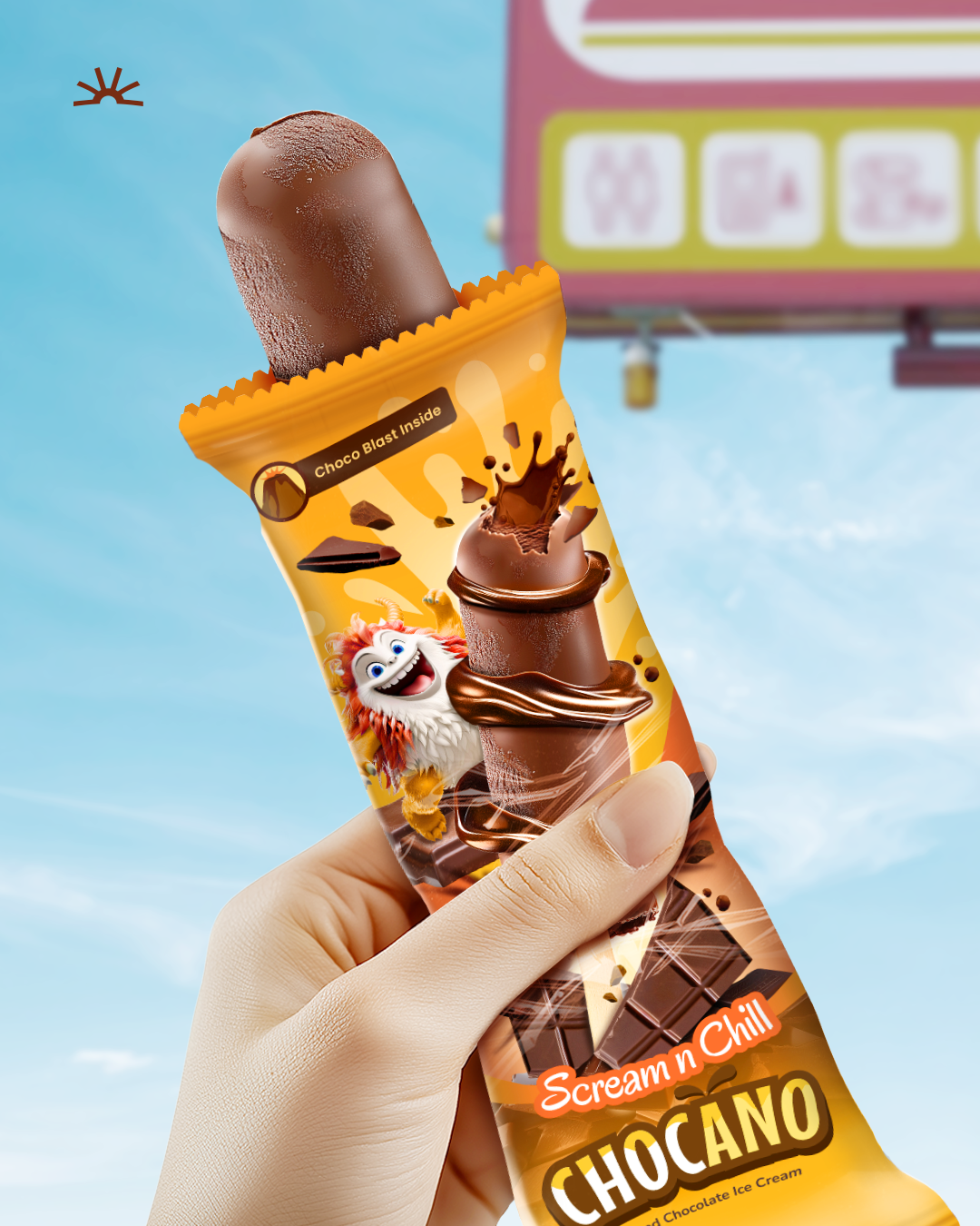
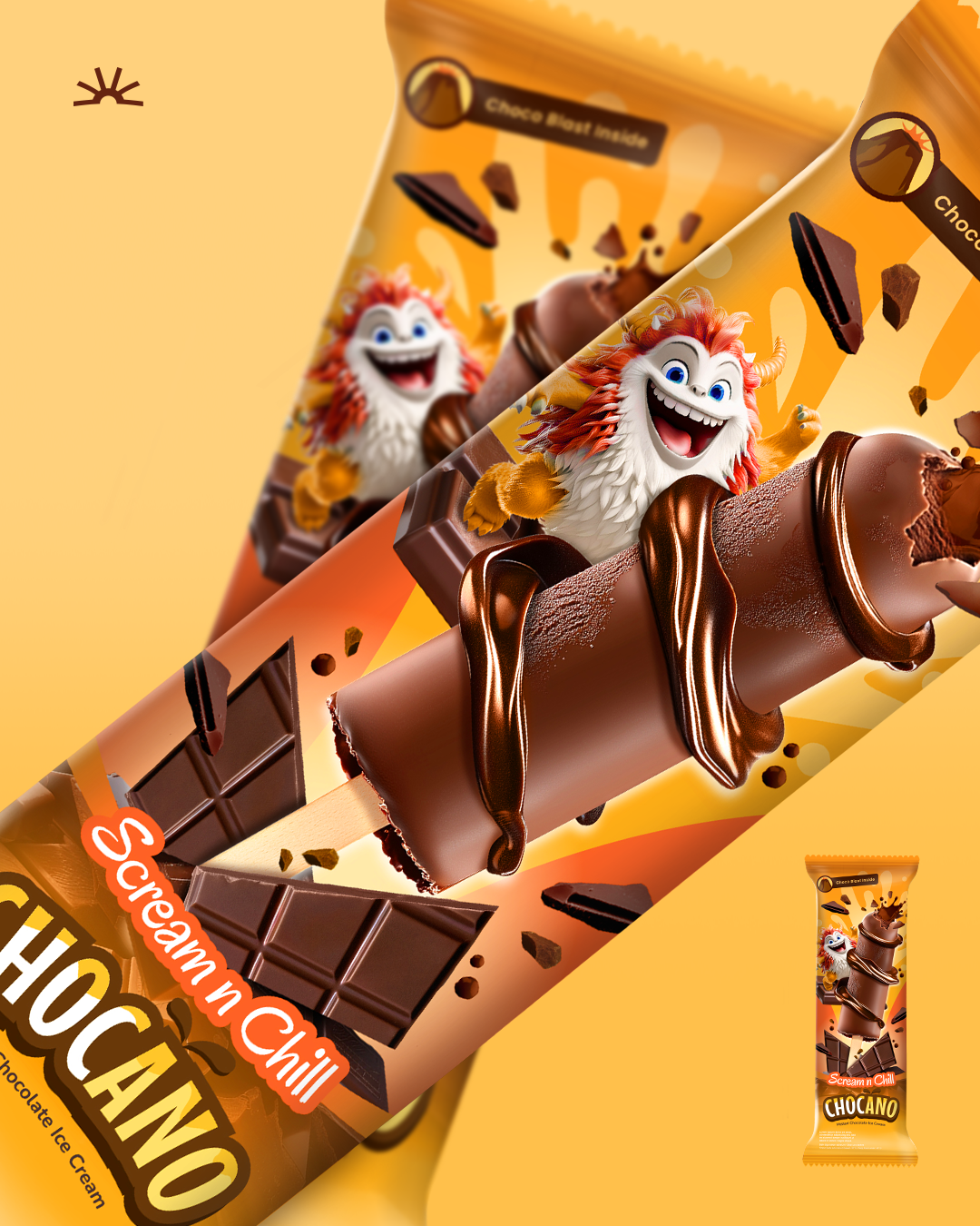
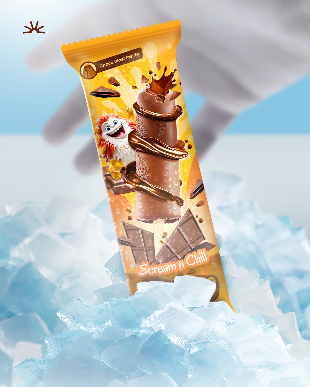
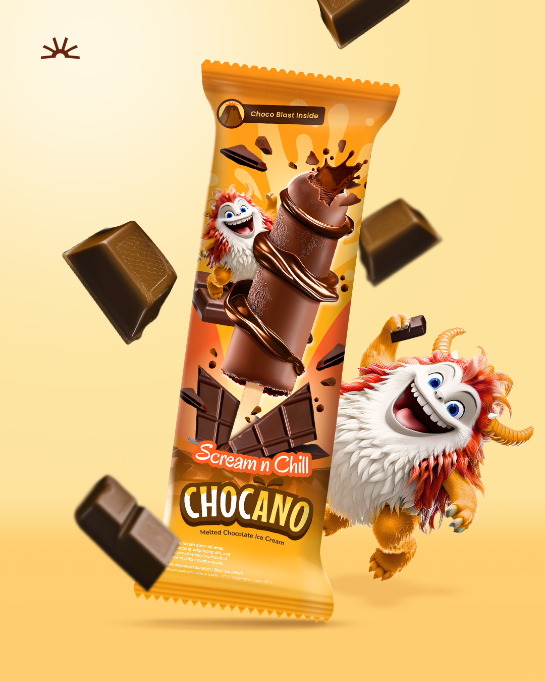
The concept was to create a monster-filled universe where every flavor is a character with a unique story. The parent brand, Scream n Chill, invites kids into this playful world, while each ice cream variant brings its own energetic personality to the shelf. The Chocano variant, for instance, draws inspiration from volcanic eruptions — channeling the drama of molten chocolate bursts through explosive graphics, gooey textures, and fiery palette choices.
The design balances wildness with appetite appeal. Bold, expressive typography shouts from the pack. Oversized monster mascots break out of the grid. And the color system is purposefully loud — from blazing reds to electric blues — ensuring instant impact from a distance.
Solution
Our solution was to build a full-fledged visual universe. This meant naming both the master brand and its sub-variant, developing characters with rich backstories, and crafting a design language that feels both chaotic and cohesive. That is why we intentionally name the brand “scream“. from the logo system to the background patterns and illustration style, it works together to convey motion, noise, and flavor. The packs had to jump off the shelf and straight into kids’ imaginations.
The result is a packaging system that stands out in a crowded freezer aisle, sparks instant emotional connection, and invites playful interaction. Scream n Chill is loud by design — and proudly so. It’s not just a treat — it’s a scream-worthy experience.