

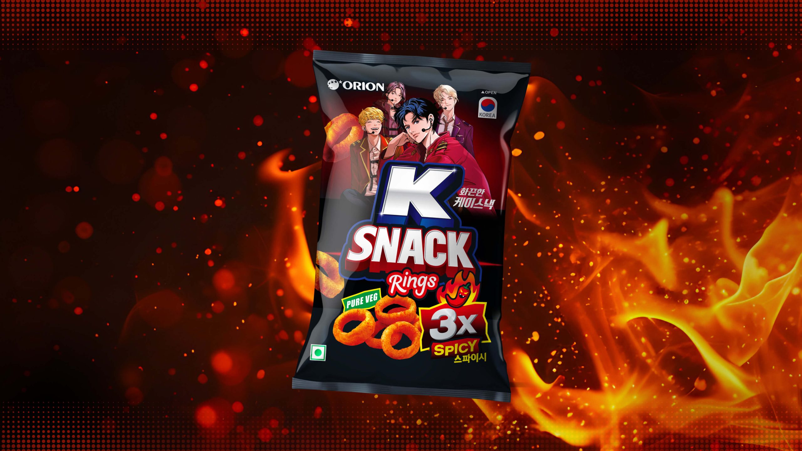
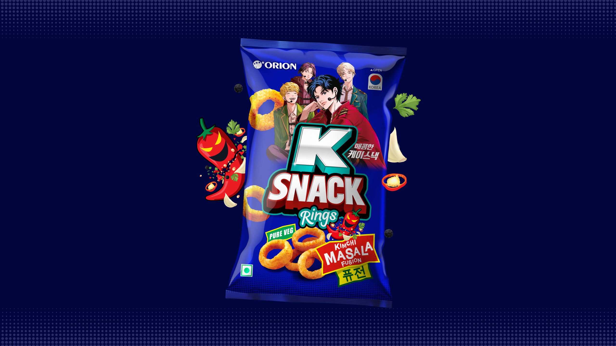
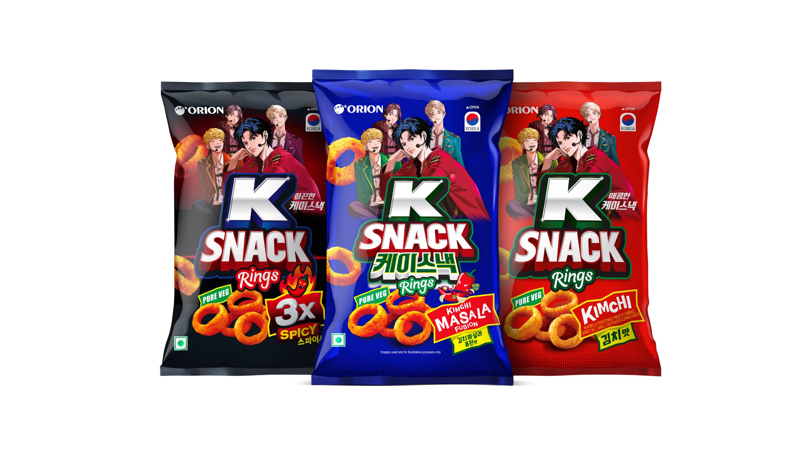
We had the opportunity to work with Orion to design the packaging for their K Snack range-an exciting product line created to bring Korean-inspired flavours to the Indian snacking market. With Gen Z in India deeply influenced by Korean pop culture, from K-pop and K-dramas to anime, our design approach focused on capturing this cultural wave and translating it into a bold, trend-driven visual identity. The flavours-Kimchi, Masala Fusion, and 3X Spicy-were crafted to offer a new taste experience while aligning with the audience’s growing curiosity for global, experimental snacking.
The design language uses vibrant, high-impact colours to differentiate each variant and visually communicate the flavour experience. The Kimchi pack features fiery reds to signal tanginess and spice, Masala Fusion uses a bold blue to reflect an exciting Indo-Korean blend, and 3X Spicy employs deep blacks to emphasise intensity and heat. These colours not only deliver strong shelf standout but also help create a cohesive yet diverse product family. A key highlight of the packaging is the inclusion of Korean/anime-inspired illustrated characters. Styled with fashion and attitude reminiscent of K-pop idols and anime heroes, these characters serve as cultural connectors, instantly resonating with Gen Z consumers who see Korean aesthetics as aspirational and expressive.
By merging global cultural trends with local flavour preferences, the Orion K Snack packaging aims to create a product experience that feels modern, collectible, and culturally relevant. The result is a vibrant, character-driven design that appeals to young consumers seeking novelty, identity, and a sense of connection to the Korean culture they admire.

 TheDesignPeople
 Derrick Lin
 monther al omari
 43oz
43oz lilyz design23
 Modern Theory
 Eighteen Brand Studio
 Bhumika Singh
 MohamedMashaly
 Pixels Studio
 Gulya
Gulya UPRISE
 Lizaveta Kharitonyuk
 Bonsanco Creative Studio
 DesignRepublic
 GIRAFA STUDIO
 PiotrWisniewski
 Sophiagdotcom
 CreativeWise
 SoreThumbStudio®
 Modern World Studio
 Palashcc
 Valérie Colace