

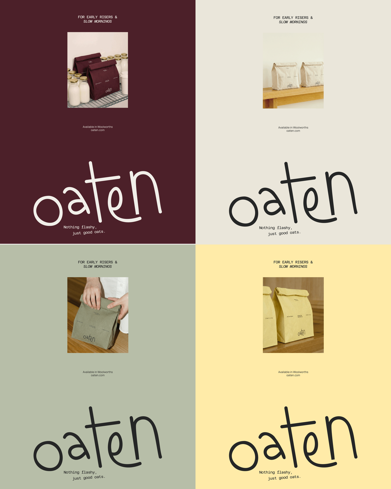
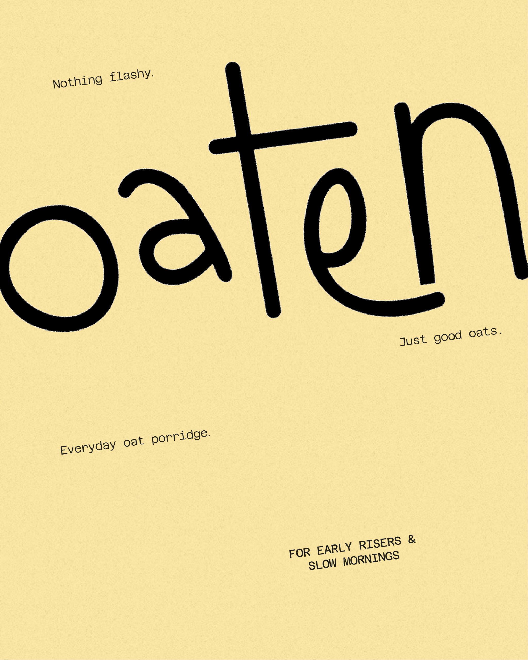
This project explores a modern and honest approach to porridge. A simple everyday product, often overlooked, yet deeply rooted in daily routines. The intention was to create a brand that reflects this simplicity — something warm, familiar and trustworthy. The brief was clear: nothing flashy, just good oats. Instead of overdesigning the product, the goal was to embrace its raw and essential nature, and translate that into a visual identity and packaging that feel natural and effortless.
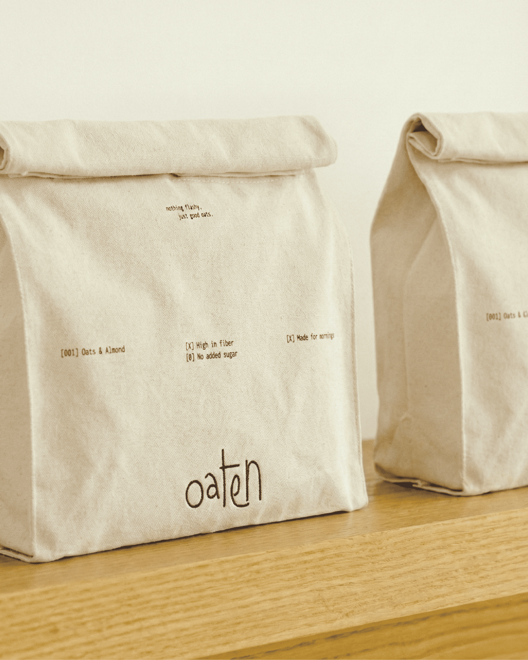
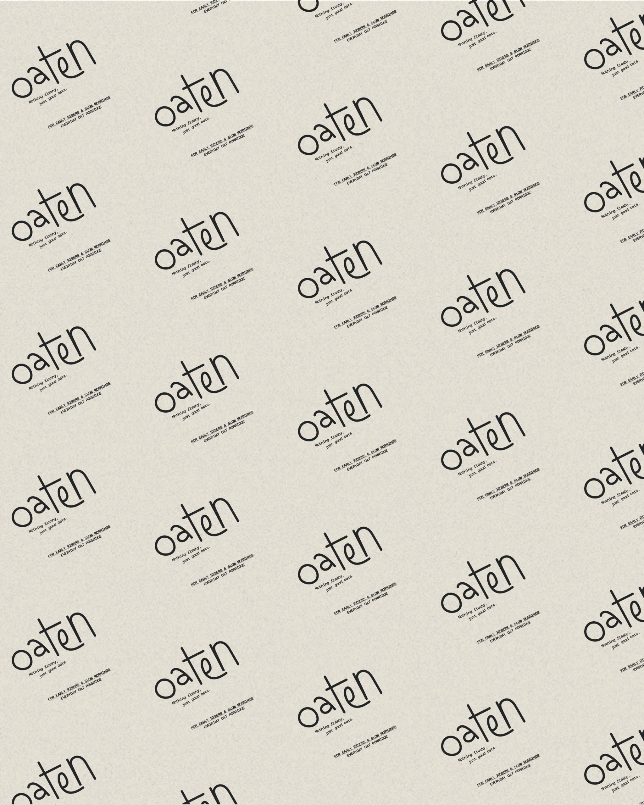
The design embraces restraint. A hand-drawn wordmark adds a human, approachable touch, while muted earthy tones evoke the natural origin of oats. The rolled paper packaging reinforces the raw and authentic character of the product, creating an object that feels simple and honest.
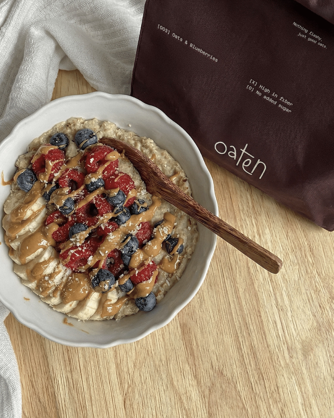
The result is a contemporary porridge brand that stands out through its quiet simplicity — something that feels right at home on a kitchen shelf, becoming part of a calm everyday ritual.



 Studio Zak
 Ander Sanchez
 Atipus
 Widarto Impact
 hovski
 Ohmybrand
 CreativeWise
 Rauf Karaev
 Hooperstudio
 La Nube de Ideas
 Modern Theory
 Akim Melnik Design Studio
 preflightcreative
 Seyf El Haq Menouer
 Badraddine Attik
 Samriddhi Ravi
 Alessandro Ammaturo
 Amblr Studio
 vladlenalevit
 Sis Tsarukyan
 monther al omari
 alchimistestudioParis
 designsbysukaina
 About House of Ta
 Amjad Battal