
Visual Architecture and Typography
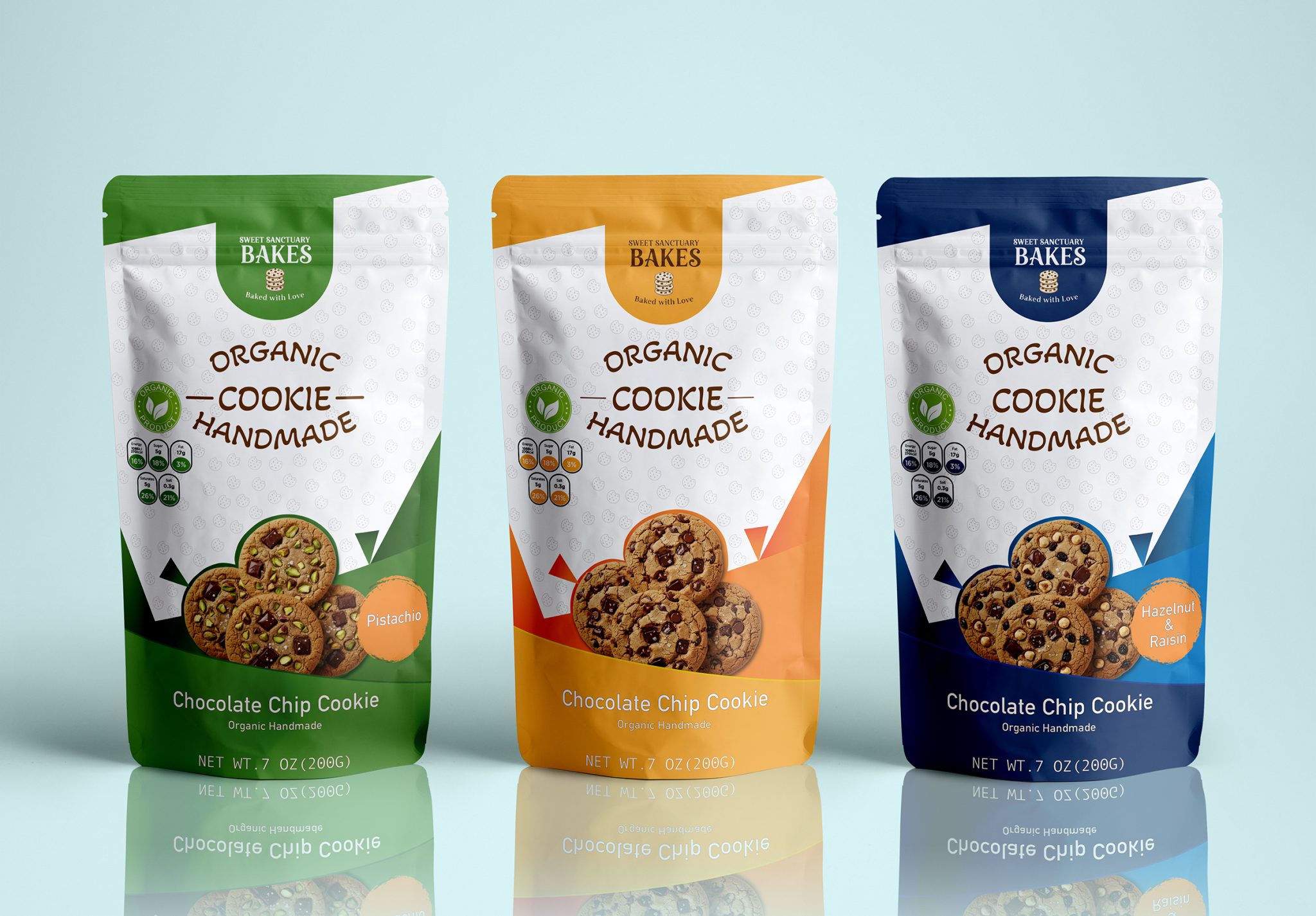
At the core of the design, I established a strong typographic hierarchy that defines the product’s identity.
- “Handmade” Emphasis: The handwriting-style font used in the center conveys a sense of craftsmanship rather than an industrial feel.
- Information Hierarchy: I positioned the logo at the top to build trust. By grouping the “Organic” and “Handmade” callouts in the center, I aimed to accelerate the consumer’s decision-making process.
- Icon Usage: The “Organic Product” seal on the left and the circular nutritional value indicators appeal to the modern, transparency-seeking, and health-conscious consumer.
Color Strategy and Segmentation
I utilized the color-coding method to differentiate the products from one another. I broke the cleanliness of the white background with vibrant and sharp geometric forms:
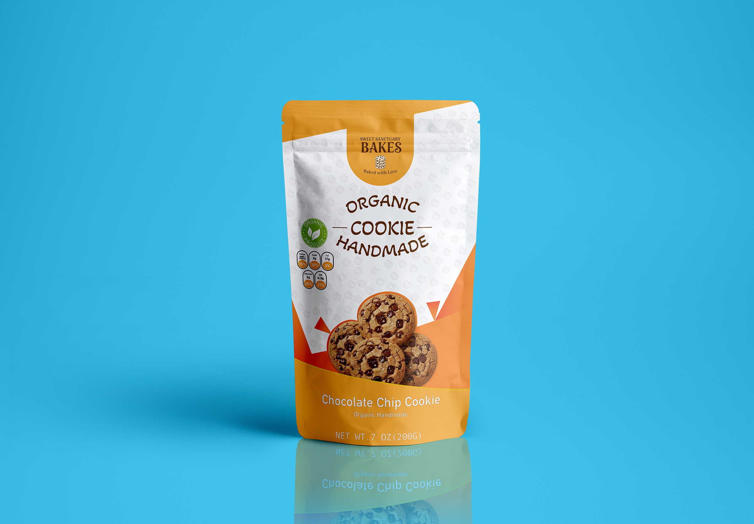
- Classic Orange (Chocolate Chip): I chose a traditional energy to trigger the warmth of chocolate and the appetite for freshly baked goods.
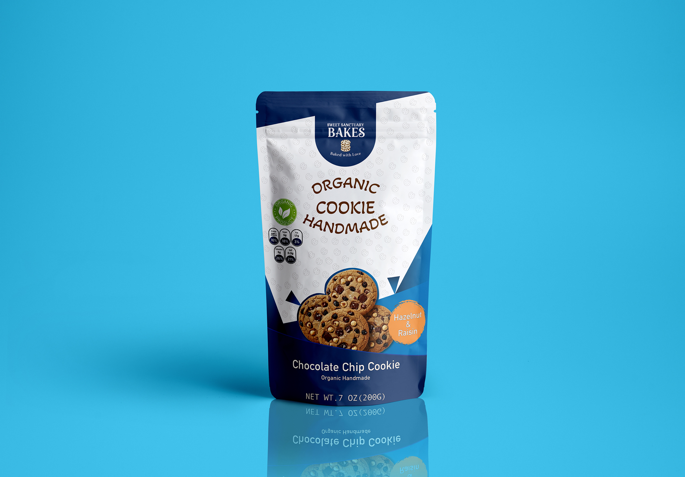
- Navy & Night Blue (Hazelnut & Raisin): I wanted to move the hazelnut and raisin combination into a more “premium” and settled segment. The orange “Hazelnut & Raisin” bubble at the bottom right provides visual balance.
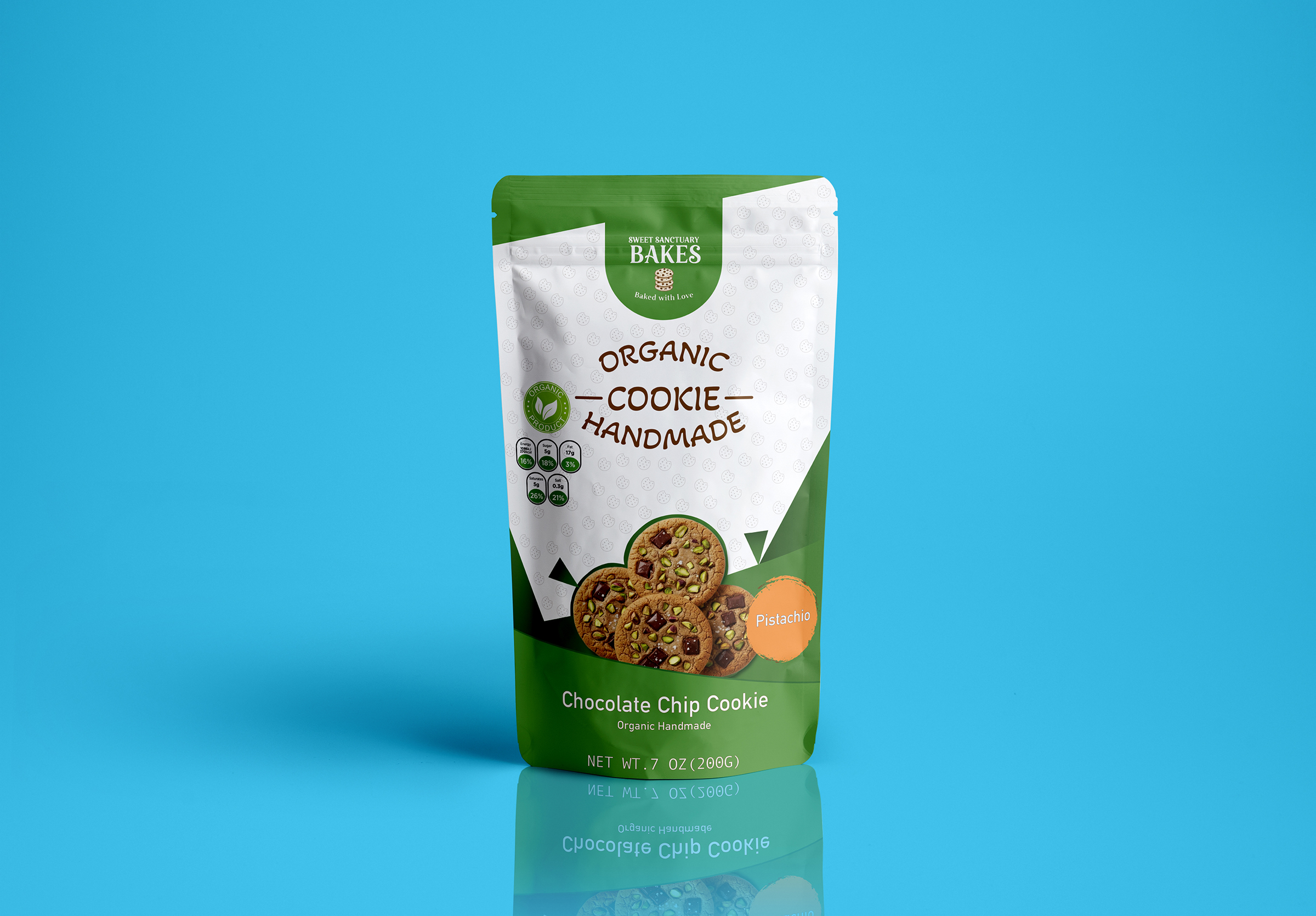
- Nature Green (Pistachio): Selected to emphasize the naturalness and freshness of pistachios, this tone became the strongest color supporting the “organic” theme.
Appetite Appeal
I preferred a high-resolution and realistic style for the cookie visuals used at the bottom of the packaging.
- Pattern (Background): Small cookie icons repeating faintly on the white background add depth to the design while filling negative space with a “brand signature.”
- Geometric Sharpness: The triangular forms separating the top and bottom colored areas add a modern and dynamic vibe; they transform the product from a “boring organic food” into a “modern snack.”
 Derrick Lin
 Biaa
Biaa Petitmoulin Studio
 White Bear Studio
 Eva Chistyakova
 monther al omari
 Atipus
 alchimistestudioParis
 oneandother
 bloomburo
 helocrene
 Shapers Studio
 Denver Design
 Aidearte
 andrew.huerta
 softmachine
 airobtq
 Buzz & Co.
 Ruby
Ruby themythographer
 IDNB Inc.
 viktorflr
 Zenpack