
Brand Identity and the “SHIFT” Concept
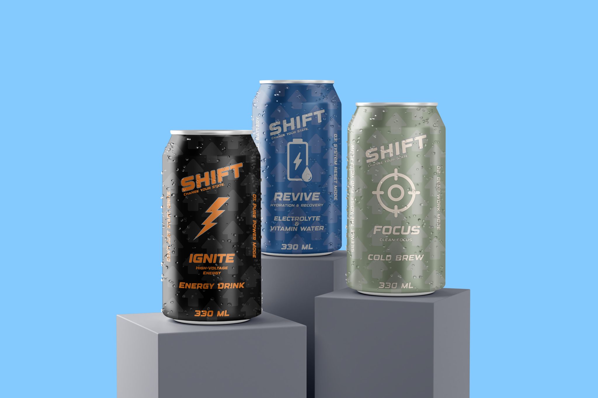
The cornerstone of the design is built upon the name “SHIFT,” symbolizing change and progress, supported by a vertical/horizontal balance.
- Typographic Choices: An industrial and technological font was selected for the brand name to emphasize the product’s “performance-oriented” nature. The sharp lines in the typeface were structured to evoke a digital interface, referencing the modern consumer’s connection with technology.
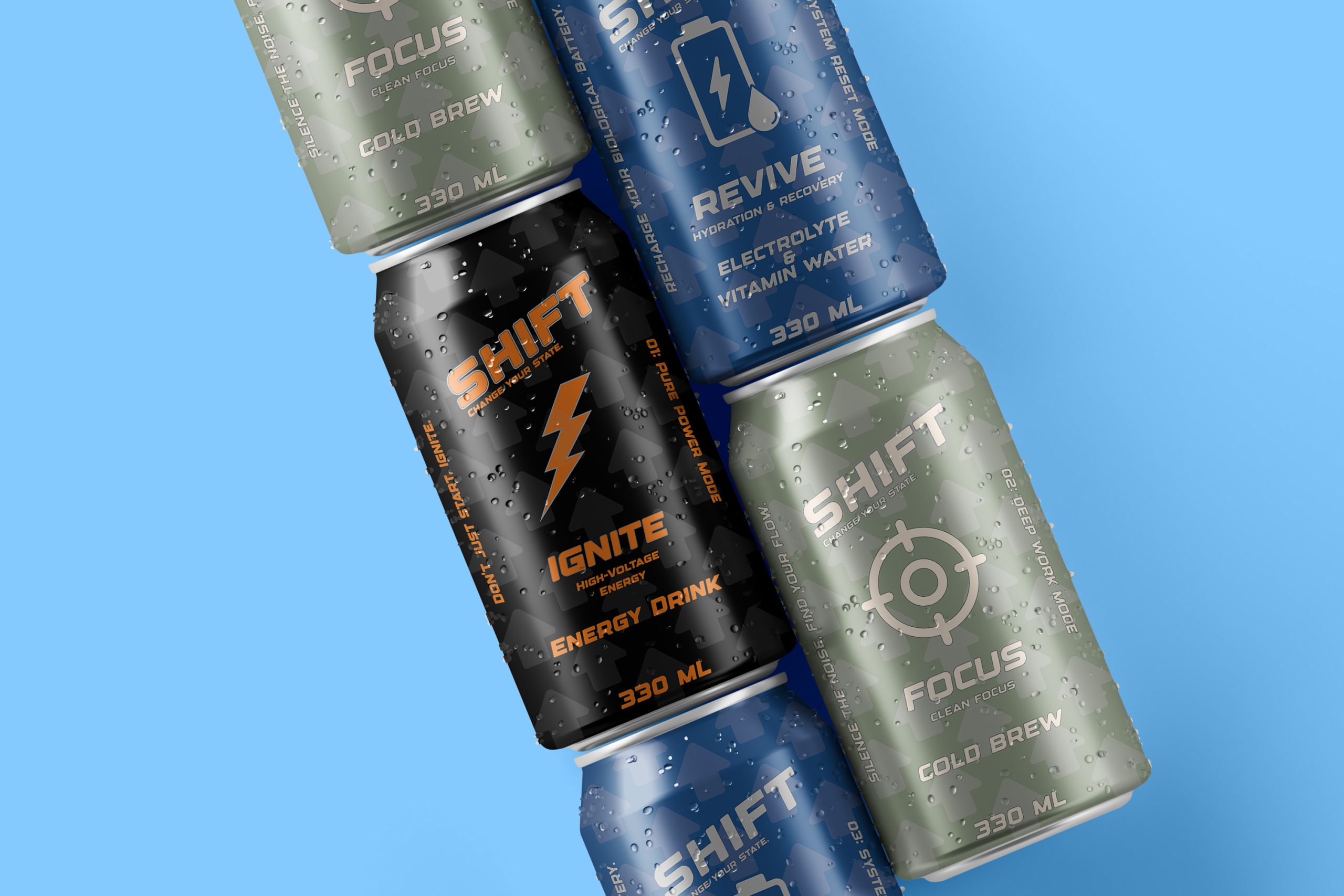
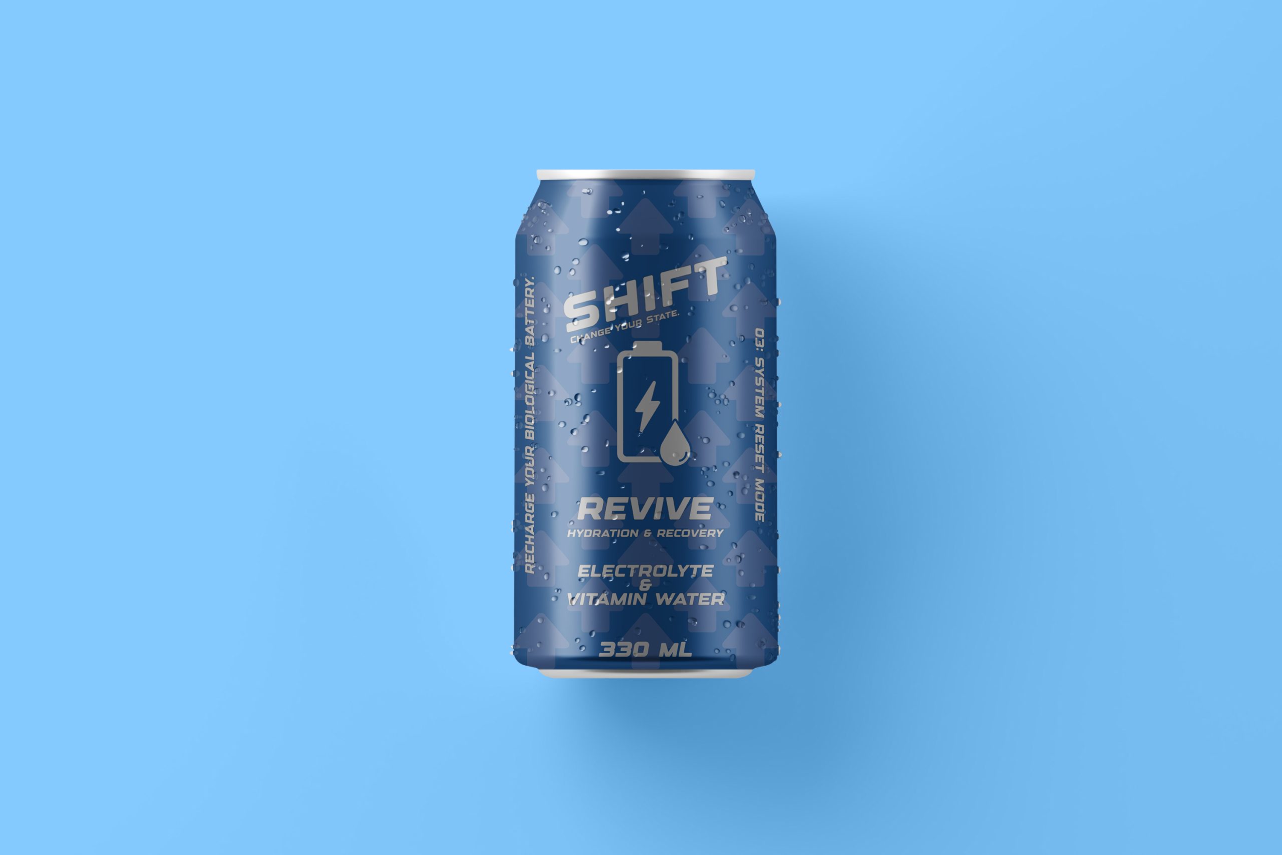
- Background Patterning: An upward-pointing arrow pattern covering the entire surface of the packaging was designed to subconsciously instill the brand’s promise of “ascent” and “progress.” This pattern adds depth while serving as a powerful visual signature across all variants in the series.
Functional Color Coding and Segmentation
The three distinct needs within the series (Energy, Focus, Recovery) were differentiated according to universal principles of color psychology:
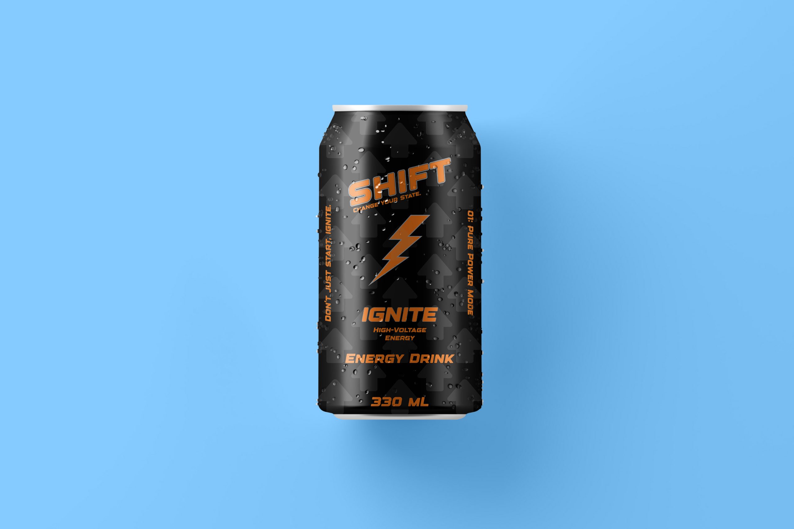
- IGNITE – High-Voltage Energy (Black & Orange): Designed as “Pure Power Mode,” this variant utilizes the authority of black and the high energy of orange. This color palette, supported by a lightning bolt icon, was chosen to symbolize the product’s instant energy-boosting power.
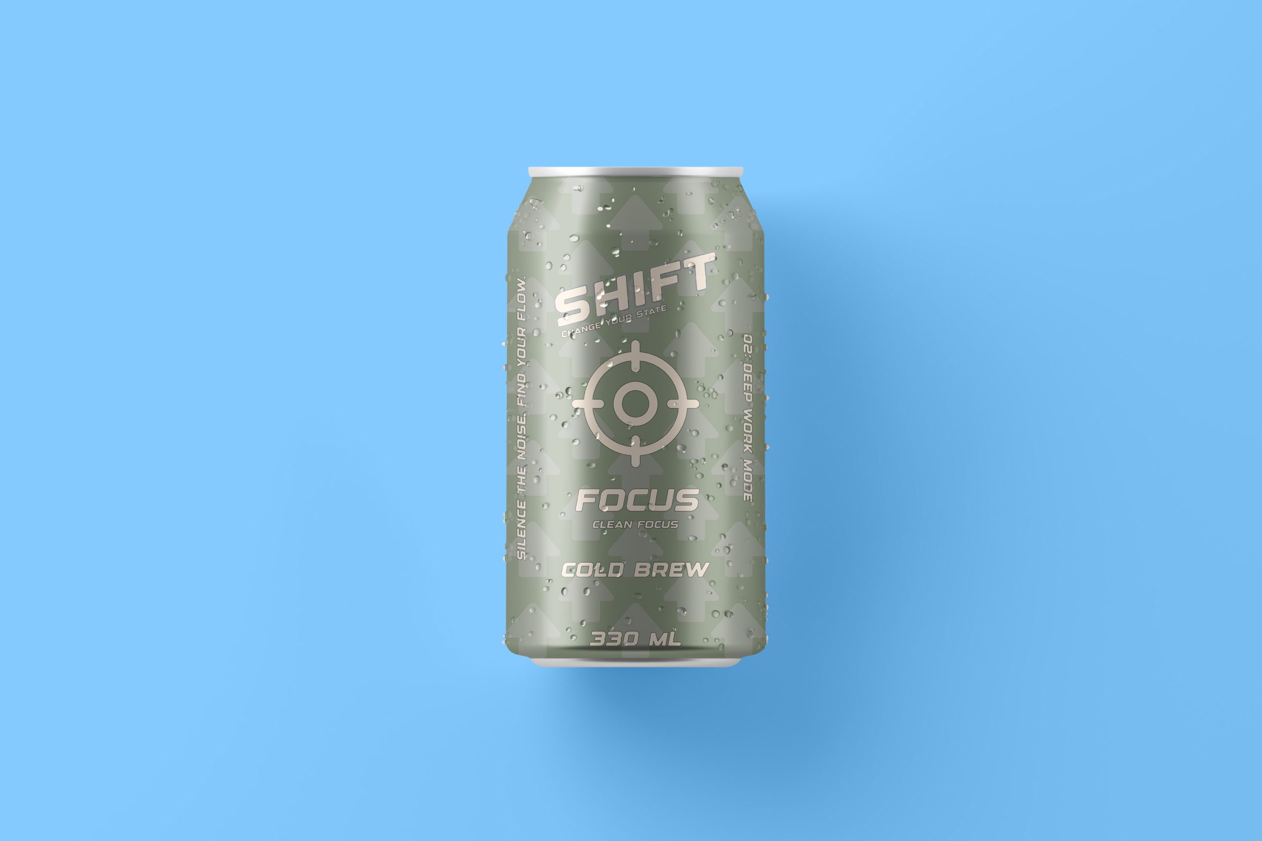
- FOCUS – Clean Focus Cold Brew (Sage Green & Silver): For mental clarity and concentration, “Sage Green”—a more calming tone—was preferred. Paired with a target icon, this color aims to represent “silencing the noise” and transitioning into Deep Work mode.
- REVIVE – Hydration & Recovery (Deep Blue & Silver): The promise of a “System Reset Mode” and recharging the body was constructed with deep blue, the color of water and freshness. A battery icon was placed to visualize the sense of “refilling” provided by electrolytes and vitamin support.
Information Architecture and Vertical Layout
A distinct visual language was aimed for through the use of vertical text blocks placed on the sides of the packaging, departing from traditional beverage labeling:
- Motivational Guidance: Vertical slogan placements such as “Recharge your biological battery” and “Silence the noise, find your flow” were structured to create an intriguing “unboxing” effect, encouraging the consumer to examine the product closely.”
- Iconographic Clarity: Centrally placed minimalist icons (Lightning, Target, Battery) were designed to communicate the product’s function in a global language without the need for words.
Structural Form and Material Perception
The 330 ml “Sleek Can” form was preferred to support the product’s modern, elegant, and portable character:
- Finishing Techniques: The water droplet effects (mockup details) on the packaging were used to reinforce the perception that the product should always be consumed “cold and fresh.“
- Matte and Metallic Contrast: Planning to highlight the background arrow pattern with a matte texture while making the logo and icons pop using glossy/metallic printing techniques (such as Spot UV or Foil Stamping) ensures the product’s position in the “Premium” segment.
 Derrick Lin
 Biaa
Biaa Petitmoulin Studio
 White Bear Studio
 Eva Chistyakova
 monther al omari
 Atipus
 alchimistestudioParis
 oneandother
 bloomburo
 helocrene
 Shapers Studio
 Denver Design
 Aidearte
 andrew.huerta
 softmachine
 airobtq
 Buzz & Co.
 Ruby
Ruby themythographer
 IDNB Inc.
 viktorflr
 Zenpack